
Screen Controls
A guide to creating forms using screen controls in Form Pages
Form page screen controls are fundamental elements within the ComUnity Development Toolkit that empower developers to create interactive and user-friendly forms for data collection and input. These controls serve as building blocks for designing effective user interfaces and streamlining data submission processes. Form controls encompass a diverse range of components, each designed to cater to specific input needs.
From input fields and auto-inputs to reference inputs and an extensive array of buttons, these form controls serve as screen controls specifically designed to build forms. They provide a versatile set of tools that seamlessly facilitate data interaction. By incorporating these controls into your application, you can elevate user experience, ensure precise data input, and optimise the overall functionality of your application.
In the following sections, we will delve into the various types of form controls available, explore their unique properties, and discuss best practices for integrating them into your application's design. Whether you're creating simple data entry forms or complex multi-step processes, form controls provide you with the means to build efficient and intuitive user interfaces that cater to your application's requirements.
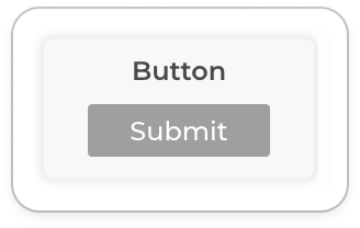
Button
Buttons are interactive components which are allow users to submit forms, they are also to implement Consent. The Button screen control widget is used to build buttons.
Properties of a Button
Button Text
This property allows you to specify the default text to display on your form button. A valid Button Text must be of type string with a maximum length of 12. The Button Text property is required.
Button Text(Long)
The optional Button Text (Long) property allows you to specify an extended label for the button. This longer text will only display on devices that support longer button names, excluding those that impose text length restrictions, such as certain Java-based phones. If Button Text (Long) is provided, it will be used in place of Button Text on compatible devices.
Verb Name
This property allows you to specify an HTTP verb for the form action.
Consent Name
This property allows you to select a consent by name from a list of consents which exist in the system. The selected consent is applied when the form is submitted. To learn more view Consent.
Button Type
This specifies the type of button to use in a form and defaults to a Action button type if not specified:
Action – Standard form button
Link – A button that renders as clickable text in the form
URL Template
The button’s operation (e.g., POST, PATCH) is executed on the form’s data path, derived from either the Target URL or Entity Name. These values are configured in the Properties editor, with the Target URL taking precedence over Entity Name when constructing the data path for the page. This setting also allows appending to the data path to enable operations on a different entity.
For example, a form with a Target URL as below:
/Fault({{faultId}})
And a “URL Template” value of
/FaultType
The OData path for the operation will be as below
/Fault({{faultId}})/FaultType
Document Template
This field allows for customisation of the JSON body generated from form inputs when the form is submitted. By default, the JSON body is derived from the form inputs, but this field enables further customisation.
If the Document Template value starts with {, the body will be constructed directly from the specified template, with placeholders replaced by form input values.
For example if you created the following screen with a Target URL = “/UserProfile” and a Button that performs a PATCH operation as below:
Setting Document Template to {"Name":"{{=Name}}","Modified":"{{=now}}"} would result in a body containing only the specified fields:
If the value does not start with {, the default body structure derived from form inputs is used, and the specified Document Template value is appended to it. For instance, if Document Template is set to "Modified"="{{=now}}", the resulting body merges the template with the form-derived fields:
In summary:
• Starts with {: Uses the specified template as the complete body, with placeholders replaced by form values.
• Does not start with {: Adds the specified value to the default form-derived body.
This setup provides flexible JSON customisation to accommodate specific data requirements.
Success Content
This property allows you to specify a message to display to a user after successful form submission. Setting this value results in a dialog being displayed to the user that must be dismissed by the user.
Success Bubble Text
This property allows you to specify a message that will be displayed to the user before the action continues with submitting the request. Setting this value will result in a dialog being displayed when pressing the form submission button.
Confirm Content
This property allows you to specify a message that will be displayed to the user before the action continues with submitting the request. Setting this value will result in a dialog being displayed when pressing the button.
Navigate URL
This property allows you to specify the path to a page a user is redirected to after form submission. The accepted values are:
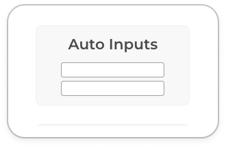
Auto Inputs
All inputs screen control widget creates form fields for all the properties of the entity specified in the Target URL or Entity name of the parent form page.
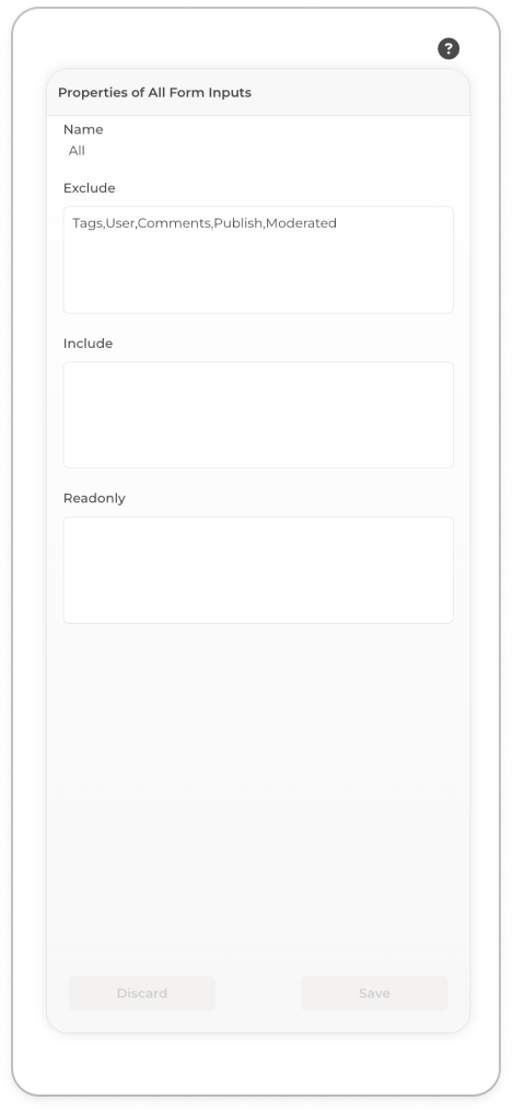
Properties of Auto Inputs
Order
This property allows you to order your form fields by entity property. It accepts a comma delimited list of entity properties.
Exclude
The property allows you to filter All Inputs by to specifying entity properties to exclude from All Inputs. It accepts a comma delimited list of entity properties.
Readonly
This property allows you to specify read only form fields by entity property. It accepts a comma delimited list of entity properties.
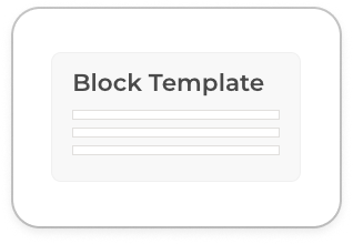
Block Template
Block Templates are screen controls A specialised list that sets up auto-refreshing (long polling) of the list values. Block Templates are particularly beneficial for dynamic content, such as notifications or chat messages, where it’s crucial to have the latest data reflected consistently.
Properties of Block Template
Block URL
This property allows you to set the Data Path for the items in the list. The value is appended to the Target URL for the page.
Block Title
Sets the title for the list item
Block Content:
Sets the title for the list item
Block Items
Sets the maximum number of items to be fetched for the list.
Query Filter
Sets the query that will be applied when fetching the records for the list.
Search Fields
Sets the fields that will be used when filtering with the text search bar.
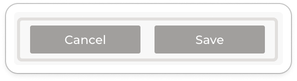
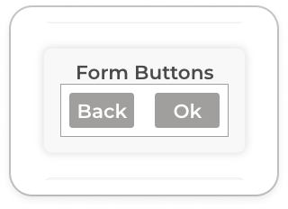
Form Buttons
Adds multiple Action buttons to a Page (i.e. Edit, Delete, etc.)
Properties of Form Buttons
Edit Text
Sets the label of the form edit button, button will only be added if there is a value set.
Update Text
Sets the label of the form update button, button will only be added if there is a value set.
Delete Text
Sets the label of the form delete button, button will only be added if there is a value set.
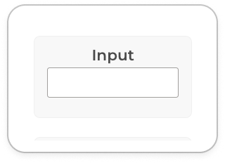
Input
Adds a single input control (i.e. text box, drop-down, etc.)
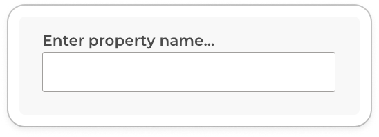
Properties of Input
Property Name
Sets the property (field) to be used for the input control.
Property Navigation
If the property is on a different entity then this value can be used to specify the navigation path to the property. The value is appended to the form’s data path.
Nav Button
The Nav Button is a versatile UI component in the ComUnity Toolkit designed to facilitate user navigation both within the application and to external resources. It allows developers to set a label, link to an external URL, or navigate to an internal page when pressed. Additionally, the Nav Button can be configured to share the application via various channels using a specific syntax.
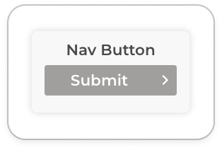
Properties of Nav Button
Title
Sets the button label.
URL
An external URL that should be opened when the button is pressed.
Icon
Sets an icon to be displayed in the Nav Button.
Detail
If the value starts with “SHARE:” then it can be used to share the application via various channels else the value is not used. For sharing the following syntax must be used:
Navigate URL
Specifies the internal path to navigate to after form submission. Accepted values are:
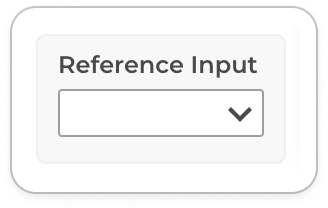
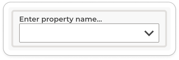
Reference Input
The Reference Input controls are used to generate dropdown lists. These lists can either be based on the entity associations of a designated page or any entity within the Data Model, even if it's unrelated to the entity specified by the Target URL of that page. For a basic configuration, simply set the Data Path to point to the desired options.
Properties of Reference Input
Property Name
Sets the property (field) to be used for the input control.
Property Navigation
If the property is on a different entity then this value can be used to specify the navigation path to the property. The value is appended to the form’s data path.
Data Path Template
The entity that will be used to populate the drop down with values is derived using the following rules:
a) If the value not set then use form data path is used
b) If the value and starts with “../” then remove last entity from the form data path and append the value after the “..” to the modified form data path. There can be multiple occurrences of “../”.
c) If value starts with “./” then append the value after the “.” to form data path
d) If the value is not any of the above then use the value as the data path
Examples
/UserProfile(guid’…’)/Faults(1234)
/UserProfile(guid’…’)/Faults(1234)
UserProfile(guid’…’)/Faults(1234)
./ FaultType
/UserProfile(guid’…’)/Faults(1234)/FaultType
/UserProfile(guid’…’)/Faults(1234)
../Account
/UserProfile(guid’…’)/Faults(1234)
/UserProfile(guid’…’)/Faults(1234)
../../Suburb
/Suburb
/UserProfile(guid’…’)/Faults(1234)
/LookupValues
/LookupValues
Query
The query that must be applied to the reference entity when fetching the values.
Search Fields
A comma-separated list of field names on the reference entity that can be used to search for matching records.
List Title Template
The template definition for displaying the value in the dropdown selector.
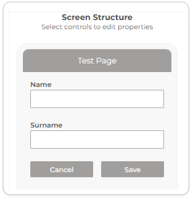
Building Forms
In the ComUnity Toolkit, you have the flexibility to construct forms utilising either the Input controls, the Auto Inputs controls, or a combination of both. With the Input controls, you're required to manually define each input field, giving you more control as you manage all your form fields directly. In contrast, the Auto Inputs feature automatically generates all input fields based on the entity defined in the TargetURL of the designated page. The primary advantage of Auto Inputs controls is their adaptability: when you modify your entity definition, your form fields adjust automatically. However, there's a drawback. If you don't want fields for all entity properties, you may have to adjust Auto Inputs settings. Thus, while Auto Inputs offers convenience, Input controls provide a granular level of management.
To create a form in a form page, follow these steps:
Specify the Target URL or the Entity name of the active form page and save your changes.
Add a Auto Inputs screen control widget to the active form page and configure its properties or else,
Add a Input screen control widget to the active form page and configure its properties or else
Add a Button control widget to an active form page and configure its properties.
You have successfully created a dynamic form. The ComUnity Development Toolkit will parse your form definition and render forms in the client with an intelligent auto fill feature.