| TitleTextSize | 20 | The text size of title text items |
| BodyTextSize | 14 | The text size of body text items |
| SelectedTextSize | BodyTextSize | The text size of selected text items |
| DetailedTextSize | 12 | The text size of detailed text items |
| LabelTextSize | 10 | The text size of label text items |
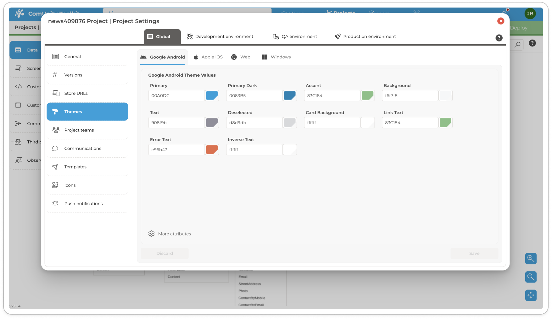
| TabIndicator | InverseText | The colour for the Tab indicator |
| TabIndicatorHeight | 4 | The height of the Tab indicator |
| TabTextNormal | InverseText | The colour for the Tab item text |
| TabTextSelected | InverseText | The colour for the selected Tab item text |
| TabTextNormalAlpha | 180 | The alpha value for Tab item text |
| AppBar | Primary | The colour for the App Bar |
| AppBarText | InverseText | The colour for the App Bar text |
| UseNavigatorDrawer | True | Enables the menu selection (hamburger icon) in the App bar |
| UseNavigatorButtons | True | Enables the menu bar at the bottom of the screen |
| NavigationButtonBackground | #000000 | Background colour for the bottom menu buttons |
| NumNavigationButtons | 5 | The number of menu button to display in the bottom menu bar |
| ShowNavigationButtonText | False | Show text descriptions on the bottom menu bar buttons |
| NavigationButtonNormal | InverseText | The colour for the bottom menu bar button icon and text |
| NavigationButtonSelect | Accent | The colour for the bottom menu bar button icon and text for the selected button |
| NavigationButtonTextSize | DetailedTextSize | The text size of the descriptions on the bottom menu buttons |
| DrawerHeaderBackground | Primary | The colour for the drawer header background |
| DrawerHeaderText | InverseText | The colour for the drawer header text |
| DrawerHeaderTextSize | 34 | The size of the drawer header text |
| DrawerHeaderHeight | 160 | The height of the drawer header |
| DrawerBackground | Background | The colour for the drawer background |
| DrawerText | Text | The colour of the drawer text |
| DrawerTextSize | BodyTextSize | The text size of the drawer text items |
| IconSize | 24 | Sets the app icon size |
| CardIconSize | 36 | Sets the icon sizes for lists |
| GridIconSize | 48 | Sets the icon sizes for grids |
| GridSize | 128 | Sets the size of grid items for a list |
| GridElevation | 4 | Sets the elevation of the grid items |
| SearchTextSize | BodyTextSize | The text size of the search text |
| SearchText | Text | The colour of the search text |
| SearchHintText | Text | The colour of the search hint text |
| Button | Primary | The colour for buttons |
| ButtonDisabled | Text | The colour for disabled buttons |
| ButtonText | InverseText | The colour for button text |
| ButtonTextSize | BodyTextSize | The text size for button text |
| LinkButton | Accent | The colour for link buttons |