Themes
The ComUnity Platform offers the ability to customise the appearance of your app across different client platforms through themes. A theme is a collection of attributes that define the style and layout of your app for a specific client platform.
Themes in the Toolkit provide developers with a comprehensive set of customisation options to tailor the user experience. ComUnity developers have the flexibility to modify various components, including tabs, buttons, text size, and label appearance.
For example, developers can easily customise the colour scheme of tabs using themes, allowing them to define the background colour, font colour, and other visual properties associated with tab elements. This ensures that tabs align with the desired design language and branding of the application.
Similarly, themes enable developers to customise the appearance of buttons by adjusting the background colour, font colour, and other visual attributes. This flexibility allows for the creation of buttons that seamlessly integrate with the overall aesthetic of the application and provide intuitive visual feedback to users.
Text size customisation is another crucial aspect offered by themes. Developers can modify the font size of text elements to ensure optimal readability and accommodate different user preferences or accessibility needs. By adjusting the text size, developers can optimise the user experience for various devices and screen sizes.
It's important to note that the availability of customisation options may vary depending on the platform. For example, in mobile app development, developers may have the option to modify the accent colour, which is a platform-specific customisation feature.
In summary, themes in the Toolkit empower developers to customise the appearance of components such as tabs, buttons, text size, and label appearance across various client platforms. By leveraging these customisation options, developers can create visually appealing interfaces that align with branding, enhance usability, and cater to different user preferences.
Supported clients include:
Accessing and Customising Themes in the ComUnity Developer Toolkit
To customise the appearance of your app across different client platforms, the Themes feature in the Toolkit provides developers with a convenient interface. Themes allow you to modify attributes and properties of various components, such as tabs, buttons, text size, and label appearance. This guide will walk you through accessing the Themes interface and provide an overview of its layout and functionality.
Accessing Themes in the Toolkit
To access Themes in the Toolkit and begin customising your app's appearance, follow these simple steps:
Open your project Settings: Navigate to your project settings to access the customisation options. This can typically be done through a settings menu or toolbar.
Click Project Setting in the navigation bar: Locate and click on the Project Setting option in the navigation bar of the settings interface. This will take you to a view displaying your project settings.
Select Themes in the sidebar: Within the project settings view, you will find a sidebar that includes various configuration options. Look for the Themes option in the sidebar and select it.
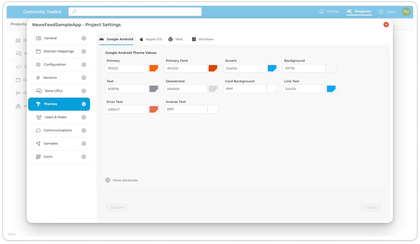
Tab View of Supported Clients: Upon selecting the Themes option, you will be presented with a tab view layout. Each tab represents a supported client platform, such as Android, iOS, Web, and Windows. The tab view allows you to navigate between different clients to customise their specific appearance.
Layout and Customisation Options
Once you've accessed the Themes interface, you will find a user-friendly layout that simplifies the customisation process. Here are some key aspects of the interface:
Tab View Menu: The tab view menu presents each supported client as a separate tab. This enables you to focus on customising the appearance of the app for a specific platform. Simply click on the desired tab to access the corresponding customisation options.
Attributes and Properties: Within each client tab, you will find relevant attributes and properties that can be modified. These options may include colour schemes, font styles, sizes, and other visual settings. All colour attributes are equipped with a built-in colour picker, which supports both selection from a colour palette and manual input of hexadecimal colours.
View More Attributes: In some cases, you may find that the initial view of attributes is condensed to provide a streamlined interface. If you require additional customisation options, you can click on a More Attributes option to expand the tab view. This allows you to access and modify a wider range of settings to refine the app's appearance.
Save: Once you have made the desired changes to the attributes and properties, clicking on the Save button will save the modifications. This ensures that your customised settings are applied to the app, reflecting the desired appearance for the selected client platform.
By utilising the intuitive interface of the Themes feature, developers can easily navigate through the supported client tabs, modify the relevant attributes, and create visually appealing and consistent user interfaces for their apps.
In conclusion, accessing and customising Themes in the Toolkit involves navigating to the project settings, selecting the Themes option, and exploring the tab view layout for each supported client platform. With the ability to modify various attributes and properties, including the use of a built-in colour picker, developers can easily customise the appearance of their apps to match branding, enhance usability, and create a personalised user experience.
Supported Attributes in Each Client Platform
In this section, we will provide an overview of the supported settings in the ComUnity Platform that can be customised for each client platform. These settings allow you to modify various aspects of your app's appearance and behaviour to create a unique and engaging user experience that aligns with your brand and audience.
During initial project set up, the ComUnity Toolkit provides you with an interface to select primary and accent colours for the colour scheme of your project, which will in turn affect the colours in your theme. However, the document assumes you used the default colour scheme, which consists of primary colour #004080 and accent colour #008000.
Google Android
Basic Settings
When creating a new project, the primary and accent colours can be selected from the dialog. These colours will be used as shown below, with suitable values set for the additional values. These values can be changed as required.
Primary
Set on project creation
The default colour for the app bar and other primary UI elements
PrimaryDark
Primary
A darker variant of the primary colour, used for the status bar (on Android 5.0+) and contextual app bars
Accent
Set on project creation
A secondary colour for controls like checkboxes and text fields
Background
#f6f7f8
The app background colour
Text
#908f9b
The app text colour
Deselected
#d8d9db
The colour used for disabled controls
CardBackground
#ffffff
The background colour for cards (used in grid lists)
LinkText
Primary
The text colour for links that can be clicked
ErrorText
#e96b47
The text colour for error messages
InverseText
#ffffff
The text colour for dark backgrounds (i.e. text on the App bar)
More attributes
The following settings will use the specified default value if not value is set. The values can be overridden if required.
TitleTextSize
20
The text size of title text items
BodyTextSize
14
The text size of body text items
SelectedTextSize
BodyTextSize
The text size of selected text items
DetailedTextSize
12
The text size of detailed text items
LabelTextSize
10
The text size of label text items
TabIndicator
InverseText
The colour for the Tab indicator
TabIndicatorHeight
4
The height of the Tab indicator
TabTextNormal
InverseText
The colour for the Tab item text
TabTextSelected
InverseText
The colour for the selected Tab item text
TabTextNormalAlpha
180
The alpha value for Tab item text
AppBar
Primary
The colour for the App Bar
AppBarText
InverseText
The colour for the App Bar text
UseNavigatorDrawer
True
Enables the menu selection (hamburger icon) in the App bar
UseNavigatorButtons
True
Enables the menu bar at the bottom of the screen
NavigationButtonBackground
#000000
Background colour for the bottom menu buttons
NumNavigationButtons
5
The number of menu button to display in the bottom menu bar
ShowNavigationButtonText
False
Show text descriptions on the bottom menu bar buttons
NavigationButtonNormal
InverseText
The colour for the bottom menu bar button icon and text
NavigationButtonSelect
Accent
The colour for the bottom menu bar button icon and text for the selected button
NavigationButtonTextSize
DetailedTextSize
The text size of the descriptions on the bottom menu buttons
DrawerHeaderBackground
Primary
The colour for the drawer header background
DrawerHeaderText
InverseText
The colour for the drawer header text
DrawerHeaderTextSize
34
The size of the drawer header text
DrawerHeaderHeight
160
The height of the drawer header
DrawerBackground
Background
The colour for the drawer background
DrawerText
Text
The colour of the drawer text
DrawerTextSize
BodyTextSize
The text size of the drawer text items
IconSize
24
Sets the app icon size
CardIconSize
36
Sets the icon sizes for lists
GridIconSize
48
Sets the icon sizes for grids
GridSize
128
Sets the size of grid items for a list
GridElevation
4
Sets the elevation of the grid items
SearchTextSize
BodyTextSize
The text size of the search text
SearchText
Text
The colour of the search text
SearchHintText
Text
The colour of the search hint text
Button
Primary
The colour for buttons
ButtonDisabled
Text
The colour for disabled buttons
ButtonText
InverseText
The colour for button text
ButtonTextSize
BodyTextSize
The text size for button text
LinkButton
Accent
The colour for link buttons
Additional Resources
iOS
Background
#f6f7f8
The app background colour
FormBackground
#ffffff
The background colour of forms
Text
#9008f9b
The colour of the text
Accent
#008000
The colour of button labels
Navbar
#004080
The background colour of the navigation bar
NavbarAction
#ffffff
The colour of the action buttons in the navigation bar
TabSelected
#008000
The colour of an active tab's text and icons
Tab
#333333
The the colour of tab text and icons
Label
#004080
The text colour of form labels
Error
#ff0000
The text colour of error messages
Link
#004080
Colour of links in markdown documents
SegmentedMenu
#004080
Colour of text and icons in segmented menus
StatusbarWhite
checked
Allows you to toggle the colour of the Status bar at the top of the screen which can be light or dark
LabelAllCaps
checked
Allows you to capitalise all labels
LabelFont
5
Allows you to set the font size of labels
ContentFont
8
The font size of content
WEB
ToolbarBackground
#004080
Toolbar background
ToolbarTitle
#ffffff
Toolbar text colour
ToolbarIcon
#008000
>>>>>>>Developer Input Requested
InputHighlight
#004080
Changes the input (field) lower line to this colour and slightly increases the line width.
InputLabel
#004080
Label text colour
TabsBackground
#efefef
Background of the colour
TabsText
#004080
Text colour within tabs
Asside
#004080
The text colour of the list items in the list adjacent to the Asside
Avatar
#004080
No longer in use
BaseText
#303030
Base text colour
BaseBackground
#ffffff
Base page background colour
Windows
TitleForeground
#fffffff
The colour of the title
Title Background
#004080
The background colour of the title
ListForeground
#494751
The colour of list items
ListBackground
#ffffff
The background colour of the list
FormLabel
#008000
The colour of form labels
FormError
#e96b47
The colour of form error messages
FormForeground
#494751
The colour of the input text of form fields
FormBackground
#ffffff
The background colour of a form element
MenuForeground
#495741
The text colour of the menu items
MenuBackground
#ffffff
The background colour of the menu element
PivotSelected
#ffffff
The colour of the pivot when selected
PivotUnselected
#004080
The colour of the pivot when unselected
PivotBackground
#004080
The background colour of the pivot
TileForeground
#494751
The text colour of tiles
TileBackground
#d8d9db
The background colour of tiles
TabForeground
#004080
The text colour of the tab text
TabBackground
#ffffff
The background colour of tab
FormMargin
8px
The margin of the form element
TileMargin
4px
The margin of the tile
MenuItems
5
Menu items count
ButtonSize
35
The size of button in width