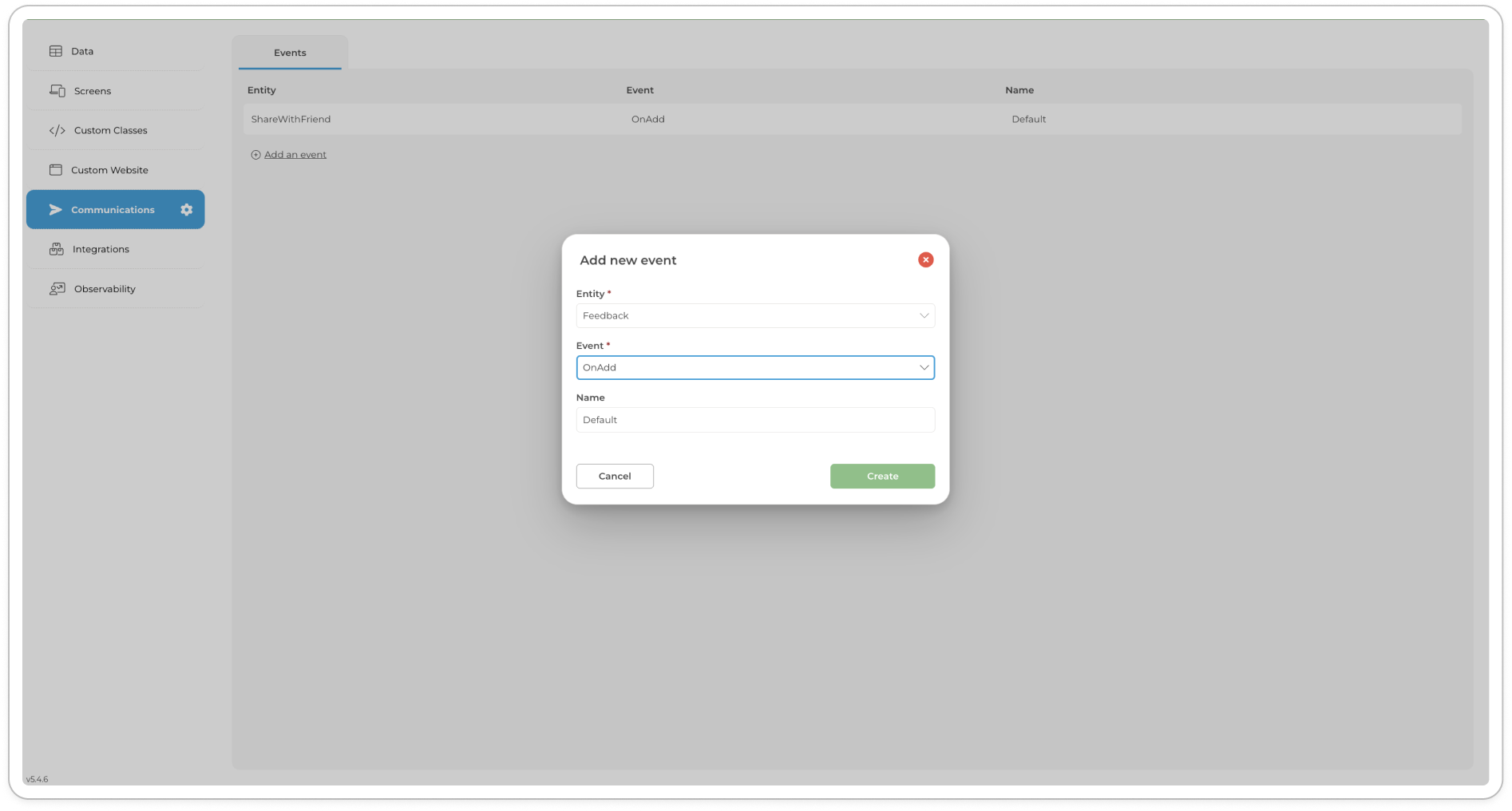
Manage your account: Profile, Settings, and Actions
The Manage Your Account menu provides quick access to essential options for managing your profile, updating account settings, and performing key actions. From here, you can customise your personal details, change your password, clear the application cache, and securely sign out. This menu ensures users have effortless control over their account and related actions.
Profile: View and edit personal details such as name, surname, cell number, email, company name, and role within the company.
Notification Settings: Customise the types of notifications you receive and how you receive them, tailored to different categories like organisational events, platform events, and project events.
: Securely update your account password to maintain the safety and privacy of your account.
: Remove cached data to ensure the application runs smoothly and efficiently.
: Safely log out of your account to protect your personal information and maintain account security.
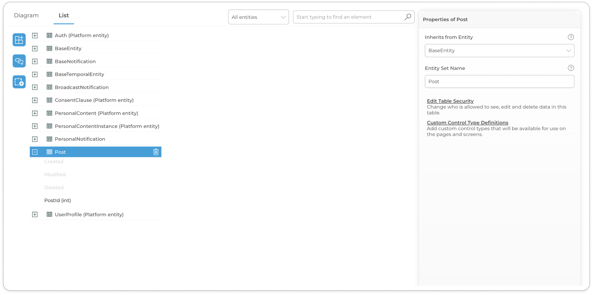
Profile
The Profile section allows users to view and edit their profile details. Users can update their name, surname, cell number, email, company name, company role and avatar.
To access Profile settings, follow these steps:
Navigate to the 'Profile' tab in the account settings.
Click the 'Edit your profile details below' button.
Update the desired fields: Name, Surname, Cell, Email, Company Name, and Company Role.
Account Settings
Account Settings provides a shortcut to an interface with the detailed Accounts section which contains subsections Profile, Change Password and Notification Settings.
For more detailed documentation, refer to ..
Change Password
The Change Password section allows users to update their account password.
To access Change Password, follow these steps:
Navigate to the 'Change Password' tab in the account settings.
Enter your current password (if required).
Enter the new password in the 'New password' field.
Clear Application Cache
The Clear Application Cache option allows users to clear the stored cache data in the application.
To Clear Cache of you application, follow these steps:
Click on your avatar in the top-right corner of the application.
Select 'Clear application cache' from the dropdown menu.
Confirm the action if prompted to clear the cache.
Sign Out
The Sign Out option allows users to securely log out of the application.
To Sign Out, follow these steps:
Click on your avatar in the top-right corner of the application.
Select 'Sign out' from the dropdown menu.
You will be redirected to the login screen after signing out.
🔗 Related Topics
- Learn how to manage organisation-wide settings and configure role-based access. This section is essential for administrators who oversee user permissions and governance across multiple projects.
ComUnity Developer Toolkit
Discover the power of the ComUnity Developer Toolkit: streamline platform creation, maximise efficiency, and deliver exceptional user experiences across multiple platforms.
Overview
The ComUnity Developer Toolkit is a comprehensive platform that simplifies the creation of multi-sided digital platforms for developers. It sets itself apart by offering a single design interface and a powerful Low-Code Rapid Development Interface that not only streamlines the development process but also enables developers to build platforms faster and more cost-effectively compared to traditional manual coding methods. With its unmatched speed, the ComUnity Developer Toolkit empowers developers to bring their digital platforms to life rapidly, giving them a competitive edge over other development tools in the market.
Manage your project
Introducing Projects in the ComUnity Developer Toolkit. Learn essential techniques for creating and configuring projects to build robust digital applications.
A tenant is an instance of the ComUnity Platform, that is provisioned to an organisation. The type of tenancy supported in your organisation depends on your licence for further details view ComUnity Developer Toolkit/Login section. Each tenant is identified using a unique system generated name which is not configurable. Each ComUnity Platform tenant is distinct, unique, and separate from all other ComUnity Platform tenants. A tenant can have many projects but each project belongs to a single tenant.
A project in the ComUnity Developer Toolkit contains everything that defines your namespace for an application.
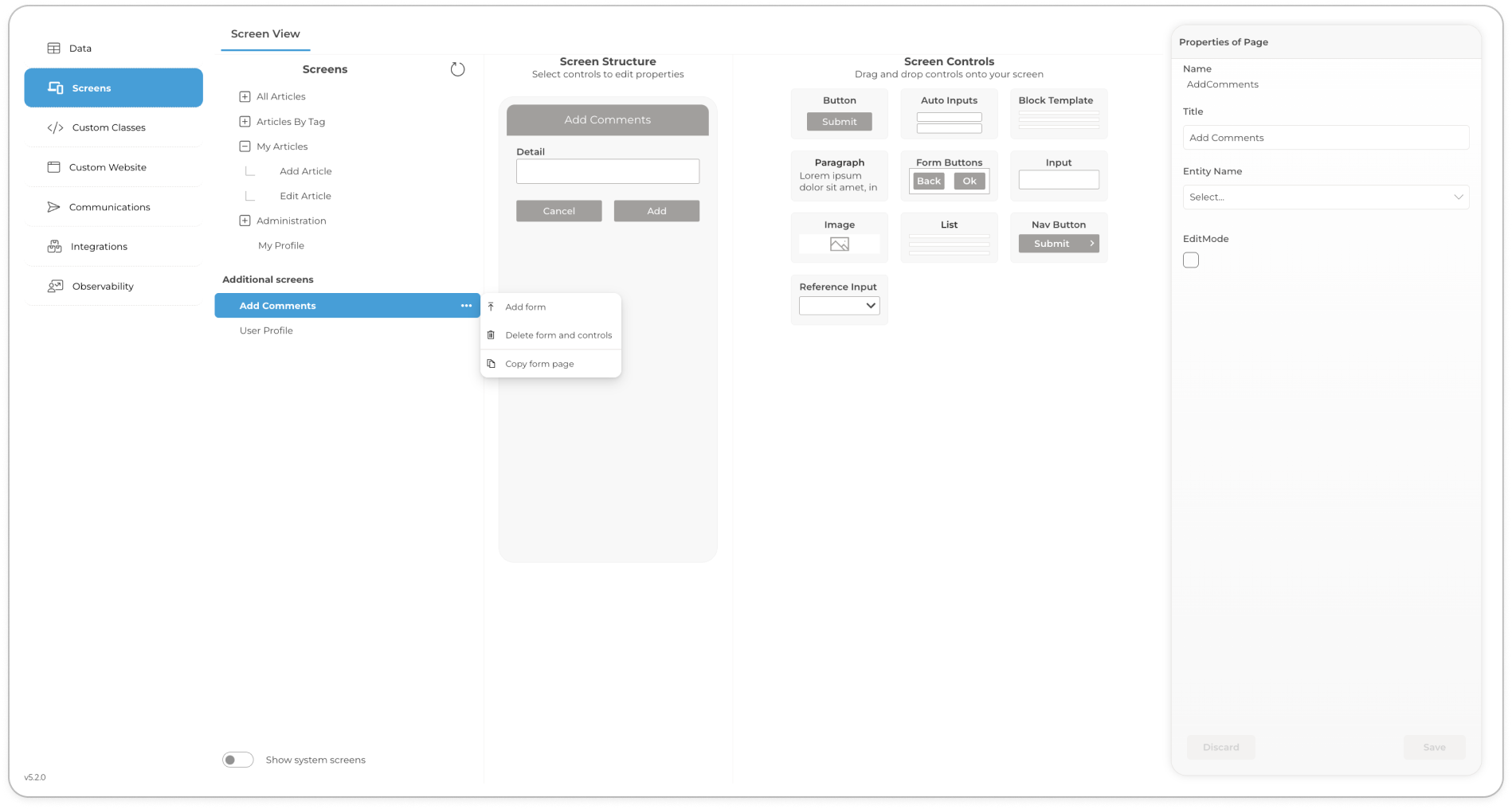
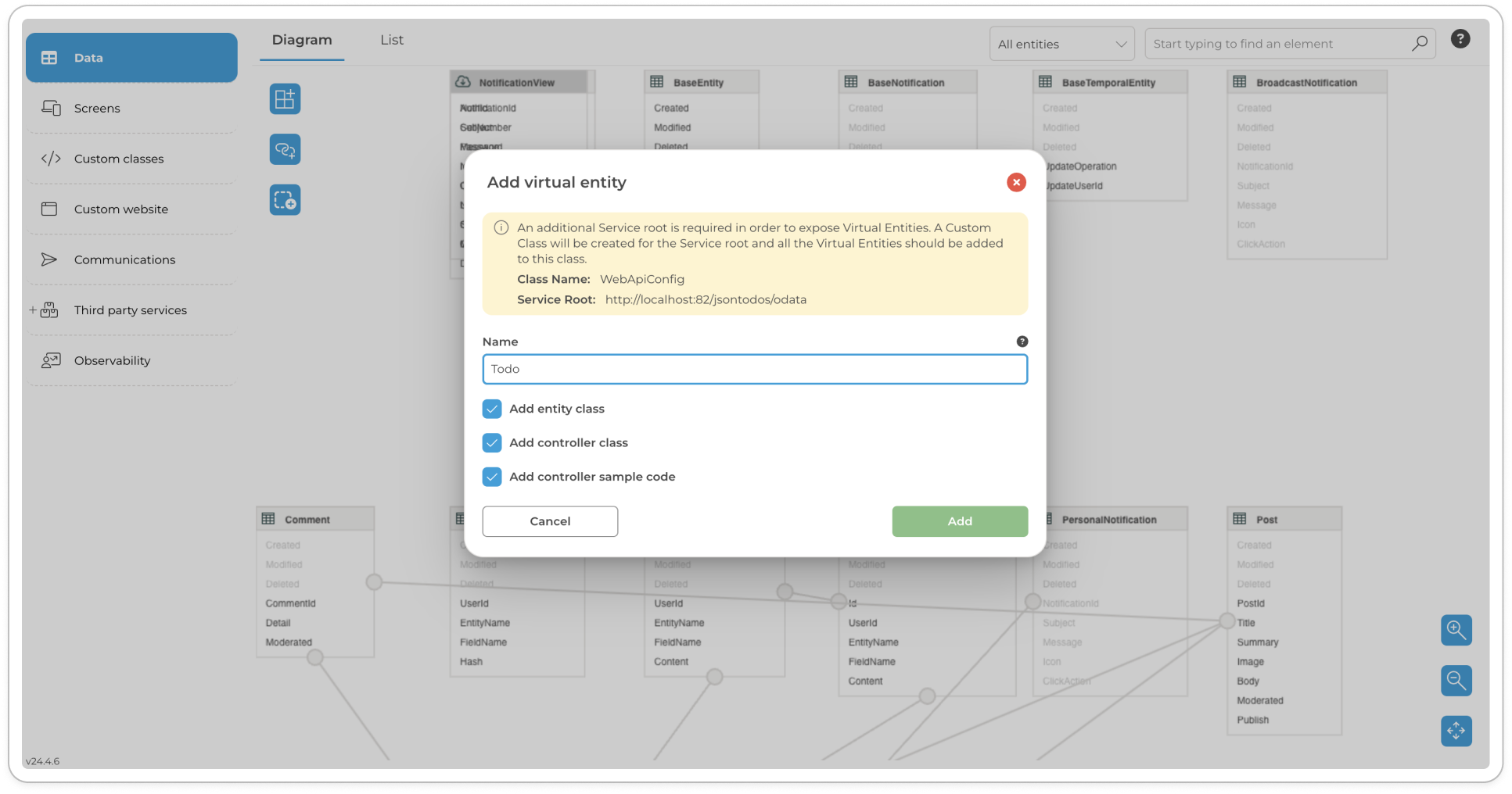
Access Manage your account menu from avatar - click to view full image
Manage your account
Profile settings
Change Password
Key Feature of the ComUnity Developer Toolkit
The ComUnity Developer Toolkit offers a crucial advantage by enabling developers to build their projects efficiently across multiple platforms. This unique capability eliminates the need for separate development efforts for each target platform and significantly reduces redundant tasks.
With the Toolkit, the development phase begins by building the web version of your project. This initial focus provides a visual representation of your project and facilitates testing during development. While working on the web version, you also have the option to set up properties and configurations specific to other client applications within the Toolkit.
To adapt your project for different clients, such as iOS, Windows, and Android, you can utilise the Toolkit's features to define properties and settings unique to each platform. These properties can include platform-specific design elements, device capabilities, or integrations with native features.
By setting up these properties within the Toolkit, you ensure that the generated client applications align with the respective platform requirements. This allows for a seamless and optimised user experience across different devices and operating systems.
Additionally, the Toolkit provides a streamlined workflow for managing the variations between client applications. You can efficiently update and maintain your project by making changes within the Toolkit, which then propagate to all the generated client applications, ensuring consistency and reducing development overhead.
By offering this level of flexibility and customisation, the ComUnity Developer Toolkit empowers developers to efficiently build projects for multiple platforms while maintaining a unified codebase and reducing time and effort spent on redundant development tasks.
The Toolkit supports the end-to-end Digital Project Lifecycle Management, covering the following phases:
Plan: Within the Toolkit, you can create the high-level requirements for your digital project and design the overall project structure.
Code: Utilise the Toolkit's development tools, such as the built-in code editor or integration with external tools like Visual Studio, to write the necessary code for your digital project.
Build: Automated build tools provided by the Toolkit assist in building the required server components and native client applications directly from your code.
Test: Use the Toolkit's testing capabilities to run tests on the latest builds and ensure the functionality of your digital project.
Release: Prepare the code and other project assets within the Toolkit for release, making them ready for deployment.
Deploy: Take advantage of the Toolkit's automated deployment tools, which assist in deploying the builds from development to quality assurance (QA), staging, and production environments.
Operate: Integrate the Toolkit into server environments to effectively manage the deployment and operation of ComUnity digital projects, ensuring smooth execution and performance.
Monitor: The Toolkit provides ongoing system health monitoring and allows you to monitor all components of the digital ecosystem, ensuring optimal performance and identifying any potential issues.
By offering an intuitive and streamlined development experience, the ComUnity Developer Toolkit empowers developers to create compelling multi-sided digital platforms efficiently and effectively.
ComUnity Digital Services Development Life Cycle
The ComUnity Developer Toolkit provides a comprehensive software development life cycle for building digital services. This development life cycle encompasses the following phases:
Create a new Project:
Begin by creating a new project within the Toolkit, setting the foundation for your digital service development.
Define Metadata and Authorization:
Define the necessary metadata and authorisation settings for your application within the Toolkit. This includes specifying data structures, user roles, permissions, and authentication mechanisms.
Integrate with External Services:
Seamlessly integrate your digital service with external services or APIs by leveraging the integration capabilities of the Toolkit. This enables your application to communicate and interact with third-party systems.
Build Communication Services:
Utilise the Toolkit's features to build communication services within your application. This includes implementing functionalities such as messaging, notifications, real-time updates, and data synchronisation.
Build Client Applications:
After completing your project within the ComUnity Developer Toolkit, you have the option to enlist the assistance of the ComUnity Team to build client applications for each supported platform.
Deploy to Dev/QA/Production Servers:
Once the development phase is complete, deploy your application to development, quality assurance (QA), and production servers using the deployment tools provided by the Toolkit. This ensures a controlled and organised release of your digital service.
In addition to the development life cycle, the ComUnity Developer Toolkit offers a range of configurable components. These components can be customised and tailored according to your specific application requirements. The diagram below illustrates the various components that you can configure when utilising the Toolkit:
ComUnity Platform high level architecture diagram
By following this comprehensive software development life cycle and leveraging the configurable components of the Toolkit, developers can efficiently create and deploy robust digital services across multiple platforms.
This document provides technical reference information for the ComUnity Platform Azure Marketplace offering. Use this alongside the for detailed specifications, credential management, and architecture details. For an introduction to ComUnity and platform engineering concepts, see the section.
Deployment Flow Overview
The deployment process follows these stages:
Stage
What You See
Duration
Marketplace Offer Details
Offer Naming
The marketplace offer appears as "City as a Platform" or "ComUnity Platform". The "City as a Platform" naming reflects the target market of municipalities and smart city initiatives, but the toolkit deployed is the full ComUnity Developer Toolkit.
Available Plans
Seven pricing plans are available, scaled by municipality size:
Plan
Target Use Case
All plans deploy identical toolkit resources; the difference is in billing structure and support tiers. For testing, select the Innovator plan as noted in the marketplace listing.
What Gets Deployed
The marketplace deployment creates a Development environment only. QA and Production environments must be provisioned separately using the Infrastructure Management feature within the toolkit.
Resource Architecture
Resource Group Structure
The deployment creates a nested structure:
Level
Description
Navigating to Resources
From Marketplace Resource Group → Managed Application → Managed Resource Group:
Open your marketplace resource group (e.g., JPGTestMarketplaceDec)
You'll see the Managed Application listed (e.g., JPGTestMarketPlaceApp)
Click on the Managed Application to open its overview
Azure Resources Created
The managed resource group contains approximately 30 resources:
Resource Type
Example Name
Purpose
Note: Resource names include auto-generated suffixes (e.g., eukrhl5h4bmgc) to ensure uniqueness.
Platform Components (on VM)
The following services are installed on the Virtual Machine:
Component
Function
Credentials Reference
Credential Types
Credential
Username
Password
Purpose
Note: The VM username azureuser is automatically configured during deployment. The Password you enter in the deployment form is used for this VM account.
Credential Retrieval
Toolkit Admin Credentials
Default credentials are fixed. Change immediately after first login via the toolkit's user management interface.
VM Credentials
The password is set during deployment and cannot be retrieved afterward. If lost:
Use Azure Portal's VM password reset feature, or
Redeploy the toolkit with a new password
SQL Server Credentials
Known Limitation: SQL credentials are auto-generated during deployment but are not currently exposed to users in the deployment outputs. This is being addressed in future versions.
Workaround: Contact ComUnity support to retrieve SQL credentials if direct database access is required.
When VM Access Is Needed
Most toolkit users never need VM access. VM login is required for:
Installing additional software on the VM
Reviewing VM-level logs for troubleshooting
Configuring Windows-level settings
Access method: Remote Desktop Protocol (RDP) to the public IP address
Configuration Parameters
Deployment Form Fields (Basics Tab)
Field
Required
Notes
Review + Create Tab
Before deployment, you must accept:
Requirement
Description
Viewing Deployment Parameters
After deployment, you can view configuration values:
Navigate to your Marketplace Resource Group
Click on the Managed Application
In the left sidebar under Settings, click Parameters and Outputs
Note: Passwords are not displayed for security reasons.
Installation Script Behaviour
Custom Script Extension
The Custom Script Extension runs a PowerShell script that:
Installs Windows components and prerequisites
Tests that all prerequisites installed correctly
Extracts platform component archive
Installs each platform service sequentially
Idempotent Design
The installation script is designed to be idempotent—it can be run multiple times safely:
Checks if services are already installed before installing
Skips completed steps on re-run
Always runs verification tests
This means redeploying to the same resource group will pick up from where installation left off if a previous deployment failed.
Timing Breakdown
Phase
Duration
Known Limitations
Limitation
Status / Workaround
Region Considerations
The toolkit uses only standard Azure managed services and should deploy successfully in any Azure region. However:
Latency: Deploy to a region close to your users. Cross-region access increases response times.
Testing: Primary testing has been done in South Africa North. Other regions should work identically.
Resource availability: VM sizes may vary by region. The deployment template selects appropriate available SKUs.
Support Procedures
Support Contact Information
Support contact details are displayed in the Managed Application overview page after deployment:
Contact Method
Details
When to Contact Support
Deployment exceeds 90 minutes
Custom Script Extension fails with errors
Need SQL Server credentials
Information to Provide
Azure subscription ID
Resource group name(s)
Deployment timestamp
Error messages from Deployments view (screenshots helpful)
Related Documentation
Document
Description
Login
Overview
The ComUnity Developer Toolkit is a cloud-based solution deployed in Microsoft Azure, accessible from any browser. The URL you use to access the Toolkit depends on your organisation’s deployment type:
1. Shared Multi-Tenancy Environment:
For organisations using the shared ComUnity environment, access the Toolkit via, the URL:
This environment is often used for testing or as part of a multi-tenancy organisational license.
2. Single-Tenancy Deployment:
For organisations with dedicated Toolkit instances, use the unique URL provided by your administrator. Single-tenancy deployments are hosted in isolated environments for enhanced security and customisation.
Use the Toolkit on your desktop for the best possible development experience.
The Toolkit supports multiple authentication options to cater to organisational needs. With the release of v24.4, authentication was introduced for single-tenancy instances hosted in .
(Available in v24.4 and above)
Password-based Authentication
Password-Based Authentication is the default login method for users in both shared and single-tenancy deployments. It enables users to securely access the Toolkit using a unique username and password combination provided during registration.
If you are a registered Toolkit user and your registration request has been approved, you can log into the Toolkit using your provided credentials. Upon successful login, you will be directed to the Home Screen, where you can access the Toolkit’s features and functionalities.
Registration
To create a new user account in the ComUnity Platform, please follow these steps:
From the Home Screen, click on Request Access.
You will be directed to the Request Access screen.
Complete the Request Access form by providing your relevant details.
Ensure accurate and complete information to expedite the account creation process.
All fields marked with an asterisk * are required.
After completing your registration, please be aware that your approval may take up to 24 hours to be processed on weekdays. If you registered on a weekend, please note that the waiting period may extend to the first day of the week.
Password Reset
To reset your password, follow these steps:
Go to the login screen of the ComUnity Developer Toolkit, as instructed above.
Click Forgotten your password?
Enter your username.
Microsoft Entra Login
As of version 24.4, the ComUnity Developer Toolkit supports as an authentication mechanism, enabling organisations to facilitate secure sign-ins for their users and partners. This integration offers a seamless, enterprise-grade authentication flow, aligning with modern identity management practices. Microsoft Entra authentication is available exclusively for single-tenancy Toolkit instances deployed in Azure environments.
The introduction of Microsoft Entra authentication enhances the Toolkit’s ability to serve organisations managing complex authentication requirements for their users and partners. By leveraging Microsoft Entra, organisations can provide a unified authentication experience while maintaining high security standards and scalability.
Advantages
• Unified Authentication: Supports both user and partner sign-ins.
• Enterprise-Grade Security: Utilises OAuth 2.0 and OpenID Connect protocols.
• Simplified Management: Reduces administrative overhead in -hosted single-tenancy deployments.
Limitations
• Deployment Only: Microsoft Entra authentication is exclusive to single-tenancy instances hosted in Azure and is not supported in shared environments or the multi-tenancy ComUnity Platform.
Steps to Sign In with Microsoft Entra
1. Ensure you are signed into your organisational-issued Microsoft account. If not, visit and authenticate.
2. Open your organisation’s Toolkit instance URL (e.g., https://yourorg.domain).
3. On the login screen, click Login with Microsoft. You will be authenticated and automatically redirected to the Toolkit’s Home Screen upon successful login.
Environments
Our deployment process utilises three distinct environments, each colour-coded to prevent deployment errors by providing immediate visual differentiation. This system ensures that modifications and updates are made in the correct environment, safeguarding the development and deployment pipeline.
Development Environment(Green)
This serves as the default playground for developers with relevant access. They can write, test, and refine code freely within this environment before moving it further down the pipeline. This isolated space ensures code integrity and consistency across the team.
QA/Testing Environment(Vibrant Purple)
After the development phase, code is promoted to the QA/Testing environment. Here, rigorous testing takes place to ensure the application functions flawlessly under various conditions. This environment closely resembles the production setup, allowing for the identification and resolution of potential issues before reaching end users.
Production Environment (Deep Purple)
The final stage in the deployment process is the production environment. This is where the fully tested and stable application is made live and accessible to end-users. Deployments to this environment are critical and require meticulous planning and execution to ensure service continuity and reliability.
By employing these colour distinctions—green for Development, vibrant purple for QA/Testing, and deep purple for Production—we enhance operational safety by reducing the risk of cross-environment deployment errors, thereby supporting the overall quality and success of the application.
ComUnity Platform - Technical Overview
ComUnity Digital Service Delivery Platform
The ComUnity Digital Service Delivery Platform is a comprehensive solution that provides organisations with the tools, templates, and infrastructure they need to build, deploy, and manage digital solutions, products and services. The platform is designed to be highly flexible, scalable, and secure, making it well-suited for organisations of all sizes and industries.
The platform falls into an emerging technology area called Platform Engineering. It aggregates many disparate elements of a digital solution and reduces technical complexity. Platform engineering is a new socio-engineering concept that straddles team structure and the engineering discipline behind it to build scalable and resilient digital platforms. The old way of development teams not communicating with each other and doing whatever they want is now replaced by teams all working on a unified platform.
Manual Project Deployment Across Environments
The deployment process within the ComUnity Platform is a critical pathway that ensures your application is thoroughly tested and stable before it reaches the end-user. Adhering to a structured and sequential progression through the Development, QA/Testing, and Production environments, each stage serves as a gatekeeper, ensuring only the highest quality code is promoted.
Deployment Types: Partial vs. Full Deployment
When deploying your project within the ComUnity Platform, it is essential to determine whether a partial or full deployment is necessary. Each type of deployment serves different purposes and is used under specific conditions.
Deploy
Deploy your apps into the dedicated environments throughout the development lifecycle and establish roles and permissions to ensure secure and efficient deployments.
Key Features
Streamlined Deployment Workflow:
Dedicated Environments: Leverage three distinct environments – Development, QA/Testing, and Production – each designed for a specific stage of your project's lifecycle.
Create a project
To create a project using the ComUnity Developer Toolkit, the first step is to log in to the platform. If you're unsure about the login process, you can refer to the section for more information.
Once you have successfully logged in, you will be directed to the Home screen. If you are already actively engaged in a project, click on the Home navigation item located within the menu bar.
To create a new project, follow these steps:
Go to the Start a new project section at the bottom of your home page. Here, you'll find a variety of templates to choose from to help you create your project.
Templates
Overview
Templates are preconfigured application components (entities, associations, navigation, screens, and application objects) that can be added to a project to quickly and easily add specific features. Templates can also be added to a brand new project to fast track creation.
Templates offer a number of benefits, including:
Project Settings
The ComUnity Toolkit offers a robust, role-based settings system designed to manage various project specific settings. Understanding these settings is crucial for effective management and configuration. For more detailed information, refer to the relevant sections within Project Settings.
Project configuration in the ComUnity Developer Toolkit is managed through the Project Settings section, which provides a centralised location for defining environment-specific behaviours and data-level controls. Introduced in v24.4, this unified section brings together previously separate Environmental Settings and Project Settings to streamline project setup and governance. While project-level configurations are now centralised, remain a distinct area for managing organisation-wide settings.
Access to the Project Settings section is permission-based. Only users with the appropriate roles can view or modify these settings. To learn more about managing roles and access within a project, refer to the
https://toolkitnxt.comunity.me/
Seamless Transitions: Promote code smoothly between environments, ensuring an efficient development process.
Enhanced Testing: Conduct thorough testing in the QA/Testing stage, closely mimicking the production environment to identify and address potential issues before launch.
Unparalleled Security and Control:
Granular Permissions: Define and assign specific roles and permissions to team members, granting access only to the environments and resources they need.
Safeguarded Code: Restrict unauthorised access to development and testing environments, protecting your codebase from unintended modifications.
Clear Accountability: Track changes and identify responsible parties easily with role-based access controls.
Organisations
Take charge of your teams and resources with the Organisations feature in ComUnity Toolkit. This powerful suite streamlines organisational management, empowering you to build productive teams, control access, and ensure smooth collaboration.
Key Features:
Effortless Organisation Management: Manage organisations with ease and handle administrative tasks efficiently and maintain a clear structure.
Build Ideal Teams: Add, remove, and group team members intuitively. Assign roles and permissions to ensure the right people are on the right projects.
Granular Access Control: Define and update permission levels for each team member and resource. Safeguard sensitive information and prevent unauthorised access.
Secure Collaboration: Control who sees what, setting clear boundaries and promoting a culture of trust and productivity.
5. Managed App Created
Managed Application shows "Created" status
~2 min
6. Resources Provisioning
Resources appear in Managed Resource Group (30 total)
10-15 min
7. Custom Script Running
VM extension installing platform components
30-45 min
8. Deployment Complete
All resources show "Succeeded" status
—
Mega City
Major metropolitan regions
In the Essentials section, click the Managed resource group link (e.g., mrg-city-as-a-platform24_4-preview-...)
This opens the resource group containing all 30 platform resources
Network Interface
(varies)
VM network connectivity
SQL Server
(varies)
Database server for platform and project databases
SQL Databases
(multiple)
Platform database, project databases
Storage Account
(varies)
File and media storage
Managed Disk
(varies)
VM operating system storage
Container Apps Environment
dev
Hosts observability container apps
Container App
grafana
Observability dashboards
Container App
loki
Log aggregation
Container App
tempo
Distributed tracing
Container App
prometheus
Metrics collection
Container App
thanos
Long-term metrics storage
Container App
otel-collector
OpenTelemetry data collection
Application Insights
appinsights*[suffix]*
Application monitoring and telemetry
App Configuration
appconfig*[suffix]*
Centralized application settings
Key Vault
kvcmty*[suffix]*
Secure storage for secrets and certificates
Log Analytics Workspace
obs-workspace
Centralized logging for observability
Custom Web
Application hosting for built projects
Media Server
Media file processing and delivery
Data Services
Data access layer and ORM services
Advanced maintenance operations
Confirm password
Yes
Must match Password field
Application Name
Yes
Used in resource naming. Keep concise.
Managed Resource Group
Auto
Auto-populated with timestamp (e.g., mrg-city-as-a-platform24_4-preview-20251201140556). Cannot be edited.
Configures database connections
Loads platform icons and default data
Starts all services
Runs verification tests
Retries failed steps up to 3 times before failing
30–45 minutes
HTTP only by default
SSL/HTTPS requires post-deployment domain and certificate setup.
Co-Admin Access required
Must accept provider access permission to deploy. Required for support and management.
App Registration setup assistance
Domain and SSL configuration
Project build failures after deployment
Deployment operation details (tracking ID if available)
1. Marketplace Offer
Plan selection dropdown (Innovator, Town, etc.)
—
2. Basics Tab
Subscription, Resource Group, Region, Password, Application Name fields
Finally, click on the Register button to submit your account request.
For security purposes, the ComUnity platform will need to verify your identity before you can proceed with resetting your password. You will receive a one-time password (OTP) via your preferred channels, if available. Otherwise, it will be sent to the main channel associated with your registered account (e.g., email or SMS).
Retrieve the OTP.
Enter your new password and OTP in the relevant fields provided.
Platform engineering allows an autonomous delivery team to use the platform to deliver new product features at a higher pace, with reduced coordination. Other benefits are:
Encourages innovation and creativity
Rapid implementation
Faster time-to-value
Governance is baked-in
Manages all end-to-end business processes
Reduced cost of development
Improves engagement between IT and business stakeholders
Standardised user experience
Ease of maintenance
ComUnity Core and Processes
ComUnity has a data-centric intelligent core, connecting external stakeholder experiences with internal systems and processes.
The ComUnity Platform Engineering Model
The model adopted by the ComUnity Platform comprises three layers:
The ComUnity Approach to Platform Engineering
The Cloud Infrastructure Layer provides organisations with the underlying base cloud infrastructure and services that are necessary to build, deploy, and manage the higher layers of digital products and services.
Many large and complex organisations may choose to assemble “Platform Engineering” teams who build out such an internal platform from scratch. However, the ComUnity Rapid Digitisation Platform contains all the complex platform engineering capabilities out-of-the-box thus removing the need to build out such a platform from scratch. The broad capabilities provided by ComUnity include:
Base Platform Architecture/Core: the digital foundation required to build an internal Digital Platform.
Reusable Components: the digital building blocks required to build an internal Digital Platform.
Platform Developer Toolkit: the developer tools and SDKs required to build an internal Digital Platform.
Internal Developer Portal: the self-service capabilities required to operate an internal Digital Platform.
Digital Service Delivery Teams are the multidisciplinary, compact, co-located, and empowered development teams which build real value adding services and applications on top of the ComUnity Platform Instance. They do this buy leveraging the capabilities of the ComUnity Rapid Digitisation Platform layer.
ComUnity Provides a Paved Road
Digital platforms built on the principles of platform engineering offer the concept of a “paved road.” This avoids the complex processes and standards of traditional development, implementation and maintenance. Instead, it provides optimised processes developed using accepted best practices and processes, pre-defined tools, and development languages.
A full deployment involves deploying all components of your application. This includes the Data Service, Authorisation Service, Client, Communication service, Configuration, Screens, and any other modules or services within the application. Full deployments ensure that all parts of the application are updated and synchronised.
Use cases for Full Deployment:
Initial release of the application.
Major updates or changes that impact multiple modules or components.
Structural changes to the application that require all components to be redeployed.
Components in a Full Deployment:
Data Service
Authorisation Service
Client
Communication Service
Configuration
Screens
All other application modules and services
Partial Deployment
A partial deployment involves deploying only specific parts of the application. This type of deployment is useful when minor updates or bug fixes need to be applied without redeploying the entire application. Partial deployments save time and resources by targeting only the affected components.
Use cases for Partial Deployment:
Minor bug fixes or updates that affect only a specific module.
Incremental updates that do not require a full application redeployment.
Changes to configuration files or settings that do not impact the overall application structure.
Examples of Partial Deployments:
Authorisation Service: Deploy updates or fixes to the authorisation without affecting other parts of the application.
Client: Coming soon..
Communication Service: Update communication configurations or client modules independently.
Configuration: Modify and deploy changes to specific configuration
Screens: Modify and deploy changes to specific screens or UI components.
Determining the Deployment Type
During the deployment process, the ComUnity Platform allows you to select the deployment type based on your needs. For a full deployment, activate the Full Deployment toggle and ensure all components are selected. For a partial deployment, deactivate the Full Deployment toggle and select only the necessary components.
The decision between partial and full deployment should be based on the scope and impact of the changes being made. By selecting the appropriate deployment type, you can ensure a smooth and efficient deployment process, minimizing downtime and maximizing application stability.
Prerequisites for Deployment
Successful Build: Before initiating deployment, confirm that your project has successfully built without any errors or critical warnings.
To prepare your project archive for deployment, follow these carefully outlined steps to ensure your application is packaged correctly and ready for the deployment process.
Download the Project Archive:
Obtain the latest version of your project archive. This will include all the necessary files for deployment.\
Open the Web.config File:
Use to access your project's Web.config file, which contains critical configurations for deployment which need to be adjusted for the deployment.
Update Configuration Settings:
Within the Web.config file, remove keys 13-19 under <appSettings> that are pertinent only to local development.
Modify the ConfigDeployment
4. Save and Build:
Save the changes made in the `Web.config` file. *
Build your project within Visual Studio to confirm that there are no compilation errors or issues with your code.
Create a Web Deployment Package: Construct a Web Deployment Package using the Publish Web Wizard in Visual Studio. Refer to the guide Create a Web Deployment Package in Visual Studio for detailed steps.
6. Compress the Package: Compress the deployment package into a .zip file format, readying it for the deployment process.
By the end of these steps, you should have a properly configured and compressed project archive that is ready to be deployed to the designated environment.
Deploy Your Web Deployment Package: A Step-by-Step Guide
To initiate the deployment of a project within the Toolkit, a structured and guided step-by-step process is employed. This methodical approach encompasses the uploading of necessary assets and the precise configuration of deployment scripts. The focal point of this process is the deployment of a web deploy package to an Internet Information Services (IIS) server, which ensures that the application is correctly installed and configured for use in the specified environment.
To successfully deploy a project, follow these steps:
Note: To progress through each step, ensure all required fields and assets are properly set, then click the "Next" button to proceed.
Set Deployment Name and Release Notes: Begin by naming your deployment and providing detailed release notes that outline the changes and features included in this deployment.
\
Click the "Create assets" button to proceed with a full deployment
To perform a Partial Deployment:
Deactivate the Full Deployment Switch: Ensure the Full Deployment toggle is deactivated.
Select Relevant Components: Choose only the necessary components (e.g., Authorization, Communication, Configuration) to deploy.
Create Assets: Click the "Create assets" button to proceed.
Upload and Configure the Prepared Web Deploy Package: Upload the web deploy package prepared according to the . To upload the package, click the three-dot button to open a modal and select "Upload replacement". After uploading, click the "Accept" button and the Toolkit will automatically generate deployment scripts for you. Use the chevron button to expand and collapse your scripts.\
Review Your Configuration Scripts: Thoroughly review the configuration scripts to ensure they are correct and will execute as expected without errors. Make any necessary adjustments. \
Deploy: With all configurations and reviews complete, proceed to deploy your project. This final step may take some time, so please be patient.\
In conclusion, following this structured and detailed guide ensures that your project is deployed smoothly and effectively. By methodically setting up, reviewing, and executing each step, you minimise the risk of deployment errors and ensure your application performs optimally in its intended environment. This careful attention to the deployment process not only smooths the transition between environments but also supports the ongoing development and scalability of your application.
If you're not sure which template to use, you can check out the Samples section to learn more. Alternatively, you can use a blank template, by selecting the Blank Project.
Once you've found a suitable template, click on the Use This button on the template's card. This will open a new dialog box where you can enter your project details.
Enter a unique name for your project in the Project name box.
Click on the Create button to create your new project
Once your project is successfully created, click on Settings to access your project's settings.
Congratulations on successfully creating your new project! The next step is to Build and launch your project for the first time so as to publish it on Internet Information Services(ISS). Once you've done that, you can start building your project using the Toolkit Guides.
Speed: Templates can save you a significant amount of time and effort by providing you with pre-built components that you can simply add to your project.
Quality: Templates are developed by experienced developers and are tested to ensure that they meet high quality standards.
Flexibility: Templates can be customised to meet your specific needs.
Types of Templates
The platform supports the following types of templates :
Item templates: These templates add a single feature to a project, such as Governance, Live Chat, or Base Temporal Entity.
Group templates: These complex templates are used to create fully fledged applications with multiple features, such as Blog, Smart City, or Business Directory. A group template is a set of item templates.
Adding and removing templates in a ComUnity Project
Templates may have dependencies, which are references to other templates. When you add a templates with dependencies to your project, the Toolkit will automatically add its dependencies to the project. Conversely, when you remove a template with dependencies, its dependencies are not removed from your project.
After successfully creating your project, you can navigate to Project Settings > Templates to manage templates.
To add a templates to an existing project
Add a template to an existing project
Go to Project Settings > Templates .
All the templates that are already included in your project will have their checkboxes ticked.
Select a template by ticking its checkbox. Conversely, you may deselect a template by unticking its checkbox.
Click Save.
More details about the templates that are supported in the ComUnity Development Toolkit:
Application components (entities, associations, navigation, screens, and application objects) typically have preconfigured permission rules that control user access view Authorisation learn more.
Supported Templates
The ComUnity Development Toolkit includes a variety of supported templates that can be used to quickly and easily add features to your project. Templates are preconfigured application components (entities, associations, navigation, screens, and application objects) that are developed by experienced developers and tested to ensure high quality standards.
Using supported templates can save you a significant amount of time and effort, and can help you to create better quality applications. Templates are also flexible and can be customised to meet your specific needs.
In this subsection, we will list all of the supported templates that are available in the ComUnity Development Toolkit. We will also provide a brief description of each templates and explain how to use it.
We encourage you to browse the list of supported templates and to use them to create your own custom applications. If you have any questions or need assistance, please do not hesitate to contact our support team.
Application Sharing
The Application Sharing template adds application components which allow users to share your app though SMS invitation. The Notifications templates is a dependency of the ApplicationSharing templates .
Base Temporal Entity
The BaseTemporalEntity in the ComUnity Platform is a no-code template for working with temporal tables. It is recommended that temporal entities inherit from the BaseTemporalEntity.
Communities
The Communities template adds application components which allow admins to manage community data. The Notifications templates is a dependency of the Communities templates.
Economic Development
The Economic Development template provides a comprehensive solution for municipalities to manage economic development efforts in their communities. This template allows businesses to create and manage their listings, while also allowing municipal administrators to send business invitations and other notifications.
The Economic Development template includes dependencies on several other templates, including Communities, Notifications, and Push Notifications. These dependencies provide additional functionality and customisation options, such as targeted notifications to specific user groups and real-time updates for users.
With the Economic Development template, municipalities can streamline their economic development efforts and provide a user-friendly platform for businesses to manage their listings and connect with the community. This can help to boost local economic growth and promote a thriving business environment.
Contact Us
This template adds application components which allow admins to add contact us numbers and also allows both users and admins to view contact us numbers.
Cases
The Cases template is a logger implementation that allows community members to report cases or issues encountered while using municipal services. Municipal administrators can manage and address submitted logs, view and prioritise them, and track issue resolution progress. Notifications is a dependency of the Cases template.
Feedback
This template adds application components which allow users to post feedback and also allows admins to view feedback logs.
Governance
The Governance template includes application components that enable local governments to publish their documents and procedures for public consumption. Although it was initially designed for municipalities, its generic document publishing capabilities can be adapted to fit other use cases.
LiveChat
The Live Chat template provides a generic solution for offering real-time communication with users of digital services, whether it be a website or a mobile application. With the Live Chat feature, users can chat directly with customer service representatives or support agents to get quick answers to their questions, report issues, or provide feedback.
NewsFeed
The NewFeed template adds application components which allow admins to post and edit news articles and also allows users to view news articles.
Notifications
The Notification template enables an application to send both personal and broadcast notifications. Personal notifications can be targeted to a specific user while broadcast notifications are sent to all users of the application. These types of notifications primarily fall under the IN APP channels in the Communication Services and must be configured programmatically, to learn more view Trigger the Communication Service. Additionally, the Community template includes Community Notifications, which can be used to send notifications to a specific community within the application.
PublicSafety
The PublicSafety template adds application components which allow admins to manage public safety and also allows users to view vacancies and manage their cvs and job applications. The Notifications and PushNotifications templates are dependencies of the PublicSafety template.
Terms
The Terms template adds a page in your application that outlines the terms and conditions of using applications built on the ComUnity Platform, this page is accessible to all of your users.
Twitter
The Twitter template allows you to add a Twitter feed to your application using a specified hashtag or Twitter handle. However, currently there is no UI available in the toolkit the configuration of the Twitter feed. You can contact our technical team for assistance in setting up the Twitter feed in your application.
Vacancies
The Vacancies template adds application components which allow admins to manage vacancies also allows users to view vacancies and manage their cvs and job applications.
Youth Development
The YouthDevelopment template adds application components which allow admins to post and edit youth opportunities and also allows both admins and users to view youth opportunities.
Blog
A Blog template is a pre-built template or functionality that can be used to add a blog section to an application or website. It typically includes features such as the ability to create, edit and publish blog articles and manage comments.
Business Directory
The Business Directory template provides functionality to add the business profile to your applications, profile properties which can be added include photo, address, geo-location and photo.
Smart City
The Survey template provides a flexible way to create and conduct surveys within an application. Users can define custom survey questions using a variety of question types, such as multiple choice, rating scales, and open-ended text fields. These questions can be arranged into a survey form that can be filled out by respondents within the application. Once the survey is complete, the responses can be collected and analysed by the application administrators.
section.
Access Project Settings
The new consolidated Project Settings section, with configurations now organised into the following tabs:
Global Tab:
This tab includes settings applicable across all environments, such as:
These tabs clearly differentiate between global and environment-specific settings, streamlining navigation and configuration management. Some features, such as Communications, may require management at both the global and environment levels.
Benefits of the Unified Structure
Centralised Management: Project-related and environmental configurations are now accessible from a single location.
Improved Usability: The consolidated structure simplifies the process of configuring and updating settings, reducing the effort required for navigation and management.
The Tags feature in the ComUnity Developer Toolkit provides a powerful organisational system for categorising and managing Azure resources within your platform. This system enables administrators to create custom classification schemes that align with their organisational needs, from cost allocation and environment tracking to ownership and infrastructure management.
Tags offer a flexible framework for organising resources through a three-tier structure: Categories contain Tags, which are assigned Values on individual resources. This hierarchical approach allows teams to establish governance standards while maintaining the flexibility to adapt to diverse operational requirements.
Understanding the Tag Structure
The tagging system operates through three distinct levels, each serving a specific purpose in the organisational hierarchy.
Tag Categories serve as logical groupings that organise related tags together. For example, an Infrastructure category might contain tags related to technical operations, while a FinOps category groups tags used for financial tracking and cost allocation. Categories provide both organisational structure within the settings interface and role-based access control, ensuring users only see and work with tags relevant to their responsibilities.
Tag Names represent the actual classification dimensions you want to track. Common examples include environment, stack, project, owner, business-unit, and cost-centre. Each tag name can be marked as either Required or Optional, allowing administrators to enforce governance policies by ensuring critical tags are always assigned to resources.
Tag Values are the specific classifications applied to individual resources. For instance, an environment tag might have values like dev, test, or prod, while a stack tag could have values like observability, platform, or security. These values drive the dynamic grouping capabilities in the Infrastructure Catalogue.
Managing Tag Categories
Tag categories form the foundation of your tagging system, providing both organisational structure and security boundaries. This section covers how categories use role-based access control to ensure appropriate access, and guides you through creating categories and adding tags to them.
Role-Based Access Control for Categories
Tag categories implement role-based access control to ensure users only interact with tags appropriate to their organisational responsibilities. When creating a category, administrators assign it to a specific role, which determines who can view and use the tags within that category.
The available roles include:
None - Accessible to all users
Azure Developer - Restricted to Azure Developer role
Developer - Restricted to Developer role
Users assigned to a particular role can only see categories and their associated tags if the category has been configured for their role. This creates natural boundaries between different areas of responsibility within the organisation.
The Organisation administrator role typically has access to all categories regardless of their role assignment, enabling comprehensive oversight and management of the tagging system. The None option creates categories that are accessible to all users, useful for universal classification schemes that should be available organisation-wide.
Create a Tag Category
Prerequisites:
Organisation administrator access
Access to Organisation Settings
Steps:
Login as a Toolkit Administrator.
Navigate to Organisation Settings > Tags in the ComUnity Toolkit.
Select Tags from the left navigation menu.
The new category appears in the categories list. You can now add tags to this category.
Tips:
Use descriptive category names that clearly indicate their purpose
Consider your organisation's role structure when assigning category access
Finance-related tags should typically use specific roles to control access to cost data
Assign Tags to a Category
Prerequisites:
A tag category must already exist
Organisation administrator access
Steps:
Login as a Toolkit Administrator.
Navigate to Organisation Settings > Tags
Locate the category you want to add tags to.
The tag appears in the category with an indicator showing whether it's "Required" or "Optional". The tag is now available for users with appropriate role access to assign to resources.
Tips:
Use lowercase, hyphenated names for consistency (e.g., "cost-centre", not "Cost Centre")
Mark tags as "Required" only when enforcement is truly necessary
The "Description" field helps users understand what values are appropriate
Configuring Pre-defined Tag Values
Pre-defined options allow administrators to specify a set of standardised values for a tag. When users assign this tag to resources, they can select from these pre-defined values through a dropdown menu, ensuring consistency across the organisation and reducing data entry errors.
Pre-defined options are particularly useful for tags where you want to enforce a controlled vocabulary, such as environment names (dev, test, staging, prod), regions, or cost centres. Instead of allowing free-form text entry, users select from administrator-defined values.
Prerequisites:
Organisation administrator access
An existing tag (or you can add pre-defined options when creating a new tag)
Assign Pre-defined Options to a Tag
Steps:
Login as a Toolkit Administrator.
Navigate to Organisation Settings > Tags
Expand the category containing the tag you want to configure:
The pre-defined values appear as removable tags below the input field (e.g., "dev ×", "prod ×", "qa ×"). When users assign this tag to resources, they will see these values in a dropdown menu for easy selection.
Removing Pre-defined Options
To remove a pre-defined value from a tag:
Open the "Editing a tag" dialog for the tag
Locate the value you want to remove in the list of pre-defined options
Click the × (close) icon next to the value
Removing a pre-defined option does not affect resources that have already been assigned that value. Existing tag assignments remain intact. However, users will no longer be able to select the removed value when assigning tags to new resources.
How Pre-defined Options Appear to Users
When a tag has pre-defined options configured, users assigning that tag to a resource will see a dropdown menu instead of a free-text input field. This provides several benefits:
Consistency: All resources use the same standardised values
Speed: Users can quickly select from available options without typing
Accuracy: Eliminates typos and variations (e.g., "dev" vs "Dev" vs "development")
Assign Tags to Resources
Prerequisites:
Access to the Infrastructure > Catalogue
Permission to view the tag category (based on your role)
Steps:
Login as a Toolkit Administrator.
Navigate to Infrastructure > Catalogue
Locate the resource you want to tag in the resource list
The tag is assigned to the resource and syncs to Azure. You can verify by expanding the resource details in the catalogue or checking the Azure Portal.
Tips:
Use consistent tag values across resources (e.g., always "dev", not mixing "dev", "development", "Development")
Required tags show a red indicator and "No value assigned yet" message
You can assign multiple tags to a single resource by selecting different categories and tag names
How to Use Group By Tag
Prerequisites:
At least one resource must have tag values assigned
Access to the Infrastructure > Catalogue
Steps:
Navigate to Infrastructure > Catalogue
Locate the "Group By Tag" dropdown above the resource table
Click the dropdown and select a tag name (e.g., "stack", "environment", "owner")
Resources are grouped under section headers matching their tag values. You'll see:
Gray section headers for each unique tag value (e.g., "observability", "platform")
A yellow "~untagged~" section for resources without that tag assigned
Resources nested under their respective tag value sections
To change grouping:
Select a different tag from the "Group By Tag" dropdown
The view updates immediately to show groupings for the new tag
Tips:
Grouping by "environment" helps distinguish dev/test/prod resources
Grouping by "stack" shows infrastructure organization
The "~untagged~" section helps identify resources that need categorization
How to Filter Resources by Tags
Prerequisites:
Resources must have tag values assigned
Access to the Infrastructure Catalogue
Steps:
Navigate to Infrastructure > Catalogue
Locate the "Tag" filter dropdown in the toolbar (top of the page)
Click the "Tag" dropdown
The resource list shows only resources with the selected tag value. Resources without that tag value are hidden from view.
To clear the filter:
Select "All Tags" from the Tag dropdown
The view returns to showing all resources
Combining Filters and Grouping:
You can use the Tag filter and Group By Tag simultaneously
Example: Filter by "environment:dev" then Group By "stack" to see how dev resources are organised by stack
How to Verify Tags in Azure Portal
Prerequisites:
Access to Azure Portal
Tags assigned through ComUnity Toolkit
Steps:
Open the Azure Portal (portal.azure.com)
In the top search bar, type "tags" and press Enter
Select "Tags" from the search results
You can verify that tags created in ComUnity Toolkit are properly synchronised to Azure and visible in Azure's native tag management interface.
Tips:
Tags sync immediately when saved in ComUnity Toolkit
Azure's tag interface shows the same tag names and values
You can also view tags on individual resources in Azure Portal under the resource's "Tags" section
Common Use Cases
Organisations implement tagging strategies for diverse operational needs, each taking advantage of the flexible three-tier structure and role-based access control to meet specific requirements.
Environment Management
Scenario: Distinguish resources across development, testing, and production environments
Configuration:
Create a category: "Infrastructure" (Role: Developer or Operations)
Add tag: "environment" (Required)
Common values: "dev", "test", "staging", "prod"
Benefits:
Prevents configuration errors by clearly identifying environment boundaries
Enables environment-specific Azure policies and access controls
Simplifies cleanup of development resources while protecting production
Cost Allocation and Financial Management
Scenario: Track spending across business units, projects, and cost centres for chargeback reporting
Configuration:
Create a category: "FinOps" (Role: Finance team role or Organisation administrator)
Add tags:
"business-unit" (Required)
Benefits:
Generates accurate chargeback reports in Azure Cost Management
Prevents unauthorised modifications to financial metadata through role restrictions
Tracks budget consumption for specific initiatives
Infrastructure Organisation
Scenario: Group related technical components and assign ownership
Configuration:
Create a category: "Infrastructure" (Role: Operations)
Add tags:
"stack" (Required)
Benefits:
Helps teams understand dependencies between resources
Facilitates maintenance planning across related components
Provides clear accountability and escalation paths
Compliance and Governance
Scenario: Enforce organisational standards and maintain audit trails
Configuration:
Create a category: "Compliance" (Role: Organisation administrator or Security role)
Add tags:
"data-classification" (Required)
Benefits:
Ensures every resource includes metadata for audit trails
Prevents accumulation of untagged resources through Required enforcement
Maintains trustworthy classification through role-based access control
Best Practices
Establish Naming Conventions:
Use lowercase with hyphens for tag names (e.g., "cost-centre", not "Cost_Centre")
Keep tag values consistent (always "dev", never mixing "dev", "development", "Development")
Document your tag schema and value options for your organisation
Plan Your Category Structure:
Align categories with organisational responsibilities
Use role-based access to create appropriate security boundaries
Avoid creating too many categories - aim for 3-7 logical groupings
Use Required Tags Strategically:
Mark only essential tags as Required to avoid creating unnecessary overhead
Optional tags provide flexibility for additional context
Leverage Grouping and Filtering:
Use Group By Tag to visualise resource organisation
Regularly check the "~untagged~" section to maintain tagging compliance
Combine filtering and grouping for powerful resource discovery
Integrate with Azure Capabilities:
Use the same tags in Azure Policy for governance automation
Leverage tags in Azure Cost Management for financial analysis
Apply tags in Azure Backup policies and retention rules
Maintain Tag Hygiene:
Periodically audit untagged resources
Review and update tag values as organisational structure changes
Remove obsolete tags and categories to keep the system manageable
Configuration
Configuration serves as a centralised configuration management system within the ComUnity Platform, designed to streamline the management of settings across different deployment environments—Development, QA/Testing, and Production. Its primary function is to provide an overview and control mechanism for the settings within each project's environment, enhancing consistency and simplifying the management process.
Key Features
Centralised Overview: Configuration offers a unified view of your project's settings across all environments, enabling easy monitoring and adjustments without the need to access each environment separately.
Environment-Specific Configuration: It allows for the distinction and management of environment-specific settings, ensuring that configurations are appropriate and tailored for each stage of the deployment process.
Simplified Management: By centralising configuration settings this reduces the complexity of managing multiple environments, enabling you to change settings from one central location.
Cross-Environment Visibility: Gain insights into how settings are configured across Development, QA, and Production environments, facilitating a better understanding and quicker identification of configuration discrepancies.
Enhanced Security with Key Vault Integration: Configuration allows for the secure storage of sensitive settings, such as passwords and API keys, by integrating with . This feature provides additional security for stored settings, ensuring they are encrypted and safely managed. Users can easily toggle the storage location of specific settings to the Key Vault, adding an extra layer of protection.
Configuration is an integral tool for maintaining the integrity and consistency of your project's configuration, ensuring that each environment is optimally set up for its intended purpose. Whether you're diagnosing an issue or implementing new features, Configuration provides the necessary infrastructure to manage your configurations efficiently and effectively.
Manage settings on Configuration
Configuration simplifies the management of your project's settings, offering a user-friendly interface where you can edit, secure, or remove configuration details efficiently. This centralised approach not only enhances the manageability of your configurations but also promotes consistency across different environments.
To manage Configuration settings in your project, follow these steps:
Login to the ComUnity Developer Toolkit
Select your Project: From the dashboard, select the project you wish to manage.
Open Project Settings: After opening your project in the Toolkit, click the cog icon labelled Project Settings (displayed with a tooltip reading “Project settings”). For additional details on accessing Project Settings, refer to the section.
Once you've created configuration settings, you can refer to them throughout your application. These settings are stored within the Config service and can be accessed and utilised in various parts of your application's code.
Below is a list of common system-generated configuration variables that you'll typically encounter when working with new projects in the ComUnity Platform's Development deployment environment:
AppName: The AppName variable represents the name or title of your application. It serves as an identifier within the ComUnity Platform, helping to distinguish your application from others during the development phase.
BaseUrl: The BaseUrl variable specifies the base URL or web address of your application. It defines the starting point for all relative URLs within your application and is essential for proper routing and navigation during development.
ComsApi: The ComsApi variable refers to the API endpoint or URL of the communication service within the ComUnity Platform. It enables your application to interact with the communication service, facilitating the exchange of messages, notifications, and other communication-related tasks during development.
Icon Management
Icons are essential UI elements that visually represent functions, features, and commands in applications. In the ComUnity Developer Toolkit, the Icon Management feature allows developers to browse system icons, upload custom icons, and organise them for easy retrieval and implementation.
The Toolkit includes a suite of universally recognised icon libraries, Bootstrap Icons, Font Awesome 6, Devicon, and Material Design, along with a specialised Weather Icons collection. It also maintains backward compatibility with Legacy icons, ensuring a smooth transition for existing projects.
Developers can also upload custom icons, allowing them to integrate unique branding elements and design icons tailored to their application’s needs.
This guide covers how to browse, add, and use icons in your projects.
Browse Icons
To browse system and custom icon libraries in an existing project in the Toolkit, follow these steps:
Login to the ComUnity Developer Toolkit
Select your Project: From the dashboard, select the project you wish to manage.
Open Project Settings: After opening your project in the Toolkit, click the cog icon labelled Project Settings (displayed with a tooltip reading “Project settings”). For additional details on accessing Project Settings, refer to the section.
Adding a Custom Icon Library
Enrich the visual vocabulary of your applications by adding custom icons to the Toolkit. This section details the process for uploading and managing your custom icons within the Toolkit, ensuring they are optimised for performance and scalability.
To add a icon/icon library to an existing project in the Toolkit, follow these steps:
Users are responsible for ensuring that they have the correct licensing to use the icons they intend to upload.
Go to Project Settings > Icons.
All system icon libraries will appear as tiles, including the Add Icon tile view the section above.
Click the Add Icon tile to navigate to the Add a Custom Icon Library screen:
Manage Custom Icon Libraries
This section delves into the comprehensive management of custom icon libraries within the Toolkit. Developers can effortlessly add, categorise, and tag their own icon sets, ensuring effortless retrieval and organisation. Moreover, it provides the ability to preview icons to verify their alignment with design goals and enables downloading for seamless integration into applications. By harnessing these functionalities, developers can craft a unified and personalized visual language across their projects, ensuring that each icon not only fulfills a functional purpose but also harmoniously contributes to the overall aesthetic and user experience.
Categorising and Tagging Icons
Effectively organising and tagging your icon sets is essential for effortless retrieval and seamless integration into your projects. This section provides comprehensive instructions on categorising and tagging your icons within the library, empowering you to enhance icon manageability and streamline your design workflow.
Selecting Icon
Go to Project Settings > Icons.
All system icon libraries will appear as tiles view the section above for more details.
To select a custom icon library, click the Details button located within the corresponding tile. This action will display all icons contained within that specific library on your screen.
Adding a Tag
To tag an icon, click the (+) icon located next to the tag section.
Enter the desired tag name in the field that appears.
Confirm and save your tag by clicking the checkmark icon.
Adding a Category
For categorisation, click the (+) icon adjacent to the category section.
Choose a suitable category from the provided dropdown menu.
Finalise your selection by clicking the checkmark icon to save the category.
By following these straightforward steps, you can efficiently categorise and tag your icons, significantly enhancing the organisation of your library. This process not only streamlines the retrieval of icons but also facilitates their implementation into various aspects of your project, promoting a more efficient and streamlined design workflow.
Previewing Icons
After selecting a Custom Icon Library and clicking the Details button, you will be presented with a comprehensive view of all icons contained within that specific library. This allows you to preview each icon in detail, ensuring it aligns with your design vision and project requirements. To preview an icon, simply click on it. The selected icon will be displayed in a larger format, providing a clear view of its details and ensuring it seamlessly integrates with your project's aesthetic and functionality.
Downloading Icon Sets
Once you've identified the target icon for your project, you can effortlessly download it for immediate use. To download an icon, simply click the Download button located in the Preview. The selected icon will be downloaded in the appropriate format.
Expanding Your Icon Collection: Adding Icons to Custom Icon Sets
As your design needs evolve, you may find that your existing custom icon sets require additional icons to fully support your project's visual language. The Toolkit's intuitive interface makes it easy to seamlessly add new icons to your existing custom icon sets, ensuring that you have the right icons at your fingertips to bring your design vision to life.
To add icons to a custom icon set, follow these steps:
Navigate to Project Settings > Icons and locate the desired custom icon library.
Once you've identified the target library, click the Details button located within the corresponding tile. This action will display all icons contained within that specific library on your screen - icon gallery
Click the Manage tab located this action will display the Add a Custom Icon Library view, for instructions how to add icons view
Implementing Icons in Your Application
Icons serve as visual cues that empower users to effortlessly navigate and interact with various interface elements. Within the Toolkit, icons seamlessly integrate with a range of list components, elevating both aesthetic appeal and functional effectiveness. This guide delves into the process of implementing icons in diverse implementations.
Implementing icons into your is a straightforward process:
Locate the list or main menu Item where you wish to implement the icon.
Upon selection, an Icon setting option will appear in your Property Settings, granting access to the icon configuration tools.
Click on the (+) icon to reveal the icon editor, a dedicated space for selecting and customising your icons.
Build and launch your project
When you build your project the ComUnity Developer Toolkit the build service provisions resources for your app on Microsoft Azure and then builds your Data Service project based off your data model definition. If a database exists it then runs a data migration. After a successful build it then publishes your project to Internet Information Services(ISS).
Failure to rebuild your project after modifying the data model, custom classes, or virtual entities can result in data loss and inconsistencies. Rebuilding is crucial to publish changes on Internet Information Services (IIS) and ensure the integrity of your application.
Don't risk losing your work - always remember to rebuild your project for proper deployment.
To build your project in the Toolkit go to your project Settings, located under the navigation bar on the right-hand side, you will find the Build & Launch controls displayed below:
Build Status Indicator: The Build Status Indicator serves as a visual representation of your project's build status. By default, it appears as yellow and changes colour based on the outcome of the build process. After a successful build, it displays a green colour, while a red colour indicates a failed build.
Build Action Dropdown Menu Button: Clicking on the Build Action Dropdown Menu Button reveals a menu that displays the supported Build Actions. This button allows you to toggle the visibility of the dropdown menu for easy access to these actions.
It's important to note that errors can occur during the build process. If an error occurs, the build outcome indicator will display a red colour to indicate a failed build. In such cases, you may need to review the error messages or logs to identify and resolve the issues that caused the build failure.
Build & Launch: The Build & Launch action combines the build process with the automatic opening of the web version in a new browser tab. By selecting this action, your project will be built, and the web version will be launched automatically. Please ensure that browser popups are enabled for your launch to work. This build action is selected by default, providing a streamlined approach to building and launching your project.
Launch: The Launch action allows you to directly open the web version of your project in a new browser tab. By choosing this action, you can quickly access and view your project without going through the build process. This option is ideal if you have previously built your project and want to launch it again without any modifications.
General
The General tab in Project Settings displays key project properties, including the Application Name, Application Namespace, Organisation Name, Creation Date, Last Modified Date, and Application Title.
Key Features
Application Name: Displays the current name of your application. This name is normally used when referring to the code dynamically in the source code for customisations and is immutable.
Application Namespace: Shows the namespace associated with your application.
Organisation Name: Indicates the name of the organisation linked to the project.
Created: Shows the date and time when the project was created.
Last Modified: Displays the date and time of the last modification made to the project.
Application Title: Allows you to modify the title of your app. When you create a project, the name you set during the project creation process becomes the default title of your app. The General section offers an opportunity to create a new title distinct from the project name. This flexibility allows you to tailor the app title to better reflect its purpose or branding without altering the project's original name.
Access Project Settings
Login to the ComUnity Developer Toolkit
Select your Project: From the dashboard, select the project you wish to manage.
Open Project Settings: After opening your project in the Toolkit, access Project settings by clicking the cog icon with the tooltip "Project settings" (as shown below).
Customise the Application Title
Select General Settings: In the Project Settings menu, click on the "General" option.
Locate Application Title: In the General settings section, find the "Application Title" field.
Enter New Title: Click on the text field next to "Application Title" and enter your desired new title.
Store URLs
The Store URLs section under Project Settings allows developers to configure app store URLs (Google Play Store, Apple App Store, Microsoft Store) associated with the native mobile and desktop apps generated from their projects. The Toolkit enables building web, native mobile apps, and Windows desktop apps from the same code base. This section enhances user experience by ensuring that when users visit the web app on their mobile devices, they are redirected to the relevant app store for downloading the native app, achieved through deep linking. Similarly, if users visit on a desktop and a Windows app is available, they can be redirected to the Microsoft Store. This functionality is only active if the other variants of the app, aside from web, are supported. To request an app, please contact the ComUnity team.
Key Features
View URLs: Displays the current app store URLs configured for your project's app variants.
Add/Edit URLs: Provides options to add new app store URLs or edit existing ones to ensure your apps are correctly linked to their respective stores.
Managing Store URLs
To manage the app store URLs associated with your project's hybrid mobile apps, follow these steps:
Access Project Settings: For steps on how to access Project Settings, refer to the section.
Navigate to Store URLs: In the Project Settings menu, click on the "Store URLs" option.
View Current URLs: The section will display the current app store URLs associated with your project's hybrid mobile apps.
By following these steps, you can easily manage the app store URLs for your project's hybrid mobile apps, ensuring that all components are correctly configured for automated deployments.
Organisational Management
Organisational Management within the Toolkit is a comprehensive feature designed to empower the Organisation Administrator with the tools and capabilities necessary for effective management and oversight of their organisation. This functionality is pivotal in maintaining a structured, efficient, and collaborative environment within the platform.
Responsibility and Prerequisites
The Organisation Administrator is the key individual responsible for managing their organisation within the Toolkit. They are the first point of contact and register the organisation on the platform.
Key Responsibilities
Managing Users: Granting access, assigning roles, and maintaining user accounts within the organisation.
Creating and Managing Teams: Establishing teams, assigning members, and managing their composition.
In essence, the Organisation Administrator holds the highest level of authority within the Toolkit, granting them comprehensive control over their organisation's functionality.
Manage Your Organisation
View and Edit Organisation Details
To access and modify your organisation's details, follow these steps:
Organisational Settings can only be accessed by admins due to the role-based access control enforced in the Toolkit. For any other role, these settings are hidden.
Log In: Sign into the Toolkit with your credentials.
Access Organisation Settings: From the main menu, navigate to "Organisation Settings".\
View and Edit Details: Here, you can view your organisation's information and edit details such as the organisation's name.
Manage Users and Roles
To manage users and their roles within the organisation, proceed as follows:
Access Organisational Settings: Go to the "Organisation users and roles" tab within the Organisational Settings.
View Users: This section displays all users associated with your organisation. Use the search functionality to find specific users and the view functionality to find users by role.
Supported User Roles and Permissions
This section outlines the default user roles supported in the Toolkit. The roles manage access to various components and functionalities within the system. Permissions are environment-specific, and access rights range from 1 to 3.
Default Roles
Lead Developer
Developer
Operations
Each role has specific permissions across the development (DEV), quality assurance (QA), and production (PROD) environments.
Access Rights Legend
1: View only
3: Full access (view and edit)
To learn more about environments, please refer to the section.
Lead Developer
Component Name
Environment
Access Rights
Developer
Component Name
Environment
Access Rights
Operations
Component Name
Environment
Access Rights
Viewer
Component Name
Environment
Access Rights
Access Rights Legend
1: View only
3: Full access (view and edit)
Teams
To effectively manage teams in the Organisation refer to.
Conclusion
By following these guidelines, the Organisation Administrator can effectively manage the organisation's structure and member roles within the Toolkit, ensuring a streamlined and efficient operational environment.
Themes
The ComUnity Developer Toolkit enables developers to customise the appearance of their applications across client platforms, including Android, iOS, Web, and Windows, using themes. A theme is a collection of attributes that define the style and layout of the application, providing flexibility to align the app’s design with branding and user preferences.
Themes offer extensive customisation options, allowing developers to modify components such as tabs, buttons, text size, and label appearance:
Tabs: Developers can customise tab colours, including background and font colours, to align with the app’s design language and branding.
Buttons: Adjust button attributes like background colour, font colour, and visual feedback to seamlessly integrate with the app’s overall aesthetic.
Text Size: Tailor font sizes to enhance readability and support accessibility across devices and screen sizes.
It's important to note that the availability of customisation options may vary depending on the platform. For example, in mobile app development, developers may have the option to modify the accent colour, which is a platform-specific customisation feature.
By leveraging these capabilities, developers can create visually appealing interfaces that enhance usability and cater to diverse user needs. Themes ensure that the app maintains consistency across platforms while accommodating specific design and branding requirements.
Supported clients include:
Accessing and Customising Themes in the ComUnity Developer Toolkit
To customise the appearance of your app across different client platforms, the Themes feature in the Toolkit provides developers with a convenient interface. Themes allow you to modify attributes and properties of various components, such as tabs, buttons, text size, and label appearance. This guide will walk you through accessing the Themes interface and provide an overview of its layout and functionality.
Accessing Themes in the Toolkit
To access Themes in the Toolkit and begin customising your app's appearance, follow these simple steps:
Login to the ComUnity Developer Toolkit
Select your Project: From the dashboard, select the project you wish to manage.
Open Project Settings: After opening your project in the Toolkit, click the cog icon labelled Project Settings (displayed with a tooltip reading “Project settings”). For additional details on accessing Project Settings, refer to the section.
Layout and Customisation Options
Once you've accessed the Themes interface, you will find a user-friendly layout that simplifies the customisation process. Here are some key aspects of the interface:
Tab View Menu: The tab view menu presents each supported client as a separate tab. This enables you to focus on customising the appearance of the app for a specific platform. Simply click on the desired tab to access the corresponding customisation options.
Attributes and Properties: Within each client tab, you will find relevant attributes and properties that can be modified. These options may include colour schemes, font styles, sizes, and other visual settings. All colour attributes are equipped with a built-in colour picker, which supports both selection from a colour palette and manual input of hexadecimal colours.
By utilising the intuitive interface of the Themes feature, developers can easily navigate through the supported client tabs, modify the relevant attributes, and create visually appealing and consistent user interfaces for their apps.
In conclusion, accessing and customising Themes in the Toolkit involves navigating to the project settings, selecting the Themes option, and exploring the tab view layout for each supported client platform. With the ability to modify various attributes and properties, including the use of a built-in colour picker, developers can easily customise the appearance of their apps to match branding, enhance usability, and create a personalised user experience.
Supported Attributes in Each Client Platform
In this section, we will provide an overview of the supported settings in the ComUnity Platform that can be customised for each client platform. These settings allow you to modify various aspects of your app's appearance and behaviour to create a unique and engaging user experience that aligns with your brand and audience.
During , the ComUnity Toolkit provides you with an interface to select primary and accent colours for the colour scheme of your project, which will in turn affect the colours in your theme. However, the document assumes you used the default colour scheme, which consists of primary colour #004080 and accent colour #008000.
Google Android
Basic Settings
When creating a new project, the primary and accent colours can be selected from the dialog. These colours will be used as shown below, with suitable values set for the additional values. These values can be changed as required.
Name
Default Value
Description
More attributes
The following settings will use the specified default value if not value is set. The values can be overridden if required.
Name
Default Value
Description
Additional Resources
iOS
Name
Default Value
Description
WEB
Name
Default Value
Description
Windows
Name
Default Value
Description
Extending Visual Studio Projects
Overview
From version 25.2 onwards, the ComUnity Developer Toolkit supports full extension of the auto-generated Visual Studio project. Developers can now:
Add custom files and folders
Reference external
Include additional
These enhancements remove the previous limitation where customisation beyond basic code injection required direct server access. Projects downloaded from the Toolkit can now reflect a much broader range of development use cases.
Accessing the Feature in the Toolkit
To access the Visual Studio Project customisation tools:
Navigate to your project from the main Projects view.
Click on the Project Settings panel.
In the left-hand menu, select Visual Studio project.
Files Tab
Project path: Specify the internal file path under the custom/ directory (e.g. templates/ReportTemplate.xlsx).
File upload: Drag and drop a file, or click Select a file.
Uploaded files will appear in the list and be included on the next project rebuild.
Note: All uploaded files are stored under the custom/ directory. Files cannot be added to other areas of the solution structure.
1. Adding Custom Files and Directories
The Toolkit allows uploading arbitrary files that are automatically included in the custom directory of your Visual Studio project.
Example:
Upload an Excel file under custom/templates/ReportTemplate.xlsx and reference it in your service logic to generate a custom report.
2. Adding NuGet Packages
You can now include third-party libraries by specifying NuGet package dependencies through the Toolkit.
How it works:
Specify the package name and version in the Toolkit interface under the relevant entity or service configuration.
Rebuild the project.
The package is downloaded and added to the project during build.
Example:
To read Excel files, add:
You can then use ClosedXML to open and manipulate Excel spreadsheets programmatically.
3. Adding .NET Framework References
In addition to NuGet packages, you can now enable specific .NET Framework references that your custom code requires.
How it works:
Select the desired system libraries (e.g. System.Xml.Linq) from a list in the Toolkit.
These are added as references in the .csproj file during build.
They become available to all custom classes within the project.
Example:
Enable System.Xml.Linq to use:
for XML manipulation.
Typical Workflow
Write and test your code locally
Develop in Visual Studio using the downloaded project. Use the custom folder for all your extensions.
Mirror changes in the Toolkit
Upload any files required (e.g. templates).
Notes
Entity Framework: The Toolkit uses the Code-First approach. Model files are regenerated during build and cannot be edited directly.
Persistent configuration: Custom files, NuGet packages, and references are stored in the Toolkit’s configuration and persist across rebuilds.
No manual patching: These enhancements eliminate the need to manually edit the project on the server or after download.
Example Use Case
You need to generate a formatted Excel report for a data export feature:
Upload ReportTemplate.xlsx under custom/templates/.
Add the ClosedXML NuGet package via the Toolkit.
Add your report generation logic under custom/MyEntity/MyEntityService.cs
Availability
This feature is available in Toolkit v25.2 and above. Ensure your environment is up to date to access this functionality.
Versions
Manage app versions for iOS, Android, and Windows with structured updates, user notifications for major or minor changes, and clear version control throughout your app’s development lifecycle.
The ComUnity Developer Toolkit enables you to manage app versioning for iOS, Android and Windows applications using the following convection:
x.y.z
Whereby:
- x,y and z are dot seperated digits and,
- x denotes the major, y denotes the minor and z denotes the build.
When you change the major or the minor, your users will receive an in-app notification prompting them to upgrade to the latest version.
Whenever you ship a breaking change update your app version by incrementing either the major or the minor so as to prompt your users to upgrade.
Set application version information
To set up your app version information, follow these steps:
Login to the ComUnity Developer Toolkit
Select your Project: From the dashboard, select the project you wish to manage.
Open Project Settings: After opening your project in the Toolkit, click the cog icon labelled Project Settings (displayed with a tooltip reading “Project settings”). For additional details on accessing Project Settings, refer to the section.
App Users & Roles
A robust user role and permission management system, empowering administrators to control user access and capabilities.
This section details managing user access, roles, and authentication credential settings via the App Users & Roles panel in Project Settings. Learn the practical steps for configuring these options directly in the Toolkit, keeping in mind that settings are applied per-environment (accessed under the Development, QA, or Production tabs).
When working with roles in the Toolkit, it’s important to note that there are two categories:
Platform Authorization Roles – system-defined roles (e.g., Administrator, Staff, User) that enforce security and access at the platform level.
Application Roles (via the UserRoles template)– project-specific roles that live in your app’s data model and are used for grouping, segmentation, and business logic.
Within this section, you will learn how to use the App Users & Roles panel to:
Manage User Accounts: View registered users, assign or remove roles from specific users, and manage user account status (e.g., deletion, password resets [if applicable here]).
Define and Manage Platfrom Authorization Roles: Understand the default roles (Administrator, Staff, User), create and delete custom roles tailored to your project's needs.
Understand User Group Categories: Learn about the Registered Users and Anonymous Users groups (introduced in v25.1) and how they function alongside roles in the permission model.
Prerequisite Knowledge
This section assumes a basic understanding of core ComUnity Toolkit concepts. For in-depth information on the underlying principles, please refer to:
Permission Concepts & Table Security
The App Users & Roles panel is organised into three main tabs, each dedicated to specific management tasks:
Users Tab: Focuses on individual user account management and role assignments.
Roles Tab: Deals with defining roles and viewing their assigned permissions.
Credentials Tab: Allows configuration of authentication validation rules.
Subsequent sections will detail the procedures for each tab. To access this panel, please follow the instructions in the "Accessing the App Users & Roles Panel" section below.
Accessing the App Users & Roles
To manage users, roles, and credentials, you first need to navigate to the App Users & Roles panel within your project settings. Follow these steps:
Log in to the ComUnity Developer Toolkit.
Select Your Project: From the main dashboard, choose the project you wish to manage.
Open Project Settings: Once your project is open in the Toolkit, locate and click the cog icon (typically displayed with a tooltip reading “Project settings”).
You are now in the App Users & Roles panel, where you can access the Users, Roles, and Credentials tabs described in the following sections.
Understanding Roles and User Groups
Before managing specific permissions and users, it's important to understand the different types of Roles and User Groups available in the ComUnity Toolkit, as these form the basis for controlling access.
User Roles
User Roles are assigned to individual authenticated users to define their capabilities within the application. The Toolkit includes:
Default Roles:
Administrator: Typically has full access and control over project settings and user management.
Staff: Often used for internal users who manage content or perform operational tasks.
(For a deeper dive into Role-Based Access Control concepts, see the Table Security).
User Group Categories (Introduced in v25.1):
Version 25.1 introduced two special group categories that simplify applying permissions to broad sets of users:
Registered Users:
Definition: This is a dynamic group that automatically includes all authenticated users, regardless of their specific assigned role (Administrator, Staff, User, or any Custom Role).
Purpose: Use this as a shortcut in Table Security to apply baseline permissions (e.g., read access to a shared resource) uniformly across all logged-in users without needing to assign the permission to each role individually.
Permissions Context:
Both individual User Roles (Default and Custom) and the User Group Categories (Registered Users, Anonymous Users) serve as targets when you define access permissions for specific data entities using Table Security.
(Refer to the documentation for detailed instructions on configuring Table Security rules.)
Platform Roles vs Application Roles
It's important to distinguish between two kinds of roles in the ComUnity platform ecosystem:
Platform Authorization Roles - Defined and managed by the platform's authorization service.
Used for security and access control (e.g., which screens, tables, or functions a user can access).
Included in the login payload (e.g., "roles": ["Administrator", "Staff", "User"]).
Always validated server-side; the front end cannot bypass these checks.
Application Roles (UserRoles Template) - Introduced when you add the UserRoles template to your project.
Stored in your application's data model (tables such as UserRole, joined to UserProfile and UserMenu)
Intended for business logic and segmentation (e.g., "Recipient", "VIP", "Moderator").
Relevant user roles must be manually seeded into the UserRoles table to expand user roles offered by default which include Staff and User; see the tutorial section for detailed steps on how to do this
When to use each - Use Platform Roles for securing access and enforcing permissions.
Use Application Roles for grouping users in app logic, filtering, categorisation, or applying business workflows.
Managing Users (Users Tab)
The Users tab within the App Users & Roles panel allows you to view registered users in the selected environment and manage their role assignments and account status.
Accessing and Viewing Users:
Ensure you have navigated to the App Users & Roles panel for the correct project and environment (view ).
Click on the Users tab if it is not already selected.
This tab displays a list of all individuals currently registered as users within your application for this specific environment.
Assigning Roles to a User:
You can grant users specific permissions by assigning one or more roles to their account:
Locate the desired user in the list.
Click the green plus icon (+) associated with that user row. This action will open a selection dialog or modal window.
In the dialog, select the role(s) you wish to assign to this user from the list of available default and custom roles.
*(Managing User Roles definitions, such as creating custom roles, is covered in ).)
Deleting a User Account:
Action: To remove a user account permanently, locate the user in the list and click the trash icon (delete button) associated with that user.
Important Note: As per the original documentation context, please be aware that this delete functionality might be currently disabled in the interface. Verify the button's status in your Toolkit version. If enabled, a confirmation prompt will typically appear before deletion is finalized.
Password Resets:
Management of user password resets is typically handled through dedicated authentication flows or administrative tools, which may be separate from this specific Users tab. Please refer to the relevant sections on Authentication Management or User Self-Service features if applicable.
Helpful Tooltips:
Throughout the interface, hover your mouse cursor over buttons and icons (like the green plus or trash icon) to view helpful tooltips providing brief descriptions of their functions.
By using the Users tab, you can effectively manage which roles are assigned to individual users, controlling their access levels within your application for the selected environment.
Managing Roles and Viewing Permissions (Roles Tab)
The Roles tab in the App Users & Roles panel is where you define the set of available roles (beyond the defaults) for your project environment and can view a summary of permissions assigned to each role.
Accessing and Viewing Roles:
Ensure you have navigated to the App Users & Roles panel for the correct project and environment.
Click on the Roles tab.
Here, you will see a list displaying the default roles (Administrator, Staff, User) provided by the Toolkit, along with any custom roles you have previously created for this environment.
Creating a Custom Role:
If the default roles don't meet your specific permission needs, you can create custom roles:
Click the Add Role button, typically located near the top or bottom of the roles list.
A dialog box will appear prompting you to enter a name for the new role.
Type the desired name for your custom role (e.g., "ContentApprover", "FinanceManager") and confirm the creation.
Deleting a Custom Role:
You can remove custom roles that are no longer needed:
Locate the custom role you wish to delete in the list.
Click the delete icon (often a trash can symbol) associated with that role row.
Note: Default roles (Administrator, Staff, User) typically cannot be deleted. This action usually applies only to custom roles you have created.
Viewing Permissions Assigned to a Role (Role-Centric View):
This tab also provides a way to see which data entities a specific role has been granted access to via Table Security:
Find the role (either default or custom) in the list whose permissions you want to review.
In the Roles tab, locate the role you want to review (system role or project role). Next to the role name, click the pencil icon. The tooltip will display Edit table security, indicating that this action will open the permissions editor for that role.
This action opens the Edit table security view for the selected role. Here you will see a list of all tables/entities in your Data model displayed in a grid. Each entity is shown in the left-hand column, with corresponding permission types (Delete, Insert,
The Credentials tab within the App Users & Roles panel allows you to configure specific validation rules and policies that are enforced during user authentication and password management processes for the selected environment. This helps enhance security by ensuring credentials meet your organization's standards.
(For underlying concepts about how authentication works in the ComUnity Toolkit, including details on JWT and data encryption, please refer to the [Link to Authentication Concepts Documentation].)
Accessing and Configuring Credential Rules:
Ensure you have navigated to the App Users & Roles panel for the correct project and environment (see Section 2).
Click on the Credentials tab.
You will typically see a list of credential types for which you can configure validation rules, such as Cell, Email, and Plain (representing standard username/password).
By carefully configuring these rules on the Credentials tab, you can enforce strong authentication policies tailored to your project's security requirements.
Recommendations and Summary
To effectively manage user access and security using the App Users & Roles panel and related features like Table Security, consider the following best practices:
Recommendations
Leverage Registered Users for Broad Access: Use the Registered Users group as a shortcut in Table Security () when you need to grant common permissions (like read access to shared resources) to all logged-in users efficiently.
Use Anonymous Users Cautiously: Grant permissions to the Anonymous Users group sparingly, primarily for public-facing data access. Restrict these permissions to read-only (
Summary of Role Types and User Groups
For quick reference, here are the types of roles and groups used for permission management:
Type
Description
Management
Export to Sheets
Version Information:
The Registered Users and Anonymous Users group categories were introduced in ComUnity Toolkit version 25.1. Ensure you are using this version or later to utilise these features. These groups are available for permission assignment within Table Security configurations for each environment.
By following these recommendations and understanding the different roles and groups, you can effectively utilise the ComUnity Toolkit's features to manage user access securely and efficiently according to your project's requirements, leveraging the settings available in the App Users & Roles panel.
Teams
Managing Teams
Responsibility and Prerequisites:
The task of assigning managing teams to a project is entrusted to the Organisational Administrator.
To manage teams in the organisation, proceed as follows:
Roles and Permissions
Overview
In the dynamic environment of the Toolkit, roles and permissions are foundational elements that ensure secure, efficient, and effective management of projects and teams within an organization. Understanding the distinct roles within the Toolkit and the permissions associated with each is crucial for users to navigate and utilise the system to its full potential.
Roles within the Toolkit are designed to cater to various levels of responsibility, from system-wide oversight to specific project tasks. These roles facilitate a structured approach to project management, allowing for clear delineation of duties and access control. Permissions linked to these roles define what actions a user can perform, ensuring that sensitive operations and information are accessible only to authorised individuals.
Customising the Data Model
In this comprehensive guide, we will explore advanced techniques for customising your data model within the ComUnity Developer Toolkit. Discover how to fine-tune entity configurations, establish complex relationships, apply data annotations, and implement customisations to meet the unique requirements of your application. Gain in-depth knowledge and practical insights on leveraging the full potential of the Toolkit to tailor your data model with precision and flexibility.
To get started, select a topic from the list below:
Data
Explore our comprehensive guide to building application data. Gain essential knowledge and practical insights on data modelling and effective data access strategies to build scalable applications.
Developers using the ComUnity Developer Toolkit have the flexibility to build their application data models either as a Diagram (Entity Relationship Diagram - ERD) or as a List, each offering unique benefits.
When visualising the data model as a Diagram (ERD), developers gain a clear and intuitive representation of the data entities and their relationships. This visual approach simplifies the process of specifying entity properties, defining relationships, and establishing data constraints. Diagrams (ERDs) aid in designing an effective database schema, allowing developers to easily identify and optimise the structure and connections between entities.
On the other hand, representing the data model as a List provides a concise and organised view of the entities and their properties. This approach offers a straightforward way to define the structure of the data without the need for a visual diagram. Developers can easily specify entity properties, data types, and relationships using the List format, making it a suitable option for simpler data models or cases where a visual representation may not be necessary.
Both approaches have their advantages. The Diagram (ERD) provides a visual representation that aids in understanding and optimising complex data relationships, while the List format offers a streamlined view for simpler data structures or when a visual diagram is not required.
Infrastructure Management
Overview
The Infrastructure Management feature allows administrators to deploy and manage Azure environments for their Toolkit projects through pre-configured deployment scripts. This integration automates infrastructure provisioning, eliminating the need for manual Azure resource management.
Manage Entities in the Data Model: Step-by-Step Guide
Entities are the building blocks of your data model, representing the objects or concepts that you want to structure and manipulate in your application. This guide provides a step-by-step approach to creating, configuring, and managing entities within your project, ensuring data integrity and efficient data handling.
In the ComUnity Developer Toolkit, you can create entities within your data model in two ways:
Entities – Define entities from scratch to model your application’s specific data structures. This also includes the option to create entities from an existing SQL table, allowing you to incorporate structured data directly into your model.
Regardless of the chosen representation, the ComUnity Developer Toolkit seamlessly translates the configuration from either a Diagram or a List into a Visual Studio project using the Entity Framework Code First approach. This ensures a smooth transition from either an ERD or a List to the creation of the corresponding database structure, providing developers with a convenient and efficient data modelling experience.
When you create a new project in the Toolkit using one of our starter templates, the Toolkit will create a basic, predefined, and fully customisable data model for your project.
Each topic will provide detailed guidance and practical examples to help you harness the full potential of the ComUnity Developer Toolkit and tailor your data model with precision and flexibility.
Whenever you you make a change to the Data Service you must Build and launch your project so as to ensure that your changes persist, otherwise you risk losing all your work.
Discover the versatile navigation and screen configuration options offered by the ComUnity Developer Toolkit.
Manage Inheritance in the Data Model: Configuring Entity Hierarchy and Inheritance
Inheritance is a powerful feature supported by the ComUnity Developer Toolkit, allowing you to establish hierarchical relationships between entities. By default, every entity created in the Toolkit inherits from the BaseEntity, which serves as the base entity for all others. Each entity possesses a property called Inherits from Entity, which designates its parent entity. By customising the value of this property, developers can seamlessly implement inheritance and define the entity hierarchy according to their specific needs. In this comprehensive guide, we will explore how to configure entity inheritance, enabling you to leverage this essential feature for efficient data modelling and application development.
To implement inheritance in the ComUnity Developer Toolkit and establish hierarchical relationships between entities, follow these steps:
Select the entity for which you want to configure permissions. In a Diagram view, click on the entity's header section with a grey background colour. An active entity is identified by a blue border, and none of its entity fields are active (active entity fields have a blue background colour). This action will open a properties dialog that displays the entity's global properties.
Within the properties dialog, locate and click on the Inherits from Entity select dropdown by default this value is BaseEntity.
Select the desired parent entity from the dropdown.
Finally, click the Save button to persist your changes.
By following these steps, you can effectively implement inheritance in your data model and define the entity hierarchy within the ComUnity Developer Toolkit.
A tabbed interface will be presented:
Files: Upload templates, configuration files, or other resources.
NuGet packages: Add external packages for runtime and development needs.
key to reflect the deployment environment, for example:
value="<app_name>_qa"
for QA deployments and
value="<app_name>_prod"
for Production deployments. The updated section should resemble the following:
Go to Project Settings > General and then locate Application Name to view your <app_name>. Refer to the General section for more details.
It is crucial to adhere to the naming convention for the ConfigDeployment key to accurately reflect the deployment environment (e.g., <app_name>_qa for QA and <app_name>_prod for Production) to otherwise failure to do so will result in deployment errors
Supports regulatory reporting and compliance audits
Tag hierarchy showing Categories (Infrastructure, FinOps) containing Tag Names (environment, stack, owner) with Required/Optional indicators
Resource Properties dialog showing Tag Category dropdown (Data selected), Tag Name field, and tag value input. Note the 'Project : No value assigned yet' indicator for required tags
Resources grouped by 'test-tag' showing three sections: 'group-A', 'group-B', and '~untagged~' (highlighted in yellow) for resources without the tag assigned
Access Environment Settings: In the Project Settings panel, navigate to the top section where environment tabs are displayed. You will see options for Global, Development environment, QA environment, and Production environment. Click on the relevant environment tab to access its specific settings. Selecting an environment allows you to configure its deployment-related settings, ensuring the appropriate configuration for testing, staging, or live production use.
Manage Configuration Settings: After selecting an environment, navigate to the Configuration tab to manage environment-specific settings. You will see a list of existing default configuration settings displayed in a table format.
Toggle Visibility:
Use the shield icon to toggle the visibility of each setting, making it public or private according to your project's requirements.
Click the shield icon to toggle the visibility of a configuration setting:
Private values are securely stored in Azure Key Vault, ensuring they remain encrypted and protected.
Public values remain visible within the configuration settings panel.
Use the Same Value for All Environments: To apply the same value across all environments (Development, QA, and Production), toggle the “Apply globally” capsule-style switch:
Enabled: The value is used across all environments.
Disabled: You can specify different values for each environment.
Delete a settings: To remove a configuration setting:
Hover over the setting row – a trash can icon will appear on the right.
Click the trash can icon associated with that specific setting.
ComsService: The ComsService variable is a URL that represents the specific communication service employed within the application.
ComsServicePassword: The ComsServicePassword variable stores the password or secret key associated with the communication service in the Development environment. It is instrumental in authenticating and securely accessing the service.
ComsServiceUsername: The ComsServiceUsername variable stores the username or identifier used for authentication and identification within the communication service during development. It allows your application to connect and interact with the service using the designated user or account within the Development environment.
MediaServerUploadUrl: The MediaServerUploadUrl variable denotes the URL or endpoint of the media server responsible for uploading and storing media files within the ComUnity Platform's Development environment. It enables your application to seamlessly upload images, videos, or other media content for use within the platform during development.
PublishedAppName: The PublishedAppName variable represents the name of your application as it appears to end users or the public within the Development environment. It is commonly utilised for displaying the application name in user interfaces or when referencing the published version of your application during development.
WelcomeMessage: The WelcomeMessage variable contains a pre-defined message or greeting displayed to users when they initially interact with your application in the Development environment. It serves as a friendly introduction or provides essential instructions to guide users through their initial experience during development.
Tab View of Supported Icon Libraries: The Icons tab displays a tile view of supported icon libraries, including Bootstrap Icons, Font Awesome 6, Devicon and others.
You can also access Legacy icons from previous Toolkit versions.
Icons
Click Details to view system icons in the corresponding library.
Click the Add SVG files button to upload your icon files from your local machine in the screen showed below:
When adding a custom icon library, you can upload individual SVG files or a ZIP file containing SVG files. The upload function will recursively search the ZIP file structure for all SVG files and ignore any files with duplicate names.
In the screen that appears, specify the following details for your icon or icon library:
Icon library name: Enter a name for your icon library.
Style: When incorporating a library, the default Style is set to regular. However, you have the flexibility to customise this. To select a different style, simply use the dropdown menu provided. If your needs extend beyond the available options and you wish to define a unique style, you can easily do so by entering a new name in the designated field.
Drag and drop SVG files: Drag and drop the SVG files for your icon or icon library from your local machine.
After adding your icon files, you can preview and categorise your icons.
Check the box next to I have an active license that gives me permission to use these icons.
Finally click the Add icon library button.
Once you've located the desired icon, simply click on it to select it. The selected icon's properties will be displayed on the right-hand side of the screen for further customisation.
You can click the (x) mark to remove a tag
You can click the (x) mark to remove a category.
.
Choose the desired icon library. The Toolkit selects Bootstrap icons by default, if Bootstrap does not align with your requirements, explore alternative libraries provided within the Toolkit.
Browse the selected library and locate the icon that best suits your needs.
Once you've selected your icon, click Use Icon to apply your changes.
Finally click Save to persist your changes, the chosen icon will now be integrated into your list, enhancing the user interface.
: The Build action is a critical step in initiating the build process for your project. When you click on the Build action, a modal window will appear on your screen, providing important information about the build progress.
Within the modal, you will find the following components:
Progress Bar: This visual element allows you to track the progress of your build. It provides a visual representation of how far the build process has advanced.
Completed Steps Counter: This counter displays the number of build steps that have been successfully completed. It helps you keep track of the progress made by the build process.
Launch project when done Checkbox: By selecting or deselecting this checkbox, you can control whether the project will be automatically launched after the build process is complete. Choose according to your requirements.
Hide Window: If you wish to dismiss the modal window, simply click on the "Hide Window" button. This action will close the modal and allow you to continue monitoring the build progress and outcome.
To view the progress and outcome of your build, navigate to the top of your project Settings page, just below the navigation bar, where the Build controls are displayed. Here, you can observe the ongoing build progress and the outcome of the most recent build. This section provides you with a convenient overview without the need to keep the modal window open.
By utilising these features, you can effectively manage and monitor the build process of your project within the ComUnity Toolkit.
Build Progress
Error Building
Updated Application Title
Save Changes: After entering the new title, click the "Save" button to apply the changes.
Organisational Control: Having full visibility into all projects, reassigning project ownership as needed, and modifying team structures to optimise collaboration.
Organisation Details
Modify User Access: To remove a user from the organisation, click the three-dot button next to the user's name and confirm the action in the "Delete Member" modal.
Manage User Roles: To adjust user roles, click the "View Roles" button next to the respective user. Use the (+) button to assign or remove roles. For more information about the supported roles and their permissions, please refer to the Supported Roles and Permissions section.
Assign/Remove Roles: Click the plus icon in the Roles assigned to the user, an "Assign or remove team member roles" modal will appear**.** In the "Assign or remove team member roles" modal, check or uncheck roles to assign or remove them, respectively.
Apply Changes: Click "Apply" to save your modifications.
Tab View of Supported Clients: Upon selecting the Themes tab, you will be presented with a tab view layout. Each tab represents a supported client platform, such as Android, iOS, Web, and Windows. The tab view allows you to navigate between different clients to customise their specific appearance.
View More Attributes: In some cases, you may find that the initial view of attributes is condensed to provide a streamlined interface. If you require additional customisation options, you can click on a More Attributes option to expand the tab view. This allows you to access and modify a wider range of settings to refine the app's appearance.
Save: Once you have made the desired changes to the attributes and properties, clicking on the Save button will save the modifications. This ensures that your customised settings are applied to the app, reflecting the desired appearance for the selected client platform.
#f6f7f8
The app background colour
Text
#908f9b
The app text colour
Deselected
#d8d9db
The colour used for disabled controls
CardBackground
#ffffff
The background colour for cards (used in grid lists)
LinkText
Primary
The text colour for links that can be clicked
ErrorText
#e96b47
The text colour for error messages
InverseText
#ffffff
The text colour for dark backgrounds (i.e. text on the App bar)
12
The text size of detailed text items
LabelTextSize
10
The text size of label text items
TabIndicator
InverseText
The colour for the Tab indicator
TabIndicatorHeight
4
The height of the Tab indicator
TabTextNormal
InverseText
The colour for the Tab item text
TabTextSelected
InverseText
The colour for the selected Tab item text
TabTextNormalAlpha
180
The alpha value for Tab item text
AppBar
Primary
The colour for the App Bar
AppBarText
InverseText
The colour for the App Bar text
UseNavigatorDrawer
True
Enables the menu selection (hamburger icon) in the App bar
UseNavigatorButtons
True
Enables the menu bar at the bottom of the screen
NavigationButtonBackground
#000000
Background colour for the bottom menu buttons
NumNavigationButtons
5
The number of menu button to display in the bottom menu bar
ShowNavigationButtonText
False
Show text descriptions on the bottom menu bar buttons
NavigationButtonNormal
InverseText
The colour for the bottom menu bar button icon and text
NavigationButtonSelect
Accent
The colour for the bottom menu bar button icon and text for the selected button
NavigationButtonTextSize
DetailedTextSize
The text size of the descriptions on the bottom menu buttons
DrawerHeaderBackground
Primary
The colour for the drawer header background
DrawerHeaderText
InverseText
The colour for the drawer header text
DrawerHeaderTextSize
34
The size of the drawer header text
DrawerHeaderHeight
160
The height of the drawer header
DrawerBackground
Background
The colour for the drawer background
DrawerText
Text
The colour of the drawer text
DrawerTextSize
BodyTextSize
The text size of the drawer text items
IconSize
24
Sets the app icon size
CardIconSize
36
Sets the icon sizes for lists
GridIconSize
48
Sets the icon sizes for grids
GridSize
128
Sets the size of grid items for a list
GridElevation
4
Sets the elevation of the grid items
SearchTextSize
BodyTextSize
The text size of the search text
SearchText
Text
The colour of the search text
SearchHintText
Text
The colour of the search hint text
Button
Primary
The colour for buttons
ButtonDisabled
Text
The colour for disabled buttons
ButtonText
InverseText
The colour for button text
ButtonTextSize
BodyTextSize
The text size for button text
LinkButton
Accent
The colour for link buttons
#008000
The colour of button labels
Navbar
#004080
The background colour of the navigation bar
NavbarAction
#ffffff
The colour of the action buttons in the navigation bar
TabSelected
#008000
The colour of an active tab's text and icons
Tab
#333333
The the colour of tab text and icons
Label
#004080
The text colour of form labels
Error
#ff0000
The text colour of error messages
Link
#004080
Colour of links in markdown documents
SegmentedMenu
#004080
Colour of text and icons in segmented menus
StatusbarWhite
checked
Allows you to toggle the colour of the Status bar at the top of the screen which can be light or dark
LabelAllCaps
checked
Allows you to capitalise all labels
LabelFont
5
Allows you to set the font size of labels
ContentFont
8
The font size of content
#004080
Changes the input (field) lower line to this colour and slightly increases the line width.
InputLabel
#004080
Label text colour
TabsBackground
#efefef
Background of the colour
TabsText
#004080
Text colour within tabs
Asside
#004080
The text colour of the list items in the list adjacent to the Asside
Avatar
#004080
No longer in use
BaseText
#303030
Base text colour
BaseBackground
#ffffff
Base page background colour
#ffffff
The background colour of the list
FormLabel
#008000
The colour of form labels
FormError
#e96b47
The colour of form error messages
FormForeground
#494751
The colour of the input text of form fields
FormBackground
#ffffff
The background colour of a form element
MenuForeground
#495741
The text colour of the menu items
MenuBackground
#ffffff
The background colour of the menu element
PivotSelected
#ffffff
The colour of the pivot when selected
PivotUnselected
#004080
The colour of the pivot when unselected
PivotBackground
#004080
The background colour of the pivot
TileForeground
#494751
The text colour of tiles
TileBackground
#d8d9db
The background colour of tiles
TabForeground
#004080
The text colour of the tab text
TabBackground
#ffffff
The background colour of tab
FormMargin
8px
The margin of the form element
TileMargin
4px
The margin of the tile
MenuItems
5
Menu items count
ButtonSize
35
The size of button in width
Primary
Set on project creation
The default colour for the app bar and other primary UI elements
PrimaryDark
Primary
A darker variant of the primary colour, used for the status bar (on Android 5.0+) and contextual app bars
Accent
Set on project creation
A secondary colour for controls like checkboxes and text fields
View Role Permissions: Use the Role-Centric view to see which data entities a specific role currently has access to.
Configure Authentication Credentials: Customise the validation rules enforced for user logins and password requirements (e.g., length, complexity, lifetime).
(Optional: For additional details on accessing Project Settings, refer to the main Project Settings section.)
Select the Environment: Within the Project Settings panel, you will see tabs representing your different environments (e.g.Development environment, QA environment, Production environment) at the top. Click on the specific environment tab for which you want to manage app users and roles. Configuration is environment-specific.
Navigate to App Users & Roles: In the left-hand sidebar menu within the selected environment's settings, click on App Users & Roles.
User: The standard default role assigned upon registration, usually with general access and limited permissions.
Custom Roles: You can define your own roles to meet specific project requirements, allowing for granular control over permissions (e.g., "Auditor," "Content Editor").
Caution: Avoid using this group if access needs to be restricted only to specific roles; assign permissions explicitly to those roles instead.
Anonymous Users:
Definition: This group represents users who access parts of your application without logging in (i.e., unauthenticated visitors).
Purpose: Primarily used for public-facing elements, such as websites or widgets that display data from your ComUnity project (e.g., public event listings).
Best Practice: By default, grant only read-only access to Anonymous Users. Granting write permissions should be done cautiously and only where explicitly necessary for specific public interactions.
Not available in your project's OData model. You cannot $expand or filter them directly in UserProfile.
Fully queryable in OData:
/UserProfile?$expand=UserRoles&$filter=UserRoles/any(r: r/RoleName eq 'Recipient') - Can be customised, renamed, or extended depending on your project's requirements.
Optionally, app roles can be mapped to platform roles if you want alignment, but they remain distinct.
Confirm your selection(s).
Note: A single user can be assigned multiple roles, inheriting the combined permissions of all assigned roles.
Note: Once created, this custom role will be available for assignment to users (via the Users tab) and for configuring permissions in Table Security.
A confirmation prompt will appear to prevent accidental deletion. Confirm the action if you are sure you want to remove the role.
Caution: Deleting a role will remove it from any users currently assigned that role. Ensure you understand the impact before deleting.
Replace
,
Update
,
View
,
All
) as columns across the top.
A checkmark in a box indicates that the role currently has that specific permission on the entity.
You can toggle permissions by selecting or clearing the checkboxes.
Once changes are made, click Save to apply them.
This layout gives you a clear, role-centric overview of what the selected role can do across entities and provides a direct way to update those permissions in one place.
For more detailed configuration at the entity level, refer to Setting Up Role-Based Permissions for Entities: Access Control Configuration. This guide explains how to manage permissions directly in the Table Security interface by selecting an entity in the Data Model and adjusting role-based permissions in its properties dialog.
To configure the rules for a specific credential type:
The interface may present the options directly, or you might need to select the credential type (Cell, Email, etc.) from the list, potentially after clicking an Add Rule Set or Configure button (refer to the specific UI elements in your Toolkit version).
Once a credential type is selected for configuration, you can adjust the following properties (Rule Sets), which are enforced server-side:
LoginMinLength: Minimum character length for a valid username/login identifier (e.g., email, mobile number).
LoginMinLengthMessage: Custom error message if LoginMinLength fails.
PasswordMinLength: Minimum character length for the plain text password.
PasswordMinLengthMessage: Custom error message if PasswordMinLength fails.
PasswordMinCapitalLetterCount: Minimum number of uppercase letters required in the password.
PasswordMinCapitalLetterCountMessage: Custom error message if PasswordMinCapitalLetterCount fails.
PasswordMinSmallLetterCount: Minimum number of lowercase letters required.
PasswordMinSmallLetterCountMessage: Custom error message if PasswordMinSmallLetterCount fails.
PasswordMinNumericCount: Minimum number of digits (0-9) required.
PasswordMinNumericCountMessage: Custom error message if PasswordMinNumericCount fails.
PasswordMinNonalphanumericCount: Minimum number of non-alphanumeric characters (e.g., !, @, #) required.
PasswordMinNonalphanumericCountMessage: Custom error message if PasswordMinNonalphanumericCount fails.
PasswordReuseProhibitCount: Number of previous passwords a user cannot reuse when changing their password.
PasswordLifetimeDays: Number of days a password remains valid before requiring a change.
PasswordLifetimeDaysMessage: Custom error message displayed when the password lifetime expires.
MaxFailedLogins: Maximum number of incorrect login attempts before the account is locked.
PinSlidingWindowSecsMessage: Custom error message related to session expiration based on PinSlidingWindowSecs (the exact mechanism may be detailed elsewhere).
PasswordIntruderDelaySecs: Delay (in seconds) enforced between login attempts after suspicious activity is detected.
PasswordIntruderDelaySecsMessage: Custom error message shown when the intruder delay is active.
PinRequiredMessage: Custom error message indicating that a One-Time Password (OTP) is required for login.
SmsPinRazorTemplate: Allows customisation of the SMS template used for sending OTPs (using Razor syntax).
DisableAutoRegistration: If set, prevents the automatic creation of a default UserProfile record upon first login.
Read
) operations whenever possible to prevent unauthorised data modification.
Employ Custom Roles for Granularity: For sensitive data or specific workflows, avoid overly broad permissions. Create specific Custom Roles (via the Roles tab) and assign fine-grained CRUD permissions explicitly using Table Security.
Verify Permissions from Multiple Views: Regularly cross-reference permission configurations to ensure they are set as intended. Use:
The Role-Centric View (accessible via the Roles tab, as described in Section 5) to see all entities a specific role can access.
The Table-Centric View (accessible when configuring Table Security for a specific entity, see Table Security Documentation) to see all roles/groups that have access to that particular entity. Reviewing both helps prevent misconfigurations.
Registered Users
v25.1 Group: All authenticated users (Admin, Staff, User, Custom).
Used as a target in Table Security.
Anonymous Users
v25.1 Group: Unauthenticated users accessing public data.
Used as a target in Table Security.
Administrator
Default role: Full system access and control.
Assign to users via Users tab.
Staff
Default role: Internal contributors, data managers.
Assign to users via Users tab.
User
Default role: General authenticated user access.
Assign to users via Users tab.
Custom Roles
Roles you define for specific project needs (e.g., "Auditor").
Create/Delete via Roles tab; Assign via Users tab.
Access Organisation Settings: From the main menu, navigate to "Organisation Settings".
Organisation Settings
Access Teams: Go to the "Teams" tab within the Organisational Settings.
Access Teams
View Teams: This section displays all teams in your organisation.
Create a Team:
To establish a new team, click the "+ Create Team" button.
In the "Create Team" modal that appears, enter the team's name and confirm the creation.
View Team Members:
For details on a specific team, click the "View Team" button adjacent to the team's name.
A detailed view of the team members along with their roles will be displayed. Utilise the search function for an enhanced experience in finding specific members or roles.
Delete a Team: To delete a team, click the three-dot button next to the team's name and confirm the action in the "Delete Team" modal.
Assign Teams to a Project
Responsibility and Prerequisites
The task of assigning teams to a project is entrusted to the Project Owner. Before proceeding, ensure that the necessary teams have already been established within your organisation. This step requires collaboration with the Organisational Administrator, who is responsible for creating teams and assigning members to those teams.
Assigning Teams to a Project
In the Toolkit, the flexibility of project management is enhanced by allowing Project Owners to assign teams not only after a project has been established but also directly during the project creation phase. This capability streamlines the setup process, ensuring that the right resources and teams are aligned from the outset.
Assigning Teams During Project Creation
Initiate Project Creation: When creating a new project within the Toolkit, fill out the project details as prompted.
Team Assignment Option: Look for the "Assign one or more teams to the project" section within the project creation interface. This step occurs before finalising the project setup.
Select Teams: Choose from the list of available teams within your organisation. If the required team is not listed, remember that the Organisational Administrator can create and configure new teams.
Finalise Project Creation: After selecting the desired teams, proceed to complete the remaining project details and finalise the creation process.
Assigning Teams to an Existing Project - Project Teams
For Project Owners looking to assign teams to an already existing project:
Login to the ComUnity Developer Toolkit
Select your Project: From the dashboard, select the project you wish to manage.
Open Project Settings: After opening your project in the Toolkit, click the cog icon labelled Project Settings (displayed with a tooltip reading “Project settings”). For additional details on accessing Project Settings, refer to the General section.
Navigate to Project teams: In the Project Settings window, select "Project teams."
Modify Team Assignments: Click on "Add or Remove a Team from this Project" to adjust your team assignments.
To include a team in your project, check the box next to the team's name.
To remove a team from your project, uncheck the box next to the team's name.
Multiple Team Assignments: Remember, it's possible to assign multiple teams to a single project, enhancing collaboration and resource allocation.
The ability to customise team assignments allows Project Owners to align staffing with the necessary expertise and skills for successful project execution.
This section of the documentation aims to provide a comprehensive overview of the roles available within the Toolkit, detailing the permissions each role holds and the significance of these roles in the overall management of projects and organisational settings. Whether you are a Toolkit Administrator managing the system at a global level, an Organisational Administrator overseeing projects and teams, or a Developer contributing to project tasks, understanding your role and permissions is the first step towards maximising your effectiveness and contribution within the Toolkit.
By the end of this section, you will have a clear understanding of how roles and permissions work in tandem to support a secure, organised, and collaborative environment for all users involved in project and team management.
Supported Roles
In modern project management, clear roles and responsibilities are essential for operational efficiency and success. The Toolkit is designed to support organisations with a well-defined role hierarchy, ensuring smooth project development from strategic oversight to detailed task execution.
The Toolkit framework assigns specific permissions and responsibilities to each team member, from Organisational Administrators to Developers and Designers. This structure fosters effective collaboration and access control, ensuring everyone contributes to the organisation's goals. By outlining this role hierarchy, we highlight the importance of organised collaboration and access control within the platform.
Understanding your role within this structure is the first step toward leveraging the Toolkit's full potential and driving your organisation's success. Whether you're managing the organisation or contributing your expertise, the Toolkit's framework helps maintain order and efficiency in collaborative projects.
Toolkit Administrator
Positioned at the highest level, the Toolkit Administrator has system-wide access and control over all organisations, projects, and users within the Toolkit. This role is responsible for the overall management and configuration of the Toolkit, including user and organisation approvals.
Organisational Administrator
Positioned at the top of the organisational hierarchy is the Organisational Administrator, who has full control over all aspects of their organisation within the Toolkit. This includes managing users, creating teams and assigning team members, managing projects, assigning project owners, and overseeing the assignment of various teams and roles within the organisation. The Organisational Administrator can view all projects, reassign project ownership, and edit team compositions.
Project Owner
The Project Owner has control over a specific project, including visibility and editing rights. Initially, they are the sole individual with access to the project until they assign teams to it. The Project Owner can manage the project details, progress, and team assignments but operates under the governance of the Organisational Administrator.
Teams (Developers, Lead Developers, Testers, DevOps etc.)
Teams consist of individuals with roles such as Developer, Lead Developer, and other specialised roles defined within the organisation. These roles have specific permissions related to project development, such as editing project files, contributing to development tasks, and collaborating with other team members. The composition and assignment of these teams are managed by Project Administrators and overseen by Project Owners and the Organisational Administrator.
At the project level, individual contributors work within their teams on specific tasks and projects. They have access and editing rights to projects they are assigned to and follow the directions of their team leaders (e.g., Lead Developers) and project governance established by Project Owners and Administrators.
User Role Journey
This section outlines the user role journey from initial signup:
Initial Signup: A new user signs up to the Toolkit, representing a company or an individual with the intent to partner and build applications within the platform.
Initial Role Assignment: Upon signup, if the user is the first or only member of their organisation within the Toolkit, they are most likely to be made an Organisational Administrator. This role grants them the ability to manage the organisation's presence within the Toolkit, including project and user management.
Role Expansion: As the platform evolves, the plan is for Organisational Administrators to be able to invite new users into the organisation. These new users would immediately have access to the Toolkit, and their roles within the organisation can be set by the Organisational Administrator. This functionality aims to streamline the onboarding process for new users and facilitate role assignment within the organisation.
Manual Role Assignment (Current State): Currently, if another member of the organisation needs access to the Toolkit, they must register independently. The Toolkit Administrator then manually assigns this new user to the organisation, after which the Organisational Administrator can set their roles, such as Developer, Lead Developer, Tester , DevOps or any other defined role within the system.
Toolkit Administrator Role: The Toolkit Administrator plays a crucial role in this process, as they are responsible for approving registrations, creating organisations, and assigning users to organisations. This role is essential for the initial setup and ongoing management of user roles and organisation structures within the Toolkit.
Supported Roles and Permissions
Lead Developer
Component Name
Environment
Access Rights
Build & Launch
DEV
Full (3)
Deploy
DEV
Full (3)
Deploy
QA
Full (3)
Develop
DEV
Developer
Component Name
Environment
Access Rights
Build & Launch
DEV
Full (3)
Deploy
DEV
Full (3)
Deploy
QA
Full (3)
Develop
DEV
Operations
Component Name
Environment
Access Rights
Environment Settings
DEV
Full (3)
Environment Settings
PROD
Full (3)
Environment Settings
QA
Full (3)
Develop
DEV
Viewer
Component Name
Environment
Access Rights
Build & Launch
DEV
View (1)
Deploy
DEV
View (1)
Deploy
QA
View (1)
Develop
DEV
Access Rights Legend
1: View only
3: Full access (view and edit)
This format organizes the roles and their permissions in a clear tabular manner, making it easier to understand which components each role has access to and in which environments.
Current documentation is based on implementation as of v25.3. Interface and functionality subject to change in future releases. The screens shown are not according to final design specifications, as these designs became available after the development cycle had begun. The layout will be significantly different in future releases, but core functionality for managing infrastructure scripts will remain similar.
When you purchase and deploy the ComUnity Toolkit from the Azure Marketplace, it is installed into your own Azure subscription. The Toolkit operates as a self-contained environment within your Azure infrastructure. The Development environment is created automatically during initial deployment from the marketplace.
The Infrastructure Management feature allows you to subsequently provision additional environments (QA and Production) as needed for your development lifecycle.
Prerequisites
Before using Infrastructure Management features to create QA or Production environments, ensure you have:
1. Active Development Environment
Your initial Toolkit deployment from Azure Marketplace must be complete and operational. This automatically creates your Development environment with all necessary platform components.
2. Azure Subscription Access
Access to the Azure subscription where your Toolkit is deployed, with permissions to:
View resource groups and resources
Monitor deployment status
Access Azure Portal for verification
3. Administrator Permissions
Role-based access rights within the Toolkit to manage infrastructure scripts. Only users with appropriate administrator permissions can:
View infrastructure scripts
Deploy new environments
Manage existing deployments
4. App Registration Configured
An Azure App Registration with appropriate permissions is required for the Deployment Agent to:
Create databases in SQL Server
Manage Azure resources programmatically
Configure platform components
Current Status: App Registration setup is currently a manual process that must be completed before you can successfully build projects or create new environments. The Deployment Agent requires the following configured values:
Azure Client ID
Azure Client Secret
These values are configured in the Toolkit under the Deployment Agent platform component settings.
Detailed documentation for App Registration setup is in development. Contact ComUnity support for step-by-step guidance on creating and configuring the App Registration with the correct permissions. Without this configuration, project builds and new environment deployments will fail when attempting to create databases.
Deploy Azure environments through pre-configured ARM (Azure Resource Manager) templates that handle resource provisioning automatically. The Toolkit manages the deployment process in the background, allowing you to continue working on other tasks whilst infrastructure is being created.
How it works:
You configure and initiate the deployment through the Toolkit interface
The Toolkit sends the ARM template to Azure
Azure executes the template, creating all specified resources
Status updates appear in the Toolkit as deployment progresses
You receive notification when deployment completes (approximately 30-60 minutes)
Environment-Specific Management
Manage separate Development, QA, and Production environments. Each environment operates independently with its own resources:
Development Environment: Cannot be disabled (always available as the primary workspace)
QA Environment: Can be enabled or disabled to control availability
Production Environment: Can be enabled or disabled to control availability
When an environment is disabled, it becomes unavailable in deployment screens but the Azure infrastructure remains intact.
Deployment Monitoring
Track deployment progress through status indicators that update as infrastructure scripts execute:
New: Script has been added but not yet deployed
Busy: Deployment is currently in progress
Deployed: Deployment completed successfully
Status updates automatically without page refresh
You can navigate away from the infrastructure screen during deployment and return later to check progress.
Role-Based Access Control
Access to infrastructure management features is controlled through role-based access (RBA). Only users with the required permissions can create, manage, or deploy infrastructure scripts.
Infrastructure scripts require activation in each environment to match the specific deployment contexts of your project, similar to other primary features in the Toolkit.
Understanding the Toolkit Architecture
Deployment Model
The ComUnity Toolkit operates as a self-hosted solution within your Azure subscription:
Key Points:
The Toolkit is not a SaaS service - you own and manage the infrastructure
All resources exist in your Azure subscription
You have full access to underlying Azure resources through Azure Portal
The Toolkit provides a management interface on top of your Azure infrastructure
What Each Environment Contains
Each complete environment consists of:
Azure Infrastructure Resources:
Virtual Machine (VM) - Hosts all platform components
Virtual Network - Network infrastructure
Network Security Group - Firewall rules
Public IP Address - External access point
Network Interface - VM connectivity
SQL Server (if using dedicated option) or databases on shared server
SQL Databases - Platform and project databases
Storage Account - File and media storage
Managed Disk - VM operating system storage
Platform Components (installed on the VM):
Config Hub - Centralized configuration management
Auth Server - Authentication and authorization services
Communications Server - Email, SMS, WhatsApp, InApp messaging
Scheduler - Background job processing
Custom Web - Application hosting
Media Server - Media file processing
Observability Stack (if configured) - Monitoring and logging
Resource Organization
Azure resources are organized into Resource Groups. The structure depends on your SQL Server configuration choice:
Shared SQL Server Configuration
Characteristics:
Single SQL Server instance in Dev resource group
All databases (Dev + QA + Prod) on one server
QA and Prod resource groups contain only VM and supporting infrastructure
Lower cost, simplified management
Shared resources between environments
Dedicated SQL Server Configuration
Characteristics:
Separate SQL Server for each environment
Complete isolation between environments
Each resource group is self-contained
Higher cost, better performance isolation
Independent scaling per environment
Accessing Infrastructure Management
Infrastructure management features are available to users with appropriate administrator permissions.
Steps to Access
Log In: Access the Toolkit by entering your credentials.
After successful login you will be redirected to the Home screen:
Navigate to Infrastructure: From the top main menu bar, find and click on Infrastructure. You will be presented with the infrastructure management interface.
Interface Overview
The Infrastructure Management interface has sections:
All resources - Where you view all your Azure resources
Resource Groups - Where you view your Resources Groups
Resource Types - Where you view the types of the supported resources.
Infrastructure Scripts - Where you add, deploy, and manage deployment scripts
The current infrastructure management interface will change in future releases. The screens are not according to the final design specifications. The layout will be significantly different, but the core functionality for managing infrastructure scripts will remain similar.
Understanding Infrastructure Scripts
Infrastructure scripts are ARM (Azure Resource Manager) templates that automate the creation of Azure resources and installation of platform components. When you execute a script, it runs a PowerShell-based installation process that:
Creates Azure resources according to the ARM template
Installs required Windows features and applications on the VM
Installs and configures all platform components
Sets up databases and runs initialization scripts
Configures networking and firewall rules
Verifies installation success at each step
These scripts are available within the Infrastructure section when you select the Infrastructure Scripts tab.
Available Script Types
Three types of infrastructure scripts are currently available:
1. Environment with Dedicated SQL Server
Purpose: Creates a complete Azure environment with a dedicated SQL Server instance for complete environment isolation.
What it creates:
New resource group (you specify the name)
Dedicated SQL Server for this environment only
All platform databases on the dedicated server
Virtual Machine for platform components
Complete networking infrastructure (VNet, NSG, NIC, Public IP)
Storage account for files and media
All platform components installed and configured
When to use:
Production environments requiring maximum isolation
When budget allows for higher infrastructure costs
Deployment time: Approximately 45-60 minutes
2. Environment with Shared SQL Server
Purpose: Creates a complete Azure environment that reuses the SQL Server from your Development environment, reducing costs while maintaining separate compute resources.
What it creates:
New resource group for environment-specific resources
Platform databases created on Development's SQL Server (in Dev resource group)
Virtual Machine for platform components
Complete networking infrastructure
Storage account for files and media
All platform components installed and configured
What it does NOT create:
New SQL Server (uses existing Dev server)
When to use:
Cost-conscious deployments
QA environments with predictable, lower traffic
When SQL Server resources are sufficient for multiple environments
Standard development lifecycle needs
Deployment time: Approximately 45-60 minutes
3. QA Environment BLOB Storage Container
Purpose: Creates a simple resource group with a storage account. This is a test script designed to help you understand the infrastructure deployment workflow without the time and resource commitment of a full environment.
What it creates:
Resource group with specified name
Storage account within the resource group
When to use:
Testing the infrastructure deployment process
Learning how status updates work
Verifying your permissions and setup
Before committing to a full environment deployment
Deployment time: A few minutes
⚠️ CRITICAL WARNING
The dedicated and shared SQL Server scripts create and configure complete new environments. These scripts must NOT be run in existing Toolkit environments or production systems.
Running these scripts in an existing environment will attempt to create new infrastructure and may cause:
Resource naming conflicts
Configuration overwrites
Data loss
Environment corruption
Only Use Full Environment Scripts When:
Creating your first QA environment after initial Toolkit deployment
Creating your first Production environment
Setting up isolated testing environments in separate Azure subscriptions
Provisioning fresh infrastructure under administrator guidance
Never Use Full Environment Scripts:
In the current Toolkit Next environment
In existing Production environments
To "refresh" or "update" an existing environment
In shared development environments
If you need to modify an existing environment, contact support for guidance rather than running deployment scripts.
Choosing Between Shared and Dedicated SQL Server
One of the most important decisions when deploying QA or Production environments is whether to use a shared or dedicated SQL Server. This choice impacts cost, performance, isolation, and operational complexity.
Decision Framework
Consider the following factors:
Factor
Shared SQL Server
Dedicated SQL Server
Cost
Lower - One SQL Server for all environments
Higher - Separate SQL Server per environment
Performance
Shared resources may cause contention
Independent resources, no contention
Isolation
Databases share server resources
Complete isolation between environments
Management
Simpler - One server to manage
Shared SQL Server - Detailed Analysis
Architecture:
Best for:
Budget-Constrained Projects: Minimize Azure SQL Server licensing and compute costs
Development/Testing Cycles: QA environments with predictable, moderate traffic
Small to Medium Projects: Applications without intensive database workloads
Learning/Evaluation: Understanding the Toolkit without significant investment
Advantages:
Cost Effective: Pay for one SQL Server instead of multiple
Simplified Management: Single server to monitor, patch, and maintain
Easier Backup: One backup policy covers multiple environments
Quick Setup: No need to configure additional SQL Server instances
Disadvantages:
Resource Contention: Heavy load in one environment can impact others
No Performance Isolation: Can't independently scale database resources
Security Boundaries: All environments share the same SQL Server access
Single Point of Failure: SQL Server issues affect all environments
Harder to Diagnose: Performance issues harder to trace to specific environment
Typical Use Cases:
Small development teams (5-10 users)
Applications with < 1000 daily active users per environment
QA environments running automated tests
Proof-of-concept or demo environments
Dedicated SQL Server - Detailed Analysis
Architecture:
Best for:
Production Environments: When reliability and performance are critical
High-Traffic Applications: Significant user loads or transaction volumes
Performance-Sensitive: Applications where database performance is critical
Complete Isolation: Each environment's database performance is independent
Independent Scaling: Scale SQL resources per environment needs
Better Security: Separate credentials, connection strings per environment
Performance Predictability: No unexpected slowdowns from other environments
Isolated Failures: Issues in one environment don't affect others
Easier Troubleshooting: Performance issues clearly isolated to one environment
Disadvantages:
Higher Cost: Multiple SQL Server instances increase Azure spending
Complex Management: Multiple servers to monitor, patch, update
More Configuration: Separate backups, monitoring, alerts per server
Additional Overhead: More resources to manage and maintain
Typical Use Cases:
Production environments for customer-facing applications
Applications with > 5000 daily active users per environment
Performance-sensitive business applications
Environments requiring compliance certification
Multi-tenant SaaS applications
Making the Decision
Use this decision tree:
Is this Production?
Yes → Strongly consider Dedicated
No → Continue evaluating
Do you have compliance/security requirements for environment isolation?
Yes → Use Dedicated
No → Continue evaluating
Will the environment handle > 5000 daily active users?
Yes → Use Dedicated
No → Continue evaluating
Is database performance critical to your application?
Yes → Consider Dedicated
No → Continue evaluating
Is budget a primary constraint?
Yes → Use Shared
No → Consider Dedicated for better isolation
Is this QA for testing/development purposes?
Yes → Shared is usually sufficient
No → Reconsider requirements
Cost Considerations
Approximate Azure SQL Server Costs (as of 2025, varies by region):
Basic Tier: $5-15/month per database
Standard Tier: $15-200/month per database
Premium Tier: $500-5000+/month per database
Shared Configuration Example:
1 SQL Server: Standard tier
10 databases (Dev + QA + Prod projects)
Estimated monthly cost: $150-400
Dedicated Configuration Example:
3 SQL Servers: Standard tier each
10 databases distributed across environments
Estimated monthly cost: $450-1200
Note: These are rough estimates. Actual costs depend on DTU/vCore configuration, storage, backup retention, and region. Use the Azure Pricing Calculator for accurate estimates.
Recommendations by Scenario
Scenario
Recommendation
Rationale
First QA Environment
Shared
Learn the workflow, minimize costs
Production Environment
Dedicated
Isolation, performance, reliability
Development/Testing
Shared
Cost-effective, sufficient for testing
High-Traffic Production
Dedicated
Getting Help with the Decision
If you're uncertain which option is best for your specific situation:
Contact Support: Schedule a consultation with ComUnity support for architectural guidance
Start with Shared: Begin with shared SQL for QA, evaluate performance, then decide for Production
Review Azure Costs: Monitor your Dev environment's Azure costs to estimate additional servers
Assess Your Workload: Analyze your application's database usage patterns in Dev before deciding
You can use different approaches for different environments. A common pattern is Shared SQL for QA (lower cost) and Dedicated SQL for Production (better isolation and performance).
What Gets Created: Full Environment Deployment
When you deploy a full environment script (either dedicated or shared SQL), the deployment process takes approximately 45-60 minutes and creates extensive infrastructure and platform components.
Phase 1: Azure Resource Creation (5-10 minutes)
The ARM template creates the following Azure resources:
Networking Components
Virtual Network (VNet) - Isolated network for the environment
Network Security Group (NSG) - Firewall rules controlling traffic
Network Interface Card (NIC) - Connects VM to network
Public IP Address - External access endpoint
Compute Resources
Virtual Machine (VM) - Windows Server hosting platform components
Default configuration includes appropriate CPU, RAM, and disk
VM size can be specified in script parameters
Managed OS Disk - Storage for Windows operating system and applications
Data & Storage
SQL Server (Dedicated option only) - Database server instance
If using Shared option, this is skipped
SQL Databases - Multiple databases for platform and projects:
Platform system databases
Toolkit configuration database
Project databases (created as projects are deployed)
Storage Account - Blob storage for:
Media files and uploads
Platform assets
Supporting Components
Application Insights (if observability configured) - Telemetry and monitoring
Smart Detector Alert Rules - Automated alerting (limited use currently)
You can monitor this phase in Azure Portal:
Navigate to Resource Groups
Find your newly created resource group (name you specified)
Click "Deployments" in the left sidebar
Watch as resources are created one by one
Phase 2: Platform Installation (30-50 minutes)
After Azure resources are created, a Custom Script Extension on the VM runs PowerShell scripts that install and configure platform components:
Installation Steps
The installation follows this sequence (you can see progress in VM logs):
After each major component installation, the script runs tests
Verifies services are running correctly
Monitoring Installation Progress
You can monitor the installation by:
Remote Desktop to the VM:
Get the Public IP address from Azure Portal
RDP to the VM using credentials specified during deployment
Navigate to C:\temp\setup\
Open setup.log file to see real-time progress
Watch for these log entries:
If Installation Fails:
Script attempts to rerun up to 3 times automatically
Check C:\temp\setup\setup_1.log for second attempt
What You Get: Complete Working Environment
After successful deployment, you have:
Fully configured Azure infrastructure
All platform components installed and running
IIS websites configured and accessible
Databases created and initialised
Default platform icons loaded
Services running and ready to accept deployments
Environment accessible via Public IP address (HTTP initially)
What Still Needs Configuration
After deployment completes, you'll need to manually configure:
❗ App Registration - Set Client ID and Secret in Deployment Agent
❗ Observability URLs - Configure monitoring endpoints (if using observability)
❗ Domain Name - Point custom domain to Public IP (optional but recommended for Production)
❗ SSL Certificate - Install certificate and configure HTTPS (optional but recommended for Production)
❗ Enable Environment - Turn on the environment in Infrastructure settings
Default Access Credentials
The newly deployed environment includes default credentials:
Username:admin@comunityplatform.comPassword:admin
Change these default credentials immediately after first login, especially for Production environments.
Accessing Your New Environment
Get the Public IP address:
Azure Portal → Resource Groups → Your Resource Group → Public IP resource
Copy the IP address value
Access in browser:
Open browser to http://[PUBLIC-IP-ADDRESS]
You'll see the Toolkit login screen
Login with default credentials:
Username: admin@comunityplatform.com
Password: admin
You're now in the new environment!
Verifying Successful Deployment
Check these items to confirm everything deployed correctly:
In Azure Portal:
In the Toolkit (new environment):
Common Issues:
Deployment shows "Deployed" but some resources missing → Check Azure deployment logs
Can't access via IP address → Check NSG firewall rules, verify VM is running
Can't login → Platform installation may have failed, check VM installation logs
Deploying QA Environment.
Before You Begin
Ensure you have completed the prerequisites:
✅ Development environment is operational
✅ App Registration configured with Client ID and Secret
✅ Decided between Shared vs. Dedicated SQL Server (see decision guide above)
✅ Tested deployment workflow with BLOB Storage script
✅ Have access to Azure Portal for monitoring
Step 1: Choose Your Deployment Script
Navigate to Infrastructure > QA Environment > Infrastructure Scripts
Click "Add Script" button.
You'll see two main script options:
QA Environment with Dedicated SQL Server
QA Environment with Shared SQL Server
Select the appropriate script based on your decision from the SQL Server architecture section
Step 2: Configure Deployment Parameters
The configuration interface will prompt for several parameters. Fill them in carefully:
Required Parameters
Resource Group Name
Enter a name for the new QA resource group
Example: qa-environment or project-qa
Use lowercase letters, numbers, and hyphens
Choose a descriptive name for easy identification
VM Admin Username (if prompted)
Username for Remote Desktop access to the VM
Example: adminuser or vmadmin
Note: Currently the script may auto-fill this or not expose it
VM Admin Password (if prompted)
Password for VM access
Must meet Azure complexity requirements:
At least 12 characters
Mix of uppercase, lowercase, numbers, symbols
Store this password securely - you'll need it for VM access
SQL Username (if using Dedicated SQL Server)
Username for SQL Server administrator
Example: sqladmin
Will be used to connect to SQL Server
SQL Password (if using Dedicated SQL Server)
Password for SQL Server administrator
Must meet SQL Server complexity requirements:
At least 8 characters
Mix of uppercase, lowercase, numbers, symbols
Store this password securely
Region/Location
Azure region where resources will be created
Ideally, use the same region as your Development environment
Example: East US, West Europe, Southeast Asia
Note: The interface may not allow changing this currently
Optional Parameters
Some parameters may be auto-filled or determined by the script:
VM size/SKU
Storage account settings
Network configuration details
The current version of the deployment interface doesn't expose all parameters that will be available in future releases. The script uses reasonable defaults for unexposed parameters.
Step 3: Review Configuration
Before proceeding:
Double-check all parameters - especially names and passwords
Verify you're in the QA environment - not Dev or Prod
Confirm you've chosen the correct SQL Server option (shared vs. dedicated)
Save passwords securely - you'll need them later
Step 4: Add the Script
Click the Add button to add the script to your environment
The script appears in the infrastructure scripts list:
Script name shown
Status: "New" (not yet deployed)
Step 5: Deploy the QA Environment
Locate your newly added script in the list
Click "Deploy script" next to the script
Deployment begins immediately:
Status changes to "Busy"
ARM template submitted to Azure
Background process starts
Estimated deployment time: 45-60 minutes
Step 6: Monitor Deployment Progress
The deployment runs in the background. You can monitor progress in multiple ways:
In the Toolkit
Status indicator updates automatically
Shows "Busy" while deployment runs
You can navigate to other Toolkit pages and continue working
Return anytime to check status
In Azure Portal (Recommended)
For detailed progress monitoring:
Open Azure Portal in another browser tab
Navigate to Resource Groups
Find your QA resource group (name you specified)
Click "Deployments" in the left sidebar
You'll see the deployment in progress:
Deployment name: Usually contains timestamp
Status: Running (with spinning indicator)
Click on the deployment name to see detailed progress:
List of all resources being created
Status of each resource (Creating, Succeeded, Failed)
When it starts, the VM is running and platform installation begins
This phase takes the longest (30-45 minutes)
On the VM (Advanced)
If you want to watch platform installation in real-time:
Wait until VM is created (about 10-15 minutes into deployment)
Get the VM's Public IP address from Azure Portal
Remote Desktop to the VM:
Use Remote Desktop Connection (Windows) or RDP client
Enter the Public IP address
Login with VM credentials you specified
Navigate to C:\temp\setup\
Open setup.log in Notepad (or Notepad++)
Watch installation progress in real-time:
The log shows each component being installed and tested
You don't need to watch the installation - it runs completely automated. This is only useful for troubleshooting an or observation.
qa environment ongoing deployment
Step 7: Verify Deployment Completion
Deployment is complete when:
In the Toolkit:
Status changes from "Busy" to "Deployed" or "Success"
In Azure Portal:
Deployment status shows green checkmark with "Succeeded"
All resources show "Succeeded" status
No error messages or warnings
Resources Created:
Navigate to your QA resource group and verify it contains:
For Dedicated SQL Server:
1 Virtual Machine
1 SQL Server
Multiple SQL Databases (platform databases)
1 Storage Account
1 Virtual Network
1 Network Security Group
1 Network Interface
1 Public IP Address
1 OS Disk (Managed Disk)
Application Insights (if observability enabled)
For Shared SQL Server:
1 Virtual Machine
0 SQL Servers (uses Dev's server)
Multiple SQL Databases (in Dev resource group)
1 Storage Account
1 Virtual Network
1 Network Security Group
1 Network Interface
1 Public IP Address
1 OS Disk (Managed Disk)
Application Insights (if observability enabled)
Troubleshooting Deployment Issues
If deployment fails or takes longer than expected:
Deployment shows "Busy" for over 90 minutes:
Check Azure Portal deployment logs for errors
Look for resource creation failures
Common cause: Azure quota limits reached
Deployment shows "Succeeded" but resources missing:
Platform installation may have failed
RDP to VM and check C:\temp\setup\setup.log
Look for error messages in the log
Platform installation retries up to 3 times automatically
Deployment shows "Failed":
Click deployment name in Azure Portal
Review error messages
Common issues:
VM size not available in region
Quota exceeded
Network name conflicts
Invalid parameters
Need Help:
Contact ComUnity support with:
Screenshot of error
Deployment logs from Azure Portal
Setup.log from VM (if accessible)
Resource group name and subscription ID
Post-Deployment Setup
After your QA environment deployment completes successfully, several important steps remain before the environment is fully operational and ready for use.
Step 1: Enable the QA Environment
New environments are not automatically available within the Toolkit. You must manually enable them:
Navigate to Infrastructure > Azure Infrastructure
The environment management interface displays three environments:
Development Environment: Enabled (cannot be disabled)
QA Environment: Disabled
Production Environment: Disabled
Locate the QA Environment row
Toggle the enable switch to ON (or check the enabled checkbox)
Click "Save Changes" button
The QA environment is now enabled within the Toolkit
What this does:
Makes QA environment appear in deployment dropdown menus
Allows you to deploy projects to QA
Makes QA visible in environment-related screens
What this does NOT do (currently):
Does not start or stop Azure resources
Does not affect the actual infrastructure
Does not back up or restore environment data
In upcoming releases, enabling/disabling will control environment state: disabling will shut down and back up the environment, enabling will restore it. This functionality is planned but not yet implemented.
Step 2: Verify Deployment Success
Before proceeding, confirm the deployment was truly successful:
Check Toolkit Status
Navigate back to Infrastructure > QA Environment > Infrastructure Scripts
Find your deployment script
Status should show "Deployed" or "Success"
Check Azure Resources
Open Azure Portal
Navigate to Resource Groups > Your QA resource group
Verify all expected resources exist (see list in previous section)
Check that VM is running:
Find the Virtual Machine resource
Status should be "Running"
If stopped, start it manually
Check Platform Access
Get the Public IP address:
Azure Portal > Resource Groups > QA Resource Group
Click on the Public IP resource
Copy the IP address value
Open browser to http://[PUBLIC-IP-ADDRESS]
You should see the Toolkit login screen
Login with default credentials:
Username: admin@comunityplatform.com
Password: admin
If login succeeds, platform installation was successful!
Step 3: Configure Deployment Agent (Critical)
The Deployment Agent requires App Registration credentials to create databases and deploy projects. Without this configuration, you cannot build or deploy projects.
In the QA environment (accessed via Public IP), navigate to:
Platform Settings (or Platform menu)
Deployment Agent
Locate these fields:
Azure Client ID
Azure Client Secret
Enter the values from your Azure App Registration:
Copy Client ID from App Registration in Azure Portal
Copy Client Secret from App Registration
Save the changes
If you haven't created an App Registration yet, this must be done before you can successfully deploy projects. Contact support for step-by-step guidance on creating and configuring the App Registration with correct permissions.
Step 4: Configure Observability URLs (If Using Observability)
If your project uses observability features, update the monitoring endpoints:
Navigate to Platform Settings in the QA environment
For each platform component that requires observability:
Media Server
Communications Server
Other monitored components
Locate the Observability URL fields
Update with correct monitoring endpoints
Observability URL configuration is still being finalised. In some cases, these values should be auto-populated during deployment but currently are not. This will be improved in future releases.
Step 5: Change Default Credentials (Security)
The environment was deployed with default credentials that should be changed immediately:
Login to QA environment as admin@comunityplatform.com
Navigate to user management section
Change the admin password to a strong, unique password
Consider creating individual user accounts rather than sharing admin account
For Production environments, this step is critical and must not be skipped
Step 6: Configure Domain Name and SSL (Recommended for Production)
Currently, the QA environment is accessed via IP address over HTTP. For Production environments (and optionally for QA), you should:
Register a domain name (if not already done)
Configure DNS to point to the Public IP address:
Create an A record pointing to the IP
Example: qa.yourcompany.com → 20.123.45.67
Obtain SSL certificate:
Use Let's Encrypt (free, automated)
Purchase from certificate authority
Install certificate on VM:
RDP to the VM
Install certificate in Windows certificate store
Update Toolkit configuration:
Update platform URLs to use HTTPS
Update redirect URLs in Auth configuration
Domain and SSL configuration is currently a manual process. Documentation for these steps is in development. Contact support for detailed guidance, especially for Production environments where HTTPS is strongly recommended.
Step 7: Deploy Your First Project to QA
Test the new environment by deploying a project:
In your Development environment (your main Toolkit instance):
Navigate to your project
You should now see "QA Environment" in the deployment dropdown
If you don't see it, ensure you completed Step 1 (Enable Environment)
Select QA Environment from the dropdown
Click "Build" to build the project for QA
Monitor the build process:
If App Registration is correctly configured, build proceeds
Databases are created in QA SQL Server (or on shared server)
Solution: Check logs, verify all configuration steps completed
Managing Deployment Scripts
After adding scripts to your environment, several management options are available through the infrastructure interface.
Viewing Infrastructure Scripts
To see all scripts configured for an environment:
Navigate to Infrastructure from main menu
Select the environment (QA or Production)
Click on Infrastructure Scripts section
You'll see a list of all scripts with:
Script name
Associated URL/identifier
Current status (New, Busy, Deployed, Failed)
Viewing Script Details
To see detailed information about a deployed script:
Locate the script in the infrastructure scripts list
Click "View Details" button
The view expands to show additional information:
Script parameters used
Deployment timestamp
Resource group name
SQL Server configuration (if applicable)
Additional metadata
Alternative method:
Click the three-dot menu (⋮) next to the script
Select "View Details" from the dropdown
Details section expands below the script entry
Editing Script Configuration
To modify script parameters after adding but before deploying:
You can only edit scripts with "New" status. Once deployed, script parameters cannot be changed through the Toolkit interface.
Locate the script with "New" status
Click the three-dot menu (⋮)
Select "View Details" to expand
Click "Edit Function App Details" button
Modify the configuration parameters:
Update resource group name
Change passwords
Save changes
Script remains in "New" status ready for deployment with updated parameters
Limitations:
Cannot edit scripts that have been deployed
Cannot change script type (dedicated ↔ shared)
Some auto-generated parameters cannot be edited
Redeploying Scripts
If you need to redeploy an environment:
Redeployment is not currently supported through the Toolkit interface. Attempting to redeploy will likely cause issues.
Do NOT:
Deploy the same script twice
Try to "refresh" an environment by redeploying
If you need to rebuild an environment:
Delete the existing environment (see next section)
Create and deploy a new script
Reconfigure all settings
Alternative approaches:
For configuration changes: Update settings directly in the environment
For infrastructure changes: Modify resources in Azure Portal
For major changes: Contact support for guidance
Deleting Deployment Scripts
The delete function permanently removes both the script entry from the Toolkit AND the actual Azure resources created by that deployment.
⚠️ CRITICAL DELETE WARNING
When you delete a deployment script:
All Azure resources in the resource group are permanently deleted
All databases are permanently deleted
All data is permanently lost
There is no undo or recovery option
Nothing backs up your environment before deletion
This action cannot be reversed
You will lose:
Virtual machines and all installed software
SQL databases and all data
Storage accounts and all files/media
Network configuration
All platform settings and configurations
All deployed projects and their data
Only delete a script when:
Testing/learning and want to clean up resources
Environment is no longer needed
You have backed up any important data elsewhere
You understand data will be permanently lost
Never delete a script for:
Production environments (unless permanently retiring)
Environments with live user data
Active QA environments in use by your team
Environments you might need in the future
How to Delete a Script
Navigate to Infrastructure > [Environment] > Infrastructure Scripts
Locate the script you want to delete
Click the three-dot menu (⋮) next to the script name
Select "Delete" from the dropdown menu
A warning dialog appears:
If you're absolutely certain, confirm deletion
The deletion process begins:
Runs in the background
Status may show briefly as "Deleting"
When deletion completes:
Script removed from the Toolkit list
Resource group and all contents deleted from Azure
Verify Deletion
After deletion completes, verify in Azure Portal:
Navigate to Resource Groups
The deleted resource group should no longer appear
If it still exists, check Azure's "Deleted" items or Activity Log
Known Issues and Limitations
Status Display:
Deletion progress may not display clearly
Script may disappear from list before Azure deletion completes
Check Azure Portal to confirm resources are actually deleted
Partial Deletions:
If deletion fails partway through, some resources may remain
You may need to manually delete remaining resources in Azure Portal
Look for orphaned resources in Azure to avoid ongoing costs
Stuck Deletions:
If delete runs indefinitely (>15 minutes), check Azure Portal
Some resources have dependencies that must delete in order
Resources with locks cannot be deleted automatically
Soft-deleted resources (SQL, Key Vault) may require additional steps
Planned Enhancement
Future releases will expand the delete warning to display exactly which Azure resources will be deleted before confirming, providing better visibility into what will be removed.
Future Changes to Delete Functionality
The behavior of the delete function will change in future releases:
For environment scripts (QA, Production):
Delete functionality may be disabled completely
Or restricted to require administrator approval
Or replaced with "disable" that shuts down without deleting
For custom scripts (future feature):
Delete functionality will remain available
Allows users to remove their own Azure resources
Provides flexibility for custom resource management
Rationale: Accidentally deleting an entire environment (especially Production) is catastrophic. Future versions will make this harder to do unintentionally while still allowing removal of test/temporary resources.
Environment Management
The Infrastructure Management section includes environment availability controls that determine whether environments appear in deployment screens throughout the Toolkit.
Understanding Enable/Disable
Each environment has an enable/disable setting:
Development Environment: Always enabled (cannot be disabled)
QA Environment: Can be enabled or disabled
Production Environment: Can be enabled or disabled
What enabling/disabling controls:
Visibility in deployment dropdown menus
Availability when deploying projects
Appearance in environment-related screens
What enabling/disabling does NOT control (currently):
Does not start or stop Azure resources
Does not affect infrastructure costs
Does not back up or restore data
Does not modify anything in Azure
Current Behavior (v25.3)
When you enable or disable an environment and save changes:
Enabling an environment:
Updates the environment record in the Toolkit database
Makes the environment available in deployment screens
Allows users to select this environment when deploying projects
Environment appears in all relevant dropdowns
Disabling an environment:
Updates the environment record in the Toolkit database
Hides the environment from deployment screens
When users try to deploy and environment is disabled, they see a message that the environment is not active
Projects cannot be deployed to the disabled environment
Currently, enable/disable only controls Toolkit visibility. It does not affect actual infrastructure. This is a limitation of the v25.3 implementation.
Intended Future Behaviour
The enable/disable functionality is designed for future capabilities:
When you disable an environment (future):
System should shut down the environment:
Stop the VM (deallocate to stop charges)
Back up databases to blob storage
Save configuration state
Reduce infrastructure costs to minimum (storage only)
Environment data is preserved but infrastructure is offline
Significant cost savings for unused environments
When you enable an environment (future):
System should restore the environment:
Start the VM
Restore databases from backup
Restore configuration state
Bring environment back online
Environment returns to operational state
Incurs full infrastructure costs again
Use cases this will enable:
Turn off QA environment on weekends/holidays to save costs
Temporarily disable Production during maintenance windows
Reduce spending on temporarily unused environments
Quick environment recovery when needed again
Status: This functionality is not yet implemented. The infrastructure exists in the interface but the automation does not. This is on the development roadmap for future releases.
Accessing Environment Settings
To manage environment enable/disable settings:
Navigate to Infrastructure from the main menu
Click on Azure Infrastructure
This is different from "Infrastructure Scripts"
Look for environment management section
The environment management interface displays:
Development Environment: Enabled (checkbox disabled/grayed out)
Virtual Entities – Define entities that enable your data model to interact with third-party APIs, allowing queries to these services within the Toolkit as part of the data model.
This guide covers:
Creating and managing custom Entities
Using Virtual Entities to integrate third-party services
Configuring WebApiConfig to expose Virtual Entities via OData
Copying, modifying, and deleting entities efficiently
By following this guide, you will be able to define, configure, and manage both internal and external data models while maintaining a structured approach to data querying, integration, and API management.
📖 Learn More: OData in the ComUnity Developer Toolkit
The ComUnity Developer Toolkit follows the OData specification to enable structured data querying across the platform. Once an entity is created, it is automatically exposed via OData, allowing Pages to query and interact with entity data efficiently.
Entities define the core data structures in the ComUnity Developer Toolkit. They allow you to model data within your application by creating structured representations of objects or concepts.
This section covers the process of creating entities, including defining them from scratch and using the option to create entities from an existing SQL table.
Creating custom Entities
To create a custom entity, follow these steps:
In your project settings in the Toolkit navigate to Data then select Diagram or List to view your Data Model.
Locate the icon on the Diagram or List (shown below) view. This icon allows you to add a new entity to your data model.
Diagram view of the Data model
List view of the Data model
Click icon, and an Add a new entity modal window will appear on your screen.
In the Entity Name box, provide a descriptive name for your entity. Choose a name that represents the object or concept it represents in your application. Note that a valid entity name is unique and cannot contain special characters or spaces.
Finally, click on the Add an entity button to create your custom entity.
Adding Entity Fields and Configuring Field Settings
When you create a new entity in the ComUnity Developer Toolkit, it automatically inherits from a BaseEntity, which provides several default fields (attributes). These attributes include:
Created: Represents the timestamp when the entity was initially created. This property is set to the exact date and time when the entity was added to the system and is immutable.
Modified: Indicates the timestamp when the entity was last modified. This property is updated every time the entity undergoes any changes, reflecting the most recent date and time of modification. Like the Created property, the Modified property is also immutable.
Deleted: Marks the entity as deleted, typically by setting a flag or status to indicate its removal from the system. Similar to the previous properties, the Deleted property is immutable.
<EntityName>Id: An integer (int) type property that serves as the unique identifier for all records created from the entity.
The method of viewing entities fields depends on whether they are represented in an entity diagram or as a list:
Diagram: For entities presented in an entity diagram, the entity fields are visually represented within the diagram itself. Each entity will have its attributes displayed directly in the diagram, providing a comprehensive overview of its structure and relationships.
List: If the entities are presented as a list, you can expand and view their attributes by clicking the (+) icon that precedes the entity name. This will expand the entity and display its attributes in a detailed view. Conversely, to hide the properties, you can click the (-) icon.
To add properties an entity, follow these steps:
According to Microsoft’s .NET naming guidelines, public members such as properties should use Pascal casing, where each word begins with an uppercase letter. As a result, all properties in the data model have to be capitalised to ensure compatibility with C# standards and to avoid conflicts or unexpected behaviour at runtime.
Right-click on an existing property in the entity structure.
In the context menu, choose one of the following:
"Add a property above” – Inserts a new property above the selected one.
“Add a property below” – Inserts a new property below the selected one.
The Add Property modal appears.
In the Name field, provide a descriptive name for your field. Note that a valid field name is unique and cannot contain special characters or spaces.
Click “Add property” to insert the new property in the specified position.
Select the newly added property to activate it. Configure its settings in the Properties Editor, including:
Property name
Function
Value selection
Click Save to apply the changes.
Once added, the property will be available in the entity structure and can be referenced in queries or used in data models.
Creating Entities from Existing SQL Tables
Integrate your existing data seamlessly into your data model using the ComUnity Developer Toolkit. By automatically generating entity fields from your existing tables, you save time and effort. Simply migrate your database to the ComUnity platform with the assistance of the ComUnity Team, and during entity creation, these existing tables will be readily available in your Data model. Simplify the process and ensure data consistency by leveraging this automation feature.
To create an entity from existing SQL Tables, follow these steps:
Follow the steps outlined in Create a Custom Entity to access the Add a new entity modal window.
In the modal window, under Create from existing SQL Tables, you will find a greyed-out select field.
Create from existing SQL table option
Click on Create from existing SQL Table to activate the select field.
Choose an option from the select field that corresponds to the existing SQL table you want to create an entity from.
In the Entity Name box, provide a descriptive name for your entity. Choose a name that represents the object or concept it represents in your application. Note that a valid entity name is unique and cannot contain special characters or spaces.
Finally, click Add an Entity to create the entity based on the selected SQL table.
By following these steps, you can effortlessly incorporate your existing SQL tables into your data model, leveraging the power of the ComUnity Developer Toolkit.
Entity Properties
To view the entity properties in a Diagram view, simply click on the entity's header section with a grey background colour. An active entity can be identified by its blue border, and none of its entity fields will be active (active entity fields have a blue background colour). This action will open a properties dialog that displays the global properties specific to the entity.
Conversely, if you are in a List view, clicking on an entity will activate it, and an active entity will have a distinctive blue background colour. Clicking on the entity in this view will also open the properties dialog, allowing you to explore and modify the entity's global settings.
For a detailed description and explanation of each entity property, please refer to the table below.
Property Name
Description
Inherits from Entity
View
Entity Set Name
The name of the EntitySet in URLs. By default the Entity Set and SQL table name are the same.
Edit Table Security
View
Custom Property Definitions
Unsupported in V4
Table Name
SQL table name
Temporal (History) Table
Choose whether to add or remove support for storing change history
Copy Entities
In the ComUnity Developer Toolkit, we understand the importance of efficiency and productivity when it comes to creating entities in your data model. To help streamline the entity creation process, we provide a handy feature called Copy Entities. This function allows you to quickly duplicate existing entities, saving you time and effort by leveraging pre-existing configurations.
The Copy Entities function is designed to simplify the task of creating similar entities or replicating entities with similar properties, fields, or settings. Instead of starting from scratch and manually recreating each entity, you can utilise the Copy Entities function to duplicate an existing entity as a starting point. This not only accelerates the entity creation process but also ensures consistency and reduces the chance of errors or omissions.
To utilise the Copy Entities function in the ComUnity Developer Toolkit, follow these steps:
Right-click on the entity you want to copy. This action will open a context menu.
In the context menu, select "Copy this entity." This will trigger the opening of a modal titled Copy Entity.
In the Copy Entity modal, specify the name for the new entity by entering it in the New entity name box. Choose a unique and descriptive name for the copied entity.
Finally, click the OK button to initiate the copying process. The selected entity will be duplicated, and the newly created entity will be added to your data model.
By following these steps, you can efficiently create copies of entities within the ComUnity Developer Toolkit. This functionality allows you to speed up the entity creation process and streamline your data model management.
Delete an entity
To delete an entity, follow these steps:
Select the entity you want to delete by clicking on its header section with a grey background colour. An active entity can be identified by its blue border, and none of its entity fields will be active (active entity fields have a blue background colour). This action will open a properties dialog that displays the global properties specific to the entity.
Alternatively, if you are in a List view, simply click on the entity you wish to delete. An active entity will be distinguished by a distinctive blue background colour.
Once the entity is selected, you will notice a trash can icon located in the header section. Clicking on this icon will trigger a modal window titled Delete an Entity.
Finally, click the "Delete Entity" button to permanently remove the selected entity from your data model.
It's important to note that deleting an entity will also remove all associated fields and any data stored within them. Exercise caution when performing entity deletions and ensure that you have appropriate backups or data migration strategies in place.
Delete an entity property
To delete an entity field, follow these steps:
Select the entity field you wish to delete. If you are working in a Diagram view, click on the field directly. Alternatively, if you are viewing the entities in a List view, right-click on the entity field to reveal a context menu.
In the context menu, select the Delete this field option. This action will initiate a confirmation modal titled Delete Field Entity.
Review the details presented in the modal, ensuring that you have selected the correct field for deletion.
Finally, click the Delete Field button to permanently remove the selected entity field from your data model.
Please note that deleting an entity field will result in the loss of any data associated with that field. Therefore, exercise caution when deleting fields and ensure that you have appropriate data backup or migration strategies in place.
Virtual Entities
In the ComUnity Developer Toolkit, Virtual Entities provide a way to model external data sources within the data model, enabling seamless integration with third-party APIs.
Unlike regular Entities, which define data structures that map to SQL tables, Virtual Entities are not linked to a database. Instead, they act as an abstraction layer, allowing data from external APIs to be retrieved and processed dynamically while still supporting OData-based queries.
Virtual Entities allow applications to interact with API-driven data just like regular entities, making it easier to integrate third-party services while maintaining a consistent query experience within the Toolkit.
Why use Virtual Entities ?
Virtual Entities allow applications to model and interact with external APIs as structured entities, ensuring:
Consistent Data Interaction – API data is accessed through OData-based queries, just like internal data models.
No Database Mapping Required – Since Virtual Entities retrieve data dynamically, they do not map to an SQL table.
Seamless Integration with External APIs – API responses are handled like structured entity data within the Toolkit.
Unified Querying Mechanism – Developers can interact with API-driven data using the same syntax and tools as regular entities.
Creating Virtual Entities
To create a virtual entity follow these steps:
Open your project settings and navigate to the Data section.
Locate the icon, this icon allows you to add a new virtual entity to your data model.
Click the icon, an Add a virtual entity modal window will appear on your screen.
Add virtual entity modal
In the modal window, provide a unique name for your virtual entity in the designated Name box.
By default, the checkboxes for Add entity class, Add controller class, and Add controller sample code will be selected. These options generate boilerplate code for the entity and controller classes that are associated with your virtual entity. This code is placed in your project's . If you wish to include the generated code, you can leave these checkboxes selected. This will automatically generate the code for you. However, if you prefer to define your own custom entity and controller classes, you can unselect these checkboxes. This allows you to create and specify your own custom classes in the section of your project, tailored to your specific requirements.
Finally, click OK to create the virtual entity.
After creating a virtual entity, it will be visible in the Data section, either in the Diagram or List view. In the Diagram view, you can see the newly created virtual entity displayed with a single field, which is typically the entity ID.
An active newly created virtual entity with a single field called OrderId
When you need to add additional fields to a virtual entity, the process is similar to adding fields to a regular entity. However, it's important to declare these fields within the entity class definition located in the Custom Classes section of your project.
Furthermore, when you select a virtual entity in the Diagram/List view, it will be visually highlighted with a blue border to indicate its active status. On the right-hand side of the Toolkit, the Properties Editor will appear. This editor provides convenient access to various properties of the virtual entity, including its name, entity class, and controller class.
A Properties Editor of a Order - virtual entity
To modify the entity and controller classes, you can expand the text editor by clicking on the icon. This action allows you to access and edit the underlying codebase of your virtual entity. Utilising this feature, you can declare additional fields within your virtual class. Additionally, you can modify the controller class directly in the Data settings, eliminating the need to navigate to the Custom Classes section.
By utilising the text editor and modifying the controller class in the Data settings, you can conveniently make changes to your virtual entity, including adding fields and adjusting the behaviour of the controller, streamlining the customisation process.
The properties you define at this stage will be added to the application metadata and only these properties will be rendered in the client wherever your current virtual entity is referenced to.
Configuring WebApiConfig for Virtual Entities
After creating a Virtual Entity, it must be registered in WebApiConfig to be accessible via OData. This ensures that OData requests are correctly routed and that external services can be queried through the Web API.
To do this, navigate to Custom Classes > WebApiConfig, locate the CustomRegister method, and add an entry for the newly created Virtual Entity. Once modified, rebuild the project to apply the changes.
The WebApiConfig class ensures that:
Virtual Entities are registered as part of the OData model.
OData requests are properly routed to Virtual Entities.
External services can be accessed and queried through the Web API.
Modifying WebApiConfig
By default, WebApiConfig includes only system-generated entities:
Registering a Virtual Entity
To expose a newly created Virtual Entity (e.g., Custom.Order), update WebApiConfig as follows:
After making these changes, rebuild the project to apply the modifications.
Key Considerations When Modifying WebApiConfig
Explicit registration is required for each Virtual Entity.
Ensure correct namespaces when adding entities (Custom.Todo).
Rebuild the project after modifying WebApiConfig.
Verify OData routes to confirm Virtual Entities are correctly exposed.
Integrated Navigation and UI Builder for Screens in the ComUnity Developer Toolkit
The objective of this section is to introduce users to the integrated navigation and UI builder in the ComUnity Developer Toolkit.
The Screen View in the ComUnity Developer Toolkit is an integral part of the platform that allows developers to build screens for their applications. The Toolkit enforces a hierarchical structure for organising these screens, ensuring that the application's navigation is clear and logically structured. This hierarchical approach simplifies the management and organisation of screens, making it easier to maintain a coherent navigation flow as the application grows.
In the Screen View, you can expand each top-level screen to view its child screens, providing a comprehensive overview of your application's navigation structure. This representation helps you efficiently manage and organise the screens for your application.
To access the Screen View for your application's navigation and screens, open your project in the Toolkit and select the Screens tab in the sidebar.
Screen View
Here is a breakdown of the components of the Screen View:
Screens: The Screens component of the Screen View empowers users to build and visualise their application screens using a flexible hierarchical tree structure. Additionally, the integrated navigation functionality allows you to traverse the entire hierarchy of screens, ensuring a clear overview of the app's structure and layout. For an in-depth exploration of the Screens component, refer to the section on .
Screen Structure: The Screen Structure is a powerful component that allows you to easily create and manage the layout and organisation of your application screens. It provides a flexible hierarchical tree design that makes it easy to create multi-level screen arrangements. Whether you're creating a simple single-screen layout or a complex nested hierarchy, the Screen Structure can help you to ensure a smooth and intuitive user experience.
With the Screen View’s powerful features and intuitive interface, you can efficiently create and manage your application’s screens, ensuring a smooth and engaging user experience.
In the ComUnity Developer Toolkit, you have the power to establish and configure various types of entity associations and relationships within your data model. This section focuses on creating entity associations using Table Links, a powerful feature that enables you to define connections between entities and add foreign key properties.
Whether you need to establish one-to-many, one-to-one, or other types of relationships, the Toolkit offers flexible options to meet your requirements. With Table Links, you can create robust associations between entities, ensuring data integrity and efficient data retrieval.
By leveraging Table Links, you can seamlessly integrate related entities and enable cascading actions, such as automatic updates or deletions. This enhances the consistency and efficiency of your data model, providing a solid foundation for building sophisticated applications.
In the upcoming section, we will explore the step-by-step process of creating entity associations using Table Links. You will learn how to establish relationships, define foreign key properties, and configure the desired behaviour of the associations.
To create Table Links and establish entity associations follow these steps:
In your project settings in the Toolkit navigate to Data then select Diagram or List to view your Data Model.
Locate the icon, this icon allows you to add a new Table Link.
Click icon, and an Add a new table link modal window will appear on your screen.
Once you have created your table link, it will appear as a line connecting the entities in a Diagram view. In the expanded view of an entity, the table link will be displayed as a field with a icon. When you click on a table link, it will be selected and indicated by turning blue in the Diagram view or having a blue background in the List view, as shown in the images below. This visual indication helps you identify and interact with the table link easily.
Upon selecting a table link, a properties dialog will appear, providing you with a comprehensive set of options and settings to configure the behaviour and characteristics of the association. You can customise the table link properties according to your specific requirements.
For a detailed description and explanation of each table link property, please refer to the below.
Table Link Properties
Association name
Function
Value selection
Building Screens
Introducing screens and providing instructions for effective screen management
Overview
Screens are a fundamental feature within the ComUnity Toolkit, enabling developers to design and manage navigation and content structure efficiently. This feature uses a hierarchical structure, offering an intuitive approach to organising, navigating, and presenting information to users.
In this hierarchy, the top-level screens act as the primary elements that define your application’s main menu. These screens form the foundation of your app’s navigation. In the Screen View, you can expand these top-level screens if they contain nested child screens. When the project is built during development, the underlying Toolkit processes will render a web app where these top-level screens appear in a sidebar as part of the main menu. Depending on the environment (such as production or QA), the same application can be built for mobile or desktop platforms, with the navigation structure adapted accordingly. The visibility and accessibility of these screens in the menu depend on the Role-Based Access (RBA) configurations set for different user roles. This ensures that users only see the screens they have permission to access, based on their role within the application.
Hierarchical Structure and Node Types
The ComUnity Toolkit utilises a recursive hierarchical structure, where each screen is represented as a node within the hierarchy. The root node represents the top-level screen, and it can have child nodes, which are either Lists or Pages. These nodes form the building blocks of your app’s navigation and content structure:
• List: A List serves as a container node that can hold Pages, other Lists, and relevant Screen Controls. It is versatile and can be used to implement complex navigation structures. Lists can also present data in various formats, such as grids and tabs, and link to sub-screens, providing flexibility in how information is displayed.
• Page: Pages are also container nodes that can include child nodes like other Pages or Lists. They are essential for implementing CRUD operations, form handling, and dynamic lists. Pages form the interactive components of your application, allowing users to engage with the app’s functionality.
When you select a node within your screen hierarchy, the associated Screen Controls and relevant properties become visible and accessible. This feature enables you to manage and customise the selected item’s behaviour, appearance, and functionality according to your specific requirements.
System Screens and Additional Screens
In addition to the hierarchical structure, there are two types of screens that fall outside the hierarchy:
1. System Screens: These screens are predefined within the system and serve specific, often administrative or functional roles. Commonly used to manage authentication within the solution, these screens are critical and should not be deleted. They are not part of the hierarchical structure but are essential for managing the core functionality of the application.
2. Additional Screens: These screens are custom screens that do not conform to the hierarchical structure of the app. They can either be built by users or shipped as part of a starter template. Additional Screens are typically Form Pages that handle tasks like data entry or processing user input. These screens can only be linked to Form Pages and act as leaf nodes in the hierarchy, terminating a branch since they do not support child nodes. However, developers can link one Form Page to another using Additional Screens, ensuring the flow between Form Pages without disrupting the main hierarchy.
Managing Screens
When building your application's navigation in the ComUnity Toolkit, it’s essential to approach it as a hierarchical structure. This approach enables effective organisation and structuring of your navigation system.
Top-Level Screens as the Main Menu: The top-level screens form the main menu of your application, serving as the primary interface for users to access different sections or functionalities. Designing a clear and logically organised main menu is key to providing an intuitive user navigation experience.
Creating Parent and Child Screens: The ComUnity Toolkit allows you to create parent and child screens, establishing a hierarchical relationship between them. By leveraging these relationships and the drag-and-drop functionality, you can create a well-organised and intuitive navigation system for your users.
Creating Additional Screens: Additional Screens in the ComUnity Toolkit provide a way to extend your application's functionality without adhering to the hierarchical structure of parent and child screens. These screens are exclusively
Configuring Top-Level Screens in Your Application
Building a well-organised and user-friendly navigation system is fundamental to delivering an exceptional user experience in your application. One crucial aspect of navigation design is creating top-level pages that serve as primary entry points to different sections or functionalities. In this section, we will guide you through the process of creating a top-level page in your application using the ComUnity Toolkit.
To create a top-level page, follow these steps:
Open your project in the ComUnity Toolkit and select the Screens tab on the sidebar.
In the Screen View under the Screens tab, click on the Screen you wish to set as a top-level page.
Next, click on the ellipsis icon next to the selected Screen.
Congratulations on successfully creating your new top-level screen and establishing it as a fundamental component of your project's navigation!
To further enhance your Screens and tailor them to your project's specific needs, we encourage you to explore the detailed content available on and pages. These resources offer valuable insights, technical guidance, and best practices for building screens based on their respective types.
Building Links Between Screens
In the ComUnity Toolkit, screens are linked by either adding sub-screens to existing pages or pointing to pages outside the hierarchy. This creates the navigation paths users follow to move between screens in the app.
Using screen controls, you can configure links to both hierarchical and non-hierarchical pages, enabling structured and efficient navigation.
Key Points to Consider:
Page Links provide a mechanism that allows users to navigate from Navigation pages to Form pages within the your project. A Page Link should be configured to point to a new or existing Form page for it to work. Properties such as Layout Type, Icon, Role Name, and Target URL can be adjusted to define how the linked page is displayed and accessed.
Lists for Adding Sub-Screens:
Lists can add sub-screens to both Navigation pages and Form pages, whether dynamic or static. This allows additional screens to be linked within the app, improving navigation. Refer to the sections on and .
Data Entry Screens
The central focus when utilising Data Entry Screens within the ComUnity Toolkit is to significantly expedite the process of generating multiple screens, eliminating the need for individual construction. This feature introduces a time-saving mechanism by automating the creation of screens that showcase data linked to specific entities. These screens also incorporate dedicated screens for the inclusion and modification of records.
The Data Entry Screens encompass three distinct screens, each serving a pivotal role within the data management workflow:
Top-Level Screen (View Records in List View): The Top-Level Screen provides a comprehensive list view of records, enabling users to navigate through the records effortlessly. Each list item functions as a clickable link, directing users to detailed information about individual records. Additionally, this screen offers a link to conveniently access the Add Record Screen.
Edit Record Screen: Users can seamlessly transition to the Edit Record Screen by selecting a specific record from the list view. This specialised interface facilitates precise modification and updating of selected record data. The detailed form within this interface mirrors the attributes of the record, equipping users with interactive elements such as input fields, dropdown menus, and checkboxes. These elements enable thorough editing based on specific requirements.
Add Record Screen: Accessible exclusively from the Top-Level Screen, the Add Record Screen provides an intuitive form for creating new records. This user-friendly form guides users through the process of inputting necessary data for the creation of new records.
The ComUnity Toolkit seamlessly integrates Data Entry Screens with a straightforward click, while allowing room for further customisation. Developers possess the ability to align these screens precisely with the unique requirements of their applications. This level of customisation empowers developers to seamlessly integrate and refine Data Entry Screens, fostering a unified and responsive application interface.
The utilisation of Data Entry Screens is not only a means of accelerating development, but also a pathway to optimising the user experience and functionality of the application.
To create Data Entry Screens, follow these steps:
Open your project in the ComUnity Toolkit, select the Screens tab on the sidebar.
In the Screen View, you will find a list of all Screens available in your application navigation.
In the Screen View under the Screens tab, click to select the target Screen where you intend to position the top-level screen for your Data Entry Screens – this can be either above or below the selected Screen.
In conclusion, upon the successful generating of your Data Entry Screens, a top-level screen named in accordance with the specified entity will seamlessly integrate into the designated position, accompanied by the remaining screens nested within. This strategic arrangement allows for effortless access and management. Moving forward, feel free to tailor these screens to align precisely with your preferences, following the familiar process of customising standard screens view and , for more details.
View Screens
The navigation of your application is organised as a hierarchical tree structure of pages. To navigate through the tree and explore the different levels of your navigation system, follow these steps:
Expand a Screen: If a Screen has children, you will see a (+) icon next to it. Click the (+) icon to expand the navigation, revealing its child screens and sub-levels.
Collapse a Screen: To simplify the view and collapse a Screen and its child screens, click the (-) icon next to the expanded navigation.
By utilising these expand and collapse icons, you can easily navigate through the hierarchical structure of your application's navigation, allowing for a clear understanding of the relationships and organisation of the different navigation nodes.
Delete a Screen
In the ComUnity Toolkit, the Delete a Page feature provides a straightforward method to efficiently remove unnecessary or outdated pages from your application. This powerful tool streamlines the page management process, allowing you to maintain a clean and organised project.
To delete a Screen and its children, follow these steps:
Open your project in the ComUnity Toolkit and select the Screens tab on the sidebar.
In the Screen View under the Screens tab, locate and click on the Screen you wish to delete.
Click on the ellipsis icon next to the selected Screen.
This straightforward process allows you to efficiently remove both the child screen and any associated sub-screens, ensuring your application's hierarchy remains well-organised.
Copy form page
The Copy form page function serves as a convenient utility, enabling the swift generation of Form pages by duplicating existing ones. This feature proves particularly valuable when expediting the process of crafting form-based interfaces. By leveraging this functionality, developers can efficiently replicate the structure and design of pre-existing pages, expediting the creation of new form pages with consistent styling and elements.
Setting Up Role-Based Permissions for Entities: Access Control Configuration
In the ComUnity Developer Toolkit, managing user-based permissions and access control is made possible through a powerful feature called Table Security. This feature provides a comprehensive interface that allows you to define and configure role-based permissions for your entities.
With Table Security, you have full control over granting or restricting access to specific operations, such as reading, updating, or deleting data, based on different roles within your project. The interface presents a list of available roles, providing you with the flexibility to enable or disable permissions for each role as needed.
The diagram above shows the default Table Security settng for the UserProfile entity
To configure role-based permissions for your entities using Table Security, follow these steps:
Select the entity for which you want to configure permissions. In a Diagram view, click on the entity's header section with a grey background colour. An active entity is identified by a blue border, and none of its entity fields are active (active entity fields have a blue background colour). This action will open a properties dialog that displays the entity's global properties.
Within the properties dialog, locate and click on the Edit Table Security option.
A modal window titled Table Security for <<EntityName>> will appear, presenting you with an interface to configure role-based permissions.
In the interface, you will find a list of roles defined in your project, along with the supported permissions.
Use the toggle functionality provided to enable or disable specific permissions for each role. For instance, you can allow the "Read" permission for one role while disabling it for another.
Repeat this process for other permissions, such as "Update," "Delete," and any other permissions you need to configure.
Finally, click the Save button to persist your changes.
By following these steps and utilising the intuitive Table Security interface, you can easily configure role-based permissions for your entities. This allows you to control and manage access to your data based on the specific roles defined in your project. Enhance the security and privacy of your application by granting or restricting permissions to authorised users or roles as required.
Lists in Navigation pages
Lists are a versatile tool that can be used in Navigation pages to implement both and . Dynamic list rendering retrieves data from the Data service to generate a list of items, while sub-screens enable users to navigate between different screens in the application.
To use a List in a Navigation page, you first need to select it in the Screen Structure. This will display the List's supported screen controls and its properties. You can then configure the properties to enable dynamic list rendering or create sub-screens.
Dynamic List Rendering in Navigation pages
Dynamic list rendering in a Navigation page enables you to show lists of data that are fetched from the Data Service dynamically with , view for implementation details. is a valuable tool for creating complex and dynamic queries and can also be used to pass data to child pages, such as the unique identifier of a list item, by templating the property. Dynamic Lists can be displayed in a variety of layouts, such as pies, tables, and grids.
Examples:
You could use dynamic list rendering to show a list of products from the Data Service, filtered by category.
Page Link
Page Links extend the navigation hierarchy by enabling navigation between Navigation and newly created pages. Once a Page Link is created, you have the flexibility to customise it and establish a link to an existing Form page, if desired.
To create a Page Link, follow these steps:
Create or Select a Navigation page:
Begin by creating a new navigation page or selecting an existing one that you wish to use.
Screen Controls
Screen Controls offer a diverse range of UI elements used to build your application's screens. These controls encompass buttons, input fields, drop-down menus, lists, images, multimedia, and more, providing an extensive array of options to create engaging and dynamic user interfaces.
The ComUnity Development Toolkit allows seamless customisation of the behaviour and appearance of these controls, enabling developers to match them precisely to the unique requirements of their applications. When you add a screen control to a screen and correctly configure and save its properties, the Toolkit's underlying engine parses your screen control definition and renders it as a specific user interface (UI) component on the client side.
Supported UI components include lists, images, forms, text, and other interactive elements, allowing for a versatile and tailor-made user experience.
By leveraging the capabilities of Screen Controls, developers can create interactive and user-friendly interfaces that elevate the usability and appeal of their applications. This level of flexibility and functionality empowers development teams to deliver exceptional user experiences and align their applications with specific design objectives.
Navigation
Navigation pages are a powerful feature that enables the creation of complex navigation structures within applications. They can display both static content (such as images, text, and static lists) and dynamic content, and can be directly integrated into the navigation hierarchy.
The underlying node type for a Navigation page is a List, allowing it to contain other , Lists, and various Screen Controls. This versatility makes Navigation pages a flexible tool for building a wide range of navigation structures tailored to your application's needs.
Moreover, Navigation pages support the use of dynamic Lists, which are an effective way to present data from various sources, including entities, lists, and custom objects. These Lists can be customised to meet the specific requirements of your application, providing a dynamic and responsive user experience.
Examples of How to Use Navigation pages:
Form
A Form page is primarily used to embed forms, but it can also display static screen components (such as images, text content, ) and . In some configuration settings, a form page may simply be referred to as a "Page". The forms embedded within form pages are essential for implementing Create, Read, Update, and Delete (CRUD) operations.
Here are two methods for integrating form pages into your project:
1. Incorporating Forms as Top-level screens: One method involves placing a Form page directly within your project's navigation hierarchy. During screen configuration, you can achieve this by specifying the page type as Form. Additionally, you can make use of the Copy Form functionality. This approach provides swift access to a form page tailored to your needs.
2. Adding Forms as Sub-Screens: Alternatively, as you set up
Custom Website
Create personalised websites with ease using the Custom Website feature in the ComUnity Toolkit.
The ComUnity Developer Toolkit is built for flexibility, enabling developers to adapt applications to meet specific project requirements. When the default screens do not sufficiently address your needs, the Custom Website feature allows you to create a dynamic web interface with full control over structure, layout, and content.
To create a Custom Website, follow these steps:
Open your project in the Toolkit and navigate to the Custom Website section.
Bindings
By default when you create a custom web and then publish your project the Toolkit creates an initial <tenantname>.webdev.comunity.me binding for your application.
A binding is a domain for your custom website. The ComUnity Developer Toolkit can be configured to point to several bindings for a single custom website.
View to learn more about DNS registration and configuration.
Static Item - List Item
The Static List Item in the ComUnity Toolkit is a component used to add a single, predefined list item to a screen. Unlike or, static list items do not retrieve data from the but are configured with static values. Each item can be customised with optional properties such as a title, icon, details, and an Action URL, based on the developer’s specific requirements.
The Action URL is an optional property that enables navigation to a different Form screen. However, it is not mandatory; developers may choose to omit the Action URL if the static list item is intended to display information or perform a non-interactive function.
Static List Items are ideal for displaying fixed options or actions that remain consistent and do not require dynamic data, making them well-suited for use cases such as linking to predefined screens or providing consistent navigation options.
Web.config
// Web.config file example download from the Toolkit
<?xml version="1.0" encoding="utf-8"?>
<!--
For more information on how to configure your ASP.NET application, please visit
http://go.microsoft.com/fwlink/?LinkId=169433
-->
<configuration>
<configSections>
<!-- For more information on Entity Framework configuration, visit http://go.microsoft.com/fwlink/?LinkID=237468 -->
<section name="entityFramework" type="System.Data.Entity.Internal.ConfigFile.EntityFrameworkSection, EntityFramework, Version=6.0.0.0, Culture=neutral, PublicKeyToken=b77a5c561934e089" requirePermission="false" />
</configSections>
<appSettings>
<add key="AppName" value="testblog" />
<add key="BaseUrl" value="https://testblog.comunity.me" />
<add key="MediaServerUploadUrl" value="http://localhost/u/" />
<add key="ObservabilityTraceHttpUrl" value="https://otelcollector.obs.comunity.me/v1/traces" />
<add key="PublishedAppName" value="testblog" />
<add key="PushRootName" value="push_r" />
<add key="WelcomeMessage" value="Welcome to your personal 'testblog' App experience. Please go to the My Profile section and provide us with some information about yourself. The more information you provide, the more we can personalise your experience and ensure you receive communications from us that make a difference to you. We wish you a pleasant experience and we look forward to your feedback so that we can add more of the things you want and need." />
<add key="ConfigDeployment" value="Web.config" />
<add key="ConfigComponent" value="ds" />
<add key="Context" value="MultipleActiveResultSets=true;Data Source=(Local);Initial Catalog=testblog;Integrated Security=True;" />
</appSettings>
<system.web>
<compilation debug="true" targetFramework="4.8">
<assemblies>
<add assembly="Microsoft.CSharp, Version=4.0.0.0, Culture=neutral, PublicKeyToken=b03f5f7f11d50a3a" />
<add assembly="System.ComponentModel.Composition, Version=4.0.0.0, Culture=neutral, PublicKeyToken=b77a5c561934e089" />
<add assembly="System.Linq" />
<add assembly="System.Net.Http, Version=4.2.0.0, Culture=neutral, PublicKeyToken=b03f5f7f11d50a3a" />
<add assembly="System.Runtime.InteropServices" />
<add assembly="System.Runtime.InteropServices.RuntimeInformation" />
<add assembly="System.Runtime.Serialization, Version=4.0.0.0, Culture=neutral, PublicKeyToken=b77a5c561934e089" />
<add assembly="System.ServiceModel, Version=4.0.0.0, Culture=neutral, PublicKeyToken=b77a5c561934e089" />
<add assembly="System.ServiceModel.Activation, Version=4.0.0.0, Culture=neutral, PublicKeyToken=31bf3856ad364e35" />
<add assembly="System.ServiceModel.Web, Version=4.0.0.0, Culture=neutral, PublicKeyToken=31bf3856ad364e35" />
<add assembly="System.Threading.Thread" />
<add assembly="System.Web.DynamicData, Version=4.0.0.0, Culture=neutral, PublicKeyToken=31bf3856ad364e35" />
<add assembly="System.Web.Entity" />
<add assembly="System.Web.ApplicationServices, Version=4.0.0.0, Culture=neutral, PublicKeyToken=31bf3856ad364e35" />
<add assembly="System.ComponentModel.DataAnnotations, Version=4.0.0.0, Culture=neutral, PublicKeyToken=31bf3856ad364e35" />
<add assembly="System, Version=4.0.0.0, Culture=neutral, PublicKeyToken=b77a5c561934e089" />
<add assembly="System.Data, Version=4.0.0.0, Culture=neutral, PublicKeyToken=b77a5c561934e089" />
<add assembly="System.Drawing, Version=4.0.0.0, Culture=neutral, PublicKeyToken=b03f5f7f11d50a3a" />
<add assembly="System.Web, Version=4.0.0.0, Culture=neutral, PublicKeyToken=b03f5f7f11d50a3a" />
<add assembly="System.Xml, Version=4.0.0.0, Culture=neutral, PublicKeyToken=b77a5c561934e089" />
<add assembly="System.Configuration, Version=4.0.0.0, Culture=neutral, PublicKeyToken=b03f5f7f11d50a3a" />
<add assembly="System.Web.Services, Version=4.0.0.0, Culture=neutral, PublicKeyToken=b03f5f7f11d50a3a" />
<add assembly="System.EnterpriseServices, Version=4.0.0.0, Culture=neutral, PublicKeyToken=b03f5f7f11d50a3a" />
</assemblies>
</compilation>
<httpRuntime targetFramework="4.6.2" />
</system.web>
<system.serviceModel>
<serviceHostingEnvironment aspNetCompatibilityEnabled="true" multipleSiteBindingsEnabled="true" />
</system.serviceModel>
<entityFramework>
<contexts>
<context type="testblog.testblogContext, testblog">
<databaseInitializer type="testblog.testblogInit, testblog" />
</context>
</contexts>
<defaultConnectionFactory type="System.Data.Entity.Infrastructure.LocalDbConnectionFactory, EntityFramework">
<parameters>
<parameter value="mssqllocaldb" />
</parameters>
</defaultConnectionFactory>
<providers>
<provider invariantName="System.Data.SqlClient" type="System.Data.Entity.SqlServer.SqlProviderServices, EntityFramework.SqlServer" />
</providers>
</entityFramework>
<runtime>
<assemblyBinding xmlns="urn:schemas-microsoft-com:asm.v1">
<dependentAssembly>
<assemblyIdentity name="Microsoft.Data.Services" publicKeyToken="31bf3856ad364e35" culture="neutral" />
<bindingRedirect oldVersion="0.0.0.0-5.8.4.0" newVersion="5.8.4.0" />
</dependentAssembly>
<dependentAssembly>
<assemblyIdentity name="Microsoft.Data.Services.Client" publicKeyToken="31bf3856ad364e35" culture="neutral" />
<bindingRedirect oldVersion="0.0.0.0-5.8.4.0" newVersion="5.8.4.0" />
</dependentAssembly>
<dependentAssembly>
<assemblyIdentity name="Microsoft.Data.Edm" publicKeyToken="31bf3856ad364e35" culture="neutral" />
<bindingRedirect oldVersion="0.0.0.0-5.8.4.0" newVersion="5.8.4.0" />
</dependentAssembly>
<dependentAssembly>
<assemblyIdentity name="System.Spatial" publicKeyToken="31bf3856ad364e35" culture="neutral" />
<bindingRedirect oldVersion="0.0.0.0-5.8.4.0" newVersion="5.8.4.0" />
</dependentAssembly>
<dependentAssembly>
<assemblyIdentity name="Microsoft.Data.OData" publicKeyToken="31bf3856ad364e35" culture="neutral" />
<bindingRedirect oldVersion="0.0.0.0-5.8.4.0" newVersion="5.8.4.0" />
</dependentAssembly>
<dependentAssembly>
<assemblyIdentity name="Newtonsoft.Json" publicKeyToken="30ad4fe6b2a6aeed" culture="neutral" />
<bindingRedirect oldVersion="0.0.0.0-12.0.0.0" newVersion="12.0.0.0" />
</dependentAssembly>
<dependentAssembly>
<assemblyIdentity name="System.Web.Http" publicKeyToken="31bf3856ad364e35" culture="neutral" />
<bindingRedirect oldVersion="0.0.0.0-5.2.7.0" newVersion="5.2.7.0" />
</dependentAssembly>
<dependentAssembly>
<assemblyIdentity name="System.Net.Http.Formatting" publicKeyToken="31bf3856ad364e35" culture="neutral" />
<bindingRedirect oldVersion="0.0.0.0-5.2.7.0" newVersion="5.2.7.0" />
</dependentAssembly>
<dependentAssembly>
<assemblyIdentity name="System.Web.Helpers" publicKeyToken="31bf3856ad364e35" />
<bindingRedirect oldVersion="1.0.0.0-3.0.0.0" newVersion="3.0.0.0" />
</dependentAssembly>
<dependentAssembly>
<assemblyIdentity name="System.Web.WebPages" publicKeyToken="31bf3856ad364e35" />
<bindingRedirect oldVersion="1.0.0.0-3.0.0.0" newVersion="3.0.0.0" />
</dependentAssembly>
</assemblyBinding>
</runtime>
</configuration>
// To invoke an application setting in your code:
Config.{{Application Setting}}
// A real life example referencing FaultEmail application setting
Config.FaultEmail()
Your Azure Subscription
└── Resource Groups
├── Development Environment (auto-created via Marketplace)
├── QA Environment (created via Infrastructure Management)
└── Production Environment (created via Infrastructure Management)
Dev Resource Group
├── SQL Server (shared)
├── Dev Databases
├── QA Databases (on shared server)
├── Dev VM
├── Dev Networking
└── Dev Storage
QA Resource Group
├── QA VM
├── QA Networking
└── QA Storage
(No SQL Server - uses Dev's server)
Dev Resource Group
├── Dev SQL Server
├── Dev Databases
├── Dev VM
├── Dev Networking
└── Dev Storage
QA Resource Group
├── QA SQL Server (dedicated)
├── QA Databases
├── QA VM
├── QA Networking
└── QA Storage
Dev SQL Server (in Dev Resource Group)
├── Dev Databases
├── QA Databases
└── Prod Databases (if using shared for Prod)
Dev Resource Group
└── Dev SQL Server
└── Dev Databases
QA Resource Group
└── QA SQL Server
└── QA Databases
Prod Resource Group
└── Prod SQL Server
└── Prod Databases
[ ] Resource group exists with all expected resources
[ ] VM is running
[ ] SQL Server exists (dedicated) or databases exist on shared server
[ ] Storage account created
[ ] Public IP address assigned
[ ] Can login with default credentials
[ ] Can navigate through Toolkit interface
[ ] Platform Settings shows all components
[ ] Can create a test project (after configuring App Registration)
[ ] Environment enabled in Toolkit (Infrastructure > Azure Infrastructure)
[ ] Can access environment via Public IP address
[ ] Can login with default credentials
[ ] Default credentials changed to secure passwords
[ ] App Registration configured (Client ID and Secret)
[ ] Deployment Agent can connect to Azure (test with project build)
[ ] Observability URLs configured (if using observability)
[ ] Environment appears in project deployment dropdowns
[ ] Successfully deployed and tested a project in the environment
[ ] Domain name configured (Production recommended)
[ ] SSL certificate installed (Production recommended)
[ ] Backup policies configured (Production recommended)
[ ] Team members have appropriate access/credentials
[ ] Development environment operational
[ ] App Registration created and configured
[ ] Decided: Shared or Dedicated SQL Server
[ ] Resource group name chosen
[ ] VM and SQL passwords prepared (stored securely)
[ ] Tested workflow with BLOB Storage script
[ ] Verified permissions and Azure access
[ ] Time allocated (45-60 minutes for deployment + 30 minutes for configuration)
[ ] Status shows "Deployed" in Toolkit
[ ] All resources visible in Azure Portal
[ ] VM is running
[ ] Can access environment via IP address
[ ] Logged in with default credentials
[ ] Changed default password
[ ] Enabled environment in Azure Infrastructure
[ ] Configured App Registration in Deployment Agent
[ ] Deployed test project successfully
[ ] Verified project works in new environment
using System;
using System.Web.Http;
using System.Web.Http.OData.Extensions;
namespace todo1602251024
{
/*
For additional details on using OData in ASP.NET Web API, visit the following link.
https://docs.microsoft.com/en-za/aspnet/web-api/overview/odata-support-in-aspnet-web-api/
*/
public static partial class WebApiConfig
{
static partial void CustomRegister(System.Web.Http.HttpConfiguration config)
{
// Web API configuration and services
// Web API routes
config.MapHttpAttributeRoutes();
System.Web.Http.OData.Builder.ODataConventionModelBuilder builder = new System.Web.Http.OData.Builder.ODataConventionModelBuilder();
//builder.EntitySet<ClassName>("ClassName");
builder.EntitySet<Custom.NotificationView>("NotificationView");
config.Routes.MapODataServiceRoute("odata", "odata", builder.GetEdmModel());
}
}
}
using System;
using System.Web.Http;
using System.Web.Http.OData.Extensions;
namespace blog1602251024
{
/*
For additional details on using OData in ASP.NET Web API, visit the following link.
https://docs.microsoft.com/en-za/aspnet/web-api/overview/odata-support-in-aspnet-web-api/
*/
public static partial class WebApiConfig
{
static partial void CustomRegister(System.Web.Http.HttpConfiguration config)
{
// Web API configuration and services
// Web API routes
config.MapHttpAttributeRoutes();
System.Web.Http.OData.Builder.ODataConventionModelBuilder builder = new System.Web.Http.OData.Builder.ODataConventionModelBuilder();
//builder.EntitySet<ClassName>("ClassName");
builder.EntitySet<Custom.Order>("Order");
builder.EntitySet<Custom.NotificationView>("NotificationView");
config.Routes.MapODataServiceRoute("odata", "odata", builder.GetEdmModel());
}
}
}
Full (3)
Download Backup
DEV
Full (3)
Environment Settings
DEV
Full (3)
Environment Settings
PROD
Full (3)
Environment Settings
QA
Full (3)
Operate
PROD
Full (3)
Operate
QA
Full (3)
Project Settings
DEV
Full (3)
Project Settings
PROD
Full (3)
Project Settings
QA
Full (3)
Communications
DEV
Full (3)
Custom Classes
DEV
Full (3)
Custom Website
DEV
Full (3)
Data
DEV
Full (3)
Integrations
DEV
Full (3)
Observability
DEV
Full (3)
Observability
PROD
Full (3)
Observability
QA
Full (3)
Screens
DEV
Full (3)
Deploy to QA
DEV
Full (3)
Deployment history
DEV
Full (3)
Deploy to Production
QA
Full (3)
Deployment history
QA
Full (3)
Full (3)
Operate
PROD
Full (3)
Operate
QA
Full (3)
Observability
DEV
Full (3)
Observability
PROD
Full (3)
Observability
QA
Full (3)
View (1)
Download Backup
DEV
View (1)
Operate
PROD
View (1)
Operate
QA
View (1)
Communications
DEV
View (1)
Custom Classes
DEV
View (1)
Custom Website
DEV
View (1)
Data
DEV
View (1)
Integrations
DEV
View (1)
Observability
DEV
View (1)
Observability
PROD
View (1)
Observability
QA
View (1)
Screens
DEV
View (1)
SMS & WhatsApp
SMS and WhatsApp are powerful communication channels that enable you to reach your audience instantly and directly. However, before using SMS and WhatsApp in your communication strategy, there are important considerations to keep in mind. These channels require pre-configuration according to the specifications and requirements of the respective service providers.
It's crucial to familiarise yourself with the specific guidelines and restrictions set by the SMS and WhatsApp service providers you plan to use. Each provider may have different requirements regarding message formatting, character limits, opt-in/opt-out mechanisms, and other compliance-related aspects. By adhering to these specifications, you can ensure the successful delivery of your messages and maintain a positive user experience.
If you encounter any challenges or need assistance during the integration of SMS and WhatsApp channels, don't hesitate to reach out to the ComUnity team. They are available to provide guidance and support, ensuring a smooth integration process and helping you leverage the full potential of these communication channels.
Once you have understood and implemented the necessary configurations for SMS and WhatsApp, you can leverage these channels to create dynamic templates and deliver personalised and engaging messages. Let's explore the dynamic fields available for customisation within SMS & Whatsapp:
Cellphone Number: The Cellphone Number field allows you to dynamically populate the recipient's phone number. By leveraging this field, you can ensure that each message is delivered to the intended recipient, providing a seamless and personalised experience.
Message: The Message field is where you can define the content of your SMS or WhatsApp message. This field supports dynamic content, enabling you to personalise the message based on recipient-specific information or incorporate variables to create dynamic and engaging content.
By utilising these dynamic fields, you can create tailored SMS and WhatsApp messages that resonate with your audience, deliver important information, and foster meaningful communication.
Backup storage
Application Development features
Management tools
ImageMagick (image processing)
Inkscape (SVG processing)
Other dependencies
Core Web Services - Platform APIs
Deployment Agent - Automated deployment engine
Platform Databases - Schema creation and initialization
Platform Data Services - Data access layer
Communications Server - Messaging infrastructure
Custom Web - Application hosting environment
Scheduler - Background job processing
Region API - Geographic services
Com Service - Internal communication bus
Media Server - File and media processing
Set up firewall rules
Configure observability URLs (if available)
Initialize configuration settings
Checks database connections
Confirms configuration is valid
Check C:\temp\setup\setup_2.log for third attempt
If all retries fail, deployment stops and reports failure
Integrate a Page Link:
Drag and position a Page Link screen control within the Screen Structure at an appropriate location.
Access Page Link Properties:
Click on the Page Link element to select it. This action will create a system generated Page and reveal the corresponding properties within the Properties panel.
Configure and Save Properties:
Use the Properties panel to tailor the Page Link Properties as per your preferences. Once the configuration is refined, remember to save your adjustments."
Properties of a Page Link
The Page Link properties are used to configure the destination Form page that is linked to the Page Link.
Name
This property displays a system-generated name for the destination page. You can change this name to something more meaningful.
Title
This property shows the title of the automatically generated Form page linked to the Page Link. You can change this title to something more descriptive.
Layout Type
Choose a suitable layout type for your Page Link. The available layout types are:
Bar: This layout type displays the destination page contents as a horizontal list item.
Card: This layout type displays the destination page contents as a card.
Image: This layout type displays the destination page contents as an image.
Pie: This layout type displays the destination page contents as a pie chart.
PieList: This layout type displays the destination page contents as a list of pie charts.
Tab: This layout type displays the destination page contents as a tab.
Table: This layout type displays the destination page contents as a table.
Icon
Customise the icon associated with the destination page contents, selecting an appropriate visual representation.
Role Name
Define a role name, if necessary, to control access or permissions related to the destination page contents.
Target URL
The Target URL allows you to specify the OData resource path for the form and must be a collection for an insert and a single record for an update or delete operation.
Warning: This will delete the deployment script and all
associated Azure resources. This action cannot be undone.
Continue with deletion?
An example an insert (POST) operation
/Fault
Examples for an update (PUT / PATCH) or delete operation
/Fault(23)
/Fault({{= faultId}}) – where faultId will be replaced with a parameter in the Target URL of the parent navigation item.
Confirm the deletion when prompted.
Maximum Length
Defines the maximum number of characters this field can accommodate.
Enter the maximum number.
Column Name
Defines the name for this field.
Enter a name for this field as it will appear in the database.
Column Order
To use composite keys the Entity Framework (EF) requires you to define an order for the key properties.
You can do this by using the Column annotation to specify an order.
If you have entities with composite foreign keys, then you must specify the same column ordering that you used for the corresponding primary key properties.
For more information: Go to Entity framework annotations URL
The order value is relative (rather than index-based) so any values can be used. For example, 100 and 200 would be acceptable in place of 1 and 2.
Database Generated
An important database features is the ability to have computed properties.
If you're mapping your Code First classes to tables that contain computed columns, you don't want Entity Framework to try to update those columns.
But you do want the EF to return those values from the database after you've inserted or updated data.
For more information: Go to Entity framework DatabaseGenerated URL
Select one of:
Computed, Identity, None.
Minimum Length
Enter a minimum number of characters this field can accommodate
Enter the minimum number.
Indexed
You can create an index on one or more columns using the IndexAttribute. Adding the attribute to one or more properties will cause EF to create the corresponding index in the database when it creates the database..
Select the checkbox to activate the creation of an Index.
Field Type
Select the behaviour type for this field. See .
Select the required field type from the dropdown list.
Title
You can enter a Title name to define a custom label for the field when it is added to a form in the UI.
Default Value
Enter a default value for this field when a new record is created.
Property Type
Select the type of data to be stored in this field. See Datatypes.
Select one from the list of 14 options.
Entity Key
Sets the primary key.
Reset Custom Code
Check to replace custom code with default template
Custom Code
Logic that executes when intercepting change operations
List Title Template
Default template used for rendering titles of lists containing items of the entity set
List Detail Template
Default template used for rendering detail line of lists containing items of the entity set.
Sort Order
Default sort order when fetching entity set
Data Service Url
Override the default OData URL for the EntitySet endpoint with a custom Web API URL handling reading, inserting, updating and deleting records.
Max Age
The valid life time for data used in automatically refreshing lists.
Select the checkbox if the field is the primary key.
Screen Controls: Discover a range of screen control widgets that are dynamically displayed to provide relevant functionality. For more details, refer to the Screen Controls.
Show system screens: These Screens are an integral part of all projects by default. While these screens, such as Login, Registration, Reset Password, and OTP screens, should not be deleted, they can be customised to align with specific project requirements. You can easily manage the visibility of these system screens by toggling the Show system screens button.
In the From Entity box, select the entity from which you want to start the link. In the To Entity box, select the entity to which you want to link. The order of selection does not matter, as table links have no direction.
Finally, click on the Add table link button to create your table link.
Identifies the target entity
Select an Entity from the list of Tables in the dropdown.
To Relationship
Identifies the type of relationship
Select one of:
Many | 0..1 (Zero or One) | 1 (One)
To Entity Navigation Name
Each target Table Link must be identified with a name.
For more information: Go to
Entity framework relationships @
Label the Table Link
Add Foreign Key Property
It is recommended that you include properties in the model that map to foreign keys in the database. With foreign key properties included, you can create or change a relationship by modifying the foreign key value on a dependent object. Using foreign keys is even more essential when working with disconnected entities. Note: that when working with 1-to-1 or 1-to-0..1 relationships, there is no separate foreign key column, the primary key property acts as the foreign key and is always included in the model.
For more information: Go to
Entity framework relationships @
Select the checkbox to set a foreign key
From Entity
Identifies the source entity
Select an Entity from the list of Tables in the dropdown.
From Relationship
Identifies the type of relationship
Select one of:
Many | 0..1 (Zero or One) | 1 (On
From Entity Navigation Name
Each originating Table Link must be identified with a name.
pages and can be linked directly to other screens via a relative path. By creating Additional Screens, you can handle specific tasks or input forms that are not part of the main navigation hierarchy but are crucial for specific user interactions. This method allows for greater flexibility in integrating essential forms into your app's workflow, ensuring that user interactions are seamless and efficient. For detailed instructions, refer to the dedicated section on
.
A modal will appear, providing options for configuring the Screen as a top-level page (screenshot shown below).
In the modal window, click the Add screen above tab to insert a new navigation directly above the active page. Alternatively, click the Add screen below tab to insert a new navigation directly below the active screen.
An Add a new screen modal window (see screenshot below) will appear. In the Title box, enter a unique title for the screen.
Select a type from the options available. The supported Screen types in the ComUnity Toolkit are Navigation and Form pages.
Click Add a screen to create the new Screen with the specified title and type.
Next, click on the ellipsis icon next to the selected Screen.
A modal will appear, providing options for configuring the Screen as a top-level page (screenshot shown below).
Select one of the following relevant options: Add data entry screens above or Add data entry screens below. This will prompt the Add data entry screens modal to appear (screenshot below).
Inside the Add data entry screens modal, you'll find an Entity dropdown. Carefully select the desired entity for which you wish to establish Data Entry Screens.
Finally, click the Add Screens button. This action will seamlessly integrate your Data Entry Screens for the chosen entity.
A modal will appear, providing an option to delete a screen and its children (screenshot shown below):
Within the modal window, click Delete screen and children. This action will trigger a "Delete screen" modal (screenshot shown below):
Delete screen modal
Finally, click the Delete button in the modal to confirm the deletion of the child screen and its descendants.
You could use dynamic list rendering to show a list of blog posts from the Data Service, sorted by date.
You could use dynamic list rendering to show a list of users from the Data Service, grouped by country.
Implementing Dynamic Lists
To implement dynamic list rendering in Navigation screens, the following properties are essential:
Data Path
This property is used to to define the resource path of an OData URL.
When using dynamic list rendering, it is important to make sure that the response payload from the Data Path is a collection. If an individual entity is returned, the application will break.
Query
This property is used to to define the query options of an OData URL.
The ComUnity Development Toolkit appends the Data Path and Query values to the system defined service root path under the hood to form a complete OData URL.
Item Title
This property is used to define a dynamic title of the list item. The Item Title is an optional property, if you do not define it by default the system will use the List Title Template.
Item Detail
This property is used to define a dynamic list item details. The Item Detail is an optional property, if you do not define it by default the system will use the List Detail Template.
The Item Detail field also accepts Markdown content.
Item Aside
This property is used to specify content that is placed in the top right corner of the list box. Suitable properties include Created and a derived property called CreatedTimeAgo which is available by default in all entities.
Max Items
This Max Items property is used to specify limit of the records to display on the clients.
Stale After(seconds)
To improve performance the system supports caching for all read operations. The Stale After property allows you to specify the number of seconds the cached data is persisted in cache memory in the current session.
Caching is only supported for OData URL without the query options parameter.
Search Fields
This property allows you to specify entity properties to be used for filtering the dynamic list. It accepts a comma delimited string of entity properties:
Property1,Property2,Navigation_Property
Do not add spaces in your Search Fields values, valid properties are only comma delimited.
Navigation properties or entity associations are valid values of the Search Fields list property. They allow application users to filter your dynamic list by navigation property or association type.
Navigation properties or entity associations are valid values of the Search Fields list property. They allow application users to filter your dynamic list by navigation property or association type.
The Diagram A below show a screenshot of a typical Search Field as it is displayed in the web client during development, when a user clicks the Navigation Property Dropdown Icon, Navigation Properties appear as shown in Diagram B, application users are able to filter dynamic list by selecting a specific navigation property type from a dropdown of navigation property types.
Diagram A
Diagram B
Screenshot B
Icon
Icon property will show an Icon to the left of the Title / Description.
Image URL
This property is used to define a dynamic list image. Image URL will show an image to the left of the Title / Description.
Target URL
When you Create a Navigation Link from a dynamic list to a destination page(navigation or form page), the destination page not reachable unless you specify a Target URL.
The Target URL property allows you to specify a dynamic LINK from each individual list item in the current navigation page to the destination page. The query parameter in the LINK definition is typically an ID of an individual entity.
Additional Notes:
The keyword LINK is required.
FaultAddPage is a system generated identifier of your destination page(typically this is a form page), that is listed in the Properties Editor when a page is active. The screenshot below an example of a form page identifier labelled A:
faultType is query parameter.
is used to reference the dynamic value of the query parameter as shown in the last segment of the Target URL: {{=FaultTypeId}}.
Supported Screen Controls vary depending on the type of screen (Navigation or Form pages) as well as the active screen control. When you select a screen, its supported controls will appear in the Screen Structure. Additionally, as you build the active screen, adding a Screen Control to the screen view and making it active will reveal its relevant controls, allowing you to embed additional Screen Controls where applicable. This dynamic system enables you to create complex and interactive user interfaces by nesting controls within one another. For a comprehensive discussion of the supported controls for each screen type and their specific behaviours, please refer to the relevant sections dedicated to Navigation and Form pages.
Adding Screen Controls to a Screen
The process of adding Screen Controls into your project involves adding them to selected Screens or even to other selected Screen Controls. Some Screen Controls even allow you to embed additional Screen Controls within them, as is the case with Lists.
To integrate Screen Controls, follow these simple steps:
Select the Screen or relevant Screen Control:
Begin by choosing the Screen where you intend to add the Screen Control, or select an existing Screen Control that will host the new addition. This selection serves as the foundation for the placement.
Choose the Screen Control:
Access the Screen Control panel and select the desired Screen Control for your project. Depending on your choice, this can be a direct addition or an embedded Screen Control within another.
Drag and Drop Placement:
With your Screen Control selected, use the drag and drop functionality. Hover the control over the chosen area on the screen. As you do so, visual cues like dashed green lines will help identify suitable positions.
Visual Confirmation:
When you hover over a valid placement, a green solid line will appear, indicating that the Screen Control can be dropped in that spot. If satisfied with the placement, release the control to add it to your screen.
Customise and Position:
Once added, the Screen Control will find its place within your page or within the designated Screen Control. You can easily reposition it as needed for optimal layout. Additionally, take advantage of customisation options to tailor the appearance and behaviour to your requirements.
After successfully adding the Screen Controls, the screen will load, allowing you to visualise the integration within the layout. To further refine the behaviour and appearance of these added controls, you can delve into their properties configuration.
To configure the properties of a Screen Control, simply follow these steps:
Select the Control: After the screen loads, you can click on the specific Screen Control that you wish to configure. This selection triggers the display of its properties.
Access the Properties Panel: Once the control is selected, its relevant properties will appear within the Properties panel. This panel is designed to provide you with a comprehensive overview of the available settings.
Configuration Process: Proceed to configure the properties according to your project's requirements. You can fine-tune various aspects, such as appearance, behaviour, and interaction functionalities.
By customising these properties, you ensure that each Screen Control aligns precisely with your desired user experience. To apply these customisations, you should click Save button positioned at the bottom of the Properties Panel. The Properties panel offers a user-friendly interface to facilitate this customisation, allowing you to create a tailored and cohesive interface for your project.
Removing a Screen Control
When the need arises to remove a Screen Control from your layout, the process is straightforward and seamless.
Follow these steps to achieve the removal:
Select the Control
Begin by selecting the Screen Control that you wish to remove from your layout. Click on it to prepare for the removal action.
Drag to Remove
Once the control is selected, initiate the removal process by dragging it towards the Screen Controls panel. As you do so, keep an eye out for the appearance of a trash can icon within the Screen Controls panel itself.
Delete with a Drop
As you approach the Screen Controls panel with the control, the trash can icon becomes prominent, signifying the deletion capability. Once the control is positioned above the trash can icon, you can confidently release the control to drop it. This action will prompt the immediate removal of the selected Screen Control.
By following these steps, you can efficiently remove unwanted Screen Controls from your layout, ensuring that your interface remains precisely tailored to your project's evolving needs.
Standard Screen Controls
Standard screen controls are those that are available in both navigation and form pages. They are the most basic and commonly used screen controls, and include the following:
Image: This control allows you to display an image on a screen.
Paragraph: This control allows you to display text on a screen.
List: This control allows you to display a list of items on a screen and to creating more complex screen layouts and interactions.
In this section, we will discuss these standard screen controls in detail. We will cover their properties, how to use them, how they can be customised to match the specific needs of your application. and some best practices for using them effectively.
Image
Incorporating images into your screen design is a key aspect of creating visually engaging interfaces. When adding an image to a screen, you initially place a system-generated placeholder image, as depicted below. However, through the configuration of your image digest, this placeholder can be effortlessly replaced with your desired image.
Properties of an Image
Name
This property displays the system-generated name of the image.
Image Digest
Allows you to seamlessly drop or upload an image from your local computer or preferred source.
Digest Preview
Offers a convenient preview feature, allowing you to visualise the added image before finalising its placement.
By leveraging these properties, you can effortlessly introduce and customise images within your screen, enhancing the visual appeal and engagement of your user interface.
Paragraph
Markdown can be used to add text content to screens.
Properties of a Paragraph
Name
This property displays the system-generated name of the paragraph.
Content
This feature presents a text editor designed specifically for adding content using Markdown formatting. A subset of Markdown it supported when adding text content to screens. The table below gives an overview of the supported elements:
Element
Support
Heading Level 1
#
Heading Level 2
##
Heading Level 3
###
Heading Level 4
####
Heading Level 5
#####
List
Lists can play a variety of roles in an application's architecture, depending on their position in the hierarchy and how they are configured. They can be used to display data, navigate between pages, or even create complex layouts. To fully understand the function Lists, refer to the Building Screens/Overview section. For practical implementations and detailed insights, explore the following sections:
The Properties and Screen controls of a List depend on the screen type of the page in which it is contained, for more details view Navigation/Lists or Form/Lists sections.
Creating a hierarchical navigation structure with multiple levels of pages.
Designing a navigation system tailored to the specific needs of an application.
Displaying dynamic content using Lists to enhance user engagement.
Properties of a Navigation page
Name
This is the name you designated to your page during creation.
Title
This property allows you to customise the title of your navigation page.
Icon
This property allows you to select an icon which is used to prefix the Title.
For items the Icon field is required otherwise broken icon images will be rendered before your menu items.
What comes next?
Once you have set the properties of your Navigation page, you can start building your page content using screen controls. You can find a comprehensive guide on how to do this in the Screen Controls section. In the next section, we will discuss how to implement features specific to the Navigation page, which can all be done using screen controls strategically.
, the system takes the initiative to generate the required form page. This automated process ensures the creation of a corresponding blank Form page. Furthermore, you can generate new Form page by embedding Form Item within Lists in your Navigation pages, refer to
to explore this method.
Both approaches offer you versatility and simplicity in integrating form pages into your project. When you create a Form page its relevant Screen Controls and Screen Properties are shown in the Screen Controls and Properties panels within the Screen View, respectively:
The diagram above shows an in-exhaustive list of Screen Controls of a Form Page, you scroll down to view more controls in the Toolkit
Properties of a newly created Form Page whose system generated name is Faults_Page
Properties of a Form page
Title
This property allows you to specify the title of your navigation page.
If the title is not set, the system by default uses the name of your link as a title.
Role Name
This property allows you to specify the user role that has access to the navigation page.
If a Role Name is not specified a navigational component is visible to all authenticated users conversely when a Role Name is specified for a navigational component, that component is then conditionally displayed in the client. Authenticated users on the applications will see only the component which they have permission rights for, otherwise if they do not have the correct access rights the navigational elements will be hidden from their view.
To learn more about how to configure user roles and permissions view Authorisation.
Icon
This property allows you to select an icon which is used to prefix the Title.
For menu item links the Icon field is required otherwise broken icon images will be rendered before your menu items.
The screenshot below shows two menu items displayed as part of the Main Menu on a web application built using the ComUnity Development Toolkit. During navigation configuration the Icon for the Admin link was not selected during development, so it is displayed as a broken image before the link name, whereas for the Notifications menu item, a bell icon was selected.
Selected Icon
This property allows you to specify a selected icon for your IOS applications.
Page
By default a form page is empty on creation, the Page property allows you to select and copy the content and functionality of an existing form page from a list of all form the pages which exist in your application.
Entity name
This property allows you to select an entity by name from a list of entities which exist in the Data Model. This value can usually be determined by the system from the Target URL, however when the Target URL is not set then this value may be required in order to set the correct data entity that must be used for the form.
The Entity name and the Target URL serve the same purpose, to avoid redundancy you define one or the other but not both in the same configuration.
Target URL
The Target URL allows you to specify the OData resource path for the form and must be a collection for an insert and a single record for an update or delete operation.
Edit Mode
A Form page will open in “edit” mode for a new record and “read” mode for and existing record. The Edit Mode will open existing records in “edit” mode when this value is selected.
What comes next?
Once you have set the properties of your Form Page, you can start building your page content using screen controls. You can find a comprehensive guide on how to do this in the Screen Controls section. In the next section, we will discuss how to implement features specific to the Form Page, which can all be done using screen controls strategically.
If you don't have an existing Custom Web section in your project, you will see a button Configure a custom website for this project else your Custom Website will be shown:
Access Custom Website
Click Configure a custom website for this project
Please note that the configuration process might take some time. After the configuration is complete, your custom website will be displayed.
Custom Website
The essential building blocks of a custom website, presented in an intuitive tab view are: Bindings, Templates, Pages, and Resources. Each component plays a vital role in creating a personalised and functional web experience for your project.
Bindings: Bindings enable you to configure domain mappings, establishing connections between A binding represents a specific domain associated with your custom website. With the ComUnity Developer Toolkit, you can configure multiple bindings to direct to a single custom website.
Templates: Templates provide a structure for your custom website, allowing you to define reusable components and layouts. By utilising templates, you can maintain consistency across your front-end application, simplify the development process, and ensure a cohesive design and user experience.
: With the Pages component, you can create and organise your web pages, defining the layout and flow of your application. Each page can be customised to display the desired content and interact with the necessary server or data source to retrieve or submit data, providing flexibility and control over the presentation and functionality of your custom website.
: Page Elements are used to render dynamic page content, incorporating interactive and data-driven components within your custom website pages. These elements enable you to display and manipulate data, respond to user actions, and create a more engaging and interactive user experience.
: Resources consist of files used within the custom website, such as stylesheets, scripts, and other assets. By managing and leveraging these resources effectively, you can enhance the visual appeal and functionality of your front-end application, ensuring it meets the specific design and functionality requirements of your project.
ComUnity Platform also serves as a domain registrar, contact sales for more information on how to purchase and manage your domain.
To add a custom binding, follow these steps:
Open your project in the Toolkit and navigate to Custom Website then select the Bindings tab.
Locate the Add New Binding button and click on it to add a new class.
A modal window titled Add Binding will appear on your screen.
In the modal window, provide a add a unique binding for your application in the designated Binding Name box.
Finally, click Add.
After successfully adding a binding contact the ComUnity Toolkit's technical team for further assistance in enabling your binding.
The navigate path to be used when the list item is selected.The Action URL is an optional property of Static List Items in the ComUnity Toolkit. It defines the navigation path for these items, allowing users to be directed to specific screens within the application when a static list item is selected.
Key Features
Navigation to System Screens: The Action URL can be used to navigate directly to system screens using absolute paths, such as /Register or /ChangePassword
Navigation to Form Screens: For custom and Additional Form screens LINKs are used (e.g., LINK:BusinessOwnerEventsRespondPage?eventId={{= eventId }}). This allows for dynamic navigation by passing context-specific data, such as entity IDs. The same rules that apply when defining Target URLs for lists in Navigation screens are also used when defining Action URLs.
The syntax for the Action URL can have 0 to N parameters passed to the LINK,
Optional Property: The Action URL is not mandatory. If the static list item is intended to serve an informational purpose without any navigational function, the Action URL can be omitted.
Title
This property allows you to specify the title of a list list item. This property is required.
Icon
This property allows you to select an icon for a list list item.
Detail
This property allows you to specify the detail of a list list item. This property is required.
Aside
This property is used to specify static content that is placed in the top right corner of the list box.
Count
This property is no longer supported.
Image URL
The image URL property allows you to upload an image to your list item, view Images to learn more.
Icon Image URL
The name of the icon to be displayed. If set, this will be used instead of the icon value.
The diagram below an active List and its corresponding screen controls and properties
Project teams
An active entity in a Diagram view, showcasing its properties dialogue
An active entity in a List view, showcasing its properties dialogue.
Adding Sub-Screens to Navigation pages Using List Navigation
Lists in Navigation pages allow developers to organise and structure sub-screens. This functionality supports both dynamic Lists (configured to pull data from the Data Service) and static Lists (used for displaying predefined sets of links or screens).
This approach is used to add sub-screens to the navigation hierarchy, enabling clear and manageable navigation flows within your application.
Key Distinctions:
• Dynamic Lists: These are configured to fetch data from the Data Service, enabling dynamic content to populate sub-screens - to configure a List to make it dynamic define its Data Path property for further details view Dynamic List Rendering in Navigation pages.
• Static Lists: These are used to create fixed sets of links or items without requiring data from the Data service, making them useful for simpler navigation scenarios.
List Navigation
Steps to Add a Sub-Screen to a Navigation page using Lists:
Select a List:
Start by selecting a List within the Navigation page. This can be either dynamic (data-driven) or static (predefined).
Access List Screen Controls:
What you see depends on the type of List selected:
Dynamic List: Screen controls appear under the title List Navigation, displaying the following options:
Additional Tips:
If you plan to add multiple links as items to your static list, consider configuring the Layout Type property of your list for better organisation and usability.
Once a sub-screen has been added, the next step is to configure the screen properties of the destination page according to its type. For more information, refer to the documentation on Navigation and Form pages
Custom Classes
Custom Classes in the ComUnity Platform serve as a powerful tool for developers to enhance and customise the functionality of their projects, while simultaneously promoting modularity and separation of business logic. They provide a flexible foundation that enables developers to implement specialised behaviours, define unique properties, and introduce custom functionalities that precisely align with their project's requirements.
One notable advantage of Custom Classes is their ability to facilitate the separation of business logic from other components within the project. By encapsulating specific functionalities within these classes, developers can establish a modular code structure, resulting in improved maintainability, readability, and ease of updates. This separation of concerns promotes code reusability and allows for more efficient development and debugging processes.
A custom class within the <<Project name>>.Custom namespace is a system-generated class that serves as a framework for developers to incorporate their own custom logic, functionality, or data structures within the ComUnity Platform. This custom class provides developers with the necessary structure and context to seamlessly integrate their project-specific elements into the platform.
Custom Classes are commonly utilised for defining custom helper classes, which offer additional utilities and functionalities that cater to specific tasks within the project. These helper classes extend the capabilities of the ComUnity Platform, enhancing its adaptability to diverse project requirements. Additionally, Custom Classes are also instrumental in implementing , allowing developers to create virtual representations of entities within the ComUnity Platform, thereby facilitating efficient data management and manipulation.
By leveraging Custom Classes, developers can take full advantage of the ComUnity Platform's flexibility and customisation capabilities. The modular and separated nature of these classes promotes code organisation, reusability, and maintainability, resulting in more robust and adaptable projects. This empowers developers to tailor the functionality of the ComUnity Platform to their specific project needs, leading to more efficient development processes and ultimately delivering high-quality solutions.
To create a Custom Class, follow these steps:
Open your project in the Toolkit and navigate to the Custom Classes section. Here, you will find a list of all existing custom classes in your project.\
Locate the (+) Add a class button and click on it to add a new class.
A modal window titled
After creating the custom class, it will be displayed on your screen. When you click on the newly created class, the in-app code editor will appear, presenting you with the boilerplate code for the class definition. This code provides a starting point for you to add your custom class definition and tailor it to your project's requirements.
For a more extensive modification workflow, it is recommended to download the project to your local development environment. By doing so, you can leverage your preferred code editor and its features to make changes to the class definition. After making the desired modifications, you can copy and paste the updated class definition back into the in-app code editor, to learn more view Debugging and editing your application code.
To learn more about setting up your local ComUnity Project development environment, you can refer to the relevant documentation or resources available. These resources will provide detailed instructions and guidance on configuring your local environment to effectively work with the ComUnity Project.
Once you have made the necessary modifications to your custom class, ensure to build your project. Building the project incorporates the changes made to the custom class, along with any other modifications, into the project's codebase.
In addition to creating custom classes, you also have the option to delete a class if needed. Simply select the class you wish to delete and click on the trash can icon adjacent to the class name. This action will remove the class from your project, allowing for easy management and organisation of your custom classes.
By following these steps, you can effectively create, modify, and delete custom classes in the ComUnity Toolkit, providing you with the flexibility and control to tailor your project's functionality to your specific needs.
Pages
Custom web pages can only be populated with static content, dynamic content is templated into the pages as independent page elements.
To create a page in your Custom Website, follow these steps:
Open your project in the Toolkit and navigate to Custom Website then select the Pagestab.
Locate the Add a Page button and click on it to add a new page.
A modal window titled Add a Page will appear on your screen.
In the modal window, provide a add a unique page name in the designated Page Name box.
Finally, click Add.
Once you have created a page within your custom website using the ComUnity Developer Toolkit, you can proceed to build and customise its content. The Toolkit provides various options to manage your pages efficiently. You can insert page elements, add child elements to your pages, or delete pages as needed. The page structure is organised hierarchically, allowing you to expand and collapse pages to view their child elements.
To ensure a seamless and user-friendly experience on your Custom Website, the ComUnity Developer Toolkit provides several essential functions that allow you to efficiently manage and structure your pages. Let's explore these functions in detail:
Build Page Content
To create a truly tailored web experience, the ComUnity Developer Toolkit provides a comprehensive range of page settings that enable users to customise the visual presentation and functionality of their individualised website pages. To access these settings, users should designate a specific page and select the corresponding icon from a set of options. These icons facilitate various functions, including editing the page, adding page settings, deleting the page, and adding a child page in the hierarchy. By selecting the appropriate icon, users will initiate the unveiling of a modal dialog that exclusively showcases the page settings pertaining to the chosen page.
The following functions are key components for building engaging web content:
: During the page development process in the ComUnity Developer Toolkit, you have the ability to configure various page settings and elements. This includes setting parent pages, creating dynamic page elements, and utilizing templates and resources to enhance your web pages. By leveraging these features, you can create compelling and informative textual and multimedia content for your web pages.
(Dynamic): Developers have the ability to create custom page elements to meet their specific requirements. These page elements are utilities provisioned by the ComUnity Developer Toolkit and can be used to implement CRUD (Create, Read, Update, Delete) functionality in custom website pages. Developers can design and implement page elements that interact with the Data service, enabling the manipulation and display of dynamic data within their web pages.
By leveraging these diverse functions, developers can create highly personalised and dynamic web pages that cater to their specific needs. The ComUnity Developer Toolkit empowers developers with the tools necessary to design, customise, and structure their web content efficiently and effectively. This includes the creation of custom page elements for implementing CRUD functionality, the utilisation of templates for modular page elements, and the incorporation of external resources for enhanced content.
Lists in Form pages
Upon selecting a List within a Form page, you will be presented with its supported screen controls in the Screen Controls panel, along with its Properties. Notably, a List in a Form page does not possess configurable properties; it is equipped solely with a single property—Name—which displays its system-generated identification.
Properties of List
When adding a List to a Form page, you will be presented with the List Type's options. By default, List is selected, but you can choose from several other layout types:
List Types
List: Displays items as a standard list.
Grid: Shows items in a grid format.
Map: Displays items as markers in a map view (each item must have a Latitude and Longitude value).
Tab: Presents the items as tabs at the top of the Form.
Pie: Visualises items as a pie chart (requires item value to be a JSON document).
Bar: Visualises items as a bar chart (requires item value to be a JSON document).
In addition to List Types, you can define List Items, which determine the content displayed within the List:
Entity Items: Adds multiple list items created from the records contained in a database entity.
Single Item: Adds a single list item that can be templated with data values from the parent page's context.
Static Item: Adds a single static list item.
These supported screen controls and their corresponding properties are instrumental in implementing and , providing flexibility in how data is presented within your Form page.
Single Item - List Item
The Single Item - List Item is a core component of the ComUnity Toolkit, designed to render individual list items within your application’s user interface. It provides flexibility in how data is displayed by allowing properties such as the title, icon, and page to be either dynamically retrieved from a data source or configured with static values.
The Single Item can be dynamically configured by defining its Data Path. This means that properties like the title, detail, and other attributes can be populated from the Data Service, ensuring real-time, context-specific information is displayed. Alternatively, these properties can be statically set for fixed content, depending on the requirements of your application.
A key feature of the Single Item is its ability to create direct, functional links between form screens by configuring the Page property, which specifies a relative path to the destination screen.
In this section, we will explore the key properties of a Single Item, focusing on its dynamic configuration using the Data Path, and provide a step-by-step guide on implementing it within a Form page to establish functional links.
Properties of Single List Item
Title
The title of the list item.
Icon
The name of the icon to be displayed.
Detail
The detail of the list item.
Aside
The aside content that must be displayed in the list item
Count
This property is no longer supported.
Image URL
This property is no longer supported.
Icon Image URL
The name of the icon to be displayed. If set, this will be used instead of the icon value.
Page
The page to navigate to when selecting a list item, should be in the following format:
./<page_name>
Data Path
Sets the Data Path for the Form. The value specified will be appended to the page name and page Data Path to form the Target URL for the list item. The value can contain templates.
Creating Functional Links to Additional Screens with Single Item - List Item
To create a functional link between a Form Page and an Additional Screen within your project, follow these steps:
1. Add a List Component to Your Form page:
Begin by incorporating a List component within the Form page where you wish to create the navigation link.
2. Integrate a Static Item screen control:
Within the List, introduce a Static Item screen control. This element will serve as the link between the existing Screen and the Form page.
3. Access the Static Item Properties:
Click on the Static Item screen control to select it. As you do so, the associated Properties will be revealed for configuration.
4. Define the Page path:
In the displayed Properties, locate the Page property. Here, you can specify a relative path that corresponds to the Additional Screen you intend to navigate to. For instance, entering ./UserProfile in the Page property would facilitate user movement from the current screen to the UserProfile screen.
Page Development
Page Development in the ComUnity Developer Toolkit allows users to customise and optimise their web pages for a tailored and engaging user experience. By accessing the page settings, users can make adjustments to various elements and configurations. Follow the instructions below to access and modify the page settings for effective page development:
To access the page settings and customise your web page in the ComUnity Toolkit, follow these steps:
Select the Pages tab to view a comprehensive list of all existing pages within your Custom Website.
Choose the specific page you want to customise, and an array of icons will be displayed.
Locate and click the icon associated with that page. This action will open a dedicated pop-up screen that exclusively displays the page settings for that particular page.
Within this intuitive pop-up screen, you will find a range of adjustable at your disposal. These settings include Name, Parent Page Name, Template Name, Role, and Content. Modify these settings according to your specific requirements and preferences, ensuring they align with the desired structure and functionality of your web page.
Once you have made the necessary changes to the page settings, it is essential to click the Save button to apply and save the updated settings. This ensures that your modifications are effectively implemented and preserved, optimising your page development process.
Page Settings
Page Settings play a pivotal role in configuring and customizing the various aspects of your web pages within the ComUnity Developer Toolkit. By accessing these settings, you can define the essential attributes that shape the behaviour, structure, and content of each page.
Let's explore the details of the individual Page Settings:
Name
This setting displays the name of your page, serving as a unique identifier. Once set, the page name cannot be changed.
Parent Page Name
Use this setting to select a parent page for the current page. The index or home page stands apart from other pages as it does not have a parent page, providing a clear distinction within your Custom Website pages.
Template Name
Choose a template that defines the structure and layout of the current page. Templates ensure consistency across your website and streamline the development process.
Role
Specify the user role that has access to the current page. This allows you to control the visibility and permissions for different users or groups.
Content
The content field allows you to define your page content. Static page content is written using HyperText Markup Language(HTML) and can be linked with external Javascript and Cascading Style Sheet(CSS) whereas is used to template dynamic page content.
Any files(.png, .svg, .jpeg, .js, .css, etc.) that are used in your content should be stored in your Custom Web . To reference a resource in your page content use the Relative Uniform Resource Locators(URLs).
You can also reference resources which are persisted in the in your page content.
Creating Hyperlinks within Pages
Relative Uniform Resource Locators(URLs) are used as the value of the href attribute when creating hyperlinks. By default URL of the index or home page is /<<Index page name>> when linking the home page to its child page the value of href is the relative URL: /<<Index page name>>/<<Child page name>> and so on.
Templating Page Elements
A page may be passed . To reference a page element in a page use the following syntax:
Configuring Dynamic Action Templates for Event-Driven Communication Channels
The ComUnity Platform utilises an event-driven architecture to facilitate communication. Events are exposed through a REST API and can be easily triggered with a simple POST request. As part of our low-code platform, we provide a convenient helper function, CommsService.TriggerEvent(), to simplify this process.
Communication Events are typically associated with individual entities and are commonly triggered within change interceptors. As a developer, you can create these events and define dynamic action templates for each event. These templates govern the behaviour and delivery of communications across diverse channels, including email, in-app messaging, push notifications, HTTP, WhatsApp, and SMS.
To create an event follow these steps:
Open your project in the Toolkit and navigate to the Communications section to view a list of all the events currently associated with your project, if there are any.
Locate the (+) Add an event button and click on it to add a new event to your Communications.
A modal window titled Add New Event will appear on your screen.
From the dropdown menu, select the entity you want to link the event to.
Select the appropriate change interceptor for the event.
Optionally, provide a name for your event.
Finally, click the Add button to add the entity to the Communications module.
After setting up the event, you can proceed to configure templates to define the behaviour and delivery of communication for that event. Templates provide you with the flexibility to customise the content and format of communication across different channels.
Event Templates
When customising an event template, you can access the template settings by clicking the edit icon for the desired event. This action opens a modal window with various tabs representing different aspects of the template configuration.
To customise an event template, follow these steps:
Click the edit icon for the desired event. This action opens a modal window with various tabs representing different aspects of the template configuration.
Event Details: This tab allows you to specify important details related to the event template. View to learn more about configuring event details.
Communication Channels : In the modal window, you will find multiple tabs representing different communication channels supported by the event template. Each tab corresponds to a specific communication channel, such as email, in-app messaging, push notifications, HTTP, WhatsApp, and SMS. Click on each tab to explore the available options and settings for configuring communication channels.
By navigating through these tabs, you can fine-tune the event template according to your requirements, ensuring effective communication across multiple channels.
To learn more about event details and configuring specific communication channels, click the links below:
Next Steps
Defining Communication Events and templates in the Communications section does not automatically deliver messages. You must manually trigger the corresponding event from the relevant entity change interceptor(s) in your Data model. For full details on the flow and required parameters, see .
Entity Items - List Item
Enhancing Form Interaction: Utilising Lists for Rendering Entity Associations
When designing a Form page to manage a specific entity, it’s often beneficial to enhance the user experience by incorporating additional information derived from related entities. This is where Entity Items - List Item comes into play. Entity Items are special types of list items almost always used to resolve associations (also known as navigations) between entities or navigate to related screens.
Entity Items - screen control as shown in the screen view
Entity Items - screen control as shown in the screen structure
To effectively use Entity Items, you must first define associations to the entity being managed by the Form in your Data Model. These associations, also referred to as navigations, link the main entity to related entities, allowing for dynamic retrieval of associated data. For more information on setting up these associations, refer to the Table Links section in your Data Model documentation.
Once the associations are defined, you can integrate a List control within the Form page. This List control dynamically fetches and displays data from the associated entities, enriching the context and functionality of the Form page.
Associations to the entity managed by the Form must be defined in the Data Model before they can be used in a List control on a Form page.
For example, on a User Profile Form page, the List control might be configured to display the user's most recent orders, providing valuable insights into their purchasing history. In another scenario, it could be used to showcase communities or groups that the user is associated with, offering a glimpse into their social interactions and affiliations.
The versatility of the List control makes it an invaluable tool for enhancing the user experience on a Form page. By displaying relevant associated entities, the List control helps users better understand and interact with the main entity. Additionally, the List control can be customised to align with the design principles of your application, offering different layouts, styles, and interaction behaviours to ensure a seamless user experience.
In pages containing a List with Entity Items, the Target URL of the page serves as a base. The Entity Set or Navigation Property (e.g., /Comments) is appended to this Target URL to resolve the association. This means that when a user interacts with the list item, they are navigated to the appropriate related screen or entity, ensuring a cohesive and intuitive navigation experience.
Implement Dynamic List Rendering using Entity Items
To implement dynamic list rendering using Entity Items, the following properties are essential:
Query Filter:
Specifies the query that must be applied when fetching the records for the list items. Templates can be used to dynamically generate the query based on the current state of the application.
Search Fields:
Specifies the fields that must be used for search operations to filter the list.
Stale After:
This property is no longer supported.
Entity Set or Navigation Property
Specifies the entity set or navigation property from which the list items will be fetched. For example, if the Entity Set or Navigation Property is /Comments, it will be appended to the Target URL of the page that contains the List. This effectively resolves the association by directing the user to the relevant associated data.
Target URL Prefix
Specifies the URL path that should be prepended to the page Data Path when generating the Target URLs for the list items. Templates can be used to dynamically generate the URL path based on the current state of the application.
By carefully configuring these properties, you can create dynamic, context-sensitive lists that enhance the functionality and user experience of your Form pages.
Screen Controls
A guide to creating forms using screen controls in Form Pages
Form page screen controls are fundamental elements within the ComUnity Development Toolkit that empower developers to create interactive and user-friendly forms for data collection and input. These controls serve as building blocks for designing effective user interfaces and streamlining data submission processes. Form controls encompass a diverse range of components, each designed to cater to specific input needs.
From input fields and auto-inputs to reference inputs and an extensive array of buttons, these form controls serve as screen controls specifically designed to build forms. They provide a versatile set of tools that seamlessly facilitate data interaction. By incorporating these controls into your application, you can elevate user experience, ensure precise data input, and optimise the overall functionality of your application.
In the following sections, we will delve into the various types of form controls available, explore their unique properties, and discuss best practices for integrating them into your application's design. Whether you're creating simple data entry forms or complex multi-step processes, form controls provide you with the means to build efficient and intuitive user interfaces that cater to your application's requirements.
Button
Buttons are interactive components which are allow users to submit forms, they are also to implement Consent. The Button screen control widget is used to build buttons.
Properties of a Button
Button Text
This property allows you to specify the default text to display on your form button. A valid Button Text must be of type string with a maximum length of 12. The Button Text property is required.
Button Text(Long)
The optional Button Text (Long) property allows you to specify an extended label for the button. This longer text will only display on devices that support longer button names, excluding those that impose text length restrictions, such as certain Java-based phones. If Button Text (Long) is provided, it will be used in place of Button Text on compatible devices.
Verb Name
This property allows you to specify an HTTP verb for the form action.
Consent Name
This property allows you to select a consent by name from a list of consents which exist in the system. The selected consent is applied when the form is submitted. To learn more view Consent.
Button Type
This specifies the type of button to use in a form and defaults to a Action button type if not specified:
Action – Standard form button
Link – A button that renders as clickable text in the form
URL Template
The button’s operation (e.g., POST, PATCH) is executed on the form’s data path, derived from either the Target URL or Entity Name. These values are configured in the Properties editor, with the Target URL taking precedence over Entity Name when constructing the data path for the page. This setting also allows appending to the data path to enable operations on a different entity.
For example, a form with a Target URL as below:
/Fault({{faultId}})
And a “URL Template” value of
/FaultType
The OData path for the operation will be as below
/Fault({{faultId}})/FaultType
Document Template
This field allows for customisation of the JSON body generated from form inputs when the form is submitted. By default, the JSON body is derived from the form inputs, but this field enables further customisation.
If the Document Template value starts with {, the body will be constructed directly from the specified template, with placeholders replaced by form input values.
For example if you created the following screen with a Target URL = “/UserProfile” and a Button that performs a PATCH operation as below:
Setting Document Template to {"Name":"{{=Name}}","Modified":"{{=now}}"} would result in a body containing only the specified fields:
If the value does not start with {, the default body structure derived from form inputs is used, and the specified Document Template value is appended to it. For instance, if Document Template is set to "Modified"="{{=now}}", the resulting body merges the template with the form-derived fields:
In summary:
• Starts with {: Uses the specified template as the complete body, with placeholders replaced by form values.
• Does not start with {: Adds the specified value to the default form-derived body.
This setup provides flexible JSON customisation to accommodate specific data requirements.
Success Content
This property allows you to specify a message to display to a user after successful form submission. Setting this value results in a dialog being displayed to the user that must be dismissed by the user.
Success Bubble Text
This property allows you to specify a message that will be displayed to the user before the action continues with submitting the request. Setting this value will result in a dialog being displayed when pressing the form submission button.
Confirm Content
This property allows you to specify a message that will be displayed to the user before the action continues with submitting the request. Setting this value will result in a dialog being displayed when pressing the button.
Navigate URL
This property allows you to specify the path to a page a user is redirected to after form submission. The accepted values are:
Auto Inputs
All inputs screen control widget creates form fields for all the properties of the entity specified in the or of the parent form page.
Properties of Auto Inputs
Order
This property allows you to order your form fields by entity property. It accepts a comma delimited list of entity properties.
Exclude
The property allows you to filter All Inputs by to specifying entity properties to exclude from All Inputs. It accepts a comma delimited list of entity properties.
Readonly
This property allows you to specify read only form fields by entity property. It accepts a comma delimited list of entity properties.
Block Template
Block Templates are screen controls A specialised list that sets up auto-refreshing (long polling) of the list values. Block Templates are particularly beneficial for dynamic content, such as notifications or chat messages, where it’s crucial to have the latest data reflected consistently.
Properties of Block Template
Block URL
This property allows you to set the Data Path for the items in the list. The value is appended to the Target URL for the page.
Block Title
Sets the title for the list item
Block Content:
Sets the title for the list item
Block Items
Sets the maximum number of items to be fetched for the list.
Query Filter
Sets the query that will be applied when fetching the records for the list.
Search Fields
Sets the fields that will be used when filtering with the text search bar.
Form Buttons
Adds multiple Action buttons to a Page (i.e. Edit, Delete, etc.)
Properties of Form Buttons
Edit Text
Sets the label of the form edit button, button will only be added if there is a value set.
Update Text
Sets the label of the form update button, button will only be added if there is a value set.
Delete Text
Sets the label of the form delete button, button will only be added if there is a value set.
Input
Adds a single input control (i.e. text box, drop-down, etc.)
Properties of Input
Property Name
Sets the property (field) to be used for the input control.
Property Navigation
If the property is on a different entity then this value can be used to specify the navigation path to the property. The value is appended to the form’s data path.
Nav Button
The Nav Button is a versatile UI component in the ComUnity Toolkit designed to facilitate user navigation both within the application and to external resources. It allows developers to set a label, link to an external URL, or navigate to an internal page when pressed. Additionally, the Nav Button can be configured to share the application via various channels using a specific syntax.
Properties of Nav Button
Title
Sets the button label.
URL
An external URL that should be opened when the button is pressed.
Icon
Sets an icon to be displayed in the Nav Button.
Detail
If the value starts with “SHARE:” then it can be used to share the application via various channels else the value is not used. For sharing the following syntax must be used:
Navigate URL
Specifies the internal path to navigate to after form submission. Accepted values are:
Reference Input
The Reference Input controls are used to generate dropdown lists. These lists can either be based on the entity associations of a designated page or any entity within the Data Model, even if it's unrelated to the entity specified by the Target URL of that page. For a basic configuration, simply set the Data Path to point to the desired options.
Properties of Reference Input
Property Name
Sets the property (field) to be used for the input control.
Property Navigation
If the property is on a different entity then this value can be used to specify the navigation path to the property. The value is appended to the form’s data path.
Data Path Template
The entity that will be used to populate the drop down with values is derived using the following rules:
a) If the value not set then use form data path is used
b) If the value and starts with “../” then remove last entity from the form data path and append the value after the “..” to the modified form data path. There can be multiple occurrences of “../”.
c) If value starts with “./” then append the value after the “.” to form data path
d) If the value is not any of the above then use the value as the data path
Examples
Form data path (i.e Target URL)
Query
The query that must be applied to the reference entity when fetching the values.
Search Fields
A comma-separated list of field names on the reference entity that can be used to search for matching records.
List Title Template
The template definition for displaying the value in the dropdown selector.
Building Forms
In the ComUnity Toolkit, you have the flexibility to construct forms utilising either the Input controls, the Auto Inputs controls, or a combination of both. With the Input controls, you're required to manually define each input field, giving you more control as you manage all your form fields directly. In contrast, the Auto Inputs feature automatically generates all input fields based on the entity defined in the TargetURL of the designated page. The primary advantage of Auto Inputs controls is their adaptability: when you modify your entity definition, your form fields adjust automatically. However, there's a drawback. If you don't want fields for all entity properties, you may have to adjust Auto Inputs settings. Thus, while Auto Inputs offers convenience, Input controls provide a granular level of management.
To create a form in a form page, follow these steps:
Specify the or the of the active form page and save your changes.
Add a screen control widget to the active form page and configure its properties or else,
Add a screen control widget to the active form page and configure its properties or else
You have successfully created a dynamic form. The ComUnity Development Toolkit will parse your form definition and render forms in the client with an intelligent auto fill feature.
Resources
Resources are non HTML files e.g. images, stylesheets and scripts which are used in your Custom Web.
To add a resource, follow these steps:
Open your project in the Toolkit and navigate to Custom Website then select the Resourcestab to view a comprehensive list of all existing resources within your Custom Website.
Locate the Add a Resource button and click on it to add a new template.
A modal window titled Add Resource will appear on your screen.
In the modal window, provide a add a unique page name in the designated ResourceName box and select a MimeType.
Finally, click Add.
After successfully creating the resource, it will be added to the Resources view.
Select the created resource and click the icon to build and configure its . This action will reveal a modal window dedicated to customising the resource's specific settings.
Resources Settings
Resource Settings in the ComUnity Developer Toolkit offer valuable features to manage and optimise various types of content within your web pages. This includes the Mime Type and Content Type settings, which ensure proper handling and compatibility of files and resources.
Let's explore the details of the individual Resources Settings:
Mime Type
Within the Resources section of the ComUnity Developer Toolkit, you can leverage the Mime Type feature to handle different types of files and their associated formats. This feature offers a drop-down menu that presents a variety of supported file extensions.
When uploading a file, you can select the relevant mime type from the drop-down menu. This ensures that the file is appropriately categorised and handled within the Toolkit, allowing for proper rendering and processing based on its specific format.
By utilising the Mime Type feature, you can ensure seamless compatibility and accurate handling of various file types, enabling a more efficient and effective management of resources within your web pages.
Content Type
The Content Type setting in the ComUnity Developer Toolkit allows you to specify the type of resource for your content. It provides two supported options: text or file.
When selecting the File option, you gain access to additional settings that enable you to upload files directly from your local machine. This feature simplifies the process of incorporating various file types into your content.
Alternatively, if you choose the Text option, you are provided with a user-friendly text editor. This text editor allows you to conveniently input and format text content within the toolkit.
By utilising the Content Type setting, you can effectively manage and incorporate different types of resources, whether it be text-based content or files, into your web pages with ease.
Email
In this section, you will find detailed information about the supported fields that allow you to customise your email templates. These fields provide you with the flexibility to deliver personalised and engaging messages to your recipients. By understanding and utilising the configuration settings available, you can align your email communication with your brand and effectively capture the attention of your audience. Let's explore the dynamic fields available for customisation within Email:
To Address: The To address field allows you to specify the primary recipient/s of your message. To address box accepts a single email address or a semi-colon delimited list of email addresses. When you provide a list of email addresses the system will automatically iterate over the email addresses list when sending emails.
From Address: This field allows you to specify the sender of your email.
The From address field accepts a single email address. Ensure that your From address is a valid address otherwise some mail services will block your emails.
CC(Carbon Copy): The CC field in an email allows you to include additional recipients who will receive a copy of the email.
The CC box accepts a single email address or a semi-colon delimited list of email addresses. When you provide a list of email addresses the system will automatically iterate over the email addresses list when sending emails.
BCC(Blind Carbon Copy): The BCC field functions similarly to the CC field, but with one key difference: the email addresses added to the BCC field remain hidden from all other recipients.
The BCC box accepts a single email address or a semi-colon delimited list of email addresses. When you provide a list of email addresses the system will automatically iterate over the email addresses list when sending emails.
Subject: The subject field allows you to provide a concise and descriptive summary of the email's content. It serves as a headline or title for the email, giving recipients a quick understanding of the purpose or topic.
HTLM Body: This setting allows you to use HTML or to write the body of your email template.
An example showing list rendering in the HTML Body:
Text Body: This setting allows you to add the body of your template in text format. It is suited, although it can also be used for Emails, HTML Body is preferred for emails, as it produces a richer output.
Event Details: Understanding Data Sources for Dynamic Template Building
Before examining the specific fields of event details, it is important to understand the available data sources and their role in building dynamic templates. Templates rely on data stored across multiple databases and are exposed to the templates through different namespaces. The templates are written in Razor. In the ComUnity Platform, there are up to four namespaces from which communication data can be accessed:
It is important to familiarise yourself with two essential technologies: oData Version 3.0 and Razor syntax. These technologies are crucial for querying data from the namespaces and creating dynamic content in your templates.
In Razor views, data sources are represented with a prefix of @ symbol. For example, you'll find data sources named as @ModelApp, @Model.Data, and so on in the subsequent sections. The @ symbol indicates that these sources are accessed using syntax to incorporate dynamic data into the templates.
All the data referenced here can be accessed under ; please refer to the Communication Settings section for access.
@Model.App
The @Model.App namespace contains application-level data which by default includes constants and the . This is typically where a developer will define global variables. If it is desired thenamespace can be extended to include other communication variables, to learn more view .
BaseUrl
The BaseUrl is the endpoint of your web client.
If you include the BaseUrl in your template, when users click on it, they will be redirected to your web application.
To render the BaseUrl in your templates, use the:
@Model.App.BaseUrl
DataServiceUrl
The value of DataServiceUrl is an endpoint that is used to access the Data Service. This is the RESTful API exposing your custom entities. This is how you access your data.
To refer to the DataServiceUrl in your template configurations, use the :
@Model.App.DataServiceUrl
Extend @Model.App
In your project you might have to create more than one template, in that situation you might find yourself referring to the same data repeatedly. For example, for a given organisation the feedback email address you use will likely not change for the different templates used in your communications with your clients, in that scenario you would have to repeat your feedback email whenever it is required in a template.
Common data can be configured as custom variables which can then be accessed in the namespace in your templates.
When you use the Fault Starter Template to create your project, the variables FeedbackEmail, FromAddress, LogLevel, ReplyToEntity and SourceEmailAddress are already pre-defined ins as part of the application-level data.
To extend the namespace view Configuration.
To render the custom values contained namespace in your templates, use the :
@Model.App.{Variable Name}
@Model.EventData
This namespace contains the event payload. The event payload is data in json format which is passed to an event when it is triggered. In most cases the payload is simply a json representation of the affected record. You can also build up your own custom json body, to be used as a payload.
A sample event payload, when an event is triggered in one of the Faults table’s change interceptors, the payload will consist of raw data in json format that makes up a single record in the Faults table as shown in the code snippet below.
@Model.Data
When configuring content for your templates you have the liberty to create custom oData queries to access data in your Data Service, to learn more view the . The response payloads from your queries are used to populate the @Model.Data namespace.
@Model.Profile
To render @Model.Profile data in your templates, use the :
@Model.Profile. {Property name}
While the @Model.App and @Model.EventData namespaces provide some pre-populated data upon triggering the Communication Service, it's important to configure additional data sources through the Event Action. This ensures the availability of more extensive data for building robust and dynamic templates. The Event Action allows you to specify additional data sources accessible through the @Model.Profile and @Model.Data namespaces. This flexibility enables you to incorporate specific data for general communication settings and further enhance template customisation.
By understanding and utilising these data sources, you can leverage the power of dynamic template building and create effective communication experiences within your ComUnity project.
Common Helper Methods used in Templating
The following C# methods are commonly used in during templating:
:Transforms a string to its escaped form, an example is shown below:
: Transforms html into an html body, as shown in the example below:
: This method returns a new DateTime object with the number of hours specified added to its value as shown in the example below:
Conditionals: The code snippet below demonstrates how you can use conditional statements when templating messages:
URL Shortening
URL shortening is often used for two reasons: to track when a URL is accessed and to save space in messages where the length is limited, such as in SMS where HTML cannot be used to display friendly names.
By default all the urls contained in messages are shortened, config can be altered to exclude certain URL's from being shortened by extending the @Model.App namespace with the following variable ShortUrlExclusions whose value is a comma delimited list of all URLs to be excluded an example is shown in the screenshot below:
Event Details
In the Event Details section, you'll find a breakdown of the supported fields that allow you to customise your event template. These fields provide essential information and parameters for defining the behaviour and delivery of your communication. By familiarising yourself with these fields and their configuration options, you can optimise your event template to effectively meet your communication requirements. Let's explore each field in detail to understand how you can enhance your event template for seamless and impactful communication.
Template Name
This property is used to specify the name of the template associated with the event action. An empty template is a valid value of this field.
An empty template is a template which only has a name configured, its channels and content are yet to be set up.
Expand Path
This property is used to define an query that will populate the @Model.Data namespace.
The ComUnity Development Toolkit only supports the 3.0 specification.
Syntax of the Expand Path
@Model.App.DataServiceUrl/{oData Query}
To parse @Model.Data and display a single item in your templates, use the :
If the response payload from the 'Expand Path' query, contains more that one value, these values will be added to the Items collection as part of the @Model.Data namespace. Within the template one can parse over these @Model.Data.Items to create, for instance a list or table using the :
Member List Path
This property is used to define an query which typically fetches a member list. A member list is an array of records which contain the user IDs of the intended recipients of your communications. The response payload from the Member List Path can then accessed for templating through the @Model.Profile namespace.
After configuring the Member List Path it is required that you specify the .
Templates are called for each item returned by the Member List Path. For example, if the response payload contains 5 members, the templates will be called 5 times, with the respective member's information being populated from the @Model.Profile namespace each time. However, if the response payload from the Member List Path query is empty, the @Model.Profile namespace will not contain any information for templating. In this scenario, the templates will be called only once, and the information available from the @Model.EventData and @Model.Data namespaces will be used.
Member ID Field
This property is used to specify the property whose value is a user id or user identifier in each member list item as defined by the .
Context Field
A unique identifier (GUID) used to bind together all messages (email, SMS, push, in-app, etc.) related to a particular process, event, or conversation.
How It Works:
Inserted manually into the payload when triggering communication.
Saved in the database against each communication record.
Later enables grouped querying and full traceability of related messages.
Context field should be of data type .
manually into the payload when triggering communication.
Practical Usage of the Context Field
Scenerio
Context Field Source
Communication Structure
Why Context is Useful
Attachment Path
This property allows you to specify a physical path (URL) to an internet discoverable file you want to attach to your email.
When setting up email attachments use the or field configurations, but not both fields at the same time.
Attachment oData List Path
The Attachment oData List Path property allows you to specify and query that is used to fetch an attachment list. An attachment list is an array of records which contain the files you intend to attach to your emails.
After configuring the Attachment oData List Path it is required that you specify the .
Attachment oData Field
This field is used to specify the property whose value is an attachment file in each attachment list item as defined by the.
Attachment Name
This property allows you to specify is a custom user facing name for your attachment.
Priority
The priority field allows you to specify the level of importance of a message as a digit in the range from 1 up to 4.
Priority Level
Meaning
The priority a user assigns to a channel is compared to the priority of a message. If the importance of a message is higher or equal to what the user allows for a channel, the channel will be utilised.
Priority level 1(Critical) messages will never be blocked on any channels. Only use in extreme cases. Userpreferences should always be considered.
Page Elements
Page elements are modular code blocks of dynamic page content written in Razor syntax. A page element by definition belongs to a single page.
The Page Elements feature in the ComUnity Toolkit empowers developers with a customisable utility to create tailored page components that meet specific requirements. These versatile tools facilitate the implementation of CRUD (Create, Read, Update, Delete) functionality within custom website pages. By seamlessly interacting with the Data service, developers can manipulate and dynamically display data within their web pages.
To access the page settings and leverage the Page Elements, follow these steps:
Open your project in the ComUnity Toolkit and navigate to the Custom Website section.
Select the Pages tab to view a comprehensive list of all existing pages within your Custom Website.
Choose the specific page you want to customise, and an array of icons will be displayed.
Locate and click the icon associated with that page.
A modal window titled Add a Page Element will appear on your screen.
In the modal window, provide a name for the page element and select the desired type. You can choose between two available types: Element and Form Element
Form elements are designed to facilitate the posting of form-related data to the platform. However, it is worth noting that this feature is currently underutilised, and may require removal. As a best practice, use Elements for all form-related tasks.
After successfully creating the page element, it will be added to the page hierarchy.
Select the created page element to build and configure its settings. This action will reveal a pop-up screen dedicated to customising the page element's specific settings.
Page Element Settings
Page Element Settings in the ComUnity Developer Toolkit offer developers the ability to fine-tune and customise various aspects of their page elements. These settings play a crucial role in configuring the behaviour and display of dynamic content within web pages.
In order to explore these settings in detail, developers can refer to the comprehensive guide on Dynamic List Rendering in a Navigation Page, which provides in-depth information and examples. This guide covers essential topics related to Page Element Settings, including the properties and their functionalities.
Let's explore the details of the individual Page Element Settings:
Name
This property displays the name of your page element.
Page Tag
This property allows you to define a unique name that serves as a reference when templating your page element into a page. Refer to for further details.
Data Path
This property is used to define the resource path of an .
Query
This property is used to define the query options of an .
Sort Order
The Sort Order determines the ordering of the data as specified on the Data Path. It functions similarly to platform data queries. You can specify a comma-separated list of fields that you want to sort on. For example, "Name, Surname desc, DateOfBirth".
Max Items
The Max Items property is used to specify a limit on the number of records to display on the client.
Pagination is not yet supported.
Content
The payload that is returned by the oData URL you defined in your and is referenced to as Model in your content definition.
The code samples shown below show a and used to fetch data from the BaseNotification entity in the Data Service and the definition written using shows logic for iterating over the payload referenced to as Model and then displaying the outcome on the web using markup:
Data Path
Query
Content definition in
By understanding and configuring these various Page Element settings, you can customise and optimise the behaviour and display of your page elements within the ComUnity Developer Toolkit.
Communications
Communications is an event driven API that allows ComUnity Developers to integrate centralised communication into their projects.
Central to Communications is the concept of events and triggers. With the Toolkit, you can define specific events within your application that act as triggers for communication processes. These events can encompass user actions, or any other event that warrants communication. By capturing these events, you lay the foundation for delivering targeted messages to your users.
The ComUnity Developer Toolkit offers the ComsService.TriggerEvent() function for efficient communication execution. When an event occurs, invoking this function triggers the Communication Service to manage the delivery of messages across various channels. It abstracts the complexities of background processes, enabling you to focus on creating meaningful interactions with your users.
To configure your messaging flows, the Communication Settings offered by the Toolkit are essential. You can define Channel Priorities to assign different levels of importance to messages, ensuring efficient delivery through preferred channels. The Toolkit also provides Pre-Defined Values, offering standardised templates for common communication elements such as sender names, subject lines, or notification content. Additionally, Custom Values allow you to incorporate application-level data and variables, enabling dynamic and personalised messaging experiences.
Communications enable you to integrate messaging capabilities into your projects effortlessly. Whether it's sending notifications, alerts, or updates via email, SMS, or in-app messages, Communications ensures effective information dissemination and enhances user engagement.
The Communication Service operates independently, without awareness of other services, such as the Data Service. Therefore, all necessary data must be injected into the Communication Service, either through communication settings or through a communication event, as it cannot reference other contexts outside of itself.
Key aspects of Communication in the ComUnity Developer Toolkit:
Templates
Templates are used to implement modular layouts used for creating for pages.
To create a template, follow these steps:
Open your project in the Toolkit and navigate to Custom Website then select the Templatestab to view a comprehensive list of all existing templates within your Custom Website.
Templates View
Locate the Add a Template button and click on it to add a new template.
A modal window titled Add Template will appear on your screen.
In the modal window, provide a add a unique page name in the designated Template Name box.
Finally, click Add.
After successfully creating the template, it will be added to the Templates view.
Select the created template and click the icon to build and configure its settings. This action will reveal a pop-up screen dedicated to customising the template's specific settings.
Template Settings
Template Settings serve as a vital component within the ComUnity Developer Toolkit, enabling developers to enhance the structure and design of their web pages. These settings are instrumental in customising and optimising the visual layout and functionality of web page templates.
Let's explore the details of the individual Template Settings:
Content
Refer to for more details.
Templating pages
Each template is passed a Page .To reference a page in a template use the following syntax:
HTTP
HTTP Communication Channel: The HTTP communication channel allows you to send messages using HTTP requests, typically to other services or APIs. This flexible channel enables integration with various external systems and platforms. By configuring the following fields, you can customise and control the HTTP request:
Header: The header field allows you to specify additional information about the request, such as authentication tokens, content type, or custom headers. You can include key-value pairs to provide necessary metadata for the HTTP request.
Body: The body field contains the payload or data that you want to include in the HTTP request. It can be structured data in various formats such as JSON, XML, or plain text. You can dynamically populate this field with values from your event or use predefined variables.
Target URL: The Target URL specifies the endpoint or destination where the HTTP request should be sent. It represents the URL of the external service or API that will receive your message. You can use placeholders or variables to dynamically construct the URL based on your event data.
Verb: The verb field indicates the HTTP method or action to be performed on the target URL. It defines the nature of the request, such as GET, POST, PUT, DELETE, etc. You can choose the appropriate verb based on the desired interaction with the external service.
By configuring these fields, you can tailor the HTTP request according to the requirements of the receiving service or API, enabling seamless integration and data exchange between systems.
INAPP
In this section, you will learn how to enhance user engagement by leveraging in-app notifications. These notifications provide a convenient way to deliver important updates, alerts, or personalised messages directly within your application. By customising the content and behavior of these notifications, you can create seamless and interactive user experiences. Let's explore the dynamic fields available for customisation within in-app notifications:
User ID: The User ID field enables you to specify the recipient of the in-app notification. It corresponds to the user ID property in the @Model.EventData namespace. By dynamically populating this field with the appropriate user ID value, you can ensure that the notification is delivered to the intended recipient.
Title: The Title field enables you to provide a concise a title for your in-app notification. This field supports dynamic content, allowing you to personalise the title based on user-specific information or contextual data.
Action: This field specifies the URL of the page which the recipient of the in-app notification is redirected to when clicking a notification.
Message: The Message field allows you to compose the main body of the in-app notification. It provides an opportunity to deliver detailed information, instructions, or any other relevant content to the user. By utilising dynamic content, you can personalise the message based on user-specific data or contextual information.
Request Template: This setting allows you to define a custom request template in-app notification. A default request template for in-app notifications is specified in .
💡Try it out
Communication Settings
This section outlines how to configure communication settings within the ComUnity Toolkit. It includes:
Global and environment-specific configuration
Supported communication channels
Provider setup requirements
Best practices for secure and reliable messaging workflows
Version Note
The features in this section are available from ComUnity Toolkit version 25.2 onwards.
If you’re planning to manage communication credentials independently for QA, Dev, and Production environments, upgrading to v25.2 or later is strongly recommended.
Configuration Overview
The Toolkit supports communication via multiple channels, including , , ,, and .
Configurations are managed at two levels:
: Application-wide constants and default priorities used across all environments.
: Channel and provider configurations tailored for each environment (e.g., Development, QA, Production).
In deployed environments, users are fully responsible for setting up third-party providers and securely managing all credentials.
Global Settings
Global settings define the baseline behaviour and default data for communications across your project.
Channel Priorities
Access: Project Settings > Global > Communications
Description: These settings establish the default delivery importance for each channel.
Environment-Specific Settings (v25.2 Update)
From version 25.2, the ComUnity Toolkit provides an enhanced interface for managing communication settings independently for each environment. This allows you to define a specific communication provider and its unique credentials for each supported channel, ensuring a clear separation between your Development, QA, and Production configurations.
Configuration Steps
Navigate to the Communications hub
Access the settings via Project Settings > Communications.
Select the tab for the environment you wish to configure: Dev, QA, or Prod.
Service Provider Requirements & Setup Guides
To integrate external services, you must have an active account with the provider and obtain the necessary credentials.
Microsoft 365
Follow these steps to register an application in Azure and configure it with the necessary credentials and permissions.
1. Register the Application
Navigate to the Azure Portal → Azure Active Directory → App registrations.
Click + New registration and create a new application (e.g., ComUnityEmailClient).
2. Record Credentials & Secrets
From the application's Overview page, copy the following IDs:
Application (client) ID → Use this for the O365Client field.
Directory (tenant) ID → Use this for the O365Tenant field.
The client secret value is only displayed once upon creation. Ensure you copy and store it in a secure location immediately.
3. Set API Permissions
Go to the API Permissions tab.
Click + Add a permission, select Microsoft Graph, and choose Delegated permissions.
Add the following permissions:
References:
Twilio (SMS & WhatsApp)
Login to your .
From the main account dashboard, copy your:
Account SID
References: |
SendGrid (Email)
Login to your
Navigate to Settings > API Keys.
Create an API Key with the necessary permissions and copy the generated key.
Docs:
BulkSMS (SMS)
Generating a BulkSMS API Token
Log in to the .
Navigate to Settings > Advanced Settings > API Tokens.
Click Create Token.
For security reasons, the Token Secret will only be displayed once. Please store these credentials in a secure location, like a password manager
BulkSMS Toolkit Configuration
When configuring the Bulk SMS toolkit, map your credentials as follows:
BulkSMSUser: Use the Token ID.
BulkSMSPassword: Use the Token Secret.
Try it out
Follow this tutorial to learn how to send SMS messages to real devices using the BulkSMS service in a .
CellSys
The CellSys integration is not self-service. Unlike providers such as BulkSMS or SendGrid, CellSys does not expose full setup documentation publicly. To integrate with engage their support team through their . Upon account registration and payment they will provide API credentials you can use the the platform.
Best Practices
Secure Storage: Always store sensitive values securely and mark them with the secrecy shield in the Toolkit.
Limited Permissions: When creating API keys, grant only the minimum permissions necessary for the integration to function.
Regular Audits: Periodically review provider permissions and credentials to ensure ongoing compliance and security.
For further assistance, please refer to the official provider documentation or contact your system administrator.
To trigger the Communication Service, follow these steps:
Open your project and navigate to Data.
Select Diagram or List to view your Data model.
Locate and select the entity for which you want to configure communications. In a Diagram view, click on the entity's header section with a grey background colour. An active entity is identified by a blue border, and none of its entity fields are active (active entity fields have a blue background colour).
After triggering the Communication Service by adding the code to invoke the ComsService.Trigger() function, the next step is to configure the event action and templates.
Metrics
The ComUnity Platform's metrics functionality is a crucial component for monitoring your project's performance, providing an in-depth view of various operational aspects through the Metrics dashboard.
The ComUnity Platform’s metrics functionality is a crucial component for monitoring your project’s performance, providing an in-depth view of various operational aspects through the Metrics dashboard. This dashboard presents critical data points and trends that are vital for maintaining and optimising your project’s health and performance.
The Metrics dashboard is one of four core components of the ComUnity Platform’s Observability framework, alongside , and .
While metrics focus on system performance, traces provide detailed request-level insights, and client analytics capture user behaviour and interaction data.
Client Build
The Client Build feature enables you to generate Android and iOS mobile clients directly from the ComUnity Toolkit without installing or configuring a local development environment. From version 25.2 onwards, every project without build errors can be packaged into native clients. This capability is included in the core Toolkit offering, no additional licensing or modules are required.
The build process packages your project configuration, assets, and settings into a ready-to-install mobile app, making it ideal for rapid testing, demos, and production deployment.
Overview
Client Build automates the creation of installable application files for:
Events and Notifications Management
In the ComUnity Toolkit, an event represents any significant occurrence or change within the system that warrants attention. Events are integral to maintaining system integrity, monitoring performance, and ensuring a responsive user experience. The scope of events in the ComUnity Toolkit includes, but is not limited to:
Platform Events: These are critical to the overall health and performance of the platform. Examples include system outages, resource limits being reached (e.g., disk space, memory usage), and critical errors.
Organisation Events: Events related to specific organisational activities, such as user management actions, role assignments, and organisational policy updates.
Traces
The ComUnity Developer Toolkit offers tracing capabilities through the integration of and , providing a robust and user-friendly interface for monitoring and troubleshooting your projects. This integration provides a rich set of features to enhance your observability strategy, particularly in identifying and resolving issues efficiently.
The ComUnity Developer Toolkit offers powerful tracing capabilities through the integration of and , providing a robust and intuitive interface for monitoring and troubleshooting your projects.
Tracing is a key part of the ComUnity Platform's Observability framework, complementing Metrics (system performance data) and Client Analytics (user activity insights).
While present aggregated performance indicators, Traces capture the complete journey of individual requests across the system, from the user interface through backend services, giving teams detailed visibility into how each component interacts during execution.
Push Notifications
Push Notifications play a pivotal role in engaging users and delivering timely information directly to their mobile devices. These notifications are sent from a mobile app to a user's phone screen, ensuring that important messages and updates capture their attention. It's important to note that users must have downloaded the corresponding mobile app and opted into receiving push notifications from the app in order to receive these alerts. Let's explore the dynamic fields available for customisation within push notifications:
User ID: The User ID field enables you to specify the recipient of the in-app notification. It corresponds to the user ID property in the @Model.EventData namespace. By dynamically populating this field with the appropriate user ID value, you can ensure that the notification is delivered to the intended recipient.
Observability
Observability feature offers a comprehensive suite of tools designed to enhance visibility and insight across your application's performance and usage. With a focus on user-friendliness, the standout aspect of our observability suite is its ease of setup—every feature can be enabled with just a click of a button, streamlining the integration of advanced monitoring capabilities into your workflow.
The ComUnity Platform provides comprehensive observability tools that help you understand your application's health, performance, and user experience. With integrated monitoring, logging, and analytics, you can quickly identify issues, optimise performance, and understand how users interact with your applications.
What makes our observability different: Everything is integrated out-of-the-box. Enable observability once, and you immediately get metrics dashboards, log search, distributed tracing, and user analytics—all connected and correlated for faster troubleshooting.
Client Analytics
The ComUnity Platform offers client analytics functionality through the integration of , a leading open-source analytics tool, providing a comprehensive and intuitive interface for analysing user interactions within your projects. This integration furnishes a diverse array of features designed to augment your analytics strategy, enabling effective collection, analysis, and interpretation of user data to drive informed decision-making and optimise user engagement.
Key Benefits
//An example of an item title
{{= Title}}
An example of an item description
{{= Description}}
// An example of templating of the created at property as an item aside
{{= Created}}
// An example of templating of the created time ago devived property as an item aside
{{= CreatedTimeAgo}}
// An example of a Search Field associated with a list fetched from the Fault Entity
Description,FaultSubType
// An example of the value of Image URL
{{= Photo}}
The syntax for the Target URL can have 0 to N parameters passed to the navigation link,
as shown below:
LINK:<link id>
LINK:<link id>?<key=value>
LINK:<link id>?<key=value>&<key=value>
// An example of a Target URL
LINK:FaultAddPage?faultType={{= FaultTypeId }}
An example an insert (POST) operation
/Fault
Examples for an update (PUT / PATCH) or delete operation
/Fault(23)
/Fault({{= faultId}}) – where faultId will be replaced with a parameter in the Target URL of the parent navigation item.
as shown below:
LINK:<link id>
LINK:<link id>?<key=value>
LINK:<link id>?<key=value>&<key=value>
// An example of a Target URL
LINK:FaultAddPage?faultType={{= FaultTypeId }}
Title: The Title field enables you to provide a concise a title for your in-app notification. This field supports dynamic content, allowing you to personalise the title based on user-specific information or contextual data.
Message: The Message field allows you to compose the main body of the in-app notification. It provides an opportunity to deliver detailed information, instructions, or any other relevant content to the user. By utilising dynamic content, you can personalise the message based on user-specific data or contextual information.
Good to know: Splitting your product into fundamental concepts, objects, or areas can be a great way to let readers deep dive into the concepts that matter most to them.
Navigation page: Adds a new Navigation page to the hierarchy.
Form: Adds a new Form page to the hierarchy.
Static List: Controls appear under the title List Items, displaying:
Nav Page Item: Adds a new Navigation page to the hierarchy.
Form Item: Adds a new Form page to the hierarchy.
Add the Screen Control:
Drop the selected screen control (either Navigation page or Form) into the List to nest a new sub-screen. This action will create a new sub-screen linked to the navigation hierarchy.
Save Changes:
After adding the control and customising any necessary properties (such as titles, layout type, page content or TargetURLs), save the changes to update the navigation structure.
Add custom class
will appear on your screen.\
In the modal window, provide a unique name for your custom class in the designated Class Name box. Choose a unique name that accurately reflects the purpose or functionality of your class.
Finally, click Add to create the custom class.
Virtual Entities
Custom Classes in the Toolkit
Templates: Create templates that enable the development of modular page elements like headers, footers, and reusable components. These templates provide a consistent structure and layout for your website, ensuring a cohesive user experience while allowing for efficient and scalable development.
Resources: Incorporate external resources into your web pages seamlessly. Embed images, videos, audio files, or other documents from various sources to enrich your content and provide a more interactive user experience.
Child Pages: Establish a hierarchical structure for your website by adding child pages. By creating child pages, you can organise and categorise your content effectively, providing visitors with a clear navigation path and logical information flow.
Description: Used to define and inject global constants into your application logic. Each value can be toggled to apply globally or be overridden per environment. Sensitive values can be marked with a secrecy shield.
Setting Name
Example Value
Description
Select a Communication Channel
Within the chosen environment, select the tab for the channel you want to set up (e.g., Email, SMS, Push, In-App, WhatsApp).
Choose a Service Provider
From the Service Provider dropdown, select the provider you wish to use for the chosen channel.
Click the Save icon to apply your selection — any dynamic fields required by the selected provider will then appear automatically.
For local development and testing, it’s recommended to use the Mock Service option.
Enter Provider Credentials
Once a provider is selected, the required configuration fields (e.g., API keys, usernames, base URIs) will be displayed.
You must obtain these credentials from the provider’s official administration portal and enter them securely into the fields provided.
Go to the Certificates & secrets tab.
Click + New client secret. After creating it, copy the secret's Value.
Use this value for the O365ClientSecret field.
Mail.Send
User.Read
offline_access
After adding the permissions, ensure you Grant admin consent for your directory.
Auth Token
For WhatsApp integration, you must also:
Configure approved Senders in your Twilio account.
Set the TwilioWhatsAppUser, Password, From, and Callback values within the Toolkit.
Enter a descriptive name for the token (e.g., ComUnityIntegration).
Immediately copy the Token ID and Token Secret.
Use Mock Services: Use the built-in mock services for all local development and testing to avoid incurring costs or sending unintended communications.
This action will open a properties dialog that displays the entity's global properties.
Within the properties dialog, locate Custom Code you can expand the text editor by clicking on the icon.
Now, you need to identify and select a change interceptor to initiate the ComsService.Trigger() function. If the custom code has already been auto-generated, you can proceed with selecting an appropriate change interceptor. However, if the custom code hasn't been auto-generated, you have the option to define your own partial class. Within this class, you can invoke the ComsService.Trigger() function using the interceptor of your choice as shown(check line 66 in the code block below):
A unique name of your event defined under Configuration -> Communication Services
payload
JSON
Use the ComsServices.JsonSerialize() function to serialise the current instance of your class into JSON
url
String
Config.ComsService()
userName
String
Config.UserName()
password
String
Config.Password()
Key Benefits
Comprehensive Performance Monitoring: Gain insights into key performance indicators such as server response times, enabling you to detect and address performance issues proactively.
Informed Decision-Making: Leverage detailed metrics to make informed decisions, ensuring your project's resources are optimised for peak performance.
Enhanced System Reliability: Monitor system health and performance trends over time, aiding in the prevention of potential issues and ensuring system stability.
Detailed Insights Available on the Metrics Dashboard
Server Response Time: This graph provides a real-time view of your server's response times, helping you identify trends and potential performance bottlenecks.
Concurrent Responses: Monitor the number of concurrent responses your server is handling to understand the load and performance under various conditions.
Accumulative Users: Track the growth of user engagement by viewing the cumulative number of users interacting with your project over time.
Requests per Day (7 Days): Analyse the daily request volume over a week to identify usage patterns, peak times, and potential stress points on your infrastructure.
Accessing Your Project's Metrics Dashboard
By default, the Metrics dashboard includes a set of standard panels that provide insights such as cumulative users and system performance statistics.
The available dashboards may change over time as new metrics are introduced or existing ones are refined. Some metrics may be temporarily disabled to reduce data noise or improve performance.
Metrics are configured and visualised through Grafana.
The default dashboards are automatically generated, but additional or customised dashboards can be created directly in Grafana where access permissions allow.
In shared or hosted environments, users may not have rights to modify or add dashboards.
Alerts can be configured in Grafana to notify your team when key thresholds are reached, for example, when disk usage or response times exceed defined limits.
Future updates will expand available dashboards and may allow users to select or configure which metrics are displayed directly within the platform.
Access the "Metrics" tab in the Observability section. The Metrics dashboard will automatically display, offering a detailed overview of your project's key performance metrics.
Metrics
Understanding Your Metrics Dashboard
When you open the Metrics tab, you'll see your service's health dashboard with several panels showing different aspects of performance.
What the Metrics Tell You
Server Response Time
What it shows: How long your server takes to respond to requests
Healthy range:
APIs: Under 500ms
Web pages: Under 2 seconds
Background processes: Depends on the task
When to investigate:
Sudden spikes (may indicate performance issue)
Gradual increase over time (may indicate resource exhaustion)
Response time consistently above your target
What to check: If response time is high, look at the trace data to identify slow operations.
Concurrent Responses
What it shows: Number of requests being handled simultaneously
What's normal: Varies by service and traffic patterns
When to investigate:
Unusually high (may indicate slow processing or stuck requests)
Drops to zero during business hours (service may be down)
What to check: Compare with Request Rate - if requests are coming in but concurrent responses are low, check for errors.
Accumulative Users
What it shows: Total number of unique users who have accessed your application over time
Use this to:
Track user growth trends
Identify successful features or campaigns
Compare across time periods
Requests per Day (7 Days)
What it shows: Daily volume of requests over the past week
Use this to:
Identify usage patterns (weekday vs weekend)
Spot unusual traffic spikes
Capacity planning
What's normal: Consistent patterns with predictable peaks
When to investigate:
Unexpected spikes (potential attack or viral content)
Sudden drops (service issues or deployment problems)
Reading the Graphs
Time Series Graphs
Most metrics are displayed as line graphs showing values over time.
How to use them:
Hover over the line to see exact values at specific times
Click and drag to zoom into a specific time period
Compare patterns - Does today look different from yesterday?
What to look for:
Spikes - Sudden increases may indicate problems or unusual events
Drops - Sudden decreases may indicate service outages
Trends - Gradual changes over days/weeks indicate capacity needs
Understanding Percentiles
You may see metrics labeled P99 or P95 - these are percentiles.
P99 Latency = 500ms means:
99% of requests complete in under 500ms
Only 1% of requests are slower
Why this matters: Average response time can be misleading. If most requests are fast (50ms) but a few are very slow (10 seconds), the average might look okay while users are experiencing problems.
Rule of thumb:
Focus on P99 for user-facing services (represents worst-case user experience)
P95 is useful for understanding typical performance
P50 (median) shows what "most users" experience
Common Investigation Patterns
Pattern 1: Error Rate Increases
You notice: Error percentage panel shows 5% (was normally <1%)
Steps:
Note the time when errors started
Navigate to Logs and search for errors during that time:
Examine error messages to identify the cause
If logs show a trace_id, view the trace for detailed flow
Pattern 2: Latency Spike
You notice: Server Response Time suddenly increases
Steps:
Check if error rate also increased (errors often cause latency)
Look at Concurrent Responses - are requests backing up?
View traces from the spike period to identify slow operations
Common causes:
Slow database queries
External API timeouts
Memory/CPU exhaustion
Pattern 3: Traffic Drop
You notice: Requests per Day shows sudden decrease
Steps:
Check if service is actually down (Concurrent Responses = 0?)
Look for deployment events at that time
Check logs for startup errors or crashes
Verify with team if intentional (maintenance, feature flag change)
Using Time Controls
Selecting Time Ranges
The time range selector (top right of dashboard) lets you focus on specific periods:
Quick ranges:
Last 5 minutes - Real-time monitoring
Last 1 hour - Recent issue investigation
Last 24 hours - Daily pattern analysis
Last 7 days - Weekly trend comparison
Custom range: Click the time range and select specific start/end dates
Tip: Use the refresh interval dropdown to auto-update dashboards every 5-30 seconds when actively monitoring.
Comparing Time Periods
To compare current performance to a baseline:
Note current metrics (e.g., response time = 800ms)
Change time range to yesterday at the same time
Compare values
Look for differences in patterns
Example: If latency is high now but was normal yesterday at the same time, it's likely a new issue (not normal load).
When to Create an Alert
Dashboards are great for investigation, but you can't watch them 24/7. Create alerts for:
Critical issues:
Error rate > 5%
Server response time > 2 seconds for 5+ minutes
Service becomes unreachable
Capacity planning:
Database connections approaching limit
Disk space < 20%
Memory usage > 85%
Business metrics:
Payment processing rate drops
User signups below threshold
See Alerts for how to configure notifications.
Tips for Daily Monitoring
✅ DO:
Check dashboards regularly (daily for production services)
Compare to historical data - Is this normal for this time/day?
Investigate gradual changes - Slow degradation is easy to miss
Use multiple metrics together - Latency + Errors + Requests tells the full story
❌ DON'T:
Panic at single spikes - Brief anomalies are normal
Ignore sustained issues - If it lasts >10 minutes, investigate
Forget about off-peak hours - Problems can start when traffic is low
Rely only on dashboards - Use logs and traces for root cause
Next Steps
See elevated errors? → Search Logs to find specific error messages
Identify slow requests? → View Traces to see detailed request flow
Need to be notified? → Set up Alerts for automatic notifications
Want custom metrics? → Learn about Instrumentation
The Client Build feature streamlines the process of producing ready-to-install Android and iOS applications directly from the ComUnity Toolkit, eliminating the need for complex local development setups. By following the prerequisites, platform setup, and build steps, teams can quickly deploy test-ready mobile clients for demonstrations, QA, and stakeholder reviews.
Whether distributing via the /d handler for Android, TestFlight for iOS, or pushing to public app stores, the process ensures a smooth path from configuration to installation. For best results:
Keep assets optimised.
Maintain separate API keys per environment.
Test thoroughly on physical devices early in the project cycle.
By integrating Client Build into your workflow, you reduce turnaround time, improve feedback loops, and accelerate delivery of your mobile solutions to users.
Project Events: These events pertain to project-specific activities, such as creation, updates, and deletions of projects, task assignments, and status changes.
Toolkit Events: These involve actions within the Toolkit itself, such as updates to Toolkit configurations, new feature deployments, and user feedback logs.
Unknown Events: Events that do not fall into the predefined categories, which may need further classification.
Accessing and Managing Events
Accessing Events
Events and Notifications
Notification Panel:
Click on the bell icon located in the top-right corner of the dashboard to access the notification panel.
The notification panel displays the latest notifications, categorised by their severity (low, medium, high, critical) and at the bottom has options to Show all unread notifications or Show all events and notifications.
Events Page:
To view all events, click on the Show all events and notifications link at the bottom of the notification panel. This will take you to the comprehensive events management page.
Filtering and Managing Events
Filtering Events:
Use the left sidebar to filter events by Importance, Date Range, Status, and Categories.
Importance levels include: High, Medium, Low, and Critical.
Date ranges can be set to view events from the last day, week, month, or a custom range.
Status filters allow you to view events that are New, In Process, or Processed.
Categories help in narrowing down events specific to Organisation, Platform, Project, Toolkit, or Unknown.
Managing Events:
Events can be marked as read or unread by clicking on the three dots menu in the top-right corner of each event.
Change the status of events to reflect their current processing state (New, In Process, Processed).
Notifications
Notification Settings
Customise Notifications
There are two ways to access notification settings:
Via Events Page:
On the events management page, click on the Notification Settings link at the bottom left.
Via Profile Menu:
Navigate to Account > Profile > Notification Settings from the main dashboard.
Notification Settings Interface:
The notification settings interface allows users to control what types of notifications they receive and how they receive them. Users can toggle notifications on or off for different categories of events.
Notification Categories:
Organisation Events: Includes notifications for user management, security, and access.
Platform Events: Includes notifications for services and infrastructure.
Project Events: Includes notifications for version control, storage, security events and alerts, performance and response times, monitoring and logs, integration failures, infrastructure, and error events (compilation and runtime exceptions).
Severity Levels
Notifications are colour-coded based on their severity to help prioritize actions:
Low: Informational notifications that do not require immediate attention.
Medium: Notifications indicating actions that should be monitored.
High: Notifications requiring prompt attention to prevent potential issues.
Critical: Urgent notifications that need immediate action to prevent system failures or significant problems.
Technical Implementation Details
Event Logging and Notification Dispatch
Events are logged in the system and notifications are generated based on user roles and subscriptions.
The system automatically categorises events and dispatches notifications to relevant users, ensuring that all critical activities are monitored and addressed promptly.
Conclusion
The ComUnity Toolkit's events and notifications management system provides a robust framework for monitoring and responding to significant occurrences within the platform. By utilising the filtering and management capabilities, developers can maintain a high level of system awareness and ensure timely responses to critical events. For further assistance or to report issues, please contact the support team.
Types of Traces in the Toolkit
The ComUnity Developer Toolkit provides two distinct Traces interfaces depending on your access level and what you're investigating:
Type
Scope
Access Required
Navigation Path
Platform Traces
All platform infrastructure components across all projects
Toolkit Administrator
Sidebar → Observability → Traces
Project Traces
Single project's application request flows
Project User (with project access)
Project → Observability → Traces
Platform Traces
Platform Traces capture request flows across the ComUnity Platform's core infrastructure components. Use Platform Traces for:
Infrastructure monitoring and health checks
Cross-project debugging and investigation
Platform service performance analysis
DevOps troubleshooting
What you'll see: Core platform services such as core_web.vm_dev, core_availability.vm_dev, and other infrastructure components.
Project Traces
Project Traces are scoped to a single project and display tracing specific to that project's application operations. Use Project Traces for:
Application-level debugging
Project-specific performance analysis
Custom application request flows
End-user request troubleshooting
What you'll see: Request flows through your project's application code and services.
This page documents both interfaces. The interface sections below focus primarily on Platform Traces, which includes the enhanced Search Options. Project Traces follow a similar pattern but are scoped to your specific project.
Key Benefits
Detailed Insight: Obtain a granular view of your application's transactions and workflows. Tracing allows you to follow individual requests as they travel through your application, providing visibility into the lifecycle of each request and how different components interact.
Performance Optimisation: Identify performance bottlenecks and inefficiencies within your application. By visualising the flow and duration of requests, you can pinpoint areas where latency occurs, enabling targeted optimisations to improve overall performance.
Error Identification and Troubleshooting: Quickly detect and diagnose issues within your application. The traces dashboard highlights errors and exceptions, allowing you to trace them back to their source, understand the context, and resolve issues more efficiently.
Root Cause Analysis: Delve into the specifics of any issue or anomaly in your application. Tracing provides the detailed context necessary for comprehensive root cause analysis, helping you understand not just what went wrong, but why.
Collaboration and Communication: Share insights and findings with your team. The dashboard's visual representations and detailed trace data facilitate clearer communication, enabling teams to collaborate effectively on diagnosing and resolving issues.
Log in to the Toolkit with Toolkit Administrator credentials.
From the left sidebar, select Observability (under the Platform context).
Select the Traces tab.
Choose your target environment from the Environment dropdown (Development, QA, or Production).
If you see a white screen or cannot access Platform Traces, verify that your account has the Toolkit Administrator role assigned.
Project Traces Access
Required Access: Project User with project permissions
Log in to the Toolkit.
Open your project from the project list.
Navigate to Observability in the main menu.
Select the Traces tab.
Platform Traces - Interface
The Platform Traces interface provides comprehensive search and filtering capabilities for locating traces across all platform components.
Platform Traces
Query Controls
The top section provides controls for managing your trace query:
Control
Description
Time range
Filter traces by time period. Options include preset ranges (e.g., "Last 15 minutes") or custom date/time ranges.
Traces limit
Maximum number of traces to retrieve. Default is 20. Increase this value to review more traces.
Refresh
Execute the current query and reload trace results.
Records found
Displays the count of traces matching your current filters.
Search Options
The Search options panel provides advanced filtering capabilities. Click the panel header to expand or collapse the search options.
The panel includes utility icons:
Clear (⊗) — Reset all search filters to default values
Refresh (↻) — Re-execute the search with current filter settings
Component
Filter traces by the originating platform service or component.
Field
Description
Dropdown
Select from available components
The component list is environment-specific. When viewing the Development environment, only components that have generated traces in Development are shown. The same applies to QA and Production environments.
Example platform components:
core_web.vm_dev — Core web service (Development)
core_web.vm_prod — Core web service (Production)
core_availability.vm_dev — Availability monitoring service (Development)
{% hint style="info" %} Component names include environment suffixes (e.g., .vm_dev for Development, .vm_prod for Production) to help identify the source environment. {% endhint %}
Span Name
Filter traces containing specific span names. Spans represent individual units of work within a trace.
GET /o/comcity/Campaign — Specific HTTP endpoint operations
Duration
Filter traces based on execution time. This helps identify slow-performing requests or verify that operations complete within expected thresholds.
Field
Options
Description
Scope
span
The scope to apply duration filtering
Operator (min)
>
Greater than — find traces exceeding this duration
Value (min)
e.g., 100ms, 1.2s
Minimum duration threshold
Operator (max)
<
Less than — find traces under this duration
Duration format examples:
100ms — 100 milliseconds
1.2s — 1.2 seconds
5s — 5 seconds
Common filter configurations:
Filter
Purpose
> 1s
Find slow requests taking longer than 1 second
< 100ms
Verify fast operations complete quickly
> 500ms AND < 2s
Find requests in a specific performance range
Tags
Perform advanced filtering using metadata tags associated with trace spans. Different services and operations expose different tags.
Field
Options
Description
Scope
span
The scope to search for tags
Tag
Select a tag
Choose from available tag names
Operator
=
Equality operator for tag value matching
Value
Select or enter value
The tag value to match
{% hint style="info" %} If "No values found" appears in the value dropdown, the selected tag may not have indexed values, or no traces with that tag exist in the current time range. {% endhint %}
Common tags in ComUnity Platform traces:
Tag
Description
Example Values
request.verb
HTTP method
GET, POST, PUT, DELETE
request.url
Request URL path
/o/comcity/Campaign
response.status_code
HTTP response code
200, 404, 500
User
Authenticated user
Trace Results List
The trace results display in a table format with the following columns:
Column
Description
Trace ID
Unique identifier for the trace. Click to expand trace details.
Start time
Timestamp when the trace began (format: YYYY-MM-DD HH:MM:SS.mmm)
Service name
The primary service that handled the request
Name
The operation or endpoint name
Duration
Total trace duration
Visual indicators:
Highlighted row (green background) — Currently selected/expanded trace
Duration values — Displayed in appropriate units (ms, s)
Expanded Trace View
Click on any trace row to expand the detailed trace visualization below the results list.
Trace Header
The expanded view header displays:
Trace ID with full identifier (e.g., Trace - 7a5f87c25c4a97da918211ce7f2720ce)
Service and operation summary (e.g., core_availability.vm_dev: watch (10.1 s))
Start timestamp
Fullscreen toggle icon (⤢) — Expand trace visualization to full screen
Timeline Header
The horizontal timeline shows time markers in milliseconds:
Timeline progresses left to right
Markers indicate elapsed time from trace start (e.g., 17.55 ms, 35.09 ms, 52.64 ms, 70.18 ms)
Service & Operation Breakdown
The waterfall visualization displays:
Element
Description
Service rows
Expandable rows showing service name and operation
Nested spans
Indented rows showing child operations within a service
Duration bars
Green horizontal bars showing relative duration
Duration values
Precise timing displayed to the right of each bar
Example span hierarchy:
Duration units:
µs — Microseconds (millionths of a second)
ms — Milliseconds (thousandths of a second)
s — Seconds
Understanding Traces: The Complete Request Journey
A trace shows the path a single request takes through your system, from start to finish.
Example: When a user clicks "Submit Payment"
A trace captures:
Web app receives click → sends API request (10ms)
API validates payment details (5ms)
API calls payment gateway (200ms) ← This is slow!
Payment gateway responds (50ms)
API updates database (15ms)
API returns success to web app (5ms)
Total time: 285ms, with payment gateway being the bottleneck (200ms out of 285ms)
Without a trace, you'd only know the request took 285ms—you wouldn't know WHERE the time was spent.
When to Use Traces
Use traces to answer these questions:
"Why is this request slow?" — Trace shows which operation took the longest time
"Where did this error occur?" — Trace highlights the failed step and shows what happened before/after
"Which services are involved in this workflow?" — Trace visualises the complete dependency chain
"What's the normal flow for this request?" — Trace shows the expected path through your system
Finding a Trace
There are three main ways to locate a specific trace depending on what you're investigating.
Method 1: From an Error Log (Most Common)
When investigating an issue, start by finding the relevant error in your logs. Every log entry in the ComUnity Platform includes a trace_id that links it to the complete request flow.
Steps:
Search for errors in Logs:
Click on an error log to expand it
Look for the trace_id field (e.g., trace_id: "c33aa305656ce5f7b71db7bb85e54494" or in headers as x-b3-traceid)
Copy the trace_id
Navigate to Observability → Traces
Paste the trace_id in the search box
Click Search
You'll see the complete flow of that failed request.
Method 2: Browse Recent Traces
When you don't have a specific trace_id but want to explore system behavior or investigate patterns:
Navigate to Observability → Traces
Recent traces are displayed automatically
Use Search Options to filter by:
Component/Service name
Time range
Duration (find only slow traces)
Tags (e.g., status codes for errors only)
Reading a Trace Visualisation
When you open a trace, you'll see a waterfall-style visualisation.
The Timeline (Horizontal Axis)
Left to right = Time progressing
Total duration shown at the top (e.g., "494ms")
Each bar represents one operation (called a "span")
Wider bars = Longer duration = Potential problem
The Services (Vertical Sections)
Each service gets its own horizontal section
Bars within a section are operations within that service
Nested bars show sub-operations (e.g., database query within an API call)
The Colours
Different colors indicate different states:
Blue/Green — Successful operation
Red — Error occurred in this operation
Yellow/Orange — Warning or slower than expected
The Spans (Individual Bars)
Each bar is a "span" representing one operation.
Click on any span to see:
Operation name (e.g., "database query", "HTTP request")
Duration (how long it took)
Status (success/error)
Tags/attributes (additional context like query parameters, user ID)
Error messages (if the span failed)
Real Example: ComUnity Platform Request Trace
Here's an actual trace from the ComUnity Platform showing a News data request:
Trace Overview
Trace ID:c33aa305656ce5f7b71db7bb85e54494
Request: GET /o/testcampaigns0842042025/News
Total Duration: ~492ms
Services Involved: 2 (runtime, core_web)
Status: Success (200)
Request Flow Breakdown
What This Trace Tells Us
System is healthy:
Most operations complete in under 10ms
Authentication and authorization are fast (< 1ms)
No errors in the flow
Potential optimization:
Database request takes 401ms out of 492ms total (81% of time)
This is the bottleneck — if we need to improve performance, start here
Trace Attributes You'll See
In ComUnity Platform traces, you'll find these useful attributes:
Request Information:
request.verb: HTTP method (GET, POST, etc.)
request.url: Full request URL
Authorization: Authentication header
User: Logged-in user email
AppName: Which application is being accessed
Response Information:
response.status_code: HTTP status (200, 404, 500, etc.)
response.size: Response body size in bytes
response.body: Actual response content (in some spans)
Code Location:
code.file: Source file where span was created
code.line: Line number in source file
Finding Trace IDs in Your System
ComUnity Platform uses B3 propagation for trace IDs. You'll find them in:
1. HTTP Headers:
2. Log Entries:
3. Error Messages: Trace IDs are automatically included in error logs for correlation.
Example: Debugging a Slow API Request
Problem: Users report that the payment confirmation page is slow
Step 1: Find the Slow Request
From the Metrics dashboard, you notice P99 latency for the payment API is 5 seconds (normally 500ms).
Step 2: Get a Trace
Option A: Find an error log with a trace ID Option B: Browse recent traces and filter to payment-api with duration > 4 seconds
Step 3: Open the Trace
You see the timeline shows a total duration of 5.2 seconds.
Step 4: Identify the Bottleneck
Scanning the visualization, you notice:
Most spans are under 50ms (green/blue, thin bars)
ONE span is 4.8 seconds wide (much wider than others)
It's labeled "database query: SELECT * FROM orders WHERE..."
Step 5: Examine the Details
Click on the slow span to see:
Step 6: Take Action
Now you know:
The slow operation is a specific database query
It's taking 4.8 seconds (out of 5.2 total)
The query searches for pending orders by customer ID
Next steps:
Check if the orders table has an index on customer_id
Consider caching frequent queries
Optimize the query or add database indexes
Step 7: Verify the Fix
After implementing the fix:
Wait for new requests to generate new traces
Search for recent traces to the same endpoint
Verify the database query span is now under 100ms
Common Trace Patterns
Healthy Trace
Characteristics:
Total duration within acceptable range (e.g., <500ms for API)
All spans are green/blue (no errors)
Time distributed evenly across operations
No single operation dominates
Slow External Dependency
Characteristics:
Total duration is high
One span (usually an external API call) is very wide
Other operations are fast
What this means: Your code is fast, but you're waiting on an external service
Actions:
Check if the external service is experiencing issues
Consider adding timeout limits
Implement caching if appropriate
Add retry logic with exponential backoff
Error in Request Flow
Characteristics:
One or more spans are red
Trace may stop abruptly (if error caused request to fail)
Error span shows error message in details
Actions:
Check database connectivity
Review error message in span details
Look for related errors in Logs
Check if database is overloaded (see Metrics)
Sequential Operations That Could Be Parallel
Characteristics:
Multiple operations happen one after another
Each waits for the previous to complete
Total duration is the sum of all operations
What this means: Optimisation opportunity — refactor code to fetch data concurrently
Linking Traces to Other Data
Trace → Logs
When: You see an error span in a trace Action: Look for log entries with the same trace_id
Logs → Trace
When: You find an error in logs Action: Copy the trace_id from the log and search for it in Traces
Metrics → Traces
When: Dashboard shows increased latency Action: Find traces from that time period with high duration
Tips for Trace Analysis
DO:
Start with the longest spans — they're usually the problem
Check error spans first — errors often cause cascading slowness
Compare to successful traces — see what's different
Look for patterns — one slow request might be random; many indicate a real issue
Use trace IDs from logs — they provide the most relevant context
DON'T:
Assume one trace tells the whole story — look at multiple traces
Ignore fast operations — sometimes the problem is something that should happen but doesn't
Forget about sampling — not every request generates a trace
Overlook nested spans — the real problem might be hidden in a sub-operation
Common Trace Investigation Questions
"This trace looks normal, but users say it's slow"
Possible causes:
Network latency between user and server (not captured in trace)
Client-side rendering time (trace only shows server-side)
Multiple sequential requests (each fast, but total UX is slow)
Action: Check Client Analytics for client-side performance data
"I see the error, but why did it happen?"
Look at:
Tags/attributes on the error span — may include error details
Spans before the error — what was the application doing just before failure?
Logs with the same trace_id — often have more detailed error messages
"The trace has many services - which one is the problem?"
Strategy:
Sort spans by duration (if visualization allows)
Identify the longest span
That service/operation is where to start investigation
Check if that service's Metrics show issues
Next Steps
Found a slow operation? → Check if Metrics show a pattern
See an error? → Search Logs for detailed error messages
Need to be notified of trace errors? → Set up Alerts (coming soon)
Technical Details
The tracing system uses:
Jaeger for trace visualisation
OpenTelemetry for trace collection and instrumentation
The power of the ComUnity Platform's observability comes from how these tools integrate:
Scenario: Users report slow page loads
Start with Metrics → Notice P99 latency spike at 14:30
Check Logs → Find error messages during that time period
View Traces → See complete request flow and identify slow database query
Correlate → All three tools share trace IDs for seamless navigation
Every log entry includes a trace ID. Every trace links to logs. Metrics dashboards link to both. This correlation eliminates the need to manually piece together data from different systems.
Quick Start Guide
Step 1: Access Observability
Observability is segmented per environment, with Metrics, Traces, and Logs supported by default in each active environment. Client Analytics requires manual enablement. Follow the steps below to enable Client Analytics for each deployment environment.
Enabling Client Analytics
Prerequisites:
Access to the ComUnity Developer Toolkit
Project with at least one active environment
Steps:
Log into the Toolkit with your credentials
Open your project from the project list
Navigate to Observability in the main menu
Go to Project Settings > Environment tab> Observability tab:
Click "Activate Page Analytics" and wait for the background process to complete
Access your dashboards from the Observability menu
Client Analytics is enabled for the selected environment. Your observability dashboards are now accessible from the Observability menu.
You'll need to enable Client Analytics separately for Development, QA, and Production environments.
Time to enable: Approximately 2-3 minutes per environment
Step 2: Access Your Dashboards
Once enabled, you can access four integrated dashboards:
Metrics Dashboard
Logs Dashboard
Traces Dashboard
Metrics Dashboard
View real-time performance data
Monitor service health
Track custom metrics
Create alerts for issues
Logs Search
Search error messages
Filter by time and service
Find trace IDs for correlation
Debug production issues
Traces Viewer
Visualize request flows
Identify bottlenecks
Debug slow operations
Understand service dependencies
Client Analytics
Track user engagement
Understand feature adoption
Analyse user flows
Monitor traffic sources
Step 3: Instrument Your Application (Optional)
The platform automatically collects infrastructure metrics, logs, and traces. For deeper insights, you can add custom instrumentation:
Add custom metrics for business logic (e.g., payment success rate, user signups) Add structured logging for better searchability Add custom trace spans for specific operations
Learn about instrumentation →(coming soon)
Common Use Cases
Use Case 1: Troubleshooting Production Errors
Problem: Users reporting "payment failed" errors
Investigation workflow:
Logs: Search for "payment failed" errors
Find trace ID in the error log entry
Traces: Open the trace to see full request flow
Identify: Payment gateway timeout after 30 seconds
Action: Increase timeout or add retry logic
Time to resolution: Minutes instead of hours
Use Case 2: Optimising Slow Endpoints
Problem: API endpoint taking 5 seconds (should be under 500ms)
Investigation workflow:
Metrics: Notice P99 latency spike in dashboard
Traces: Filter to slow requests (>4 seconds)
Identify: Database query taking 4.8 out of 5 seconds
Logs: Find the actual SQL query in log details
Action: Add database index or optimise query
Result: 10x performance improvement
Use Case 3: Understanding Feature Adoption
Problem: New feature launched but unsure if users are using it
Investigation workflow:
Client Analytics: Check page visits to feature screen
Compare: Feature page visits vs total visits = adoption rate
Analyze: Check bounce rate and time on page
Result: 15% adoption, high bounce rate = users trying but not engaging
Action: Improve feature onboarding
Insight: Data-driven feature development
Use Case 4: Capacity Planning
Problem: Need to prepare for traffic surge during campaign
Investigation workflow:
Metrics: Review historical peak traffic patterns
Identify: Current capacity handles 1,000 req/sec
Calculate: Expected campaign traffic is 3,000 req/sec
Traces: Check if any services have bottlenecks under load
Action: Scale infrastructure proactively
Result: Zero downtime during campaign
Getting Help
Documentation
Metrics Guide - Understanding dashboards and creating alerts
Logs Guide - Searching logs and debugging with LogQL
Traces Guide - Reading trace visualisations and finding bottlenecks
- Understanding user behavior and analytics
Troubleshooting Guide - Common issues and solutions (coming soon)
Quick Reference - Query cheat sheets and glossary (coming soon)
Best Practices
For Daily Monitoring
Check metrics dashboards daily
Review error rates and latency
Look for unusual patterns
Verify no alerts are firing
Use logs for investigation
Start with time period when issue occurred
Search for errors or specific events
Follow trace IDs to see full context
Review analytics weekly
Track user engagement trends
Identify popular features
Monitor mobile vs desktop usage
For Troubleshooting
Follow the investigation pattern:
Metrics → Identify when problem started
Logs → Find specific error messages
Traces → See complete request flow
Correlate → Use trace IDs to connect data
Ask the right questions:
What happened? (Logs)
When did it happen? (Metrics)
Where in the system? (Traces)
Who was affected? (Analytics)
For Performance Optimisation
Focus on user-facing metrics first:
P99 latency (worst-case user experience)
Error rate (user frustration)
Page load time (user engagement)
Use traces to find bottlenecks:
Identify longest operations
Optimise database queries
Cache expensive operations
Consider async processing
Measure the impact:
Compare before/after metrics
Check if user engagement improved
Verify error rates decreased
Security and Privacy
Data Ownership
All observability data stays on your infrastructure. No data is sent to third-party services.
Privacy Compliance
GDPR compliant: IP anonymisation, consent management
CCPA compliant: User opt-out and data deletion
HIPAA compatible: Can be configured for healthcare applications
Access Control
Observability data access is controlled through ComUnity Platform permissions. Users only see data for projects and environments they have access to.
Set Up Alerts → Get notified when issues occur (coming soon)
Add Custom Instrumentation → Track business metrics (coming soon)
Need Help?
Review the troubleshooting guides for common issues
Contact support through support@comunityplatform.com
Check the quick reference for query syntax
Track user interactions in real time, providing insights into user behaviour and preferences.
Access detailed analytics reports, assisting in the identification of trends and informing data-driven decision-making processes.
Ensure compliance with global data privacy standards, reflecting Matomo's emphasis on user privacy protection.
To leverage your project's Client Analytics dashboard powered by Matomo, follow these steps:
Enable Observability: Activate the observability feature in your project. For detailed instructions on enabling observability within the Toolkit, refer to the Observability Integration guide.
Access the Dashboard: Navigate to the Observability tab. By default, the Client Analytics tab will be displayed, showcasing your analytics dashboard.
Client Analytics
This integration not only enhances the analytical capabilities within the ComUnity Platform but also aligns with the commitment to providing user-centric, secure, and effective digital solutions.
Understanding Client Analytics
When you navigate to Observability → Client Analytics, you'll see the Matomo analytics dashboard showing how users interact with your application.
Client Analytics focuses on user behaviour (what users do), which complements the other observability tools:
Metrics track system performance (how your infrastructure performs)
Traces track request flows (how data moves through your system)
Client Analytics track user actions (how people use your application)
Together, these three tools give you complete visibility: system health, request-level debugging, and user experience insights.
Key Metrics Explained
Visits vs Visitors
Understanding the difference between visits and visitors helps you measure both total engagement and unique user growth.
Visits (Sessions)
A visit is one browsing session by a user
If a user visits your app in the morning, leaves, and returns in the afternoon, that counts as 2 visits
Session typically ends after 30 minutes of inactivity
Use this to: Understand total engagement and activity levels
Visitors (Unique Users)
A visitor is a unique person (tracked by device/browser)
Same person visiting multiple times = 1 visitor, multiple visits
Use this to: Track your actual user base size and growth
Example:
100 visitors made 250 visits = Each user visited ~2.5 times on average
This indicates moderate engagement—users return but aren't heavily engaged
Pages Per Visit (Engagement Depth)
What it shows: Average number of pages or screens viewed during each visit
Interpreting the metric:
Higher is better - Indicates users exploring and engaging with your app
Context matters - What's "good" depends on your application type
Typical ranges by application type:
E-commerce: 3-5 pages typical
Content/News apps: 5-10 pages indicates good engagement
SaaS/Productivity tools: 2-4 pages per session
Single-purpose apps: 1-2 pages may be normal
Warning signs: Very low pages per visit (1-2) in applications that expect exploration might indicate:
Users not finding what they need
Poor navigation or confusing interface
Technical issues preventing page loads
Wrong audience or unclear value proposition
Action: Review which pages users land on and where they immediately exit. Check for navigation issues or missing content.
Visit Duration
What it shows: Average time users spend in your application per visit
High bounce rate (> 70%) - Wrong audience or misleading ads
Very short sessions - Poor landing page experience
Low conversion despite high traffic - Landing page optimization needed
High cost per conversion - Need better targeting or creative
Workflow 5: Identify Your Power Users
Goal: Understand what highly engaged users do differently
Steps:
Navigate to Visitors → Engagement → Visits by Duration
Review users with longest sessions (top 10%)
Navigate to Visitors → Engagement → Pages per Visit
Identify users viewing the most pages
Cross-reference to find overlap
Power user characteristics to identify:
Much longer than average session duration
Significantly more pages per visit
Frequent return visits
Complete key workflows or conversions
Access advanced features
Strategic uses of power user insights:
Feature prioritisation - What features do power users love?
User personas - Create profiles of highly engaged users
Retention tactics - What keeps power users coming back?
Monetisation - Power users often willing to pay for premium features
Beta testing - Recruit power users for testing new features
Understanding User Segments
Segmenting users helps you understand different behaviour patterns and optimise for specific groups.
New vs Returning Visitors
New Visitors:
First time visiting your application
Critical for acquisition metrics
Higher bounce rate is more acceptable (they're exploring)
Need clear onboarding and value proposition
May not complete goals on first visit
Returning Visitors:
Came back after initial visit
Strong indicator of product-market fit
Should have better engagement metrics
Already understand your interface
More likely to convert or complete goals
Healthy application indicators:
Growing mix of both new and returning visitors
Return visitor rate of 40-60%
Returning visitors have 2-3x engagement vs new
New visitor conversion rate reasonable for your industry
If return visitor rate is low (< 20%):
Users trying once and not finding value
Lack of sticky features or compelling content
Poor first-time user experience
No reason to return (check if you have new content or features)
Segmenting by Geography
Different regions often use features differently:
Cultural differences affect feature preferences
Time zones affect peak usage hours
Internet speeds vary by region (affects performance needs)
Language preferences may indicate localisation needs
Regulatory requirements vary by country
Action: Use geographic data to inform localisation, feature development, and support priorities.
Segmenting by Device
Mobile users often exhibit different behaviour:
Shorter, more focused sessions
Use different features (location-based, camera)
Need simpler, faster interfaces
May require different optimisation priorities
Desktop users typically:
Longer sessions with more exploration
Complete complex workflows
Use productivity features more
Tolerate more complex interfaces
Action: Optimise critical workflows for each device type's usage patterns.
Privacy and Compliance
Matomo is designed with privacy as a core principle and helps you comply with data protection regulations.
Privacy Features Built Into Matomo
IP Address Anonymisation
Matomo automatically anonymises IP addresses
Only partial IP addresses are stored
Users cannot be individually identified by IP
Do Not Track (DNT) Respect
Matomo honours browser DNT signals
Users who set DNT are not tracked
Automatic compliance with user preferences
Cookie-less Tracking Option
Matomo can track without using cookies
Reduces privacy concerns
Maintains compliance with strict regulations
Data Ownership
All data stays on your infrastructure
No sharing with third-party advertising networks
Complete control over data retention and deletion
Compliance with Regulations
GDPR (Europe)
Matomo provides required privacy controls
Supports user data export and deletion requests
Built-in consent management features
No data transferred outside your control
CCPA (California)
Supports opt-out requirements
Provides data access for users
Enables data deletion on request
HIPAA/Healthcare
Can be configured for healthcare compliance
No PII stored if configured correctly
Full audit trail of data access
User Privacy Rights
Users of your application have the right to:
Know what data is collected - Analytics tracking is disclosed
Opt out of tracking - Via DNT or your consent mechanism
Access their data - Request report of tracked activities
Delete their data - Request removal from analytics
Best practices:
Include analytics tracking in your privacy policy
Provide clear opt-out mechanism
Respect user privacy preferences
Only track what you need for legitimate purposes
Setting Up Goals and Conversions
Goals track specific user actions that indicate success for your business. This is an advanced feature typically configured by administrators.
Common goal types:
User completes registration
User makes a purchase
User submits a form
User watches a video to completion
User reaches a specific page (thank you page)
User stays on site for specific duration
Why goals matter:
Convert raw visits into meaningful business metrics
Calculate conversion rates and ROI
Identify which traffic sources deliver valuable users
Optimize user flows toward goal completion
Note: Goal configuration requires administrator access. If you need goals set up, contact your platform administrator or see the Technical Documentation.
Connecting Analytics to Other Observability Data
Client Analytics tells you what users do, but sometimes you need to understand why by correlating with system data.
Analytics → Logs
When: Analytics shows users abandoning a specific page
Action: Check Logs for errors on that page during the same time period
Example:
Steps:
Note exact time when bounce rate increased
Navigate to Logs
Search for errors: {service_name="checkout"} |= "ERROR"
Filter to the time period
Identify correlation between errors and bounce rate
Analytics → Metrics
When: Analytics shows traffic spike but poor engagement
Action: Check Metrics to see if performance degraded under load
Example:
Steps:
Note when engagement metrics dropped
Navigate to Metrics dashboard
Check P99 latency, error rate, and resource usage
Compare normal load to spike period
Identify performance bottleneck
Analytics → Traces
When: Users report slow page loads on specific features
Action: Use Traces to identify slow operations
Example:
Steps:
Identify problematic page from Analytics
Navigate to Traces
Search for traces to that endpoint
Review trace duration and identify bottlenecks
Optimise slow operations
Tips for Effective Analytics Use
✅ DO:
Check analytics regularly - Weekly for production apps minimum
Focus on trends, not single days - Day-to-day fluctuations are normal
Segment your data - Overall metrics hide important patterns
Set up goals - Track what actually matters to your business
Compare time periods - This month vs last month, this quarter vs last quarter
Correlate with other data - Link to Logs, Metrics, Traces when investigating issues
Test on real devices - Don't rely only on data, experience it yourself
❌ DON'T:
Obsess over vanity metrics - Total visits matter less than engagement and conversion
Ignore context - Traffic drop might be expected (weekend, holiday)
Make decisions from small samples - Need enough data for statistical significance
Forget about bots - High traffic with 100% bounce rate might be bot traffic
Compare dissimilar time periods - Holiday week vs normal week isn't meaningful
Ignore mobile experience - If mobile is growing, prioritize mobile optimization
Skip the qualitative - Numbers tell you what, but not why
Next Steps
See unusual user behaviour? → Check Logs and Metrics for system issues
Want to track custom events? → See Instrumentation (coming soon)
Need to be notified of traffic anomalies? → Set up Alerts (coming soon)
Want detailed analytics setup? → See Technical Documentation
Technical Details
Client Analytics is powered by:
Matomo - Open-source analytics platform
Privacy-first tracking - GDPR, CCPA, and HIPAA compliant
Single Item - screen control as shown in the screen view
Microsoft Fabric
Overview
Microsoft Fabric is integrated into the ComUnity Developer Toolkit (available from version 24.5) to facilitate data replication and reporting by creating Fabric mirrors of databases. This integration allows developers and analysts to transform and query data in a separate mirrored environment without directly impacting the production database.
This functionality is available for single-tenant environments, where organisations manage their own Azure subscription. Users in shared environments do not have access to this feature due to Azure subscription constraints.
The integration is currently in development, with the ability to create a Fabric Mirror in the development environment. Future updates will extend this functionality to Quality Assurance (QA) and Production environment.
Key Features
Fabric Mirror Creation
The Toolkit enables the creation of a Fabric Mirror, which is a replica of the source database. This mirror allows:
Replication of all tables or selective tables.
Automatic synchronisation when new tables are added in the source database (if full replication is chosen).
Microsoft Fabric Configuration Workflow
Creating a Fabric Mirror in the Toolkit allows users to replicate database tables for use in reporting and data transformation without affecting operational databases.
The process starts by navigating to Third Party Services > Microsoft Fabric within the Toolkit, where existing mirrors are listed. Users can initiate a new mirror by selecting "Create a Fabric mirror" option, providing an optional description, and choosing the tables to replicate.
By default, all existing and future tables are included, but specific selections can be made by unchecking undesired tables. Once the "Create Fabric mirror" button is clicked, the mirroring process begins, with completion time varying based on data size.
After a successful mirror creation, the entry appears in the UI, where users can access additional options via the ellipsis menu. Users can delete a mirror, view replication status, and configure replication settings from this menu. Selecting View in Fabric Portal redirects users to the Microsoft Fabric portal, where the mirror is identified by its assigned name in the Toolkit.
To create a Fabric Mirror follow these steps:
Navigate to Third Party Services > Microsoft Fabric in the Toolkit.
Click "Create a Microsoft Fabric mirror" to open the Microsoft Fabric mirror creation dialog.
Microsoft Fabric Documentation
Since Microsoft Fabric handles data transformation and reporting outside the Toolkit, users are encouraged to refer to Microsoft’s official documentation for detailed guidance on:
Azure Logic Apps
Overview
Azure Logic Apps enable you to automate workflows and integrate applications, data, and services across systems. The ComUnity Developer Toolkit simplifies the management of Logic Apps within your projects, providing tools to create, configure, and link Logic Apps seamlessly.
This feature was introduced in the ComUnity Developer Toolkit v24.3.
Why Use Azure Logic Apps?
Azure Logic Apps are ideal for:
Event-Driven Automation: Automatically perform actions (e.g., send an email, trigger a webhook) based on events like database updates or HTTP requests.
Scheduled Tasks: Set up workflows that run on specific schedules (e.g., daily reports, periodic data syncing).
Seamless Integration: Connect to over 400 Azure and third-party services (e.g., Office 365, Salesforce, APIs).
For a complete overview of connectors and use cases, refer to the .
Integrating Azure Logic Apps into Your Project
Azure Logic Apps allow you to automate workflows and integrate services with minimal effort. This guide walks you through the steps to set up Azure Logic Apps in the ComUnity Developer Toolkit, enabling streamlined automation and integration directly within your project.
To setup Azure logic apps in your project follow the instructions below:
Log In: Access the Toolkit by entering your credentials.
Open Your Project: Locate and select your project within the Toolkit.
Access Azure Logic Apps: In the sidebar, expand the Third Party Services section and click on the Azure Logic Apps tab to begin the setup process. A list of existing Logic Apps in your project, if any, will be displayed on this screen.
Manage Logic Apps
The ComUnity Developer Toolkit provides several options for managing your Logic Apps efficiently. From accessing detailed configurations in the Azure Portal to refreshing endpoints or removing unused Logic Apps, these tools give you full control over your workflows. Use the features below to ensure your Logic Apps remain up-to-date and optimised for your project’s needs.
View Details
Select the ellipsis (...) next to the Logic App and click View in Azure Portal.
This redirects you to the Azure Portal where you can edit the workflow, add triggers, and configure actions.
Ensure you have sufficient permissions (e.g., Logic App Contributor) to access and manage resources in Azure. If you encounter a “No Access” error, contact your Azure administrator.
Refresh Endpoint:
If your Logic App has a trigger with a URL (e.g., HTTP trigger), click Refresh Endpoint to fetch and display the latest endpoint URL in the toolkit.
Delete Logic App:
• Use the ellipsis menu to delete an existing Logic App if it’s no longer required.
Additional Resources
Azure Function Apps
The Azure Function Apps integration allows teams to extend their Toolkit applications by incorporating event-driven, serverless functions. This integration offers an easy way to introduce custom logic, automate workflows, and connect external services without the need for complex infrastructure management. Designed for flexibility and scalability, this feature empowers teams to enhance their applications with minimal effort.
Key Features:
Event-Driven Logic: Implement functions that automatically execute in response to specific triggers, such as data changes, scheduled jobs, or external events. This capability allows you to integrate dynamic functionality without worrying about manual execution or monitoring.
Automated Management: Once integrated, the Toolkit handles the deployment, scaling, and monitoring of your Azure Function Apps. You don’t need to manually manage the Azure infrastructure—focus on your app’s functionality while the platform ensures smooth operations.
Custom Workflows: Create and manage workflows directly within your Toolkit applications. Whether automating routine tasks or processing complex data flows, the platform seamlessly integrates with Azure Function Apps, providing the flexibility to handle diverse requirements.
Scalable Architecture: The platform automatically leverages Azure’s auto-scaling features to maintain optimal performance under varying workloads. Your applications can handle spikes in demand without requiring manual intervention or additional configurations.
For further details on setting up and configuring Azure Function Apps within the Toolkit, refer to the official .
Azure Function Apps Integration
Function Apps in the Toolkit are controlled through role-based access (RBA), allowing only authorised roles to create, manage, or deploy functions. Users without the required permissions will be restricted from accessing these features. As with all primary features in the Toolkit, Function Apps require activation in each environment to match the specific deployment contexts of your project.
Before integrating your function app, ensure that it is properly built and prepared for upload. This includes following the appropriate steps to package the function app according to the Azure specification. For more details, refer to the section.
Log In: Access the Toolkit by entering your credentials.
Open Your Project: Locate and select your project within the Toolkit.
Navigate to Azure function apps: From the main menu, find and click on " Azure function apps". You will be presented with instructions for setting up and managing Function Apps in your project environment. If any function apps already exist, you will see them listed on this screen. For each function app, essential details are displayed, including the function app's name, its URL, and its current status.
The URL property displayed on the Azure Function Apps screen specifies the server URL for your function app.
Preparing Your Function App for Upload
To ensure your function app is ready for deployment, follow the suitable for your runtime, paying special attention to the following:
Include Only Essential Application Files: Ensure that your package contains the core function code and necessary configuration files.
Exclude Unnecessary Files and Dependencies: Avoid packaging large directories like dependency folders or other artifacts, as the deployment process will handle dependencies automatically.
Keep the Package Lightweight: Focus on including only essential files to reduce upload times and minimise potential deployment issues.
After following these steps, compress the folder into a .zip file for upload into the Toolkit.
Manage Function Apps
To manage your function app, click the three-dot button (⋮) next to the function app's name. This will open a menu with the following options:
Edit Function App Details: Modify the function app's settings, including uploading a new .zip file containing your Azure Function App application package. This option is essential for updating the function app or applying changes to its core functionality.
Edit Function App Settings: Configure environmental variables that will be injected into the function app’s runtime on Azure. This is crucial for setting up the app’s environment-specific configurations, ensuring that it runs correctly within different deployment contexts.For more details on managing your project's settings across all environments, refer to the section. To align your setup with Azure’s best practices, and for additional guidance on configuring environmental variables, refer to the official .\
By utilising these features, you can effectively manage your Azure Function Apps, ensuring they are correctly configured and functioning as intended within your project. The Edit Function App Settings option, in particular, allows for precise control over the environmental variables, enabling you to customise how your function app operates across various environments.
Logs
The ComUnity Developer Toolkit provides comprehensive logging capabilities through integration with Grafana Loki, enabling developers and DevOps personnel to monitor system events, debug issues, and track communications across platform components. This feature offers a streamlined interface for viewing logs without requiring direct access to Grafana, bringing observability directly into the Toolkit experience.
Logging is a foundational component of the ComUnity Platform’s Observability framework, working alongside Metrics (system performance data) and Traces (request flow visibility). While Metrics provide aggregated performance indicators and Traces capture the journey of individual requests, Logs offer detailed event-level information about what is happening within your application at any given moment.
Key Benefits
Real-Time Visibility: Monitor system events as they occur across all platform components. Logs capture detailed information about operations, errors, and warnings, providing immediate insight into system behaviour.
Communication Debugging: Troubleshoot email and messaging issues directly within the Toolkit. The Communication Service logs reveal why messages may not be sending, including invalid email addresses, missing channel configurations, and delivery failures.
Error Identification: Quickly identify and diagnose issues using colour-coded severity levels. Error logs (red) highlight critical issues requiring immediate attention, while warning logs (orange) indicate potential problems that may need investigation.
Flexible Filtering: Search and filter logs by time range, component, severity, and custom search terms. Advanced search options include attribute searching, case sensitivity, and regular expression pattern matching.
Custom Instrumentation: Add logging to your own project code using provided code snippets, enabling you to track application-specific events and debug custom functionality.
Understanding Log Levels
Logs are categorised by severity to help you quickly assess the nature and urgency of each entry:
Level
Colour
Description
Action Required
💡 When viewing logs, start by filtering for errors to identify critical issues, then expand to warnings and information logs for context.
Types of Logs
The Toolkit provides two distinct log views, each designed for different audiences and purposes. Understanding the difference is essential for effective troubleshooting.
Comparison Overview
Aspect
Platform Logs
Project Logs
Platform Logs
What They Are
Platform Logs provide visibility into the entire platform infrastructure. These logs are generated automatically by platform components and capture system-level events across all services.
Who Can Access
Required Role: Toolkit Administrator
To access Platform Logs, you must be logged in as a Toolkit Administrator. This role grants access to platform-wide observability data but does not automatically grant access to individual project data.
If you are a Toolkit Administrator and see a white screen when clicking on a specific project, this is expected behaviour. Toolkit Administrators have platform-level access but may not have permissions to view project-specific data. The system does not differentiate between view and edit permissions at the project level — if you lack project access, the menu options simply won’t be available.
How to Access
Log in to the Toolkit with Toolkit Administrator credentials.
Click Platform in the top navigation bar.
Navigate to Observability in the left menu.
What You’ll See
Platform Logs display activity from all platform components. Common components include:
Component
Description
Typical Log Content
Key Capabilities
View logs from any component across the platform
Debug communication issues (why emails aren’t sending)
Monitor infrastructure health across all services
Primary Use Cases
Communication Troubleshooting: When emails or messages aren’t being delivered, Platform Logs reveal the complete flow from event trigger (Communication Data Service) through delivery attempt (Communication Service), including specific error messages like “no channels defined” or “invalid email”.
Infrastructure Monitoring: DevOps teams can monitor all platform components for errors and warnings, identifying issues before they impact end users.
Cross-Service Debugging: When issues span multiple components, Platform Logs allow you to trace events across the entire infrastructure.
Project Logs
What They Are
Project Logs are scoped to a single project and display logging specific to that project’s operations. Unlike Platform Logs, Project Logs do not contain automatic system logging by default.
Who Can Access
Required Access: Any user with project permissions
If you can access and work within a project, you can view that project’s logs. There is no separate role requirement beyond standard project access.
How to Access
Log in to the Toolkit.
Open your project from the project list.
Navigate to Observability in the main menu.
What You’ll See
By default, Project Logs are empty.
Project Logs only display:
Custom logs you have added to your project code using the provided code snippets
(Future) Platform logs tagged with your project identifier
Current Limitations
Limitation
Explanation
Workaround
Future Enhancement: The platform team plans to include project-related communication logs in the Project Logs view. This requires platform components to tag their logs with the project identifier, which is not yet implemented. Once available, you’ll see communication logs (like email delivery results) directly in your Project Logs without needing Platform-level access.
Key Capabilities
View custom application logs added to your project code
Filter by time range up to 30 days
Search log content including attributes
Primary Use Cases
Application Debugging: Track specific events in your custom code, such as when records are created, updated, or deleted.
Custom Workflow Monitoring: Log key points in your business logic to understand application behaviour.
Error Tracking: Capture and review errors specific to your application’s custom functionality.
Access Rules Summary
User Role
Platform Logs
Project Logs
Notes
Understanding the White Screen
If you’re a Toolkit Administrator and encounter a white screen when clicking on a project:
Cause: You have platform-level administrative access but haven’t been granted access to that specific project.
Why It Happens: The Toolkit doesn’t differentiate between view-only and edit permissions at the project level. Without explicit project access, the system hides all menu options rather than showing a limited view.
Resolution Options:
Have a project administrator add you to the project with appropriate permissions
Access the project using an account that has project-level permissions
Use Platform Logs to view infrastructure-level data (if that meets your needs)
Choosing the Right Log View
If You Need To…
Use
Why
Using the Logs Interface
Both Platform Logs and Project Logs share the same interface controls. This section describes how to use the filtering, search, and display features.
Time Range Selection
The time range filter determines the period for which logs are retrieved:
Predefined Ranges: Select from options such as “Last 30 days” for quick filtering.
Custom Range: Choose specific start and end dates for precise time periods.
Maximum Range: Custom ranges are limited to approximately 30 days to ensure performance.
When you change the time range, the Available Components dropdown automatically updates to show only components that have logged data within that period. The dropdown displays the count of components found (e.g., “3 components found”).
Component Selection
The Available Components dropdown allows you to filter logs by specific services:
Option
Description
Common platform components you may encounter:
core-web-service — Application server logs
communication-data-service — Communication event triggers
communication-service — Message delivery logic
Log Line Limit
The Log Line Limit setting controls how many log entries are returned per query:
Default: 100 log entries
Adjustable: Increase this value to retrieve more logs
Indicator: If “Records Found” equals your limit, there may be additional logs available
To retrieve more logs:
Increase the Log Line Limit value in the top toolbar.
Click Refresh to reload with the new limit.
Search Functionality
The search box filters the displayed logs based on your search terms. Three toggle buttons next to the search box control search behaviour:
Toggle
Function
Use Case
Search Examples:
Expanding Log Details
Each log entry can be expanded to reveal additional attributes:
Click on any log entry in the list.
The entry expands to show detailed attributes including:
Service Name: The component that generated the log
Scope Name: Additional context about the log source
Timestamp: Precise time of the event
When the Attributes search toggle is enabled, your search will include these expanded details, allowing you to find logs based on information not visible in the collapsed view.
Adding Custom Logs to Your Project
You can instrument your project code with custom logging to track specific events and aid debugging. The Toolkit provides code snippets to simplify this process.
Prerequisites
Before adding custom logging, ensure your project is configured to send logs to the correct observability endpoint:
Open your project in the Toolkit.
Navigate to Settings → Environment → Configuration.
Locate the ObservabilityLogHttpUrl setting.
Save any changes and rebuild your project if necessary.
If this URL points to a test or development observability stack (e.g., contains .dev. in the URL), your logs will not appear in the production Logs interface. Ensure the URL matches the production endpoint shown above.
Step-by-Step Instructions
Open your project in the Toolkit.
Navigate to the entity where you want to add logging.
Select the entity (not a property) to access the code editor.
Available Log Snippets
Four code snippets are available for logging:
Snippet
Severity
Use Case
Code Snippet: Basic Info Log
Use this snippet to log a simple informational message:
Code Snippet: Warning Log
Use this snippet to log potential issues that may need attention:
Code Snippet: Error Log
Use this snippet to log critical errors requiring investigation:
Code Snippet: Log with Additional Attributes
Use this snippet when you need to include structured data with your log entry:
To customise:
Move the using ComUnity.DataServices.Observability; statement to the top of your file.
Replace "user profile updated" with your descriptive log message.
Add or modify key-value pairs in the atts list to include relevant data:
Change the EventSeverity value as needed for warnings or errors.
EventSeverity Reference
Severity Level
Constant
Colour in UI
Customising the Snippets
All four snippets follow the same pattern. To customise:
Move the import statement: Copy using ComUnity.DataServices.Observability; to the top of your file with the other using statements.
Replace the log message: Change "log details" to a descriptive message (e.g., "Tag added successfully" or "Payment processing failed").
Choose the appropriate severity: Use eventlog_information_type for normal operations, eventlog_warning_type for concerning situations, and eventlog_error_type for failures.
Troubleshooting Custom Logging
"Tracer could not be found" Error
If you encounter this error when publishing:
Open the Code Editor for your entity.
Locate the using statements at the top of the file.
Add the following import:
Save and publish again.
The code snippets include a comment reminding you to move this import statement. Ensure it's placed with the other using statements at the top of your file, not inline with your method code.
Logs Not Appearing
If your custom logs don't appear in the interface:
Wait 5 minutes: Logs may take up to 5 minutes to propagate through the system.
Verify the Observability URL: Check that your project configuration points to the correct observability stack.
Rebuild and relaunch: After configuration changes, rebuild and relaunch your project to ensure the data service restarts with the new settings.
Common Use Cases
Debugging Communication Issues
The Communication Data Service and Communication Service logs are particularly valuable for troubleshooting email and messaging problems.
Scenario: Emails are not being sent from your application.
Investigation Steps:
Navigate to Platform → Logs (as Toolkit Administrator).
Set the time range to cover when the communication should have occurred.
Select Communication Data Service from Available Components and refresh.
no channels defined — Channel configuration is missing
invalid email — Email address format is incorrect
Delivery failure messages — External email service issues
Common Causes:
Missing or misconfigured communication channels
Invalid email addresses in recipient fields
Authentication issues with email providers
Previously, debugging communication issues required contacting support to investigate database logs. With Platform Logs, you can now self-serve this investigation.
Platform administrators can use logs to monitor overall system health.
Daily Health Check:
Navigate to Platform Logs.
Set time range to “Last 24 hours”.
Select “All Components” and refresh.
Filter for errors by typing
Key Indicators to Watch:
Repeated errors from the same component
Warnings increasing in frequency
Database connection issues
Debugging Custom Project Code
When troubleshooting custom functionality you’ve built:
Add strategic logging at key points in your code:
Method entry points
Before and after external calls
In error handling blocks
When processing important data
Use appropriate severity levels:
Info for tracking normal flow
Warning for unexpected but recoverable situations
Error for failures
Include context in log messages:
Entity IDs
User information
Input values
State information
Use attributes for structured data when you need to log multiple related values.
Technical Reference
Underlying Technology
The Logs feature integrates with the Grafana observability stack:
Component
Purpose
Documentation
The Toolkit interface provides a streamlined view of Loki logs without requiring separate Grafana credentials or navigation. If you have direct access to Grafana, you can also view logs there with additional query capabilities.
Log Retention
Logs are retained according to the platform’s data retention policy. Contact your administrator for specific retention periods.
Performance Considerations
Custom ranges are limited to approximately 30 days for performance reasons.
Large log volumes may take longer to load; use component filtering to improve response times.
The Log Line Limit prevents excessive data transfer; increase only when necessary.
Best Practices
Start with errors: When troubleshooting, filter for errors first to identify critical issues.
Use component filtering: Rather than viewing all components, focus on the specific service you’re investigating.
Add meaningful log messages: When adding custom logs, include enough context to understand the situation without needing to look at code.
Future Roadmap
The following enhancements are planned for the Logs feature:
Project-Tagged Communication Logs: Communication service logs related to a specific project will appear in that project’s logs (requires platform components to tag logs with project identifiers).
Automatic Platform Event Inclusion: Select platform events affecting your project may be included automatically in Project Logs.
These enhancements are dependent on platform component updates and are subject to change.
Related Topics
— Monitor application performance and resource utilisation
— Track request flows and identify performance bottlenecks
— Understand user engagement and application usage patterns
The Logs interface design may be updated based on UX team feedback. Future releases may include improved layout options for component selection and additional filtering capabilities.
The ComUnity Developer Toolkit provides a powerful low-code environment for rapidly building the core of your digital service. But what happens when your project has a unique requirement that goes beyond the standard components?
This is where the Web sites and ComUnity Central features provides the essential leeway. It is the Toolkit's dedicated extensibility layer, serving as a powerful "escape hatch" that allows you to build any custom front-end experience you can imagine.
Whether you need to create a simple admin panel, a specific back-office tool, or a complete customer-facing portal, this feature allows you to build and embed a self-contained "site within a site." It gives you the ultimate flexibility to extend our core offering and meet any use-case-specific need.
To address these needs, the Toolkit provides two distinct features for creating custom front-ends:
: For deploying self-contained static sites using HTML, CSS, and JavaScript. This feature is best suited for content-driven pages or simple tools that do not require a client-side build process.
: For deploying a complete React application. This feature is the designated solution for building complex, interactive Single Page Applications (SPAs) that can handle sophisticated UI, state management, and client-side calls to any third-party API.
Standard Web sites
The Web Sites feature allows you to deploy and manage static web content directly from your Toolkit project. It is the perfect choice for simple landing pages, documentation, or basic front-end interfaces that don't require a complex build process.
Common Use Cases
Project Landing Page: A simple marketing or informational microsite to introduce your solution.
API Documentation: Host static HTML documentation for your project's APIs.
Simple Admin Tools: Create basic forms and dashboards for internal project administration.
Key Capabilities
Host Static Content: Deploy websites built with HTML, CSS, JavaScript, images, and fonts.
Integrated URL Routing: Websites are served through the platform's built-in /w/ URL handler for seamless access.
Direct File Management: Upload and manage your site's files and folders directly within the Toolkit.
Understanding the URL Structure
Every website you create is assigned a unique URL based on the following pattern:
https://<domain>/w/<project-name>/<url-suffix>
Component
Description
Example
Example URL: https://toolkitv3.comunity.me/w/pokemon/games/index.html
Creating a Web site
Open your project and navigate to the Web sites section.
Scroll past the Community Central tile to the Web sites area.
Click +Add web site to open the creation dialog.
Managing Your Web site
Once a website is created, you can click Edit on its tile to access the file manager. From here you can:
Add file: Upload individual files like index.html, stylesheets, or scripts.
Add folder: Create new directories to organise your content.
Upload archive: Import a .zip file containing your entire site structure. This is the most efficient way to deploy a complete site.
The default entry point for any website must be an index.html file placed at the root level of your uploaded files. If this file is missing or in a sub-folder, the site will not load correctly.
Community Central
Community Central is a specialised web site project type within the ComUnity Developer Toolkit, designed to act as the central portal for a solution. Unlike regular static web sites, this option generates a React-based app with project scaffolding and local development capabilities.
Why Use Community Central?
While standard web sites are excellent for simple content, modern user portals demand complex UIs and streamlined development workflows. Community Central was built to meet these needs by providing:
Go Beyond Toolkit APIs: Overcome backend limitations. Because Community Central is a complete React application, it can call any remote API, not just those provided by the Toolkit. This allows you to integrate third-party services (e.g., Stripe for payments, Google Maps for location data, or any other REST API) directly into your user-facing portal, giving you limitless integration possibilities.
Accelerated Setup: Get a complete, build-ready React application with a single click, saving you from complex manual configuration.
A "Golden Path" for Development: Start with a project scaffold that follows industry best practices, ensuring a solid, maintainable foundation.
Common Use Cases
Customer Self-Service Portal: A full-featured portal for users to log in, manage their accounts, and view data.
Interactive Data Dashboard: A dynamic Single Page Application (SPA) that presents data from your project's APIs with interactive charts and tables.
Partner or Vendor Platform: A central hub for third-party partners to onboard and interact with your solution.
You can only create one Community Central site per project. If your solution requires multiple web portals, use the standard Web Site feature for any additional sites.
Key Features
Feature
Description
Creating Your Community Central Site
From your project's dashboard, navigate to the Web sites section.
Locate the Community Central web site tile at the top.
Click Add Community Central to begin the setup process.
Managing Your ComUnity Central Web site
You have two primary ways to manage and customise your ComUnity Central site: directly within the Toolkit for quick edits, or by downloading the project for advanced development.
Quick Edits of the ComUnity Central Web site in the Toolkit
For simple changes, click Edit on the Community Central tile. From the file manager, you can perform basic operations like Add file, Add folder, Upload archive, and Download site archive.
Advanced Customisation of the ComUnity Central Web Site (Local Development)
For major changes, work with the project on your local machine:
In the file manager view, click Download project archive.
Unzip the file and open the project folder in your preferred code editor (e.g., VS Code).
Follow the instructions in the README.md file to install dependencies and run the local development server (e.g., npm install, then npm run dev
Understanding the File Structure
When you open the file manager, you will see the compiled output of the React application. The key files are:
index.html: The main entry point for your application. This file must remain at the root level.
favicon.ico: The site icon. You can replace this with your own.
static/: A folder containing the compiled and minified JavaScript, CSS, and other assets.
APIs
Overview
The Toolkit’s API management feature enables organisations to connect to third-party services by integrating with Azure API Management (APIM). The Toolkit provides a structured way to register and configure APIs, eliminating the need for direct configuration in Azure while ensuring seamless integration with APIM.
Once APIs are registered in the Toolkit, they are automatically synchronised with Azure API Management, where developers can configure API operations such as request handling and transformations. The Toolkit serves as the central interface for managing API definitions, while API operations are set up in Azure API Gateway.
After integration, the Toolkit allows organisations to expose APIs using Virtual Entities and . These features provide a structured approach to defining how APIs are accessed and interacted with, ensuring clear separation of concerns and enabling controlled API consumption.
This API management feature is available for single-tenant environments, where organisations manage their own Azure subscription. Shared environment users do not have access to this functionality due to Azure subscription constraints.
For more details on Azure API Management, refer to the .
Key Features
API Creation & Management: Developers can define APIs within the Toolkit, which are then registered in Azure API Management.
Supported API types:
Custom HTTP API – Manually configured endpoints.
OData API – Supports structured OData queries.
When to Use APIs
APIs management is particularly useful when:
Integrating External Services: If your application needs to communicate with external APIs securely and efficiently.
Centralising API Security & Access Control: By leveraging Azure’s security policies, developers can manage authentication, authorisation, and traffic control without implementing custom security layers.
Enhancing Performance & Scalability: API Management enables caching, request throttling, and rate limiting, ensuring optimal performance under high load.
API Configuration Workflow
Creating an API: Navigate to API Management in the Toolkit. Click "Add New API" and select the API type. Provide either a Service URL (for manual configuration) or a Definition Link (for OpenAPI/OData imports). Define the API name, description, and version. Click Save & Register API – the API is now created in Azure API Management.
Configuring API Operations: API operations must be configured via the Azure API Management Portal: Open Azure API Management Portal. Locate the API created by the Toolkit. Define operations, authentication, and response configurations. Save and publish changes. Return to the Toolkit and click "Synchronise API Operations" to fetch updates from Azure.
Testing & Deployment: Developers can use mock services in the Toolkit to validate API behaviour. API calls are logged in Azure API Insights for debugging and performance monitoring. Future updates will introduce automated deployment pipelines for QA and Production environments.
Virtual Entities & Custom Classes for API Exposure
API Management in the Toolkit extends beyond simple configurations—it allows developers to expose APIs using and . These features provide a structured way to interact with API endpoints while maintaining separation of concerns. For detailed instructions, refer to the Virtual Entities & Custom Classes documentation.
Key Workflow
Creating aVirtual Entity – Developers can define Virtual Entities to represent external API resources. During setup, the Toolkit automatically generates the Entity Class, Controller Class, and Controller Sample Code, which are stored under Custom Classes.
Extending APIs with Custom Classes – The Controller Class can be modified to implement custom business logic, allowing APIs to be structured and managed efficiently. Custom Classes provide a flexible way to encapsulate API-related operations.
For more information, refer to the & documentation.
Code Generation (v25.3)
The Toolkit provides a built-in code generation feature that creates ready-to-use C# classes for registered APIs.
This eliminates the need for manual boilerplate coding and ensures consistent integration across HTTP, OData, and OpenAPI endpoints.
After registering an API under Azure APIs, developers can use the Generate Code function to automatically create controller and model classes or API wrappers based on the selected API type.
Generated files are stored under Custom Classes, where they can be extended or modified for specific business logic.
Accessing Code Generation
Navigate to Third Party Services > Azure APIs.
Select an API from the list to open its configuration screen.
Click the </> Generate code icon next to the API name.
This opens the Generate Code dialog for the selected API:
Generation Options
Inside the Generate Code dialog, select the desired generation mode:
Option
Description
Applies To
Workflow
Select API Type – Choose the API (HTTP, OData, or OpenAPI) from Azure APIs.
Fetch Operations or Entities –
For HTTP/OpenAPI: click Fetch Operations to retrieve endpoints.
Behaviour
The generator interprets API metadata to build the appropriate class structure.
For OData APIs, multiple entities are previewed together and saved as separate files.
HTTP and OpenAPI APIs generate a single API Interface Class that includes all selected endpoints.
Example Use
API Interface Class: Integrate with REST or OpenAPI endpoints using strongly typed method calls.
Virtual Entity and Controller: Represent an OData service as a native Toolkit entity and surface it in screens.
Combine these generated components with intercept methods or workflow logic to extend API functionality.
Notes
GraphQL APIs are not yet supported for code generation.
Duplicate class names must be resolved before regenerating code.
Verify Config Hub entries before deploying to QA or Production environments.
Try it out 💡
Learn how to use Virtual Entities by following this step-by-step tutorial:
Integrations
An integration generates a proxy class from an Open API specification for an external service, providing pre-built methods that encapsulate the details of interacting with the service. This saves time and effort in writing integration code manually, allowing you to focus on high-level integration logic. You can implement the proxy class directly in your data model, simplifying the integration process, improving code maintainability, and leveraging your existing data infrastructure.
To an an Integration in a selected project, follow these steps:
Open your project in the Toolkit and navigate to the Integrations section. Here, you will find a list of all existing integrations in your project if any exist.
To add an integration click, Add an integration.
An Add Integration modal will appear, add a unique name of your Integration in the Integration Name box.
Select an integration type from the Integration Type dropdown menu, currently there is only one supported integration type which is OpenAPI/Swagger.
Copy and paste the Open API specification of your external integration/web service in MetaData.
Click Create
The ComUnity Toolkit will automatically generate the definition of the proxy class for your integration based on the Open API specification you provided. However, if there are any errors during the parsing process of the Open API specification, these errors will be displayed.
It's essential to ensure that the Open API specification is correctly formatted to avoid errors during the parsing process. By checking the specification before submitting it to the ComUnity Toolkit, you can avoid potential issues and ensure that your integration is generated accurately.
Reports
The Reports feature enables you to embed and display PowerBI reports directly within your Toolkit project interface. By integrating your custom analytics and dashboards into the Toolkit, you create a unified workspace where project management, monitoring, and data analysis coexist, eliminating the need to switch between multiple tools and platforms.
Key Features
PowerBI Integration: Embed PowerBI reports directly into your Toolkit interface, providing seamless access to your analytics alongside your project management tools.
Custom Analytics: Build and display reports tailored to your specific project needs, whether tracking business metrics, operational data, user behaviour, or any other domain-specific analytics.
Environment-Specific Reporting: Configure different reports for each deployment environment (Development, QA, Production), allowing you to monitor environment-specific data and maintain proper data isolation.
Interactive Dashboards: Leverage PowerBI's full capabilities including interactive visualisations, date filtering, drill-down analytics, and real-time data updates.
Unified Interface: Access all your analytics within the Toolkit without switching to external tools, streamlining your workflow and improving productivity.
Understanding Your Data Architecture
Your Toolkit project automatically collects and stores data as your application runs. This data is stored in an MS SQL Database that forms the core of your project's data infrastructure. Key data sources include:
User and application data: Stored in the MS SQL Database
Communication logs: Email, SMS, WhatsApp, and InApp messaging records tracked by the Communications Server
Usage analytics: Web and mobile client interaction data
Users with Microsoft Fabric capacity licensing can create Fabric Mirrors of their project databases (available from Toolkit version 24.5). This mirroring functionality allows you to replicate database tables into Microsoft Fabric, where you can connect reports to the mirrored data instead of directly to the SQL Server database. This approach enables data transformation and querying in a separate mirrored environment without directly impacting the operational database. For complete details on setting up and using Fabric Mirrors, see the documentation.
Prerequisites
Before configuring Reports in your Toolkit project, ensure you have:
PowerBI Workspace: An active PowerBI workspace in your Azure environment where you can create and publish reports. For guidance on creating and managing workspaces, see the .
PowerBI License: PowerBI Pro or Premium licenses for users who will create and publish reports. For detailed information about licensing options and requirements, refer to the .
Database Connection Details: Access to your Toolkit project's MS SQL Database connection information, including:
Creating PowerBI Reports for Your Project
Before you can display reports in the Toolkit, you must first create them in PowerBI:
1. Connect PowerBI to Your MS SQL Database
Using PowerBI Desktop:
Open PowerBI Desktop
Click "Get Data" from the Home ribbon
Select "SQL Server" from the data sources list
Connection Tips:
Use DirectQuery for real-time data or Import for better performance with historical data
Ensure your SQL Server firewall allows connections from PowerBI service IP addresses
If connecting from PowerBI Service (cloud), you may need to configure an On-Premises Data Gateway
2. Explore Available Data
Common tables you might find in your Toolkit database include:
Users: Application user accounts and profiles
Communications: Logs of emails, SMS, WhatsApp, and InApp messages sent through the Communications Server
Sessions: User login and activity sessions
3. Build Your Reports
Create visualisations relevant to your project's needs
Design dashboards that provide actionable insights
Add filters, drill-through capabilities, and interactive elements
4. Publish to PowerBI Workspace
Click "Publish" in PowerBI Desktop
Select your PowerBI workspace
Wait for the upload to complete
To find Report ID and Dataset ID:
Open your report in PowerBI Service (app.powerbi.com)
The Report ID is in the URL: https://app.powerbi.com/groups/{workspace-id}/reports/{report-id}
Navigate to the dataset settings to find the Dataset ID
5. Configure Embedding and Permissions
In PowerBI Service, navigate to your report settings
Ensure embedding is enabled for the report
Configure Row-Level Security (RLS) if needed to restrict data access
Reports Integration
The Toolkit's Reports feature is environment-specific, allowing you to configure different reports for each deployment environment of your project. Follow these steps to add and configure reports:
Log In: Access the Toolkit by entering your credentials.
Open Your Project: Locate and select your project within the Toolkit.
Navigate to Reports Settings using one of the following methods:
Quick Access (Recommended):
Accessing and Using Reports
Once configured, your reports become accessible through the Toolkit's main interface:
Navigate to Reports: From the main menu sidebar, click on Reports.
Select Environment: Ensure you're viewing the correct environment (Development, QA, or Production) using the environment selector at the top of the page.
Choose Report: Use the report dropdown menu to select which report you want to view.
Example Report Scenarios
While the Reports feature is completely customisable to your project's needs, here are some common report types that projects often implement:
Communications Analytics
Monitor messaging activity across all channels supported by the Communications Server:
Delivery Metrics: Track message delivery success rates across Email, SMS, WhatsApp, and InApp channels
Volume Trends: Visualise communication volume over time, identify peak usage periods
Failure Analysis: Identify and analyse delivery failures by channel, error type, and recipient
Sample SQL Query for Communications Data:
Usage Analytics
Understand how users interact with your application across web and mobile clients:
Active Users: Track daily, weekly, and monthly active users
Feature Adoption: Monitor which features are most frequently used
Session Analytics: Analyze session duration, frequency, and patterns
Sample SQL Query for Usage Data:
Performance and Health Monitoring
Track system performance and operational health:
Response Times: Monitor API response times and identify slow endpoints
Error Rates: Track application errors, exceptions, and their frequency
Create domain-specific analytics relevant to your application:
Transaction Volumes: Track business transactions, revenue, conversions
Customer Metrics: Monitor user acquisition, retention, churn rates
Operational KPIs: Measure key performance indicators specific to your business
Managing Reports
Editing Report Configurations
To update an existing report configuration:
Navigate to Reports in Project Settings
Select the appropriate environment
Click the edit icon (pencil) next to the report you want to modify
Removing Reports
To remove a report from the Toolkit:
Navigate to Reports in Project Settings
Select the appropriate environment
Click the delete icon (trash can) next to the report you want to remove
Note: This only removes the report configuration from the Toolkit interface; it does not delete the actual PowerBI report from your workspace or affect your PowerBI dataset.
Environment-Specific Configurations
Reports are configured independently for each environment, allowing you to:
Display different reports in Development vs. Production
Connect to environment-specific databases (Dev database, QA database, Production database)
Use test data in Development environments without affecting production analytics
Recommended Approach:
Create separate PowerBI workspaces for each environment (e.g., "MyProject-Dev", "MyProject-QA", "MyProject-Prod")
Configure each workspace to connect to the corresponding environment's database
This ensures complete data isolation and prevents accidental data mixing
Best Practices
Report Design and Development
Start Simple: Begin with a few essential reports and expand your analytics over time as needs evolve and you become more familiar with your data.
Incremental Development: Build reports iteratively, starting with basic visualizations and adding complexity as requirements become clearer.
Data Model Optimization: Design efficient data models in PowerBI with proper relationships, measures, and calculated columns to ensure good performance.
Data and Performance
Choose Import vs. DirectQuery Wisely:
Use Import for better performance with historical data that doesn't need to be real-time
Use DirectQuery when you need live data or when dataset size exceeds PowerBI limits
Security and Access Control
Row-Level Security: Implement RLS in PowerBI to ensure users only see data they're authorized to access.
Environment Separation: Use separate databases and PowerBI workspaces for each environment to maintain data isolation.
Credential Management: Securely store and manage database credentials; avoid hardcoding credentials in connection strings.
Maintenance and Documentation
Version Control: Keep track of report changes and maintain versions of your .pbix files.
Documentation: Maintain documentation about:
What each report displays and its business purpose
Troubleshooting
Report Not Displaying
Symptoms: Report area is blank or shows an error message
Possible Causes and Solutions:
Incorrect Report ID or Dataset ID: Verify the IDs are correct by checking your PowerBI Service workspace
Embedding Not Enabled: Ensure the report has embedding enabled in PowerBI Service settings
Authentication Issues: Check that PowerBI embedding authentication is properly configured
Data Not Updating
Symptoms: Report displays outdated data
Possible Causes and Solutions:
Dataset Refresh Schedule: Check and update the dataset refresh schedule in PowerBI Service
Refresh Failures: Review dataset refresh history for errors
Data Source Connection: Verify the connection to your MS SQL Database is active and credentials are valid
Connection Errors
Symptoms: Cannot connect PowerBI to SQL Server database
Possible Causes and Solutions:
Firewall Rules: Ensure SQL Server firewall allows connections from PowerBI service IP ranges
Authentication Failure: Verify database credentials are correct and account has necessary permissions
Server Not Reachable: Check SQL Server hostname/IP address is correct and server is online
Performance Issues
Symptoms: Reports load slowly or timeout
Possible Causes and Solutions:
Large Datasets: Consider using aggregations or limiting the date range of data loaded
Complex Visuals: Simplify report visualizations and reduce the number of visuals per page
DirectQuery Limitations: If using DirectQuery, optimize SQL queries and consider switching to Import for better performance
Authorisation Errors
Symptoms: Users see "Access Denied" or similar messages
Possible Causes and Solutions:
PowerBI Licenses: Ensure users have appropriate PowerBI licenses assigned
Workspace Permissions: Verify users have access to the PowerBI workspace containing the report
Row-Level Security: Check RLS rules aren't incorrectly blocking access to data
Advanced Topics
Using On-Premises Data Gateway
If your SQL Server database is not publicly accessible (behind a firewall, on-premises, or in a private network), you'll need to install and configure an On-Premises Data Gateway:
Download the gateway from the PowerBI Service
Install it on a server that can access your SQL Server database
Configure the gateway with your database connection details
Implementing Row-Level Security
To restrict data access based on user roles:
Define RLS roles in PowerBI Desktop using DAX filters
Assign users to roles in PowerBI Service
Test RLS by viewing the report as different users
Creating Parameterised Reports
Enable dynamic reports that users can customise:
Create parameters in PowerBI Desktop
Use parameters in queries and filters
Expose parameters in the report interface
Users can adjust parameters to view different data slices
By leveraging the Reports feature with your Toolkit's MS SQL Database, you transform the Toolkit into a comprehensive project management and analytics hub, enabling data-driven decision-making and providing visibility into all aspects of your digital project's performance, user engagement, and operational health.
Build a Simple Blog App: The Beginner's Guide to ComUnity Development
In this tutorial, we focus on building a blog application from scratch on the ComUnity Platform. You'll start by developing your own data model, giving you full control over its customisation and a clear understanding of its structure. As the tutorial progresses, we'll guide you through extending this data model, enhancing your application with additional features and functionalities. This approach provides a thorough learning experience for developers eager to understand and utilise the full capabilities of the ComUnity platform. By the end of this guide, you’ll not only have a bespoke blog application but also the skills to extend and improve applications within this dynamic platform.
What you will learn?
Through this hands-on guide, you'll learn to:
Define your data model with entities like articles and comments.
Configure metadata for user access, pages, and navigation.
Extend the data service for notifications and external data integration.
This tutorial is perfect for developers familiar with , , , and who want to explore building applications on ComUnity.
ComUnity Developer Toolkit Environment:
The ComUnity Developer Toolkit is hosted in Azure and accessible at:
Prerequisites:
Internet connection
ComUnity user account with appropriate access (contact ComUnity support)
programming skills
Changes made to the Data Service require you to Build your app to publish these changes. Subsequently, when modifications are made to screens, you must Launch your app to update the application metadata. For further details, see .
Assets:
This section contains various assets which are used in the tutorial.
Blog Application Features:
This tutorial builds a simple blog app with the following features:
Users can create, edit, and publish articles.
All users can view articles and add comments.
Authors can tag blog articles and readers can view, and comment on tagged articles.
Walkthrough
: Define the entities and relationships for your blog application.
: Publish your defined data model and make it accessible on ComUnity.
: Set up access rights, pages, and navigation for your blog app.
Data Model
The following diagram shows the data model that will be created for the example application.
Data Service Project Development
The ComUnity platform leverages the Entity Framework Code First approach for the Data Service project, which forms the backbone of your application's data model. The Platform Toolkit Application streamlines the process of creating your data services project. It allows for the data model to be outlined through configuration data, simplifying the development process. Once your data model is defined, the Platform Toolkit Application will take charge, automatically generating, building, and publishing the data service project to IIS. This section will guide you through these steps, ensuring a smooth transition from concept to a functioning component of your application.
Data Model Configuration
To configure your Data Model, follow these steps:
Login into the ComUnity Developer Toolkit.
Create a project using the Blank Project template with a unique title, an illustration is shown in the following diagram:
After successfully creating your project the Toolkit will successfully redirect you to your project structure. The diagrams below show a the structure of the created Data Model of your project:
Data Service Publishing
The ComUnity Developer Toolkit streamlines the development process by automatically provisioning necessary resources on Microsoft Azure and constructing your Data Service project based on the defined data model. This integration includes executing data migrations for existing databases and deploying your project to Internet Information Services (IIS) following a successful build. However, it's crucial to note that any alterations to the data model, custom classes, or virtual entities necessitate a project rebuild to avoid data loss and maintain application consistency, to learn more view .
When viewing your application in the browser you will be redirected to the Accept Terms, after clicking the "ACCEPT TERMS" button users are redirected to the authentication screens:
Metadata Configuration
In this section of the tutorial, we'll focus on how metadata is utilised to design the application's navigation and its pages. You'll learn how to create various screens for key functionalities, including:
Viewing all published articles.
Browsing articles categorised by tags.
Creating, editing, and tagging posts.
We'll also delve into setting up navigation items. These links are essential for connecting the pages and defining the application's flow. They play a crucial role in forming simple pages containing lists and in structuring the application menus.
Let's create the main screens that exist in the app, the app requires the following screens:
My Articles - a screen allows users to view all articles they created
Add Article - a screen that allows users to add blog articles
Edit Article - a screen that allows users to edit the blog articles they created
The diagram below shows the hierarchical structure of the aforementioned screens:
My Articles screen
Data Entry Screens are a powerful feature of the Toolkit that automate the creation of user interfaces for interacting with database entities. By simply selecting an entity, the Toolkit generates a suite of screens allowing users to view all items associated with that entity, inspect details of individual items, and update information as needed. This functionality is particularly useful for applications requiring dynamic content management, such as managing articles or blog posts. The "My Articles" screen will comprise a group of screens enabling users to create blog posts, view their posts, and edit them created from Data Entry Screens. Additionally, these screens will be further customised to incorporate the functionality of adding Tags, enhancing the organisation and searchability of content.
To create the My Articles screen and its child screens, follow these steps:
In the Toolkit, find and click on the "Screens" menu item located in the sidebar. All screens which exist in your application will be displayed in the Screen View.
Select the any of the top-level screens , such as "Administration" and click the three-dot-button adjacent to the selected screen, then click "Add data screens above" as shown below:
My Articles > Post screen
Select the Post screen in the Screen View, then update the Title of the screen in the Properties Editor from "Post" to "My Articles" as shown in the screenshot below:
In the Properties Editor set the value of the field Icon to cog .
My Articles > Add Post Record screen
Add Post Record screen
Click on the "Add Post Record" screen in the Screen View to activate its supported Properties Editor, then set the properties outlines in the table below:
Property
Value
Description
My Articles > PostEditPage screen
Select the "PostEditPage" screen in the Screen View, then update the Title of the screen in the Properties Editor from EditRecord to Edit Article as we did in the previous step.
Edit the Target URL field from /Post to:
This request is intended to perform a partial update on a specific post within the collection of posts associated with a particular user profile, identified by a GUID.
All Articles screen
This screen will allow users to view all published blog articles.
To create the All Articles screen, follow these steps:
Select the any of the top-level screens , such as "My Articles" and click the three-dot-button adjacent to the selected screen, then click "Add screen above" as shown below:
When the Add a new screen window appears, set Navigation page as the Screen type and set the Title to "All Articles" as shown in the screenshot below:
In the next step, we'll guide you through creating the "AllArticlesViewPage" mentioned in the Target URL.
View Article screen
To create the View Article screen, follow these steps:
Select the All Articles screen created in the previous step.
Select the Screen Structure and then click on the List we implemented in the "All Articles" to activate its supported Screen Controls.
Drag and drop the "Form" screen control from the Screen Controls onto the activated
In the next step, we'll guide you through adding functionality to add and view comments.
Add Comment screen
To create the Add Comment screen, follow these steps:
Under Additional Screens, select 'User Profiles' and click the three-dot-button adjacent to the selected screen, then click Add screen as shown below:
When the Add new window appears, choose Form Page as the page type and set the Title to Add Comment:
Select the Add Comments screen created in the previous step, to activate its Screen Structure.
Articles By Tag screen
To create the Articles By Tag screen, follow these steps:
Select the any of the top-level screens , such as 'My Articles'. and click the three-dot-button adjacent to the selected screen, then click Add screen as shown below:
When the Add a new screen window appears, choose Navigation page as the page type and set the Title to Articles By Tag as shown in the screenshot below:
Tagged Articles screen
To configure the Tagged Articles screen created in the previous step, follow these steps:
Click and select the Item 1 screen in the Screen View, to activate its supported Properties Editor and set the Title to "Tagged Articles":
Click the Save button to persist your changes
Click and select the Tagged Articles screen in the Screen View, to activate its Screen Structure:
Tagged Articles View screen
To configure the Tagged Articles View screen created in the previous step, follow these steps:
Click and select the Item 1 screen in the Screen View, to activate its supported Properties Editor and set the properties outlined in the table below:
Property
Value
Description
Implement functionality to Add Tags in the Edit Article screen
To configure functionality and content to add Tags in the Edit Article screen, follow these steps:
Click and select the Edit Article screen in the Screen View, to activate its Screen Structure:
Drag and drop the "List" form control from the Screen Controls onto the Edit Article screen under the existing content, the desired layout is shown below:
Click on the List control to activate its supported Screen Controls, then drag and drop "Single Item" into the List control.
Add Tag screen
To create the Add By Tag screen, follow these steps:
Under Additional Screens, select 'User Profiles' and click the three-dot-button adjacent to the selected screen, then click Add form as shown below:
When the Add new window appears, choose Form Page as the page type and set the Title to Add Tag:
Click the Add Tag
Manage Tags
The responsibility of adding article tags to the application is assigned to the Staff user role. Follow the instructions below to implement this feature:
Access the Administration Screen:
Navigate to the Administration screen.
Locate and select the Content Management section within the screen structure.
Launch your app to publish your changes you will be automatically redirected to a web application, if you have not yet registered in the app proceed to do so. Add a Staff role to your account so as to be able to manage Tags view for information about managing role based user access.
Conclusion
In conclusion, this tutorial has guided you through the essential steps and techniques to effectively enhance your application. From configuring screen structures to integrating dynamic content management features such as tagging, we've covered a broad spectrum of functionalities that are crucial for a modern, user-friendly application.
Building a Comprehensive News App: Integrating In-App Messaging, Push Notifications, SMS, and Email
In this tutorial, we focus to building a robust communication framework within news application on the ComUnity Platform, leveraging pre-built modules and functionalities available in the Toolkit. Starting with templates modules as our foundation, you’ll gain insights into efficiently integrating and customising these components to suit your application needs. As we progress, the tutorial will guide you through the setup of various communication channels—such as in-app messaging, push notifications, SMS, and email—offered by the Toolkit.
This structured approach not only simplifies the development process by using existing, well-tested modules but also lays a solid foundation for understanding how to establish effective communication mechanisms. By exploring these foundational setups, you will acquire the skills necessary to further enhance and scale any application on the dynamic ComUnity platform. By the end of this guide, you’ll not only have a bespoke blog application equipped with sophisticated communication tools but also the expertise to expand and adapt these functionalities to create more comprehensive applications.
For a deeper understanding, refer to the s guide as you progress through this tutorial. This comprehensive resource provides additional details and explanations of the concepts covered here.
Overview
In this comprehensive guide, you will:
Integrate Pre-built Modules: Learn how to seamlessly integrate pre-built modules when creating your project, utilising existing functionalities to speed up development.
Extend the Data Model: Expand the data model to include new entities that facilitate the integration of various communication channels, ensuring a robust foundation for your application’s communication needs.
Set Up Communication Process: Define communication events and create templates for channels like in-app messaging, push notifications, SMS, and email. Implement change interceptors to dynamically manage messages, then activate these communication channels to start operations.
This tutorial is perfect for developers familiar with , , , and who want to explore building applications on ComUnity.
Prerequisites:
Internet connection
ComUnity user account with appropriate access (contact ComUnity support)
programming skills
Walkthrough
:
Start with the integration of necessary pre-built modules into your project, setting up the core functionalities of your blog application.
Configure initial project settings to incorporate these modules, ensuring they fit well within the overall application architecture.
Module Integration and Initial Setup
In this section, we'll walk you through the process of creating a project by utilizing pre-defined templates within the ComUnity Developer Toolkit. This approach allows you to leverage existing templates to quickly establish the foundation of your news application. Here are the steps to get started:
Login into the ComUnity Developer Toolkit.
Create a project using the Custom Project template with a unique title, add search to add the News, Feedback and Notification templates in the Select one or more templates to the project field an illustration is shown in the following diagram:
Build your project to verify the integrity of your Data Model and ensure that it is free from any errors.
Data Model Extension and Configuration
In this section, we will focus on extending the Data Model. This involves creating additional entities that are crucial for configuring various communication channels within your application. We will also establish the necessary associations between these entities to ensure seamless data integration and functionality, in addition to that we will also configure table security settings for these entities to specify entity-level permissions, ensuring data integrity and access control.
Define the following entities in your project's Data Model view to learn more if you are not sure how to proceed:
Entity
Properties
Data Types
Rules
Required
Default Value
We have successfully extended the Data Model, created necessary entity associations, and configured table security to enhance your application's communication functionalities. These steps ensure robust data integration and controlled access, preparing your system for advanced features.
Next, we will focus on configuring communication events and event triggers, which are essential for activating the application’s communication channels under specific conditions.
Configuration of Communication Events and Sequential Template Setup
In this section, we will focus on the configuration and setup of interceptors for key communication channels within your application. These channels include:
This setup involves detailed configuration of each specified templates, along with the implementation of interceptors that activate these communications under appropriate conditions. This framework not only supports these initial communication functionalities but is also designed to be scalable, allowing for the integration of additional channels as your application develops.
SMS: Sharing the app with friends via SMS
To enable the feature that allows users to share your application with friends via SMS, follow these detailed steps:
Access the Communication Settings:
In the Toolkit, navigate to the sidebar and click on the "Communication" menu item. This will display any existing events in your project on the Communication screen.
Click the "+Add an event" button. In the pop-up modal, select "ShareWithFriend" under the Entity field and "OnAdd" under the
EMAIL: Obtaining user feedback via email
To enable the feature that allows users to share feedback about your application with friends via Email, follow these detailed steps:
Dynamic email communications are exclusively restricted to email addresses issued by our organisation during testing. This means that both the 'from' and 'to' email addresses used in your communications must be officially provided by ComUnity Platform organisation. This policy ensures security and compliance with our internal email communication standards.
If you need to set up a 'to' email address for receiving test emails or require any assistance with email configuration, please contact the ComUnity Platform Team. They are available to provide you with the necessary support and guidance to ensure your email communications are set up correctly and efficiently.
Access the Communication Settings:
In the Toolkit, navigate to the sidebar and click on the "Communication" menu item. This will display any existing events in your project on the Communication screen.
Click the "+Add an event" button. In the pop-up modal, select "Feedback" under the Entity field and "OnAdd" under the
INAPP: Sending in-app notifications to all users when new news articles are published
To enable the feature that allows users to receive in-app notifications about new news articles published in your application, follow these detailed steps:
Access the Communication Settings:
In the Toolkit, navigate to the sidebar and click on the "Communication" menu item. This will display any existing events in your project on the Communication screen.
Click the "+Add an event" button. In the pop-up modal, select "News" under the Entity field and "OnAdd" under the
Activating Communication Channels and Setting Channel Priorities
To enable communications, specify channel priorities within the channel settings. This activation is essential for starting the communication process.
To initialise communication channels, follow these steps:
In the Toolkit, navigate to the Project name in the bottom left of the navigation bar click the Project Settings cog icons, the Project settings modal will appear:
Select the Communications tab to view Channel Priorities in your project if any exist:
Testing and Validation for Each Channel
To ensure that the communication events and event handlers set up in your project function as intended, we recommend conducting thorough testing by following typical user actions within the application. Below are step-by-step instructions to test each communication channel, using the example of sharing the app with friends via SMS:
Launch the Web App:
Start by launching the project web application to access its features.
Create and Use a User Account:
Test SMS Communication:
Navigate to the Share page within the web app.
Enter a valid cell phone number into the "Friend Cell" field.
Click the "Share" button.
Test Email Communication:
Navigate to the Feedback page within the web app.
Enter feedback in the "PLEASE ENTER FEEDBACK" field.
Click the "SEND" button.
Test In-App Communication:
Sign In as Admin:
Use your admin account credentials to sign in.
Navigate to News Article Section:
This process simulates a real user's experience, allowing you to confirm the operational effectiveness of communication features and to identify any areas needing adjustment.
Media Server
Introduction
The "media" within the ComUnity Platform's Media Services alludes to the diverse range of content types that the platform can handle, enriching the architecture of digital solutions. The Media Services component of the ComUnity Platform offers a robust layer that efficiently processes requests for every content type it supports. This encompasses two main categories: structured and unstructured data.
How to Configure In-App Notifications for User Profile Updates Using Communications
In this tutorial, we demonstrate how to configure in-app notifications for user profile updates using the Communications service in the ComUnity Developer Toolkit. This ensures that users receive a personal notification within the application whenever their own profile is updated—either by themselves or by another user, such as an administrator.
To enable this functionality, it is mandatory to include the Notifications template in your project, if it is not already integrated by default. The Notifications templates provides the required structure to support in-app notifications. If it is not included, you will need to build a custom implementation to facilitate notification delivery within your application.
What You’ll Learn
JSON Placeholder Todos API Integration in a Simple Blog App
In this tutorial, we focus on demonstrating API integration using the ComUnity Developer Toolkit, powered by . Rather than starting from scratch, we will accelerate development by leveraging a template, allowing us to focus on key integrations and customisations.
A core aspect of this tutorial is utilising the APIs feature to integrate external data sources. We will connect to the JSONPlaceholder API through Azure APIM, showcasing how the Toolkit enables structured API management and integration while maintaining a well-defined data model. This hands-on guide highlights how Virtual Entities facilitate controlled interaction with third-party services, ensuring secure and efficient API exposure within the Toolkit.
What You’ll Learn
Bulk SMS Campaign
This guide details the process for creating an administrative screen to broadcast bulk SMS messages. The system will target all UserProfile records that meet three conditions: they are assigned the Recipient user role, have opted in to mobile communications (ContactByMobile is true), and have a valid South African phone number (the Cell field starts with +27).
Prerequisites
Before proceeding, confirm the project environment is configured as follows:
Debugging and editing your application code
The recommended workflow for effective editing and debugging of complex code in your ComUnity Projects is outlined below:
Pre-requisites
High level proficiency in C# and .NET application development.
// Boilerplate code for a custom class
using System;
using System.Collections.Generic;
using System.Linq;
using System.Web;
namespace <<<ProjectName>>>.Custom
{
public class <<<Custom Class>>>
{
}
}
• . – Stay on the current page.
• .. – Return to the previous page.
• LINK:<screen name> – Navigate to a specific screen by replacing <screen name> with the desired target screen.
//If 'item.DocumentName' contains characters that is not valid in a url, it needs to be escaped...
<a href="@(Model.App.BaseUrl)/u/f/@Uri.EscapeDataString(item.DocumentName)">@(item.DocumentName)</a>
// Using Razor to test vales:
@if (Model.Data.Items.Count == 0) {...}
@if (Model.Data.Summary == null) {...}
// An example of an oData Query
@Model.App.DataServiceUrl/Fault(@Model.EventData.Fault)?$expand=Status
@Model.Data.{Property name}
foreach (var item in @Model.Data.Items) {...}
// Copyright (c) ComUnity 2017
using ComUnity.DataServices;
using ComUnity.DataServices.DomainUtility.Exceptions;
using ComUnity.DataServices.DomainUtility.Security;
using ComUnity.DataServices.ServiceUtility;
using System;
using System.Collections.Generic;
using System.ComponentModel.DataAnnotations;
using System.ComponentModel.DataAnnotations.Schema;
using System.Data.Entity;
using System.Data.Entity.ModelConfiguration.Conventions;
using System.Data.Services;
using System.Data.Services.Providers;
using System.Linq;
using System.Linq.Expressions;
using System.Web;
namespace CaseComms.Models
{
public partial class Case
{
// START auto-generated - CTOR
public Case() : base()
{
// END auto-generated, add custom code below this line
}
// START auto-generated - OnAdd
public override void OnAdd(CaseCommsContext context)
{
base.OnAdd(context);
CaseStatus status = context.Set<CaseStatus>().FirstOrDefault();
Status = status ?? throw new GeneralException(400, "General", "No status defined in database!");
context.SaveChanges();
DateTime dt = DateTime.Now;
string refString = dt.ToShortDateString() + "-" + CaseId;
ReferenceNumber = refString;
var toAddress = Config.CaseEmail();
var an = Config.AppName();
var cs = Config.ComsService();
if (toAddress != null && an != null && cs != null)
{
var payload = ComsServices.JsonSerialize(this);
ComsServices.TriggerEvent(an, "OnAddCase", payload, cs, Config.ComsServiceUsername(), Config.ComsServicePassword());
}
// END auto-generated, add custom code below this line
}
// START auto-generated - OnChange
public override void OnChange(CaseCommsContext context)
{
base.OnChange(context);
int prevStatus = context.Entry(this).OriginalValues.GetValue<int>("StatusCaseStatusId");
if (StatusCaseStatusId != prevStatus)
{
var an = Config.AppName();
var cs = Config.ComsService();
if (an != null && cs != null)
{
var payload = ComsServices.JsonSerialize(this);
// ComsServices.TriggerEvent() invocation
ComsServices.TriggerEvent(an, "OnChangeCase", payload, cs, Config.ComsServiceUsername(), Config.ComsServicePassword());
}
}
// END auto-generated, add custom code below this line
}
// START auto-generated - OnDelete
public override void OnDelete(CaseCommsContext context)
{
base.OnDelete(context);
// END auto-generated, add custom code below this line
}
// START auto-generated - Filter start
public static Expression<Func<Case,bool>> Filter(CaseCommsContext context)
{
Expression<Func<Case, bool>> filter = o => true;
// END auto-generated, add custom code below this line
// START auto-generated - Filter end
return filter;
}
// END auto-generated, add custom code below this line
// START auto-generated - OnSeed
public static void OnSeed(CaseCommsContext context)
{
// END auto-generated, add custom code below this line
}
}
}
{service_name="your-service"} |= "ERROR"
https://toolkitv3.comunity.me/d/{projectname}/
{service_name="payment-api"} |= "ERROR"
▼ core_web.vm_dev GET /o/comcity/Campaign ████████ 5.94 ms
▼ handler █ 12.03 µs
▼ incoming_request ██████ 5.93 ms
handle ███ 1.31 ms
brand █ 5.89 µs
Analytics: 80% bounce rate on checkout page at 2:00 PM
Logs: Multiple "payment gateway timeout" errors at 2:00 PM
Conclusion: Technical issue causing user abandonment
Analytics: 10,000 visits but average session duration dropped to 10 seconds
Metrics: Server response time increased to 5 seconds during traffic spike
Conclusion: Performance issues under load ruined user experience
Analytics: Users spending very little time on reports page
Traces: Report generation taking 30+ seconds (users giving up)
Conclusion: Backend performance issue, not UX issue
**bold**
_italic_
- List Item 1
- List Item 2
[link](https://example.com)

/Resources/<<Resource name>>
{{= <<Page Tag>>}}
/BaseNotification
Deleted eq null and isof('TEST12345.BroadcastNotification')
@{var cnt = Model == null ? 0 : ((IEnumerable<IDictionary<string,object>>)Model).Count();}
@if (cnt == 0) {
<div style="padding:32px">No notifications have been sent.</div>
} else {
foreach(var item in Model) {
<div class="card">
<div class="card_container">
<h4><b>@item["Subject"]</b></h4>
<p>@item["Message"]</p>
</div>
</div>
}
}}
{{= Page}}
Set up your local development environment
The ComUnity Development Toolkit has a default text editor which has limitations when it comes to editing complex codebases. The tools outlined below will offer a better development experience in scenarios where you have to manipulate complex code, download and install them for your operating system.
Download the Data Service Project from the ComUnity Toolkit
To download your project from the ComUnity Developer Toolkit to your local development environment, follow these steps:
Go to Configuration > Application
Navigate to the Download Data Service Project section in the Content Area.
Click Create Archive, to create a .zip file of your data service project.
Click the generated archive to download it.
Local Development
After you finish editing or resolving your bugs in your local environment ensure that the application builds successfully and then copy all the updated files and paste them where it is relevant and then rebuild your project.
APIs can be created using either: A Service URL (endpoint-based configuration). A Definition Link (importing OpenAPI/OData specifications).
Seamless Integration with Azure API Management: APIs registered via the Toolkit are automatically created in Azure API Gateway. The Toolkit UI provides a synchronisation feature to retrieve API operations from Azure. Built-in security policies, such as OAuth2 and JWT authentication, are applied through Azure APIM. API analytics and monitoring are available in Azure API Insights.
Deployment & Environment Considerations
Only available for single-tenant environments, where the organisation manages its own Azure subscription. API deployment and mirroring into QA and Production environments are still under development. Shared environment users cannot access API Management features due to Azure subscription constraints.
Monitoring & Logging API Traffic: Developers can track API usage, detect anomalies, and gain insights through Azure APIM’s built-in monitoring tools.
Managing API Versions & Lifecycle: The Toolkit enables versioning and gradual rollouts of API changes, minimising disruptions for consumers. For further insights, explore Azure API Management Use Cases.
Deploying Extended API Features – Once custom logic is implemented, the API can be deployed and made available to consumers. API updates can be versioned and synchronised with Azure API Management for ongoing maintenance and improvements.
For OData: click Fetch Entities from Azure to load entity metadata.
Generate Code – Choose one of the available options:
API Interface Class
Virtual Entity (Model and Controller)
Controller Class Name – Provide or confirm the default name.
Select Methods or Entities – Tick the operations or entities to include.
Click Generate Code.
Review and click Save Code to insert the generated files under Custom Classes.
A corresponding configuration entry is created in Config Hub.
The new class or entity can now be used directly in logic, screens, or workflows.
Generated code can be safely modified within Custom Classes.
Re-running the generator does not overwrite existing files unless the same class name is used.
API Interface Class
Creates a single wrapper class that exposes available endpoints as callable methods. Use this to integrate external REST or OpenAPI services.
HTTP, OpenAPI
Virtual Entity (Model and Controller Classes)
Creates a Virtual Entity with a data model and controller automatically derived from OData metadata. Use this to expose structured data from OData endpoints within the Toolkit.
Use the search bar to find specific events quickly.
Expand or collapse event details to view more information about each event.
Events Management
Manual synchronisation if only selective tables are mirrored.
Deployment Environment Management
The Toolkit supports three deployment environments, but currently, Microsoft Fabric is only available in the Development environment:
Development environment (currently functional, with Fabric support)
Quality Assurance (QA) environment (in progress, Fabric support planned)
Production environment (planned, Fabric support pending future updates)
Each mirrored database follows a naming convention, typically Env_ProjectName, to maintain consistency.
Data Transformation and Reporting
Once the Fabric Mirror is created, further transformations can be performed outside the Toolkit within Microsoft Fabric:
Combining tables for easier reporting
Fetching external data to build enriched datasets
Creating new schemas for specific reporting needs. These transformations make the mirrored data more efficient for analysis and visualisation in reporting tools like Power BI.
Replication Monitoring
The Toolkit provides options to:
View replication status
Refresh replication status
Monitor synchronisation progress
If replication is incomplete or delayed, users can check the Fabric environment for more details
Provide an optional description for your mirror in the field provided.
By default, all tables in your project, including future tables, are selected since the "Mirror future tables" field is checked.
To select specific tables, uncheck the "Mirror future tables" field then uncheck undesired tables from the list shown.
Click the "Create Fabric Mirror" button to initiate the process.
Processing time depends on the size of the data being mirrored. After successful mirroring, your Fabric Mirror will appear in the UI with its details.
Click the ellipsis (⋮) menu next to your mirror entry, then select “Refresh replication status” to check if the Fabric mirror has been fully deployed on the Fabric Portal.
View deployment status of your Microsoft Fabric mirror:
Fully deployed Fabric Mirror—indicated by a "Last updated" date in the mirror details. This mirror is now accessible in the Fabric Portal.
Once replication is complete (indicated by a "Last updated" date published in the mirror details), click the ellipsis (⋮) menu and select “View in Fabric Portal” to open the Microsoft Fabric portal and view the mirror.
Low-Code Workflows: Build workflows visually using a drag-and-drop designer, minimising the need for extensive programming.
Click Create an Azure Logic app button, a pop-up window will appear with the heading Create an Azure Logic App. You will see a single input field labeled Azure Logic App Name, enter a unique name for your Logic App in the field (e.g., MyLogicApp).
Create an Azure Logic app
Once created, the Logic App will appear in the screen with the following details:
Azure Name: The name of the Logic App.
Endpoint: URL: Use this URL to test and confirm that your Logic App is correctly configured. Copy and paste it into your browser to access the newly created workflow.
Azure Resource ID: The unique identifier for the resource in Azure.
Azure Resource Group: The resource group where the Logic App resides.
Each function app listed on this screen displays its name, associated URL, and current status, such as "Active Function App." You can click View Details to expand and see more information about the selected function app.\
Click "Create a Function App" to open the Create an Azure Function App modal. In the modal, enter the name of your function app in the Name field, select the appropriate runtime from the Runtime Stack field, and then choose the version from the Version field.\
Create an Azure Function App
Click "Create Function App" to trigger the background process. Once complete, your newly created function app will appear on the Azure Function Apps screen.
Next, click the three-dot button (⋮) next to the function app you created in the previous step, then select View Details from the dropdown menu. This will expand the function app to show further details. From here, choose Edit Function App Details to upload a .zip file containing your Azure Function App application package. Refer to the Preparing Your Function App for Upload section for additional guidance.\
Click "Publish Changes" to deploy your function app.
Delete Function App: Permanently removes the function app from the platform. Be cautious when using this option, as it cannot be undone.
The image shows a function app named "MetaFunctionApp" within the QA environment. Here, specific settings, including environmental variables, can be configured for this environment, ensuring that the function app operates correctly within its designated context.
Default Content
Platform services automatically logged
Empty — requires custom instrumentation
Primary Use Case
Infrastructure monitoring, communication debugging
Application-specific debugging
Select Logs.
Choose your time range and component, then click Refresh.
Unlike Platform Logs, no system events are logged by default
Add custom logging to your entity code using code snippets
No communication logs
Emails/messages sent from your project don’t appear in Project Logs
View Communication Service logs in Platform Logs (requires Toolkit Admin access)
Project tag not set
Platform components don’t currently write the project identifier to their logs
Planned for future release
Toolkit Administrator
✅ Full Access
⚠️ Requires Project Access
May see white screen on projects without explicit project permissions
Project Developer
❌ No Access
✅ Full Access
Limited to projects they have permissions for
Project Viewer
❌ No Access
✅ View Access
Debug why an email isn’t sending
Platform Logs
Communication Service logs are only in Platform Logs
Monitor overall platform health
Platform Logs
Shows all infrastructure components
Debug custom code you’ve written
Project Logs
Shows your custom instrumentation
Track application-specific events
Project Logs
Scoped to your project only
All Components
Displays logs from all services mixed together; useful for getting a complete picture
Specific Component
Filters to logs from a single service; useful for focused troubleshooting
Attributes
When enabled, searches within expanded log attributes (detailed information visible when you click a log entry). When disabled, only searches visible log text.
Enable when searching for specific values in log details
Case Sensitive
When enabled, matches exact case (e.g., “ERROR” won’t match “error”).
Enable when searching for specific log levels written in capitals
Regex
Enables regular expression pattern matching for advanced searches.
Enable for complex pattern matching (e.g., E.* matches anything starting with “E”)
Info Log
Information
Standard operational messages; normal activity tracking
Warning Log
Warning
Potential issues; situations that may need attention
Immediate attention recommended; indicates system failures
Single project only
API requests, authentication, response data
Can view but may not modify logging configuration
Terms of Service Pages: Host standalone legal documents like privacy policies or terms of use.
"Lite" User Portals: A lightweight interface for users to view information without the complexity of a full application.
In the dialog, enter a URL suffix (e.g., my-app, tools, admin).
Click Add, this action will create your web site and after successful creation it will appear as a tile under Web sites:
Click Edit to customise your web site content
Edit Web sites - Preview
The Preview pane provides a visual inspection area for website files within the Toolkit. It allows developers to verify file contents without downloading or opening them externally. The feature supports limited file types and is intended for verification, not for navigation or editing.
Functionality
Displays HTML and image files in a simple rendered view.
Supports scrolling for large HTML files.
Lists files when a folder is uploaded and allows selection of individual files for preview.
Automatically opens the index.html file if present.
Operates in read-only mode; no in-place editing is available.
Current Behaviour
HTML files are displayed as rendered pages without applied CSS or JavaScript.
Image files (e.g. .jpg, .png) are displayed directly in the pane.
Other file types are listed but not rendered.
Known Limitations
Styling (CSS) and script execution are not supported.
The pane does not combine assets or show fully rendered websites.
Only a limited set of file types can be previewed.
Click Open web site to view your site on the browser.
Download site archive: Export the current site files as a .zip archive.
Streamlined Workflow: Easily download the project to work in a rich IDE like VS Code, then deploy your production build back to the Toolkit with a simple archive upload.
Focus on Your Application, Not on Tooling: Spend your time building features, not wrestling with configuration.
Please be patient. The Toolkit is now generating the React project and running the initial build. This may take a few moments.
Once complete, the tile will update. You can now:
Click Open web site to preview your new portal.
Click Edit to start managing your project files.
).
Make your code changes and test them locally.
When ready, run the build command (e.g., npm run build) to generate a build or dist folder.
Return to the Toolkit's file manager and use Upload archive to upload a .zip of the contents of your build folder. This deploys your changes.
site_created: An internal marker file used by the Toolkit. You can safely ignore this file.
https://<domain>
The base domain of your Toolkit environment.
https://toolkitv3.comunity.me
/sw/
The platform's internal Static Web Handler.
/sw/
<project-name>
The unique identifier of your Toolkit project.
pokemon
<url-suffix>
A custom path you define during creation.
Powered by React
Automatically generates a complete React project and handles the initial build.
Integrated File Management
View, edit, and organise project files directly from the Toolkit's UI.
Full Source Code Access
Download the entire React project to work in your preferred local environment.
Instant Live Preview
Instantly accessible via the platform's /w/ URL handler.
Report Creation Skills: Familiarity with PowerBI Desktop or PowerBI Service for creating reports and dashboards. If you're new to PowerBI, start with the PowerBI getting started guide.
Data Schema Knowledge: Understanding of your project's database schema and the tables/views available for reporting. Consult your Toolkit project's database documentation or use SQL Server Management Studio to explore the available data structures.
Enter your connection details:
Server: Your SQL Server hostname or IP address
Database: Your Toolkit project's database name
Data Connectivity mode: Choose "Import" or "DirectQuery" based on your needs
Click "OK" and provide authentication credentials when prompted
Select the tables and views you want to include in your report
Transactions: Application-specific business transactions
Analytics/Events: Usage tracking and event logs from web and mobile clients
Custom Tables: Any domain-specific tables created for your application
Configure date ranges, slicers, and parameters for dynamic reporting
Test your report with sample data to ensure accuracy
Note the
Report ID
and
Dataset ID
(you'll need these for Toolkit configuration)
Set up scheduled refresh for your dataset if using Import mode
Verify that users who will view the report in the Toolkit have appropriate PowerBI permissions
Click the cog icon adjacent to the Reports menu item in the main navigation
This takes you directly to the Reports settings for the Development environment
Via Project Settings:
Click the settings icon to access your project's configuration options
From the settings menu, select the deployment environment (Development, QA, or Production)
Find and click on Reports to display the Reports settings interface
Select Environment: If you used the quick access method, you can switch between environments using the environment selector. Each environment is isolated, so you'll need to configure separate PowerBI reports for each environment.
Add a Report: Click the "Add a report" button to create a new report configuration.
Configure Report Details: In the "Edit Report" dialog, provide the following information:
Report name: Enter a descriptive name for your report (e.g., "Sales Dashboard", "Communications Analytics", "User Engagement Metrics")
Report Id: Enter the PowerBI Report ID from your PowerBI workspace (found in the report URL in PowerBI Service)
Dataset Id: Enter the corresponding PowerBI Dataset ID (found in your PowerBI workspace dataset settings)
Embedded URL: Provide the PowerBI embed URL for the report (optional, depending on your PowerBI configuration)
Save Configuration: Click "Save changes" to complete the report setup. The Toolkit will validate and store your configuration.
Repeat for Additional Reports: Add as many reports as needed for your project by repeating steps 6-8.
Interact with Reports: Once displayed, you can:
Filter by Date: Use date range selectors to focus on specific time periods
Toggle Views: Switch between different views or tabs within the report (e.g., Summary vs. Details)
Interact with Visuals: Click on charts, graphs, and tables to drill down or filter data
Refresh Data: Reports will display data based on your PowerBI dataset refresh schedule
Export Data: Use PowerBI's built-in export capabilities if configured in your report
Channel Distribution: Compare usage across different communication channels
Response Times: Measure time-to-delivery for different message types
Geographic Distribution: Map user locations and regional usage trends
Device Breakdown: Understand the distribution of web vs. mobile client usage, device types, and operating systems
User Journey: Visualize common user paths through your application
Uptime: Track system availability and downtime incidents
API Usage: Analyze API endpoint usage patterns and identify heavy consumers
Trend Analysis: Identify patterns and trends in your application data
Forecasting: Use historical data to predict future trends and demands
Update the configuration details (name, Report ID, Dataset ID, or Embedded URL)
Click "Save changes"
Confirm the deletion when prompted
Maintain separate PowerBI workspaces per environment for better organization
Control which analytics are visible in each deployment stage
Test new reports in Development before promoting to Production
Naming Conventions: Use clear, descriptive names for reports, measures, and visualizations that indicate their purpose and the data they display.
Scheduled Refresh: Configure appropriate refresh schedules for imported datasets (e.g., hourly, daily) based on how current your data needs to be.
Aggregations: For large datasets, use aggregation tables in your SQL database to improve query performance.
Date Tables: Create and use date dimension tables for consistent time-based filtering and analysis.
Query Optimization: Write efficient SQL queries and avoid pulling unnecessary columns or rows into PowerBI.
PowerBI Licensing: Ensure all users who need to view reports have appropriate PowerBI licenses.
Data sources and table schemas
Refresh schedules and dependencies
How to interpret key metrics and KPIs
Known limitations or data quality issues
Regular Reviews: Periodically review your reports to ensure they still meet business needs and retire outdated reports.
Monitor Dataset Refresh: Set up alerts for dataset refresh failures and monitor refresh performance.
Network Connectivity: Verify network connectivity between the Toolkit and PowerBI services
PowerBI Service Outage: Check PowerBI service health status
Import Mode: If using Import mode, remember data only updates when the dataset refreshes (not real-time)
Gateway Issues: If using an On-Premises Data Gateway, check its status and configuration
Gateway Required: If SQL Server is not publicly accessible, install and configure an On-Premises Data Gateway
SSL/TLS Requirements: Verify SSL certificate configuration if your SQL Server requires encrypted connections
Database Performance: Check SQL Server query performance and add indexes where appropriate
Network Latency: Evaluate network speed between PowerBI and your database
Toolkit Permissions: Ensure users have the appropriate role in the Toolkit to access the Reports feature
Register the gateway in your PowerBI workspace
Configure your dataset to use the gateway for connections
Consider syncing RLS roles with your application's user roles
The Data Model of a newly created BlogApp shown as a List
The Data Model of a newly created BlogApp shown as a Diagram
In this step we will create the custom entities shown in the Entity Relationship Diagram (ERD) of the application above and populate them with field properties, to get started:
Navigate to the "Data" section within the Toolkit. Once there, locate and click on the "List view" tab. This area allows you to view and manage the entities within your data model.
Locate and click the "Add new entity" icon to initiate the creation of a new entity.
In the "Entity Name" field, enter Post as the name of your new entity.
Confirm the creation by clicking the "Add Entity" button. This action will successfully create the "Post" entity within your Data Model.
To add custom properties to the "Post" entity, right-click on any existing property, follow these steps:
Expand the "Post" entity to reveal its properties by clicking the "+" sign next to the entity's name.
To add a new property, click on any existing property within the "Post" entity. A modal will appear, offering you the options to "Add a property above" or "Add a property below" the selected property. Select a single option from these choices. Refer to the screenshot provided for guidance:
In this step, we'll establish Table Security rules for the entities we've previously created. These rules are crucial as they determine who has the permissions to view, edit, and delete data within the table linked to each entity. Follow the steps below to configure Table Security rules for the "Post" entity:
Navigate to the List view of the entities in your Data Model
Locate and select the "Post" entity from the list. This action will activate the Properties Editor specifically for the "Post" entity, allowing you to modify its settings.
With the "Post" entity selected, look for and click on the "Edit Security" option. This action will open the "Table Security for Post" modal.
Within the modal, you will see various permissions that can be enabled or disabled for different roles. Refer to the image below for the desired output settings for the "Post" Entity. Adjust the permissions by checking (to grant) or unchecking (to revoke) the relevant boxes for each role:
After configuring the security settings for the "Post" entity, repeat the same steps for each entity you have added to the Data Model. Select the entity, click on "Edit Security," and adjust the permissions as necessary, ensuring comprehensive security coverage across all entities.
In this step we will create associations of the entities we created in the step above, lets link the User Profile to the Post entity, to get started:
Navigate to the List view of the entities in your Data Model
Select the UserProfile entity
Click the icon to add an association, in the Add new entity link you must specify the from and to entities of your association for which in the case the from entity is the UserProfile and the to entity is Post and then click the Save button
To view the association between UserProfile and Post entities created in the previous step, simply expand the collapsible UserProfile in the list. You'll see the Post association listed beneath it, indicating their connection.
Select the association to configure its properties in the Properties Editor, in this case you set the From Relationship to 1(One) and the To Relationship to *(Many) and click the Save button to persist your settings.
Click Save and repeat the steps specified above using the relationships specified in the table below and ensure that the field "Add Foreign Key Property" is checked for all associations you create.
From Entity
To Entity
Relationship Type
From Entity Navigation Name
From Relationship
To Entity Navigation Name
To Relationship
Editing user profiles.
Adding comments to articles.
Admin functions like adding or removing tags, editing all articles, and managing comments (including deletion).
All Articles - a screen that allows users to view all published blog articles
View Article - a screen that allows users to view a single blog article and navigate to an Add Comment
Add Comment - a screen that allows users to add comments to a blog article
In the "Add data entry screens" modal, use the Entity dropdown to choose the "Post" entity. This selection informs the Toolkit of the specific entity it should use to generate your screens.
Select an entity for your Data Entry Screens
Desired layout after adding Data Entry Screens
With the data screens generated, we will proceed on to customising and configuring each screen to align with the "My Articles" concept. This involves setting titles, adjusting properties, and ensuring that the layout and functionality meet your requirements for content management:
Click the Save button to persist your changes.
Click and select the List screen control in the Screen Structure to activate its Properties Editor, and set the properties outline in the table below:
Property
Value
Description
Data Path
/UserProfile(guid'{{=userguid}}')/Posts
This property defines the specific endpoint or route for accessing posts associated with a user's profile in the application. The dynamic portion, guid'{{=userguid}}', is a placeholder that gets replaced with the actual globally unique identifier (GUID) of the user at runtime. This ensures that the data fetched or submitted via this path is precisely linked to the correct user profile, facilitating targeted retrieval or update of posts under a specific user's account. It's essential for operations like displaying a user's articles or submitting new ones under their profile.
Item Title
{{= Title}}
The Item Title property specifies the template for dynamically displaying the title of each item, such as a post or article, retrieved from the data source. By using the placeholder {{= Title}}, the system automatically inserts the title of each respective post into the layout or list where this template is applied. This dynamic binding ensures that the displayed title matches exactly what is stored for each post in the database, providing a direct and accurate reflection of the content to the user.
Click the Save button to persist your changes.
Add Article
This property defines the heading or title of the screen in the application.
Target URL
/UserProfile(guid'{{=userguid}}')/Posts
The Target URL property specifies the endpoint or API route the application will call to perform a specific operation, in this context, to submit or associate new posts with a user's profile. The dynamic part of the URL, guid'{{=userguid}}', is replaced at runtime with the actual GUID (Globally Unique Identifier) of the user, ensuring that the new posts are correctly linked to the user's profile. This URL pattern facilitates direct access to a subset of data related to the user, specifically their posts, enabling a seamless data submission process.
Click and select the Auto Inputs screen control in the screen screen structure to activate its Properties Editor, and set the properties outline in the table below:
Property
Value
Description
Exclude
Tags,User,Comments
Comma delimited list of Post entity navigations to exclude from Auto Input control
Click the Save button to persist your changes.
Click Save to persist your changes.
Click and select the Auto Inputs screen control in the screen screen structure to activate its Properties Editor, and set the properties outline in the table below:
Property
Value
Description
Exclude
Tags,User,Comments
Comma delimited list of Post entity navigations to exclude from Auto Input control
Click Save to persist your changes.
Click the "Edit Article" screen to activate its supported Properties Editor and carefully observe the "Name" property within the Properties Editor. In the example provided below, the name of the screen is identified as "1PostEditPage".
Proceed to your "My Articles" section and select the "List" option to continue. Within the Properties Editor for the "List" screen, locate the section for setting the Target URL. Update the Target URL field with the following link:
The Target URL you've set, 1PostEditPage?postId={{= PostId }}, plays a crucial role in linking users from one part of your application to a specific editing page for articles, utilising a dynamic parameter to provide a customised experience.
To view your changes, either launch your app or, if it's already open, reload the page twice.
Drag and drop the "List" form control from the Screen Controls onto the All Articles' screen.
Position the List control in the Screen Structure, refer to the provided image for the desired layout.
Configure the List control
Select the List Control: Click on the List control to activate its Properties Editor.
Active List Control in the AllArticles screen's structure
Set the properties: The table below shows the properties and values you need to set for the active List. Click More Settings to view settings which are hidden by default
Property
Value
Description
To view your changes, either launch your app or, if it's already open, reload the page twice.
List,
the desired output is such that the
Form
control is then nested as
Item 1
in the
All Articles
screen is shown below:
Select the Item 1: Click on the Item 1 in the Screen View to activate its Screen Structure, Screen Controls and Properties Editor.
Set the properties outlined in the table below, the desired configuration is also shown below:
Settings for View Articles screen
Property
Value
Description
Title
View Article
This property specifies the title of the screen or page within the application. Setting this value to "View Article" indicates that the screen is dedicated to displaying an article's content, providing users with a clear understanding of the page's purpose. The title is typically displayed at the top of the screen or in the browser tab, serving as a visual indicator of the current view.
Click the Save button to persist your changes.
Click on the "View Article" screen to re-select it. This action will activate the "Screen Structure" section for further modifications.
Build its Screen Structure Step-by-Step:
Drag and drop three Paragraph screen controls into the View Article Screen
Using Templated Markdown populate each Paragraph screen control Title, Summary and Body.
Screen Control
Value
To add an optional "divider.png" image, drag and drop the Image screen control into the screen a. Click the Image control to activate it in the Properties Editor then upload this image in the Image Digest field.
Note: Add each item individually. This ensures correct placement and order.
Click "Save" after adding each item. This saves your progress and avoids losing changes.
To view your changes, either launch your app or, if it's already open, reload the page twice.
Drag and drop the "Input" and "Button" screen control from the Screen Controls onto the Screen Structure:
Click on the "Input" control to activate its Properties Editor, then set the properties outlined in the table below:
Property
Value
Description
Property Name
Detail
Specifies the input label
Click on the "Button" control to activate its Properties Editor, then set the properties outlined in the table below:
Property
Value
Description
Button Text
Add
Specifies the button label
Verb Name
Post
Specifies the HTTP method used for the form action. In this case, "Post" indicates that the form will submit data to the server to create a comment.
To implement functionality to add a comment to a page, click the View Article Page in the Screen View to activate its Screen Structure and Properties Editor.
Drag and drop the "List" screen control from the Screen Controls and place it below the divider.
Click on the List control to activate its supported Screen Controls.
Drag and drop the "Single Item" and the "Entity Items" screen control from the Screen Controls onto the activated List, the desired output is shown below:
Click on the "Single Item" control to activate its supported Properties Editor, then set the properties outlines in the table below:
Property
Value
Description
Title
Add Comment
This property sets the title or heading of the interface screen where users can add a new comment. By naming the screen "Add Comment," it clearly informs users that they are in the section of the application dedicated to submitting their feedback or thoughts on a particular topic or post. This title helps enhance user navigation and usability by providing a clear context for the action they are about to perform.
Icon
svg/sdk/plus-circle/Bootstrap/regular
This property specifies an icon to be used in conjunction with the screen or page title, enhancing the visual appeal and providing a visual cue about the action or content associated with the title. The value svg/sdk/plus-circle/Bootstrap/regular points to a specific icon within a structured library or SDK, indicating the use of a "plus-circle" icon from the Bootstrap icon set in its regular style. This icon, often symbolizing the addition of new items or content, is prefixed to the title, offering an intuitive understanding that the user is about to engage in a creation or addition process, such as adding a new comment, post, or item within the application. The use of this icon helps to visually distinguish the action or page, making the user interface more user-friendly and accessible.
Click on the "Entity Items" control to activate its supported Properties Editor, then set the properties outlines in the table below:
Property
Value
Description
EntitySet/Navigation
/Comments
This property indicates the specific EntitySet or navigation path used within the application's data model, particularly in the context of OData services or similar API structures. The value /Comments designates the targeted dataset or resource for operations, in this case, comments. It functions as a reference to the collection of comment entities, enabling the application to perform actions such as querying, adding, updating, or deleting comment records. By specifying /Comments, the property clearly defines the path for accessing or interacting with comment data stored in the backend. This allows for efficient data manipulation and retrieval, ensuring that the application can dynamically handle user interactions related to comments, such as displaying a list of comments or submitting new ones.
To view your changes, either launch your app or, if it's already open, reload the page twice.
Click and select the Articles By Tag screen in the screen view to activate its Screen Structure:
In the Properties Editor set the value of Icon to ticket .
Drag and drop the "List" form control from the Screen Controls onto the Articles By Tag screen structure and set its layout type to "Grid".
Click on the List control to activate its supported Properties Editor, then set the properties outlines in the table below:
Property
Value
Description
Data Path
/Tag
This property designates the specific endpoint or route within the application's backend from which tag-related data can be accessed or manipulated. The value /Tag signifies that this path is dedicated to operations involving tags, such as retrieving all tags, adding a new tag, or editing existing tags. It serves as a direct link to the tag resource, facilitating seamless interaction with the tag data stored in the database.
Item Title
{{= Name}}
This property specifies the name of the Tag by default only the Tag icon is shown
Click the Save button to persist your changes
Click on the List control to re-select it and activate its supported Screen Controls:
Drag and drop the "Navigation Page" screen control from the Screen Controls onto the activated List, the desired output is shown below:
Item 1 is nested under Articles By Tag screen
In the next step we will configure Item 1 to be the Tagged Articles screen.
Drag and drop the "List" form control from the Screen Controls onto the Tagged Articles screen structure.
Click on the List control to activate its supported Properties Editor, then set the properties outlines in the table below:
Property
Value
Description
Data Path
/Post
This property specifies the API endpoint or route for fetching posts from the backend. The /Post value indicates the data path that the application uses to retrieve post-related data, serving as the primary access point for post resources within the system.
Query
Publish eq true and Tags/any(id:id/TagId eq {{= tagId }})
This query filters the posts to be fetched based on specific conditions. It ensures that only posts which are published (Publish eq true) and contain any tags matching a specified tag ID (Tags/any(id:id/TagId eq {{= tagId }})) are retrieved. The {{= tagId }} portion is dynamically replaced with the actual tag ID during the query execution, allowing for flexible and targeted data retrieval based on user interaction or specific criteria.
Drag and drop the "Form" screen control from the Screen Controls onto the activated List, this action will nest a Form Page, Item 1 as shown in the screenshot below:
In the next step we will configure Item 1 to be the Tagged Articles View screen.
Configure the screen structure for the "Tagged Articles" view to mirror the content, layout, and properties of the "All Articles View." Ensure that the final setup for the "Tagged Articles" view is identical in terms of its presentation and functionality, providing a consistent user experience across both views.
Final screen structure of Tagged Articles View
For the next step, enhance the "Edit Article" screen by integrating the capability for authors to add Tags to their posts. This addition is crucial as, while we have developed the functionality to display articles based on Tags, we currently lack a mechanism for actually assigning those Tags to articles. This enhancement will bridge that gap, allowing for a more dynamic and organised content management process.
Click the Single Item from within the List to activate it so that its supported Properties Editor, then set the properties outlined in the the table below:
Property
Value
Description
Title
Add Tag
This property sets the heading or name of a specific interface within the application, designated as "Add Tag." It clearly communicates to users that they are interacting with a section or screen dedicated to the creation or addition of new tags. This title is essential for guiding users through the functionality of the app, ensuring they understand they are in the process of tagging items, such as articles or posts.
Icon
svg/sdk/plus-circle-dotted/Bootstrap/regular
This property specifies an icon to be used alongside the user interface, particularly to visually represent the action or feature it accompanies, in this case, adding a tag. The value svg/sdk/plus-circle-dotted/Bootstrap/regular indicates the file path and style for a specific icon within a standardised set or library. The icon, described as a "plus-circle-dotted" from the Bootstrap collection in its regular form, symbolises the addition of new elements or features, such as tags, enhancing the visual appeal and intuitive understanding of the function it represents.
After adjusting the settings for the Single Item, click outside the screen structure area to deactivate your previous selection.
Drag the "Paragraph" screen control into the Screen Structure. Then, using Markdown, add the text as illustrated in the screenshot provided below.
Drag and drop the "List" form control from the Screen Controls under the content added in the previous step, the desired layout is shown below:
Click on the List control to activate its supported Screen Controls, then drag and drop "Entity Items" into the List control.
Click the Entity Items from within the List to activate it so that its supported Properties Editor, then set the properties outlined in the the table below:
Property
Value
Description
Entity Set or Navigation Property
/Tags
This property specifies the path used to fetch data. In this context, the value "/Tags" indicates that the data for the entity items will be retrieved from the "Tags" endpoint in the OData service.
Next, proceed to develop the "Add Tags" screen, as previously mentioned in the TARGET URL section. This step involves creating the actual interface that will facilitate the tagging functionality.
screen created in the previous step, to activate its Screen Structure.
Drag the "Paragraph" screen control into the Screen Structure. Then, using Markdown, add the text as illustrated in the screenshot provided below.
Drag the "Reference Input" screen control into the Screen Structure. The click it to activate its supported Propertied Editor then set the properties outlines in the table below:
Property
Value
Description
Property Name
Tags
Name assigned to the Reference Input field
Data Path Template
/Tag
The Data Path Template specifies the API endpoint or route for accessing tag-related data. The value /Tag designates the path to the resource where tags are stored or managed in the backend. This path is utilized by the application to perform operations such as retrieving, adding, or updating tags, ensuring a direct link to the tags resource for efficient data handling.
Drag the "Button" screen control into the Screen Structure. The click it to activate its supported Propertied Editor then set the properties outlines in the table below:
Property
Value
Description
Button Text
Add
This property specifies the text to be displayed on a button, guiding users on the action that will be performed upon clicking. The value "Add" indicates that the button is intended for operations that involve adding new items, entries, or data into the application. It's a clear call-to-action for users to initiate an addition process, whether it's adding a new post, tag, or any other entity within the application's context.
Verb Name
PATCH
The Verb Name refers to the HTTP method used for a particular operation in web development, especially in API calls. The value "PATCH" specifies that the operation involves partially updating an existing resource. Unlike PUT, which replaces the entire resource, PATCH is used to make changes to specific fields of a resource without altering the entire data set. This method is commonly used for updating records or settings in an application, allowing for more efficient and targeted data modifications.
Select the List Screen Control:
Under the Content Management section, click the List screen control to select it
Add Navigation Page Item Controls:
Drag and drop a Navigation Page Item controls into the active list. This action will nest these pages within the Administration page.
Configure the Navigation Page Item:
Select there Navigation Page control from the list by clicking it to activate the Properties Editor.
Populate the necessary fields as outlined below:
Screen Control
Property
Value
Click the Save button to persist your changes.
Expand the Administration screen and select the Article Tags screen to activate its relevant Screen Structure and Controls.
Drag and drop the Page Link screen control into the Article Tags screen structure
Click on the Page Link control then configure its properties outlined in the table below
Property
Value
Title
Add Tag
Icon
nn_more
Role Name
Staff
Target URL
Click the Save button to persist your changes.
Drag and drop a Paragraph screen control into the Add Tags screen
Using Templated Markdown populate the Paragraph with the content: ##Tags List
Drag and Drop a List into the screen and configure its following properties:
Property
Value
Target URL
/Tag
Click the Save button to persist your changes.
Expand the Article Tags screen to view the Add Tag screen added in step 8.
Click the Add Tag screen in the Screen View to activate its Screen controls
Drag and Drop two Input controls and Button onto the into the screen and configure their corresponding screen control properties as specified in the table below:
Screen Control
Property
Value
Input
Property Name
Name
Input
Property Name
Icon
Click the Save button to persist your changes.
Title
Tagged Article View
This property sets the title or heading for a specific screen or page within the application, in this case, designated as "Tagged Article View." It indicates that the page is focused on displaying articles that have been tagged with a specific keyword or category. The title helps users understand the context and purpose of the page they are viewing, ensuring a cohesive user experience by clearly identifying the content theme or focus.
Create a new Blank Project in the ComUnity Developer Toolkit
Accept Term screen
Screen hierarchy in the Blog application
Adding Data Entry Screens above Administration screen
Setting the page Title of Item 1
Item 1 title is updated to Tagged Articles
Title
The Target URL property specifies the endpoint or resource location that the application should navigate to or fetch data from, based on a dynamic identifier. In this value, /Post({{= postId }}), the URL is constructed to target a specific post within the application, with {{= postId }} serving as a placeholder for the post's unique identifier. This dynamic approach allows for the URL to adapt based on the context in which it is used, enabling direct access to detailed views of posts by substituting the placeholder with an actual post ID. This functionality is crucial for creating a navigable and user-friendly interface where users can easily access detailed information about a specific article or post.
Test Communication Functionality: Verify that the communication setup works as expected, ensuring reliable and effective communication throughout your application.
Extend your existing data model to include new entities necessary for supporting the planned communication functions, such as entities for communication preferences, logs, and user interactions.
Define and configure relationships between these new and existing entities to ensure smooth data flows and functionality integration.
Start with a Single Channel: Begin by configuring one communication channel, such as In-App Messaging. This channel should be set up to manage messaging operations triggered by user interactions or other specified events.
Configure Additional Channels Sequentially: Continue by setting up additional channels such as Push Notifications, SMS, and Email. Configure each channel one at a time to ensure detailed attention and comprehensive setup.
2. Adapting Change Interceptors for Event Handling
Implement Change Interceptors: For each configured channel, implement change interceptors. These interceptors are crucial for handling specific events that trigger communications, such as new post alerts, comment notifications, or urgent updates.
Ensure Effective Data Manipulation: Verify that interceptors are effectively accessing and manipulating the required data. They should integrate seamlessly with the communication functionalities to provide a smooth operational flow.
After configuring and setting up interceptors for a channel, conduct rigorous testing to ensure that communications are triggered appropriately and data handling is correct.
Validate the integration of each channel’s setup within the application, checking for performance issues or data inconsistencies.
Regularly publish these configurations to the ComUnity platform to test in a live-like environment, gathering feedback for iterative improvements.
Build and Launch
-
Checked
-
In this step, we'll establish Table Security rules for the entities we've previously created. These rules are crucial as they determine who has the permissions to view, edit, and delete data within the table linked to each entity. the images that follow show the desired permission for the entities we added in the previous steps. Adjust the permissions by checking (to grant) or unchecking (to revoke) the relevant boxes for each role:
In this step we will create associations of the entities we created in the step above, using the relationships specified in the table below, view Creating Entity Associations: Configuring Table Links to learn more if you are not sure how to proceed:
From Entity
To Entity
Relationship Type
From Entity Navigation Name
From Relationship
To Entity Navigation Name
To Relationship
UserProfile
Build your project to verify the integrity of your Data Model and ensure that it is free from any errors.
Event
field. Leave the
Name
field at its default value "
Default
" and click "
Create
" to create the event.
Configure the Event:
Select the event you just created, click its corresponding pen icon this will open the Action Templates modalof the current event.
Under the Details tab, ensure the Template Name reads "OnAddSharewithFriendDefault".
Switch to the SMS tab and click "Add SMS Template" and fill in the fields as instructed below (details for these fields should be provided here).
Field
Value
Click "Save" to finalise the event configuration.
Integrate Custom Code:
Go to Data > List and select the "ShareWithFriend" entity, then click More Settings > Custom Code. A text editor will open showing the custom code associated with the current entity.
Find the "OnAdd" change interceptor and add the specified code below the relevant comment.
Close the text editor and click "Save" in the Properties Editor to apply the changes.
Create the Share Screen:
Click on the "Screens" menu item in the sidebar.
Find the Feedback screen, click the three-dot button next to it, and select "Add screen below".
In the modal that appears, set the Title to "Share", keep the default setting of "Form page" for the Screen type, and click the "Add screen" button.
Configure Screen Properties: Select the Share screen and open the Properties Editor to adjust its settings as detailed in the following table. Focus only on the properties mentioned; leave all other properties at their default values unless specified otherwise.
Properties
Property Value
Build Screen Content: After setting the screen properties, build the content of the Share screen as outlined in the table below. Adjust screen controls and their properties as necessary to achieve the desired layout and functionality. Be sure to click the "Save" button in the Properties Editor to apply and preserve your changes.
Screen Control
Properties
Property Value
Build and Launch your project that it is error-free. This step is crucial to confirm that all new configurations and code integrations have been correctly implemented. Launching your project also allows you to view changes in real-time, providing an immediate visual confirmation that your application behaves as expected.
Event
field. Leave the
Name
field at its default value "
Default
" and click "
Create
" to create the event.
Configure the Event:
Select the event you just created, click its corresponding pen icon this will open the Action Templates modalof the current event.
Under the Details tab, ensure the Template Name reads "OnAddFeedbackDefault".
Switch to the Email tab and click "Add Email Template" and fill in the fields as instructed below (details for these fields should be provided here).
Field
Value
Click "Save" to finalise the event configuration.
Configure Communication Environment Variables - CustomerSupportEmailAddress
Locate and click Environment Settings' cog icon in the Toolkits top-navigation bar
Go to Communication > Custom Values tab, all custom environmental communication variables associated with your project will be displayed
Click Add a configuration setting a Add configuration modal will appear set the Name to CustomerSupportEmailAddress and the Value to a ComUnity Platform issued email address.
Click "Add" button.
Integrate Custom Code:
Go to Data > List and select the "Feedback" entity, then click More Settings > Custom Code. A text editor will open showing the custom code associated with the current entity.
Find the "OnAdd" change interceptor and add the specified code below the relevant comment.
Close the text editor and click "Save" in the Properties Editor to apply the changes.
Build and Launch your project that it is error-free. This step is crucial to confirm that all new configurations and code integrations have been correctly implemented. Launching your project also allows you to view changes in real-time, providing an immediate visual confirmation that your application behaves as expected.
Event
field. Leave the
Name
field at its default value "
Default
" and click "
Create
" to create the event.
Configure the Event:
Select the event you just created, click its corresponding pen icon this will open the Action Templates modalof the current event.
Under the Details tab, ensure the Template Name reads "OnAddNewsDefault" and fill in the fields as instructed below (details for these fields should be provided in the table below)
Field
Value
Click "Save" to finalise the event details configuration.
Select In App tab, fill in the fields User Id, Action, Title and Message, as instructed below (details for these field values should be provided in the table below):
Integrate Custom Code:
Go to Data > List and select the "News" entity, then click More Settings > Custom Code. A text editor will open showing the custom code associated with the current entity.
Find the "OnAdd" change interceptor and add the specified code below the relevant comment.
Close the text editor and click "Save" in the Properties Editor to apply the changes.
Build and Launch your project that it is error-free. This step is crucial to confirm that all new configurations and code integrations have been correctly implemented. Launching your project also allows you to view changes in real-time, providing an immediate visual confirmation that your application behaves as expected.
Click +Add a channel priority button in the Add a channel priority modal that appears select EMAIL and click the Add button.
Repeat the step above to select on channels INAPP and SMS.
Launch your project and proceed to test the Communication we have set up in the previous steps.
Sign up to create a new user account.
Or else, sign in with your new account credentials.
Create Another User Account with Staff Role:
Sign Up for a Second Account:
Repeat the sign-up process to create a second user account.
Assign Staff Role:
Assign it the "Staff" role within the Toolkit viewfor more details about user management
Verify that the cell number entered receives the intended SMS message, confirming that the SMS functionality is working correctly.
Verify that the email address you configured to receive feedback email receives the intended email message, confirming that the Email functionality is working correctly.
Go to the "Admin" tab in the main menu.
Select "News Article".
Add and Publish a News Article:
Click on "Add New Article".
Fill in the article details (e.g., title, description, detail and photo).
Publish the article.
Check Notifications:
Navigate to the "Notification" tab.
You should see a personal notification alerting you that a news article has been published.
This confirms that the in-app notification functionality is working correctly.
Structured data transactions leverage the OData protocol, presenting a dual interface comprising an API for data manipulation and a URL-based query domain-specific language (DSL) for information retrieval. This approach ensures:
Data Parsing: Interprets OData requests to determine the appropriate data entities, supporting authorisation and adherence to data governance policies.
Value-Added Processing: Prior to data relay to the business logic layer, the system performs essential processing for optimisation.
Error Handling: Enhances the developer experience by appending diagnostic information to errors for quicker resolution.
Unstructured Data Management
Unstructured data, particularly a wide array of file types, is handled with robust capabilities:
Azure Blob Storage Integration: Seamlessly uploads and downloads large files (up to 270 GB), featuring functionalities such as de-duplication, download resumption, and cache management.
HTTP Feature Utilisation: Employs partial GET requests, enabling browsers to manage video playback efficiently when accessing large video files hosted on the platform.
Specialised Media Processing
The platform excels in media adaptation and optimisation through:
Image Transformation Pipeline: Utilises a declarative approach for dynamic image processing, which adapts content according to device capabilities to optimise bandwidth and processing requirements.
Caching Mechanism: Improves performance by caching image transformations, minimising CPU usage on subsequent requests.
Iconography Support
Delivering a comprehensive icon set handling, the server:
SVG API Utilisation: Offers access to standard icon repositories, including Font Awesome, Noun Project, and Material Design, complete with on-the-fly rasterisation connected to the image transformation pipeline for efficient icon generation.
By default the ComUnity Developer Toolkit Media Server supports anonymous public read access to storage resources, to increase the security of your applications you may opt to use the managed media server as it only allows permission based and time-bound access to storage resources.
Media Server Upload UI
The Media Server Upload interface in the ComUnity Developer Toolkit provides developers with a convenient, environment-specific upload utility for managing media assets such as images, documents, and other supported file types
Environment-Specific Uploads
Uploads are scoped per environment:
Development
QA
Production
This ensures that media files can be tested independently in each environment without risk to live data or configurations.
Uploading Files
To upload a media file:
Navigate to Project Settings > Media Server.
Select the appropriate environment tab (e.g., Development environment).
Optionally enter an Upload path (subdirectory under /u/).
Drag and drop a file or use the Select a file button.
The file will be uploaded and listed in the Uploaded Files panel.
Each file uploaded to the media server is stored using the SHA-based naming convention described in the Managing File Uploads section.
Accessing Uploaded Files
Once uploaded, each media file provides:
File URL: A permanent public URL for direct access or embedding.
SHA URL: A deterministic, hashed path derived from the file’s contents and metadata, which prevents duplication and supports version integrity.
Both URLs are displayed at the bottom of the upload panel upon successful upload. You may click on the file entry to copy either URL for use in your application.
Deleting Media Files
Each uploaded asset includes a trash can icon.
Clicking the icon allows you to delete the asset from the environment’s media server store.
Note: Deletion is permanent and scoped to the selected environment only.
Managing file uploads
SHA File Naming
All files uploaded to the media follow a SHA’s standard file naming convention:
Although use of the SHA File Naming convection prevents duplicate file uploads, its main disadvantage is that uploading an existing file/s are overwritten.
Image file types
Other file types
The Filenames Data Service maintains a mapping of the original file name (or friendly name) to the SHA name.
Upload a single file
Retrieve files
The format of the URL used to retrieve storage resources from a public Media server:
Notes:
Base URL: this specifies the base url of your project, during development its https://toolkitv3.comunity.me
u : this segment of the URL denotes the Media Server, it is required.
args represent various arguments or parameters which are used to define your search.
When fetching images from the Media Server you can append optional arguments to the URL string which allow you to manipulate your images. These modifiers used to manipulate images are derived from Graphics Magick.
The table below describes the image modifiers supported in the Media Server:
Modifier
Name
Description
$autoOrient
Auto orient
This modifier is used to automatically adjust the orientation of an image based on its embedded EXIF data. When a photo is taken, the camera records its orientation in the image's metadata. However, some image editors or viewers may not properly handle this information, causing the image to appear rotated incorrectly. The $autoOrient modifier automatically reads the orientation data and rotates the image accordingly. This can be especially useful when dealing with images uploaded from mobile devices or cameras with rotating sensors
$blur/
<<radius>>/<<sigma>>
Blur
This modifier applies a Gaussian blur to the image, which can be used to reduce noise or soften details. The <<radius>> parameter specifies the radius of the blur kernel, and the <<sigma>> parameter controls the standard deviation of the Gaussian distribution. A larger <<radius>> value will result in a more blurry image, while a larger <<sigma>> value will result in a smoother transition between pixels. The $blur modifier can be used in combination with other modifiers to achieve various effects, such as creating a shallow depth of field or simulating motion blur.
$border/<<width>>/<<height>>/<<colour>>
Border
This modifier adds a border of a specified width and height around the image, with a specified color. The <<width>> and <<height>> parameters specify the size of the border, and the <<colour>> parameter specifies the colour of the border. The <<colour>> parameter can be specified using a variety of formats, including hexadecimal values (e.g. #FF0000), RGB values (e.g. rgb(255,0,0)), or color names (e.g. red). The $border modifier can be used to add visual separation between an image and its surroundings or to create a frame around an image.
Option
Details
colour
Named colour, e.g. red 0xRGB, hex numbers 0xRRGGBB, 8 bits each 0xRRGGBBAA, 8 bits each
gravity
NorthWest, North, NorthEast, West, Center, East, SouthWest, South, or SouthEast
options
m – maintain aspect ratio but width and height are minimum ! – exact size p – size in percentage a – maximum area in pixels of an image g – change dimensions only if width or height exceeds s – resizes only if both dimension are less
Set up a project using predefined templates to enable communications and notifications.
Create a communication event triggered when a user profile is updated.
Configure an in-app notification template to target the affected user.
Add code to the generated OnChange interceptor to trigger the communication event.
Enable communication channels to support in-app delivery.
Test and verify that the notification appears in the user’s application.
By the end of this tutorial, you’ll have a working setup that delivers personalised in-app notifications to individual users whenever their profile is updated.
Prerequisites
Access Requirements
A ComUnity user account with permissions to create and configure projects in the Toolkit.
Technical Knowledge
Familiarity with the Toolkit’s Data and Communication modules.
Knowledge of change interceptors in the .NET ecosystem: Change interceptors are a concept from WCF Data Services and Entity Framework in the .NET ecosystem, specifically C#. In the context of the ComUnity Developer Toolkit, they’re surfaced as part of the auto-generated custom code, which builds on ASP.NET Web API and OData principles.
Project Setup
Before proceeding with the API integration, ensure that you have:
Created a project using the Vacancies and the Notifications templates or similar. The only requirement is that your project has a Notifications templates included.
Successfully build and launch the project—this step is essential, as it generates the Custom Code for entities defined in your Data model. The Custom Code is accessible via the Properties Editor under each entity’s settings and is where change interceptors can be defined or modified.
Registered a user account and signed in to the web app.
Create and Configure the Communication Event
To trigger an in-app notification when a user’s profile is updated, you must create a communication event for the UserProfile entity using Communications.
Follow the steps below to configure this:
With your project open in the Toolkit, navigate to the Communications section using the sidebar.
Click the + Add an event button.
In the Add Event modal, complete the fields as follows:
Entity: UserProfile
Event: OnChange
Name: leave the default value (Default)
Click Create.
This step registers a communication event that will be triggered whenever changes are detected in the UserProfile entity.
Define the In-App Notification Template
Once the event is created, configure the in-app message that will be sent to the user:
Locate the event you just created in the list.
Click the pen icon to open the Action Templates modal.
Select the In App tab.
Fill in the fields using the following values:
Field
Value
Description
Click Save to finalise the in-app notification template.
At this point, the event and notification template are configured, but the event still needs to be triggered from the OnChange interceptor in the generated custom code for the UserProfile entity.
Integrate the Event in Custom Code
To trigger the in-app notification when a user profile is updated, you must call the communication event from the OnChange interceptor in the UserProfile entity’s custom code. This interceptor is generated when the project is built and allows you to insert custom logic during entity lifecycle events.
Follow the steps below to integrate the event:
In the Toolkit, go to Data > List.
Select the UserProfile entity.
Click More Settings > Custom Code.
A code editor will open displaying the generated custom class for UserProfile.
Locate the OnChange method in the file.
Below the comment that marks where custom logic can be added, insert the following line:
Close the editor and click Save to apply your changes.
Build your project to generate the latest code and publish to IIS.
This call instructs the Toolkit’s Communications service to trigger the event you configured earlier, using the current user’s ID as the target recipient.
Configure Channel Priorities
To ensure in-app notifications are delivered, you must enable the INAPP communication channel in your project. This tells the Communications service to use in-app delivery for the notification event.
Follow the steps below:
With the Toolkit open, navigate to the top left of the header bar and click the cog icon next to your project name to open Project Settings. Click the cog icon to open the Project Settings modal.
In the Project Settings modal, open the Communications tab.
Click + Add a channel priority.
In the modal that appears:
Select INAPP.
Click Add to confirm.
Close the modal.
With the INAPP channel enabled, the system is now configured to deliver notifications directly within the app interface when the event is triggered.
At this point, you must contact ComUnity Support to manually restart the Communications service for your project. There is ongoing work to automate this process, but currently, this step is required to activate communication features in a newly configured project.
Test the In-App Notification
Once your configuration is complete, you can test the notification flow directly in your running project.
Follow the steps below:
Launch your project - this step updates the project metadata and reflects your latest configuration changes and also opens your application in a browser tab.
While signed in, navigate to your My Profile page.
Make a visible change to your profile—for example, update your name or contact information.
Save the changes.
Navigate to the Notifications tab in the web app.
You should see a new notification with the title:
“User Profile is updated”
This confirms that the in-app notification has been triggered and successfully delivered to the signed-in user.
If no notification appears, ensure the INAPP channel is enabled and the Communications service has been restarted. Contact ComUnity Support to manually restart the service. This step is currently required but will be automated in a future release.
Conclusion
In this tutorial, we configured in-app notifications for user profile updates using the Communications service in the ComUnity Developer Toolkit. By defining a communication event, customising the notification template, updating the OnChange interceptor, and enabling the INAPP channel, we created a personalised feedback mechanism that alerts users when their profile has been updated.
This approach provides a reliable, event-driven way to keep users informed of changes relevant to them and can be extended to support other communication scenarios within your application.
To explore further:
Configure broadcast in-app notifications for events that affect multiple users (e.g. new announcements or published content).
Add fallback channels such as email to ensure important messages reach users even when they’re not signed in.
By leveraging the Communications service and built-in tooling, you can create responsive, user-focused communication flows with minimal overhead.
📚 Further Reading
Communicationsoverview – Learn more about how communication events and channels work within the ComUnity Developer Toolkit.
Set up a blog application using a predefined template to accelerate development.
Register and configure an API in the ComUnity Developer Toolkit to connect to an external data source.
Define a Virtual Entity to represent the external API within the data model.
Expose the API via the Virtual Entity by registering it in WebApiConfig.
Create a custom API class (TodosAPI) and update the controller class to handle API interactions.
Query and display JSONPlaceholder Todos within the blog application.
By the end of this tutorial, you’ll have a functional blog application enhanced with external data integration, as well as the skills to extend and improve applications within the Toolkit.
Prerequisites
Access Requirements
A ComUnity user account with the necessary permissions (contact ComUnity Support if required).
A single-tenant environment is required for API integration (organisations must host their own instance of the Toolkit in Azure).
If a single-tenant instance is unavailable, users can request access to the shared ComUnity Platform environment (API management is not supported in this environment).
Technical Knowledge
C# programming skills
Familiarity with WCF Data Services, Entity Framework, and
Development Tools
Visual Studio 2022 (Community, Professional, or Enterprise)
Blog Application Features:
This tutorial builds a simple blog app with the following features:
Users can create, edit, and publish articles.
All users can view articles and add comments.
Authors can tag blog articles and readers can view, and comment on tagged articles.
Users can fetch and view todos from JSON Placeholder API
This section walks you through quickly setting up a blog application in just three steps. This forms the foundation for integrating the JSONPlaceholder Todos API in later sections.
To quickly build your blog, follow these steps:
Login into the ComUnity Developer Toolkit.
Create a project using the Blog Project template with a unique title, an illustration is shown in the following diagram:
Creating a Blog app from a template
Build and Launch your project the after building you will be redirected to your new app, refer to for further details. Register and log in to access the blog application.
Integrate JSON Placeholder API Todos using APIs
In this section, we will register, configure, and expose the JSONPlaceholder API within the ComUnity Developer Toolkit using the APIs feature. This process involves:
Registering the API in the Toolkit and deploying it to Azure API Management (APIM).
Defining an API operation to retrieve Todos from the JSONPlaceholder API.
Testing the API in Azure to verify the response.
Configuring a Virtual Entity to expose the Todos API within the Toolkit.
Updating Custom Classes and the WebApiConfig class to enable API access.
Building the UI to display the fetched Todos in the blog application.
By following these steps, you will integrate an external API, expose it within the data model, and render its data on a UI page. This approach demonstrates how to extend applications using the ComUnity Developer Toolkit’s API integration capabilities powered by Azure API Management.
Register the API in the Toolkit and deploy it to Azure API Management (APIM)
In the ComUnity Developer Toolkit, open your project and navigate to Third Party Services > APIs.
Enter a unique name for your API in the API display name field.
Select the option HTTP as the definition type.
Provide a relevant description.
In the Provide Web URL field, enter:
Click Add Azure API button to your project button to deploy the API to Azure API Management (APIM).
Note: The Toolkit will handle API registration and deployment based on your specifications.
Access and Review the API in Azure API Management (APIM)
Once the API is deployed, click the ellipsis (⋮) button next to View Details and select View in Azure Portal.
Define an API Operation
Navigate to the Design tab and select Add an operation.
Provide a resource name:
Test the API Operation in Azure
Go to the Test tab in the Azure API Management Portal.
Select the operation created in the previous step (/todos).
Configure Properties and Security of the Todo Virtual Entity in the Data model
Go back to the ComUnity Developer Toolkit under Data.
Create a Virtual Entity named Todo. For detailed instructions on creating virtual entities in the Toolkit, refer to the section.
Expose the Todos JSON Placeholder API via an Virtual Entities and Custom Classes
Go to Custom Classes in the Toolkit select the WebConfigApi class and register your Virtual Entity as shown below (line 23):
Create a TodosAPI class add the code below:
Build the UI - for more information on how to build lists in Navigation pages refer to the section
Navigate Screens in the Toolkit and create a Todos Navigational page.
Set an icon of your choice
Build and Launch your project and view your todos in your application.
Conclusion
This tutorial has demonstrated how to integrate external APIs into an application using the ComUnity Developer Toolkit. By connecting to the JSONPlaceholder API, we successfully retrieved and displayed Todos using a Virtual Entity and the APIs feature.
Beyond this example, you can further enhance your integration skills by:
Exploring Other API Types – Try integrating APIs using OpenAPI and GraphQL API specifications to understand different API structures and query mechanisms.
Expanding Functionality – Modify the application to:
Post new Todos by extending the API integration with POST requests.
View a single Todo by configuring a GET operation with parameters.
Update or delete Todos by implementing PUT and DELETE operations.
• Customising the UI – Improve the presentation of Todos
By applying these additional enhancements, you can deepen your understanding of API integrations and extend the functionality of your application to meet real-world requirements.
Project Template: The project was created using the News Feed template and includes the Notifications and the UserRoles templates, refer to
Entities:
UserProfile (platform): Contains the fields Id (Guid), Cell (string), ContactByMobile (bool), Name, Surname and Email.
Campaign (custom): Add a custom entity to your Data model with the name Campaign with fields CampaignId (int) and Message (string). Enable Insert permission under Edit Table Security for the Staff role. For details on configuring access, see .
SMS Provider: By default a MeSMS provider has been configured under Project Settings > Communications > SMS, update this to meet your specific needs.
Successfully build your project.
Building a Bulk SMS Campaign service
In this section, you will set up the components required to send bulk SMS messages from your application. The process combines platform authorisation roles (to secure who can create and send campaigns) with application roles (to define the recipient audience). You will then build the administrative Campaign screen, configure a communication event for SMS broadcasts, and add a custom interceptor to trigger message delivery when a campaign is created. Finally, you will connect the project to an SMS provider and run end-to-end tests to verify delivery.
Validate Platform Roles, Application Roles, and Permissions
The first step is to confirm that the correct platform authorisation roles and application roles exist and are configured with the right permissions.
Platform Roles: These are default authorisation roles available to all projects.
The Staff role is particularly important, as it grants permission to create and send campaigns.
Application Roles: These are project-specific roles introduced via the UserRoles template.
We need to dynamically create an application role called Recipient, this roleto identify and segment the target audience for campaigns.
This role is stored in the UserRole entity and allows you to segment users and query them in the Data model.
To seed the Recipient role in the UserRole in the table go to Data > List and select the UserRole entity in the Properties Editor click to expand Custom Code and identify a function called onSeed and update its logic as shown in the code- snippet below:
Save your changes
Build Your Project
Build your project to ensure that platform and application roles are correctly generated and available for assignment.
Create and Assign User Accounts
Create two user accounts with different email addresses.
Navigate to App Users & Roles in Project Settings, then open the Development environment tab.
Assign the Staff role to one user — this grants the necessary authorisation to manage and send campaigns. You can confirm this capability by going to Screens > Administration > User Admin Options > Edit User Role, this screen helps you manage user roles and its added to the project as part of the UserRole template:
Assign Application Roles in the Web App
Open the web app you just built and log in with your Staff account.
Navigate to: Administration > Users.
Select your second user account and click Edit User Role.
Assign the Recipient role to this user.
This ensures you now have:
One account with the Staff role (authorised to create and send campaigns).
One account with the Recipient role (the target audience for campaigns).
Build the Admin Campaign Screen
This step involves creating the user interface for composing and sending campaign messages.
Navigate to Screens > Administration > Sent Messages .
Click the ellipsis (⋮) next to Sent Messages, then select Add screen below.
Choose Form page as the screen type and set the page title to Campaigns.
Select the newly created Campaign screen set its Target URL to /Campaign.
In the Campaigns screen structure, add the following controls:
Auto Inputs (to automatically bind to the Campaign entity fields).
Button (to allow the user to submit the form).
Save the screen.
Saving a record from this form creates a new row in the Campaign entity, which triggers the OnAdd event configured in the subsequent steps.
Create the SMS Broadcast Event
This step configures the communication event that defines the target audience and message content.
Navigate to Communications → + Add event.
Configure the event with the following parameters:
Entity: Campaign
Event: OnAdd
Name: OnAddCampaignDefault
Open the new event to configure its Action Templates.
Details Tab (Audience)
Define the target audience using an OData query that filters the UserProfile entity.
Member OData List URL:
Member ID OData field:
SMS Tab (Message Content)
Define the SMS message template. The communication engine will generate and send one message per user returned by the audience query.
Cell Number:
This expression pulls the cell number from each individual user record identified by the audience query.
Message:
This expression pulls the message content from the Campaign record that triggered the event.
Trigger the Event with a Custom Interceptor
An interceptor is custom code that executes when a data event occurs. You will add code to the OnAdd event of the Campaign entity to trigger the communication event when a new campaign is saved.
Navigate to Data > List > Campaign.
Select More Settings > Custom Code .
Copy and add the following C# code below the auto-generated line:
Save the Custom Code.
Build your project to persist these changes.
Configure the Communications channel & SMS Provider
Ensure the project is correctly linked to the configured SMS service.
Go to Project Setting > Communications > Global
Click Add channel property button
Under Channel Priority Name select SMS
By default the channel property is then set to Medium - this setting is necessary to ensure delivery of SMSs.
Navigate to Project Settings > Development environment > Communications.
To validate or else set SMS provider settings, select the Sms tab
Select the SMS provider of your or else select Mock service that sends your SMSes to MeSMS.
Enter the required API credentials and sender ID.
Save the configuration.
Perform End-to-End Testing
The final step is to verify that the system works as expected from start to finish.
Click Edit and enter a valid South African mobile number in the Mobile field.
Click Save, then Sign Out.
Log in as a Staff user
Sign in to the web app using the Staff user profile created earlier.
Navigate to Administration > Campaigns.
Verify delivery
An SMS should be delivered to the test user’s device.
If you are using the Mock Service, confirm that the request was sent by checking MeSMS service.
Integrating the Bulk SMS Service - Final Step
The last part of the tutorial will demonstrate how you to send SMS to an actual device/s using the BulkSMS provider by following these steps outlined in the section BulkSMS . Ensure you have sufficient credits then repeat steps 2 - 3 above. A successful test will ensure that SMSes are delivered to actual devices.
Conclusion
You now have a working bulk SMS campaign feature in the ComUnity Toolkit. Staff users can create campaigns, Recipient users can be targeted, and messages are delivered via your configured SMS provider or the Mock service. This setup provides a solid foundation you can extend with additional channels, filters, or scheduling as your project grows.
Adding an Integration to a project named FaultManagementApp
This tutorial demonstrates how to extend the functionality of an existing "Cases" application built with the ComUnity Developer Toolkit. We will implement a feature where users who have commented on a case are notified when a new comment is added to that same case. This enhancement significantly improves user engagement and provides timely updates in a collaborative case resolution process.
We will focus on modifying the data model, adding custom server-side logic, configuring communication channels, and building the necessary user interface screens to support this notification feature.
What You’ll Learn
In this tutorial, you will:
Extend an existing data model by creating a new Comment entity.
Establish relationships (Table Links) between the Comment entity and existing entities (Cases, UserProfile).
Configure role-based security (Table Security) for the new Comment entity.
Prerequisites
Before you begin, ensure you have the following:
Access Requirements:
A ComUnity user account with the necessary permissions to create projects, modify data models, and configure communications.
An environment where the ComUnity Developer Toolkit is accessible.
Application Features (Enhanced)
This tutorial will add the following key feature to your Cases application:
Comment Notifications: When a user adds a comment to a case, all other users who have previously commented on that specific fault will receive an in-app notification about the new comment.
Walkthrough
Follow these steps to implement the comment notification feature.
1. Project Setup and Initial Build
When creating the project, ensure you include the Cases and Notifications templates, as these are required for a basic issue logging and response system. The Cases template (formerly known as Fault Log) allows users to log cases or issues, while admins manage, track, and resolve them. The Notifications template is used to wire in-app notifications into your project. Refer to the ComUnity Developer Toolkit documentation for detailed instructions on creating a project.
Or else add the Cases and Notifications templates to a already existing project if they don't exist.
Initial Build:
Build your project to ensure the base Cases application is functioning correctly before we begin adding new features.
2. Extend the Data Model
We need to define a new entity to store comments and link it to case and users.
Define the Comment Entity:
Navigate to the Data section in the Toolkit.
Create a new Entity named Comment.
3. Implement Custom Code for Event Triggering
We'll add custom C# code to the Comment entity. This code will execute when a new comment is added, triggering an event that will be used for notifications.
Access Custom Code for Comment Entity:
With the Comment entity selected in the Data model, find the Custom Code setting in the Properties Editor and open it.
Update Code to the class constructor:
4. Setting Up Communication for Notifications
Configure the Toolkit's communication features to send notifications when the OnAddCommentDefault event is triggered.
Configure Communication Channel:
Click the Project Settings cog icon.
Navigate to the Communication tab.
5. Build Application Screens
Now, let’s update the existing screens in the Cases app to let users view all cases, add and view comments, and also receive in-app notifications when other users comment on issues they’ve previously commented on.
All Cases Screen: This screen will list all cases logged in the app. Users can select a case to view its details and comments.
Create Screen:
Navigate to Screens in the Toolkit.
6. Final Build and Test Your Application
Build Your App:
Perform a full build of your project from the ComUnity Developer Toolkit.
Launch and Login:
Conclusion
Congratulations! You have successfully extended your Cases application to include real-time comment notifications. Users are now informed when new comments are added to cases they are involved with, fostering better communication and quicker resolutions.
This tutorial covered extending the data model, implementing custom server-side logic for event triggering, configuring the Toolkit's communication system, and building the necessary UI screens.
Further Enhancements to Explore:
Email Notifications: Extend the communication setup to also send email notifications in addition to in-app messages.
Notification Preferences: Allow users to configure their notification preferences (e.g., opt-out of certain notifications).
Different Event Triggers: Implement notifications for other events, such as when a case status changes.
By applying these concepts, you can continue to build more dynamic and interactive applications using the ComUnity Developer Toolkit.
The ComUnity Developer Toolkit is available as a managed application on Azure Marketplace under the name "City-as-a-Platform: Digital Service Platform for Cities (preview)". This guide walks you through deploying the toolkit from marketplace purchase to accessing your fully functional development environment.
What Gets Deployed
Your deployment creates a complete ComUnity Platform Toolkit Development environment including:
Virtual Machine hosting all platform components
SQL Server and databases for platform and project data
Container Apps Environment with observability stack (Grafana, Loki, Tempo, Prometheus)
Deployment Timeline
Phase
Duration
Available Plans
Seven plans are available, scaled by target municipality size:
Plan
Target Use Case
All plans deploy identical toolkit resources. The difference is in billing structure.
Prerequisites
Required Access & Permissions
✓ Azure Subscription – Active subscription with Contributor or Owner role
✓ Azure Portal Access – Logged in with the correct account
✓ Correct Directory – Ensure you're in the correct Azure directory/tenant (the offer won't appear in wrong directory)
Planning Information
✓ Chosen Azure region for deployment (select closest to your users)
✓ Resource group naming convention decided
✓ Password ready (12+ characters with upper, lower, numbers, special characters)
Deployment Process
Step 1: Access the Marketplace Offer
Log into Azure Portal at
Verify your directory: Check the directory indicator in the top right. Switch directories if needed.
Click Create a resource or navigate to Marketplace
Step 2: Select Your Plan
On the offer page, you'll see the plan selection dropdown with all seven options available:
Select your Subscription
Click the Plan dropdown to see all seven options
Select Innovator for testing (as recommended in the listing)
Step 3: Configure Basics
Complete the Basics tab with the following settings:
Project Details
Field
Action
Instance Details
Field
Action
Password Requirements: Minimum 12 characters, must include uppercase, lowercase, numbers, and special characters. Save this password securely!
Managed Application Details
Field
Action
Click Review + create to proceed.
Step 4: Review and Create
Wait for Azure to complete "Running final validation..."
Review the configuration summary under Basics
Read the Co-Admin Access Permission section
The Co-Admin Access Permission grants ComUnity administrative access to your Azure resources for support and management purposes.
Monitoring Deployment
Deployment Started
After clicking Create, you'll see the deployment in progress notification:
Understanding the Resource Structure
The deployment creates a nested structure:
Viewing Deployment Progress
Navigate to Resource Groups in the left menu
Click on your resource group:
Click on the Managed Application
Viewing Operation Details
Click on any resource to see operation details including duration and status:
Deployment Phases
Phase 1: Infrastructure Resources (10–15 minutes)
Resources being created include:
Storage accounts, Virtual Network, Network Security Groups
Public IP, Virtual Machine, SQL Server and databases
This is the longest step. The script installs all platform components on the VM including:
Config Hub
Auth Server
Core Web Services
Deployment Agent
You can safely close your browser – deployment continues in the background. Use the Refresh button to check status.
Viewing Created Resources
Once deployment progresses, you can see all resources in the Managed Resource Group:
Confirming Successful Deployment
Deployment is complete when the Deployments view shows all items as "Succeeded" with green checkmarks, especially the Custom Script Extension.
Accessing Your Toolkit
Step 1: Get the Public IP Address
Navigate to the Managed Resource Group
Click the Type column header to sort resources by type
Click on the Virtual Machine resource
Step 2: Access the Toolkit
Open a new browser tab
Enter the IP address (e.g., http://42.212.32.44)
The ComUnity Platform Toolkit login page should load
If the page doesn't load, wait 2–3 minutes for services to fully start.
Step 3: Log In
Use the default credentials:
Field
Value
⚠️ SECURITY: Change these default credentials immediately after first login.
Post-Deployment Setup
Immediate Actions
App Registration Setup (Required for Project Building)
IMPORTANT: You cannot build projects until App Registration is configured.
The Deployment Agent needs Azure permissions to create databases. Without App Registration, project builds will fail. Contact ComUnity support for assistance with this setup.
Solution: Delete the failed deployment and create a new one with a password meeting all requirements (12+ characters, uppercase, lowercase, numbers, special characters).
Deployment Takes Too Long
Situation
Action
Toolkit Login Page Doesn't Load
Verify Custom Script Extension shows "Succeeded"
Wait 2–3 minutes for services to start
Use HTTP (not HTTPS) – SSL is not configured by default
Project Build Fails
Most likely cause: App Registration not configured.
Solution: Contact support to complete App Registration setup.
Deleting Your Deployment
WARNING: Deletion permanently removes all data and cannot be undone.
When to Delete
Completing a test deployment
Starting fresh after a failed deployment
Decommissioning the platform
How to Delete
Navigate to Resource Groups
Find your marketplace resource group
Click Delete resource group
This should delete both the marketplace resource group and the managed resource group with all platform resources.
Related Documentation
Document
Description
Integrating the JSONPlaceholder Posts API Using the Toolkit’s OpenAPI Feature
This tutorial demonstrates how to integrate an external HTTP-based REST API using the OpenAPI integration support in the ComUnity Developer Toolkit. While the target API—JSONPlaceholder—is a public test API that does not natively provide an OpenAPI definition, we’ve prepared a compliant OpenAPI 3.1 specification to enable its integration into the Toolkit.
The ComUnity Developer Toolkit supports OpenAPI-based integrations via Azure API Management (APIM). When registering an API, the Toolkit expects a specification document that adheres to Azure’s OpenAPI requirements. Once registered, this allows developers to expose endpoints, define Virtual Entities, and render structured data inside the application using the Toolkit’s OData-compatible pipeline.
Before You Begin
If you’re new to the APIs feature in the ComUnity Developer Toolkit, we recommend first reviewing the , which introduces key concepts for integrating external APIs using the Toolkit. This tutorial builds upon the same foundational workflow but focuses specifically on integrating APIs using an OpenAPI specification, including steps to register, validate, and expose an API via Azure API Management (APIM).
What You’ll Learn
By the end of this tutorial, you’ll be able to:
Register a public REST API using an OpenAPI 3.1 specification
Configure and validate the API in Azure API Management (APIM) via the ComUnity Developer Toolkit.
Define a Virtual Entity to model post data from the JSONPlaceholder API.
Prerequisites
Access Requirements
A ComUnity user account with the necessary permissions (contact ComUnity Support if required).
A single-tenant environment is required for API integration (organisations must host their own instance of the Toolkit in Azure).
Once your project is ready, you can proceed with configuring the OpenAPI integration.
Resources
OpenAPI specification file for JSON placeholder Posts
Step-by-Step Tutorial: Integrating an API Using an OpenAPI Specification
To configure the OpenAPI API in the ComUnity Developer Toolkit, follow these steps:
Register the OpenAPI API in the Toolkit:
In the ComUnity Developer Toolkit, navigate to Third Party Services > APIs.
Provide a name and an optional description for your API.
Media Server Image Manipulation Tutorial: A Comprehensive Guide to Dynamic Image Processing
In this tutorial, you'll upload an image to the ComUnity Platform Media Server, add it to an application screen, and then apply transformations to create different versions of the same image—all without editing the original file.
By the end, you'll have a working image displayed in your app with rotation applied, and you'll know how to resize, crop, and apply effects to any image using simple URL modifications.
Before You Begin
Make sure you have:
Access to the ComUnity Developer Toolkit
An existing project open in the Toolkit
An image file ready to upload (PNG or JPEG work best for image manipulation)
Step 1: Open the Media Server
Let's start by navigating to where you'll upload your image.
In your project, click the Settings icon (the gear) next to your project name. The Project Settings dialog opens.
You'll see environment tabs at the top: Global, Development environment, QA environment, and Production environment. Click on Development environment since we're just testing for now.
You should now see the Media Server upload interface with a drag-and-drop area and an "Uploaded Files" panel on the right.
Each environment has its own separate Media Server. This means an image you upload to Development won't exist in QA or Production until you upload it there too. This keeps your testing isolated from your live application.
Step 2: Upload Your Image
Now let's get your image into the Media Server.
Find your image file on your computer.
Drag it into the upload area, or click "Select a file" to browse.
Wait a moment while the file uploads. Once complete, your file appears in the Uploaded Files panel on the right with a green checkmark.
Notice the numbers in the SHA filename? For images, the Media Server embeds colour and dimension information right in the filename: SHA.red.green.blue.alpha.width.height.extension. This helps the server process your image efficiently.
Step 3: Add the Image to a Screen
With your image uploaded, let's display it in your application.
Close the Project Settings dialog and click Screens in the left sidebar.
Select the screen where you want to add your image, or create a new screen.
In the Screen Controls panel on the right, find the Image control.
Your image is now part of your screen. When users view this screen in your app, they'll see the image you uploaded.
Step 4: Apply Image Manipulation Using a Content Control
Here's where the Media Server becomes powerful. Instead of opening an image editor to rotate your photo, you can apply transformations directly through the URL. To do this, you'll use a Content control with Markdown syntax rather than the Image control.
Go back to your screen in the Screens section.
From the Screen Controls panel, drag a Paragraph (Content) control onto your screen structure.
With the Content control selected, look at the Properties panel. You'll see a Markdown field.
Click Save.
Launch your project. Your image now displays rotated 180 degrees!
Let's break down what changed in the URL:
/u/g/ tells the Media Server you want to apply graphics manipulation (instead of /u/d/ for direct access)
$rotate/180 at the end rotates the image 180 degrees
The Content control with Markdown gives you full control over image URLs, making it perfect for applying transformations. The Image control is simpler but doesn't support URL modifiers.
Step 5: Try More Transformations
Now that you understand how modifiers work, try these variations in your Content control's Markdown field:
Create a thumbnail (150 pixels):
Resize to exactly 300×200 pixels:
Resize to fit within 400×300 while keeping proportions:
Apply a vintage sepia effect:
Add a soft blur:
Combine multiple effects – just chain them together:
This creates a 300×300 thumbnail with sepia toning and a subtle blur, all from a single URL.
Step 6: Fix Mobile Photo Orientation
If you're building an app where users upload photos from their phones, you'll encounter a common problem: photos appear rotated incorrectly. This happens because phones store rotation data separately from the image itself.
The fix is simple. Add $autoOrient to your image URL in the Markdown:
This reads the photo's orientation data and rotates it correctly. For any user-uploaded mobile photos, this modifier should be your default.
Step 7: Upload to Other Environments
Your image works perfectly in Development. Now let's prepare it for QA testing.
Open Project Settings again.
This time, click the QA environment tab.
Click Media server in the sidebar.
The image now exists in both Development and QA. When you're ready for production, repeat this process on the Production environment tab.
Your image URLs will work the same way in each environment—only the base URL changes. The SHA filename stays identical because it's based on the file contents, not where you uploaded it.
What You've Learned
You've completed a full workflow with the ComUnity Media Server:
You navigated to the Media Server through Project Settings, selecting your environment first.
You uploaded an image and discovered the two URL types—File URL for readable links and SHA URL for version integrity.
You added a simple image to a screen using the Image control with just the SHA filename.
Quick Reference
When you need to manipulate images, remember this pattern:
Common modifiers you'll use often:
$thumb/size – Create a thumbnail
$resize/width/height/m – Resize maintaining aspect ratio
$rotate/color/degrees – Rotate the image
The server caches your transformed images, so the first request does the processing and subsequent requests are served instantly.
Next Steps
Now that you're comfortable with the basics, try:
Using the $drawText modifier to add watermarks to images
Creating an icon set using the /u/icon/ path with custom colours
Setting up a content screen that displays user-uploaded photos with $autoOrient applied automatically
OData Integration with the Bookings API Using the APIs feature
This tutorial demonstrates how to integrate an internal OData 3.0API using the ComUnity Developer Toolkit. The API, named Bookings, is a sample service prepared internally within the organisation and exposes structured booking data through an OData-compliant interface.
The Toolkit provides native support for OData services, allowing developers to expose data via Virtual Entities, configure access control, and surface external data in the application using standard screen controls.
This tutorial guides you through registering the Bookings API, defining a data model, and building a screen to display booking records using a dynamic list.
Before You Begin
If you are new to the APIs feature in the ComUnity Developer Toolkit, we recommend reviewing the tutorial. That tutorial introduces key integration concepts using a REST-based API. This tutorial builds on that foundation but focuses on a direct OData integration, which simplifies request handling by aligning with the Toolkit’s native architecture.
What You’ll Learn
By the end of this tutorial, you will be able to:
Register an internal OData 4.0 API in the ComUnity Developer Toolkit
Define a Virtual Entity that models booking data from the API
Configure role-based access to surface data to authorised users
About the Bookings OData API
The Bookings OData API exposes a single entity type: Booking. It is defined under the namespace ComUnity.Samples.Data.Models, and available via the Bookings entity set.
Each Booking entity includes the following properties:
BookingId (Int32): The unique identifier for the booking
Description (String): A short description of the booking
BookingDate (DateTime): The scheduled date and time
Based on the available metadata, the API supports read operations (GET). Create, update, and delete capabilities are not explicitly defined and should be confirmed before implementing write functionality.
Prerequisites
Access Requirements
Access Requirements
A ComUnity user account with the necessary permissions (contact ComUnity Support if required).
Register the Bookings OData API
In the Toolkit, navigate to Third Party Services > APIs.
Click Add an Azure API button.
Provide a name (e.g., “Bookings API”) and optional description.
Once registered, click the ellipsis (⋮) next to the API and select Fetch operations from Azure to load the available OData entity sets.
Verify the API Registration in Azure:
After the API is registered, click the ellipsis (⋮) button next to the API in the Toolkit and select View in Azure Portal.
You will be redirected to Azure API Management (APIM).
Locate your newly created API under APIs (use the search function if needed).
Define the Virtual Entity
Go back to the ComUnity Developer Toolkit under Data. Create a Virtual Entity named Booking. For detailed instructions on creating Virtual Entities in the Toolkit, refer to the section.
Add the following properties to the Booking entity using the correct data types:
BookingId → int
Expose the API via Custom Classes
Go to Custom Classes in the Toolkit. Select the WebApiConfig class and register your Booking Virtual Entity as shown below (line 22):
Extend the Booking class (which was auto-generated under Custom Classes when the Virtual Entity was created in the preceding steps) with new properties: Description, BookingDate, Created, Modified, and IsDeleted as shown below:
Build the UI
In this section we will outline how to build the Bookings screen that shows all bookings as a list.
Navigate to Screens in the Toolkit and create a Bookings navigation page.
Set an icon of your choice.
Add a List control to your screen.
Conclusion
In this tutorial, we demonstrated how to integrate an internal OData API with the ComUnity Developer Toolkit using a sample service called Bookings. We covered the full workflow: registering the API, defining a Virtual Entity, exposing the data via Custom Classes, and building a user interface that displays booking records and supports navigation to detailed views.
By leveraging the Toolkit’s native support for OData, developers can expose structured external data with minimal overhead, enabling consistent access through the data model and user interface. This approach simplifies integration for well-defined services and provides a strong foundation for building interactive, data-driven applications.
You can further extend this implementation by applying filters, adding sorting and paging, or exploring additional operations if the API supports data modification. Refer to the Toolkit documentation for guidance on building forms, configuring permissions, and implementing more advanced interaction patterns.
Countries GraphQL API Integration Using the APIs feature in the Toolkit
In this tutorial, we demonstrate API integration using the ComUnity Developer Toolkit, leveraging its APIs feature to connect with a third-party GraphQL API. The APIs feature is powered by Azure API Management (APIM) and enables structured API registration, management, and controlled data exposure within the Toolkit.
Instead of starting from scratch, we will use a predefined template project to accelerate development, allowing us to focus on integrating external data via GraphQL.
A core aspect of this tutorial is understanding how to integrate and query a GraphQL API in the Toolkit. We will use the Countries API to fetch and display country data, demonstrating the flexibility of the APIs feature when working with different API types.
This tutorial integrates the Countries API, an open-source project developed by Trevor Blades. The API provides country, continent, and language data and is available under the MIT license.
🔗 GitHub Repository:
We appreciate the availability of this public API, which allows developers to explore GraphQL queries in a real-world use case.
Before You Begin
If you are new to the APIs feature in the Toolkit, we recommend first reviewing the , which covers similar API integration concepts using an HTTP-based REST API. This GraphQL tutorial builds upon the same workflow, with adjustments specific to GraphQL queries and resources.
What You’ll Learn
By the end of this tutorial, you will:
Register and configure a GraphQL API in the ComUnity Developer Toolkit.
Define a Virtual Entity to model external country data from the API.
Expose the API via WebApiConfig and Custom Classes for structured data interaction.
Prerequisites
Access Requirements
A ComUnity user account with the necessary permissions (contact ComUnity Support if required).
A single-tenant environment is required for API integration (organisations must host their own instance of the Toolkit in Azure).
Once your project is ready, you can proceed with configuring the GraphQL API.🚀
Integrate the Countries API using APIs
To configure the GraphQL API in the ComUnity Developer Toolkit, follow these steps:
Obtain the GraphQL Specification Document
Open the for the Countries API.
Click the Schema icon in the left panel.
Build the UI - for more information on how to build lists in Navigation pages refer to the section
Navigate Screens in the Toolkit and create a Countries Navigational page.
Set an icon of your choice
Conclusion
This tutorial demonstrated how to integrate a GraphQL API into a ComUnity Toolkit application using the APIs feature, powered by Azure API Management. By connecting to the open-source Countries GraphQL API, we illustrated how to register and configure APIs, define Virtual Entities, and transform GraphQL queries into OData-compliant operations using custom classes and controllers.
This approach not only enables controlled data access through the Toolkit but also allows developers to model and expose external data using familiar tools and standards. The flexibility to work with GraphQL—despite the Toolkit’s OData-first design—shows how adaptable the platform is for diverse integration scenarios.
To further extend this implementation:
Try adding GraphQL queries with parameters, such as querying countries by continent or language.
Explore mutation operations and how they can be adapted into REST-style POST requests for OData compatibility.
Improve the UI to display more detailed country data or filter results.
By applying these techniques, you’ll be able to build dynamic, data-rich applications that consume a variety of third-party APIs while maintaining a well-structured data model and user experience within the ComUnity Platform.
error → Finds logs containing "error" (case-insensitive with toggle off)
ERROR → Finds logs with uppercase "ERROR" (case-sensitive toggle on)
no channels defined → Finds specific communication error messages
invalid.*email → Regex pattern for invalid email variations
https://otelpub.obs.comunity.me/v1/logs
/* The following line must be moved to the includes at the top of the file
using ComUnity.DataServices.Observability;
*/
var tracer = HttpContext.Current.Items["ComUnityTracer"];
if (tracer != null)
{
(tracer as Tracer)?.Log("log details", new List<KeyValuePair<string, string>>(), EventSeverity.eventlog_information_type);
}
/* The following line must be moved to the includes at the top of the file
using ComUnity.DataServices.Observability;
*/
var tracer = HttpContext.Current.Items["ComUnityTracer"];
if (tracer != null)
{
(tracer as Tracer)?.Log("log details", new List<KeyValuePair<string, string>>(), EventSeverity.eventlog_warning_type);
}
/* The following line must be moved to the includes at the top of the file
using ComUnity.DataServices.Observability;
*/
var tracer = HttpContext.Current.Items["ComUnityTracer"];
if (tracer != null)
{
(tracer as Tracer)?.Log("log details", new List<KeyValuePair<string, string>>(), EventSeverity.eventlog_error_type);
}
/* The following line must be moved to the includes at the top of the file
using ComUnity.DataServices.Observability;
*/
var tracer = HttpContext.Current.Items["ComUnityTracer"];
if (tracer != null)
{
var atts = new List<KeyValuePair<string, string>>
{
new KeyValuePair<string,string>("key", "value")
};
(tracer as Tracer)?.Log("user profile updated", atts, EventSeverity.eventlog_information_type);
}
var atts = new List<KeyValuePair<string, string>>
{
new KeyValuePair<string,string>("EntityId", entity.Id.ToString()),
new KeyValuePair<string,string>("UserEmail", currentUser.Email),
new KeyValuePair<string,string>("Action", "Created")
};
var atts = new List<KeyValuePair<string, string>>
{
new KeyValuePair<string,string>("EntityId", entity.Id.ToString()),
new KeyValuePair<string,string>("UserEmail", currentUser.Email),
new KeyValuePair<string,string>("Action", "Created")
};
(tracer as Tracer)?.Log("Record created", atts, EventSeverity.eventlog_information_type);
using ComUnity.DataServices.Observability;
Typical folder structure of a downloaded ComUnity Central project (excluding node_modules, and build artefacts).
SELECT
Type as Channel,
Created as Timestamp,
ToAddress as Recipient,
Subject,
LastStatus as Status,
LastError as ErrorMessage
FROM Communications
WHERE Created >= DATEADD(month, -1, GETDATE())
SELECT
UserId,
SessionStart,
SessionEnd,
DeviceType,
Platform,
Location
FROM UserSessions
WHERE SessionStart >= DATEADD(day, -30, GETDATE())
SHA_of_file.red.green.blue.alpha.width.height.file_extension
e.g.
081b278349bb8499788bca8427f11063c73a666a66a8422840311e3397de5ad5.186.188.189.0.300.300.png
SHA_of_file.file_extension
e.g.
0aa941b04274ae04dc5a9bd214f7d5214f36e6de.txt
4dac5a4344f76fdcc496af643cfb094de5fcc6743f8e125c1e4c4415d5115a0c.xml
// Example of uploading an image to the Breede app media server using POSTMAN
POST https://breede.qa.comunity.me/u/web_main_menu.png HTTP/1.1
Content-Type: application/octet-stream
User-Agent: PostmanRuntime/7.32.3
Accept: */*
Cache-Control: no-cache
Postman-Token: dc9d1faa-56e6-4c11-b7f6-46a4d532fcc7
Host: breede.qa.comunity.me
Accept-Encoding: gzip, deflate, br
Connection: keep-alive
Content-Length: 944662
<binary file content>
HTTP/1.1 201 Created
Server: Microsoft-HTTPAPI/2.0
access-control-allow-headers: Authorization,Content-Type,Cache-Control,X-Requested-With,X-XSRF-TOKEN,If-None-Match,X-Original-Id
access-control-allow-origin: *
access-control-allow-methods: GET,POST,PUT,DELETE,PATCH,OPTIONS
Location: /u/d/e04507068cd8da2e65eb3cbd7968265e876f94daaae38086ab08c9ce34293041.202.194.189.0.1852.1135.png
ETag: "f062bd36e355276449b5e0f88ba9a82bae9b694cf1b208b5e84defff0acf1830"
Date: Fri, 07 Jul 2023 10:55:03 GMT
Content-Length: 92
e04507068cd8da2e65eb3cbd7968265e876f94daaae38086ab08c9ce34293041.202.194.189.0.1852.1135.png
// START auto-generated - OnAdd
public override void OnAdd(campaign010920250515Context context) {
base.OnAdd(context);
// END auto-generated, add custom code below this line
// Resolve app + comms service
var appName = Config.AppName();
var cs = Config.ComsService();
if (appName == null || cs == null) return;
// Minimal payload: just the message body for the campaign
var data = new
{
Message = Message
};
var payload = ComsServices.JsonSerialize(data);
// Trigger the bulk-sms event
ComsServices.TriggerEvent(
appName,
"OnAddCampaignDefault",
payload,
cs,
Config.ComsServiceUsername(),
Config.ComsServicePassword()
);
}
The Preview Pane is not a browser and does not support navigation between pages.
Navigation links inside the HTML are not functional.
Dynamically seeding the Recipient role in the UserRoles table
// START auto-generated - OnSeed
public static void OnSeed(testcampaigns0842042025Context context)
{
var requiredRoles = new List<string>
{
"User",
"Staff",
"Recipient"
};
if (context.UserRole.Count() < requiredRoles.Count)
{
foreach (var role in requiredRoles)
{
if (context.UserRole.Find(role) == null)
{
context.UserRole.Add(new UserRole
{
RoleName = role
});
}
}
}
// END auto-generated, add custom code below this line
}
Add properties to an entity
In the "Add new property" modal that pops up, enter the desired property name. Finalise this action by clicking the "Save" button, as illustrated in the diagram below. Note that the Table in step 5 contains an exhaustive list of all the entities required for the application and their relevant properties.
After saving, select the newly added property to customise it further in the Properties Editor. For example, we have adjusted the "Summary" property by setting its data type to 'String' (which is the default) and restricting the "Max Length" to 256 characters, as shown in the subsequent screenshot.
Click "Save" to apply these specifications and repeat the steps specified above using the data specified in the table below:
Sets the template for displaying detailed information about each list item. It combines static text with dynamic data fields, showing the item's Summary followed by the author's full name, which is constructed from related user data (Name and Surname).
Defines a template for constructing URLs to link to detailed article views. This property dynamically inserts the PostId of the current item into the query parameter of the URL, facilitating navigation to a detailed view page for each article.
Item Aside
{{= Created }}
This property defines what is displayed in the aside section of each list item, in this case, the creation date of the article. The template dynamically inserts the Created date, formatting it day-month format without the year.
Item Detail
{{ = Summary}}
This property sets the template for presenting a brief description or summary of each item, like an article or blog post. The placeholder {{= Summary}} is used to dynamically insert the summary content of each post into the display interface. This approach allows for a concise overview of each post's content to be presented alongside its title, offering users a snapshot of what the post is about before deciding to read further. It enhances the usability of lists or feeds by giving context to each listed item, making it easier for users to navigate through content.
Icon
cogs
This property specifies an icon to be used in conjunction with the screen or page title, enhancing the visual appeal and providing a visual cue about the action or content associated with the title.
Data Path
/Post
Defines the endpoint URL (/Post) for retrieving data from the backend. This path is used to construct the full oData query URL for fetching data, specifically targeting the "Post" resource in the database.
Query
Publish eq true and Deleted eq null
This property sets a filter condition for the oData query, instructing the system to retrieve only those records where the Publish attribute is true. This ensures that only published items are fetched from the database.
Item Title
{{= Title }}
Specifies the template for displaying each list item's title, dynamically inserting the Title property of the data item. This allows for a flexible display of titles based on the data retrieved.
Target URL
/Post({{= postId }})
This property defines the specific endpoint or URL to which a user will be directed or from which data will be retrieved. The value /Post({{= postId }}) utilises a dynamic parameter postId that is replaced with the actual ID of a post when generating the URL. This enables the application to fetch or display information specific to a particular post. The use of {{= postId }} within the URL structure indicates that this is a templated part of the URL, which will be substituted with a real post ID at runtime, allowing for dynamic navigation or data retrieval based on the user's interaction or selection.
Specifies the structure of the data payload for the POST action, including dynamic values to be included in an OData query. The Detail key is populated with the specific detail information, and the User@odata.bind key binds the document to the user profile using the user's GUID.
Data Path
/Comments
The Data Path property specifies the endpoint or API route used by the application to send or retrieve comments data. The value /Comments indicates that this particular path is dedicated to handling operations related to comments, such as posting new comments or fetching existing ones. It serves as a direct link to the comments resource on the server, ensuring that data can be accurately accessed or submitted by the application.
Page
./AddComment
This property defines the relative path to the page within the application where users can add a new comment. The value ./AddComment points to a specific screen or component designed for comment submission, indicating that this page contains the necessary interface elements (such as text input fields and submit buttons) for users to write and post their comments. The "./" prefix suggests that the path is relative, implying that the location of the AddComment page is within the same directory level as the reference point in the application's file structure.
Target URL
LINK:TaggedArticles?tagId={{= TagId }}
This property defines the URL to which a user will be directed or the application will navigate when a particular action is taken, often linked from a UI element like a button or a hyperlink. The value LINK:TaggedArticles?tagId={{= TagId }} constructs a dynamic URL for navigating to a page that displays articles associated with a specific tag. The {{= TagId }} portion is a placeholder that gets replaced with the actual ID of the tag, allowing the application to fetch and display articles tagged with that specific identifier. This dynamic linking method enables a fluid and context-sensitive navigation experience within the application, directly connecting users with the content relevant to the selected tag.
Item Title
{{= Title }}
This property defines the template for displaying each item's title in the list or collection view. The {{= Title }} template dynamically inserts the title of the post from the data retrieved, ensuring that each item accurately represents its corresponding post's title for easy identification by the user.
Specifies the template for presenting detailed information about each post item. This template combines static text with dynamic placeholders, displaying the post's summary followed by the author's name and surname. The {{= Summary }} inserts the post's summary, while {{= User/Name }} and {{= User/Surname}} are replaced with the author's first and last names, respectively. This detailed format provides a comprehensive overview of each post, enhancing user engagement and understanding of the content available.
Data Path
?postId={{= postId }}
The Data Path property defines a query parameter to be appended to a base URL, targeting a specific resource or action within the application. In this context, ?postId={{= postId }} is used to specify that the operation or data retrieval should be related to a particular post, identified by its unique ID (postId). The {{= postId }} acts as a dynamic placeholder that is replaced with the actual ID of the post in question, allowing for tailored interactions or data fetches based on the specific post being viewed or edited.
Page
./AddTag
This property indicates the relative path to a specific page or component within the application, named "AddTag." The ./AddTag value suggests that this page is dedicated to the functionality of adding new tags, located within the same directory or level as the reference point in the application's structure. This setup facilitates easy navigation and modular development, ensuring that users can access the tag addition features seamlessly as part of their interaction with the app.
Query
Posts/all(s:s/PostId ne {{= postId }})
This query is designed to filter and retrieve data based on certain conditions related to posts. Specifically, it ensures that only posts not matching a specified post ID (PostId ne {{= postId }}) are fetched. The {{= postId }} is a dynamic placeholder that gets replaced with an actual post ID during the query execution, allowing for the exclusion of a specific post from the results.
List Title Template
{{= Name}}
This property defines the template for displaying the title of each item in a list, particularly when dealing with a collection of tags. The {{= Name}} template dynamically inserts the name of the tag from the retrieved data, ensuring that each list item accurately reflects the tag's name. This approach provides a clear and direct representation of tags in the user interface, enhancing navigation and selection within the application.
JSON Placeholder API Todos displayed in a Blog app
Implement custom C# code within the Comment entity's onAdd function to trigger an event when a new comment is created.
Set up an in-app communication channel.
Define a communication event and action template to send notifications to relevant users.
Build and configure UI screens to display cases, view existing comments, and add new comments.
Test the end-to-end notification functionality.
Technical Knowledge:
Basic understanding of C# programming.
Familiarity with data modelling concepts (entities, properties, relationships).
Experience navigating and using the ComUnity Developer Toolkit.
Existing Application:
A pre-existing "Cases" application. If you don't have one, you'll need to create it first, typically using a relevant project template provided by the Toolkit. The steps below assume this base application is in place.
Add the following properties to the Comment entity:
Content (Type: string)
CommentId (Type: Guid, ensure this is set as the Primary Key, or if a default Id is created, you can rename/repurpose it or add CommentId specifically as a unique identifier).
Create Table Links: Establish relationships between the Comment entity and the Case and UserProfile entities. You will need to create two table links for the Comment table:
Table Link: Comment to Case
From Entity:Case
From Relationship:*(Many)
From Navigation Name:Comments (This will be the property name on the Case entity to access its comments)
To Entity:Comment
To Relationship:1(One)
To Entity Navigation Name:Case (This will be the property name on the Comment entity to access its parent case)
Ensure the Add Foreign Key Property link is Checked (enabled).
Table Link: Comment to UserProfile (Commentator)
From Entity:UserProfile
From Relationship:*(Many)
Configure Table Security for Comment Entity: Set the permissions for different user roles on the Comment entity.
Select the Comment entity.
In the Properties Editor, locate the Edit Table Security setting.
Configure the permissions as follows:
Administrator Role:All permissions (Checked)
Staff Role:All permissions (Checked)
Locate the constructor function as shown below so as to inject a guid id whenever a comment in injected in the database:
Add Code to onAdd Function:
Locate or add the onAdd function (this function is typically part of the entity's lifecycle hooks).
Insert the following C# snippet inside the onAdd function:
Note on CaseCaseId: The audience query for notifications later uses @Model.EventData.CaseCaseId. Ensure that the CaseCaseId (or the correct navigation property representing the Case's ID) is part of the Comment entity data being serialized in payload. If Comment has a navigation property like Case which in turn has CaseId, the serialized payload should reflect this structure, or you might need to adjust the payload to include CaseCaseId
Save and Build:
Click Save to persist your custom code changes.
Build your project to ensure there are no compilation errors.
Click Add to create a new communication channel.
Select INAPP as the channel type.
Set the Channel Priority to Medium (or as appropriate for your needs).
Click Save and close Project Settings.
Create a Communication Event:
In your Project navigation pane, go to Communications.
Click Add an Event. An "Add new event" modal will appear.
Entity: Select Comment (the entity that triggers the event).
Event: Enter OnAddCommentDefault (this must exactly match the event name used in your custom code).
Name: Leave Default selected so that the automatic event name created by the Toolkit is OnAddCommentDefault (as this exactly match the event name used in your custom code).
Click Create.
Define the Action Template (Audience and Content):
Hover over your newly created OnAddCommentDefault event in the Communications list.
Click the pencil (edit) icon to open the Action Template modal.
Configure the Audience Section: This determines who receives the notification.
Member OData List URL:
Explanation: This OData query aims to find UserProfile records.
Member ID OData Field:Id (This is typically the primary key field of the UserProfile entity).
Click Save to persist audience changes.
Set Up INAPP Message Template:
Within the same Action Template modal (or by re-opening it for the OnAddCommentDefault event), select the INAPP tab (for the INAPP channel you configured).
Define the template for the in-app notification:
USER ID:@Model.Profile.Id (This tells the system which field on the audience member's profile contains their user ID).
Title:New comment on an issues you are following
Message:
Save Changes:
Click Save to persist your INAPP template settings.
In your main app navigation structure, add a new Navigation page.
Set the following properties in the Properties Editor:
Title:All Cases
Screen type:Navigation page
Icon: Choose an appropriate icon (e.g., svg/sdk/file-ruled-fill/Bootstrap/regular or similar).
Screen Structure (List of Cases):
On the newly created All Cases screen structure, add a List control.
Select the List control to open its properties in the Properties Editor.
Define the following:
Data Path:/Case (Case is the entity set name for cases).
Detailed Case Screen: This screen will show the details of a selected case and its associated comments.
Create Screen (as a sub-screen):
Go back to the All Cases screen in the screen structure.
Select the List control you added.
Drag a Form control from the Screen Controls panel into the List control. This action creates a sub-screen for each list item.
Configure Sub-Screen:
In the screen hierarchy (usually on the left pane), you should see a new sub-screen appear under "All Cases". It might have a default name. Click the plus icon (+) adjacent to All Cases if the sub-screen is not immediately visible.
Select this newly created sub-screen to configure it.
Screen Structure for Detailed Case:
Display Case Properties:
Drag an Auto Inputs (or "Auto Form" / "Detail View" depending on Toolkit version) control onto the Detailed Case screen structure. This control will display the properties of the Case
Add Comment Screen: This screen will be a form for users to type and submit a new comment.
Create Screen:
Navigate to the Additional Screens section of your project in the Toolkit (or the equivalent area for forms/modals not in the main navigation).
Select an existing screen or a folder, select an existing screen like UseProfile a modal will pop-up choose the option like Add Form.
An "Add new Screen" modal will appear. Define the properties:
Title:Add Comment
Entity:Comment
Screen Structure:
Comment Input Form:
Drag an Auto Inputs the Add Comment screen structure. This will create a form based on the Comment entity.
The application should open automatically in a new browser tab after a successful build.
Create a new user account (e.g., UserA) if you haven't already, and log in.
Optionally, create a second user account (UserB) in a different browser or incognito window to test notifications between users.
For all testing user accounts ensure you complete your profile in app and include your name.
Create a Test Case:
Navigate to the section of your app where cases are created (this functionality should be part of your base Cases app).
Create a new general Case for testing.
First User Adds a Comment:
Log in as UserA.
Navigate to the All Cases screen.
Select the test case you created to go to its Detailed Case screen.
You should see the case details and the "Add New Comment" link.
Click "Add New Comment". You should be taken to the Add Comment screen.
Enter a comment in the Content field and click "Save".
You should be redirected back (if configured) or manually navigate back to the Detailed Case screen. Your new comment should be visible under the "Comments" section.
Second User Adds a Comment (and First User gets Notified):
Log in as UserB (in a separate browser session).
Navigate to the All Cases screen, find the same test case, and go to its Detailed Case screen. UserA's comment should be visible.
UserB clicks "Add New Comment", adds their own comment, and submits.
Check Notifications for First User:
Switch back to UserA's session.
Navigate to the Notifications tab/section in your main app navigation (this is a standard Toolkit feature).
UserA should see an in-app notification stating that UserB commented on the case, along with the message content you defined in the INAPP template.
Verify Custom Code and Event Triggering:
If notifications are not working, check the Toolkit's logs or debugging tools for any errors related to the onAdd custom code in the Comment entity or the ComsServices.TriggerEvent call.
Verify that the event OnAddCommentDefault is being correctly triggered and that the payload contains the necessary data (CaseCaseId, Commentator details, Content).
Double-check the Audience OData query in the Communication Action Template for correctness and ensure it can resolve users based on the event payload.
UI Polish: Further refine the UI for displaying comments and notifications for a better user experience.
Application Insights, App Configuration, and Key Vault
Networking components (Virtual Network, NSG, Public IP)
Approximately 30 Azure resources in total
Mega City
Major metropolitan regions
✓ 90 minutes available for deployment and initial setup
Search for "City-as-a-Platform" or "ComUnity"
Select "City-as-a-Platform: Digital Service Platform for Cities (preview)"
Click Create to proceed to the configuration form
Check the box: "I agree to the terms and conditions above"
Click Create to begin deployment
Click the Managed resource group link in the Essentials section
Under Settings in the left sidebar, click Deployments to see detailed progress.
Enable click-to-navigate functionality, allowing users to tap on a post and view its details on a dedicated screen.
Add a basic input form allowing users to submit new posts from within the app
If a single-tenant instance is unavailable, users can request access to the shared ComUnity Platform environment (API management is not supported in this environment).
Registered a user account in your app – Sign up and log in within your app
In the Provide Service URL field, enter:
Click the Select file button and upload the OpenAPI specification file for JSONPlaceholder Posts, which is provided in the Resources section.
Registering the OpenAPI API in the Toolkit
Click the Add Azure API to your project button to register and configure the API in Azure API Management (APIM).
This process ensures the API is properly registered and available for further integration within the Toolkit.
An OpenAPI API that has been registered in Azure API Management (APIM) and had its operations manually retrieved into the Toolkit by selecting “Fetch operations from Azure” from the API options ellipsis (⋮) menu.
Verify the API Registration in Azure:
After the API is registered, click the ellipsis (⋮) button next to the API in the Toolkit and select View in Azure Portal.
You will be redirected to Azure API Management (APIM).
Locate your newly created API under APIs (use the search function if needed).
Open the Settings tab and check for any schema validation errors to confirm the API was successfully registered.
Test the JSONPlaceholder API in Azure:
In Azure API Management (APIM ) under APIs, navigate to the Test tab.
Select one of the available operations listed under the API, such as GET /posts, GET /posts/{id}, or POST /posts.
Enter appropriate test data if required (e.g., provide a valid post ID or request body).
Click Send to execute the request and verify that a successful response is returned from the backend service.
Configure Properties and Security of the Post Virtual Entity in the Data Model: Go back to the ComUnity Developer Toolkit under Data. Create a Virtual Entity named Post. For detailed instructions on creating Virtual Entities in the Toolkit, refer to the Virtual Entities section.
Take note to include the following properties for the entity:
Although the properties in the OpenAPI specification are defined using lowercase names, the Toolkit automatically capitalises all entity property names to align with C# conventions. According to Microsoft’s .NET naming guidelines, public members such as properties should use Pascal casing, where each word begins with an uppercase letter. As a result, all properties in the data model have been capitalised to ensure compatibility with C# standards and to avoid conflicts or unexpected behaviour at runtime.
For more details, see .
UserId → int
Id → string
Title → string
Body → string
For guidance on configuring table security and surfacing entity data to user roles, refer to:
Ensure that the Insert and View permissions are granted to your User role.
Expose the Posts API via Virtual Entities and Custom Classes:
Go to Custom Classes in the Toolkit. Select the WebApiConfig class and register your Post Virtual Entity as shown below (line 23):
Update the Post entity class as shown below:
Create a new class named PostsAPI, where you will define the logic for communicating with the API via Azure API Management, as shown below ensure that you also update your packages as shown:
Update your controller class as shown below, ensure that you also update all your packages on your file:
Build your project after updating your Data model and Custom Classes so as to publish your changes and as well as to confirm that there are no errors in your build, if any exist debug and resolve them before proceeding to the next step.
Build the UI: In this step we will outline how to build the Posts screen that shows all posts as a list and supports the ability to click to navigate to the Post by ID screen, which shows dynamic details of the selected list item, and finally the Add a Post screen, which shows a simple form to create a post.
Navigate to Screens in the Toolkit and create a Posts navigation page.
Set an icon of your choice.
Add a List control to your screen.
Click the List item to activate it.
In the Properties Editor, set the following fields:
Data Path:
Item Title:
Click the Save button to persist your changes.
Launch your project to see your list of the titles of posts fetched from the JsonPlaceholder API server in the Posts page.
To enable click-to-navigate functionality to a Post by ID screen:
Click to select the List in the Posts screen configured in step 6.a.
Supported screen controls will appear under List Navigation under the Screen Structure tab.
To creat a Add a Post screen:
The API simulates a successful record creation (201 Created) for POST requests, but no actual data is stored. The API response is mocked and does not persist changes.
These actions complete the UI by enabling users to view a list of posts, navigate to a screen displaying the details of a selected post, and submit new posts using a form.
Build and launch your project to view your posts in the application. Click Add Post to navigate to the Add Post screen, where you can fill out a form to create a new post. Click on any post in the list to be redirected to the Post by ID page, where you can view the post’s details.
Click on your uploaded file in the list. At the bottom of the panel, you'll see two URLs appear:
File URL – Uses your original filename, like: https://toolkitv3.comunity.me/u/f/my-photo.png
SHA URL – Uses a unique hash based on the file contents, like: https://toolkitv3.comunity.me/u/d/77d55728427f43cce27624d37658dd11292f1f8c42d288af059b27297127e551.139.127.120.0.2048.1368.png
Copy the SHA URL – you'll need this in the next step. The SHA URL is longer but it's what you'll use when you want to manipulate the image later.
Drag the Image control onto your screen structure where you want the image to appear.
With the Image control selected, look at the Properties panel on the right. You'll see fields for Name and Image.
In the Image field, paste just the SHA filename portion—you don't need the full URL. For example:
The Toolkit automatically resolves this to the correct Media Server URL.
Once you've entered a valid image reference, an Image Preview appears below the field showing your image. This confirms the Toolkit found and loaded your image successfully. Click Save and Launch your project.
Enter your image using Markdown image syntax, but this time construct the URL for graphics manipulation. Change /u/d/ to /u/g/ and add your modifier at the end:
Upload the same image file.
You learned that the Content control with Markdown syntax lets you apply image manipulation by using /u/g/ URLs with modifiers.
You applied transformations like rotation, resizing, and effects by adding modifiers to the URL.
You discovered $autoOrient for handling mobile uploads.
You understood that each environment has its own Media Server, keeping development isolated from production.
$crop/width/height – Crop to size
$autoOrient – Fix mobile photo orientation
$sepia – Vintage effect
$blur/radius/sigma – Soften the image
Display booking records using a dynamic list in the UI
Enable click-to-navigate from list items to a booking detail screen
Created (DateTime): When the booking was created
Modified (DateTime): When the booking was last modified
IsDeleted (Boolean): Indicates if the booking has been soft-deleted
A single-tenant environment is required for API integration (organisations must host their own instance of the Toolkit in Azure).
If a single-tenant instance is unavailable, users can request access to the shared ComUnity Platform environment (API management is not supported in this environment).
Project Setup
Before proceeding with the API integration, ensure that you have:
Created a project using the Smart City sample or similar.
Successfully built and launched the project.
Registered a user account and signed in to the web app.
Read the official Azure API Management(APIM) documentation Import an OData API to understand the fundamentals OData API integration on the Azure platform.
Select the API definition type as OData.
In the Provide ServiceURL field, enter:
In the Definition Link field, enter the base OData endpoint for the Bookings service:
Click Add Azure API to your project button to register the API on Azure.
Once you select your API, the Entity Sets and Functions tab will open. Click the ellipsis (⋮) next to the Bookings entity set and select Test. You will be redirected to the testing screen. Scroll down and click the Send button to execute the request. This action will fetch all bookings from the Bookings API and display the response data.
The Bookings Entity Set as shown on Azure API Management platform
User Interface on APIM for Testing oData endpoints
Update your controller class as shown below, ensure that you also update all your packages on your file:
Build your project after updating your Data model and Custom Classes so as to publish your changes and as well as to confirm that there are no errors in your build, if any exist debug and resolve them before proceeding to the next step.
Click the List item to activate it.
In the Properties Editor, set the following fields:
Data Path:
Item Title:
Click the Save button to persist your changes.
Launch your project to see your list of the titles of bookings fetched from the JsonPlaceholder API server in the Bookings page.
Query and display country data using GraphQL queries within the Toolkit.
If a single-tenant instance is unavailable, users can request access to the shared ComUnity Platform environment (API management is not supported in this environment).
Registered a user account in your app – Sign up and log in within your app
Select the SDL tab.
Download the API Schema as a raw file.
Register the GraphQL API in the Toolkit
In the ComUnity Developer Toolkit, navigate to Third Party Services > APIs.
Provide a name and an optional description for your API.
In the Provide Service URL field, enter:
Click the Select file button and upload the schema file downloaded in the previous step.
Click the Add Azure API to your project button to register and configure the API in Azure API Management (APIM).
This process ensures the API is properly registered and available for further integration within the Toolkit.
Verify the API Registration in Azure
After the API is registered, click the ellipsis (⋮) button next to the API in the Toolkit and select View in Azure Portal.
You will be redirected to Azure API Management (APIM).
Locate your newly created API under APIs (use the search function if needed).
Open the Settings tab and check for any schema validation errors to confirm the API was successfully registered.
Test the Countries GraphQL API in Azure
In Azure API Management (APIM), navigate to the Test tab.
Copy and paste the following GraphQL query into the Query Editor:
Click Send to execute the query.
Verify the response data to confirm that the API is correctly retrieving country details. Once confirmed, you can proceed to define a Virtual Entity for structured interaction with the API within the Toolkit.
Configure Properties and Security of the Country Virtual Entity in the Data model: Go back to the ComUnity Developer Toolkit under Data. Create a Virtual Entity named Country. For detailed instructions on creating virtual entities in the Toolkit, refer to the Virtual Entities section, take note to include these properties for the entity.
code → string
name → string
native → string
phone → string
For guidance on configuring table security and surfacing entity data to user roles, refer to:
Expose the Countries API via an Virtual Entities and Custom Classes
Go to Custom Classes in the Toolkit select the WebConfigApi class and register your Virtual Entity as shown below (line 21):
Update the Country entity class as shown below:
Update your controller class as shown below:
GraphQL Integration in the Toolkit
The ComUnity Developer Toolkit only supports OData-compliant endpoints. To integrate a GraphQL API, all interactions — including queries and mutations — must be manually transformed into REST-style HTTP requests within custom controller logic. This involves constructing a POST request with the GraphQL operation embedded as a string payload, sending it to the Azure APIM-hosted endpoint, and parsing the response into a usable format. This approach ensures the Toolkit can treat GraphQL-driven data as if it were native OData, making it compatible with Virtual Entities, UI rendering, and internal query mechanisms.
Add a List item to your screen
Click the List item to activate it
In the Properties Editor set the fields below with the values shown to set up your screen:
Data Path:
Item Title :
Build and Launch your project and view your countries in your application.
Countries served from the Countries GraphQL API in an app
The $charcoal/<<factor>> modifier applies a charcoal-like effect to the image, simulating the appearance of a charcoal sketch. The <<factor>> parameter controls the intensity of the effect, with higher values producing more pronounced results. This effect works by simulating the appearance of charcoal on paper, emphasising the edges and contours of the image while reducing the amount of detail and texture. This can be useful for creating artistic or stylized versions of photographs or illustrations. The $charcoal modifier can be combined with other modifiers, such as resizing or cropping, to achieve various effects.
$colorize/<<red>>/
<<green>>/<<blue>>
Colorize
This modifier applies a colour tint to the image, changing the colour balance of the image by blending the original colours with the specified tint. The <<red>>, <<green>>, and <<blue>> parameters specify the intensity of the red, green, and blue colour channels respectively, ranging from 0 to 255. Setting all three values to 0 will result in a grayscale image, while setting them all to 255 will result in a fully saturated tint. The $colorize modifier can be used to add a coloured effect to an image, such as a sepia tone or a blueish tint. This modifier can also be used in combination with other modifiers, such as resizing or cropping, to achieve various effects.
$contrast/<<+-multiplier>>
Contrast
This modifier modifier adjusts the contrast of the image by multiplying the pixel values by a specified factor. The <<+-multiplier>> parameter can be a positive or negative floating point value, with values greater than 1 increasing the contrast and values between 0 and 1 decreasing the contrast. Negative values will invert the image, effectively swapping the light and dark areas. This modifier can be used to adjust the overall brightness and contrast of an image, bringing out details or emphasizing certain areas. It can also be used in combination with other modifiers, such as resizing or cropping, to achieve various effects.
$crop/<<x>>/<<y>>
Crop
The $crop/<<x>>/<<y>> modifier crops the image to a specified size by removing portions of the image outside the specified region. The <<x>> and <<y>> parameters specify the dimensions of the cropped image in pixels, with <<x>> representing the width and <<y>> representing the height. The $crop modifier can be used to remove unwanted portions of an image or to create a thumbnail of a larger image. When used in combination with other modifiers, such as resizing or rotation, the $crop modifier can be used to achieve various effects. It is also possible to specify the position of the crop area using additional parameters, such as $crop/<<x>>/<<y>>/<<width>>/<<height>>, where <<width>> and <<height>> represent the dimensions of the crop area and <<x>> and <<y>> represent the position of the top-left corner of the crop area.
This modifier adds text to the image at a specified position. The <<x>> and <<y>> parameters specify the coordinates of the top-left corner of the text box in pixels. The <<text>> parameter specifies the text to be added to the image. The <<colour>> parameter specifies the color of the text, which can be specified using a variety of formats, including hexadecimal values, RGB values, or color names. The <<fontSize>> parameter specifies the size of the text in points.
The $drawText modifier can be used to add titles, captions, watermarks, or other textual elements to images. The position of the text can be adjusted using different values for <<x>> and <<y>>, and the appearance of the text can be customized by changing the values of the <<colour>> and <<fontSize>> parameters. The $drawText modifier also supports additional parameters for adjusting the font, style, and alignment of the text.
$enhance
Enhance
The $enhance modifier applies an image enhancement algorithm to the image, improving the overall clarity and detail of the image. This modifier works by analyzing the image and adjusting the brightness, contrast, and sharpness of the image to bring out more detail and reduce noise. The $enhance modifier can be used to improve the quality of photographs or other images that may be slightly blurry or lacking in detail. It can also be used in combination with other modifiers, such as resizing or cropping, to achieve various effects.
$equalize
Equalize
The $equalize modifier applies histogram equalization to the image, adjusting the distribution of pixel values to improve the contrast and visibility of details in the image. This modifier works by mapping the pixel values of the image to a new set of values that are more evenly distributed across the available range. The result is an image with improved contrast and brightness, with details that may have been difficult to discern in the original image now more visible.
The $equalize modifier can be used to improve the visibility and clarity of images that may have been poorly exposed or have uneven lighting. It can also be used in combination with other modifiers, such as resizing or cropping, to achieve various effects. However, it should be noted that the application of this modifier can sometimes lead to an exaggerated or unnatural appearance in some images, and may not always be suitable for every use case.
$flatten
Flatten
The $flatten modifier merges all layers of the image into a single layer, resulting in a flattened image. This modifier is useful when working with images that have multiple layers, such as those that have been created in image editing software, or when combining multiple images into a single image.
When multiple layers are present in an image, each layer can contain different visual elements, such as text, graphics, or effects. The $flatten modifier removes these layers and combines all the visual elements into a single layer, resulting in a simplified image that can be used for various purposes.
It should be noted that applying the $flatten modifier is a destructive operation, as it permanently removes the separate layers from the image. It is therefore important to create a backup copy of the original image before using this modifier.
$flip
Flip Vertically
The $flip modifier flips the image horizontally along the vertical axis, effectively creating a mirror image of the original image. This modifier is useful when working with images that need to be reversed or mirrored, such as when creating reflections or simulating a flipped object.
When applied, the $flip modifier changes the orientation of the image, effectively flipping it from left to right. This can be used to create a symmetrical effect or to correct the orientation of an image that may have been scanned or captured in an inverted or mirrored state.
It is important to note that the $flip modifier is a non-destructive operation, meaning that the original image is not modified in any way. Instead, a new image is created with the flipped orientation.
$flop
Flip Horizontally
The $flop modifier flips the image vertically along the horizontal axis, effectively creating an upside-down version of the original image. This modifier is useful when working with images that need to be reversed or mirrored, such as when creating reflections or simulating a flipped object.
When applied, the $flop modifier changes the orientation of the image, effectively flipping it from top to bottom. This can be used to create a symmetrical effect or to correct the orientation of an image that may have been scanned or captured in an inverted or mirrored state.
It is important to note that the $flop modifier is a non-destructive operation, meaning that the original image is not modified in any way. Instead, a new image is created with the flipped orientation.
$normalize
Normalise
The $normalize modifier applies a normalization algorithm to the image, adjusting the contrast and brightness of the image so that the full range of pixel values is utilized. This modifier is useful for images that have uneven lighting or contrast, or images that have been poorly exposed.
When applied, the $normalize modifier analyzes the distribution of pixel values in the image and adjusts them so that the darkest pixels are set to black, and the brightest pixels are set to white, with all other pixel values adjusted proportionally in between. This results in an image with improved contrast and brightness, with details that may have been difficult to discern in the original image now more visible.
The $normalize modifier can be used to improve the visibility and clarity of images that may have been poorly exposed or have uneven lighting. It can also be used in combination with other modifiers, such as resizing or cropping, to achieve various effects.
$oil/<<radius>>
Oil painting
The $oil modifier applies an oil painting effect to the image, simulating the appearance of an oil painting by applying a brushstroke-like texture to the image. This modifier is useful for adding a creative effect to photographs or other images.
When applied, the $oil modifier analyzes the image and applies a filter that simulates the appearance of brushstrokes. The level of detail in the brushstrokes is controlled by the radius parameter, with larger values resulting in a more pronounced effect.
It is important to note that the $oil modifier is a non-destructive operation, meaning that the original image is not modified in any way. Instead, a new image is created with the oil painting effect applied. Additionally, it should be noted that the $oil modifier may not be suitable for all types of images, and may produce better results on certain types of images, such as landscapes or portraits.
$resize/<<width>>/<<height>>/
<<options>>
Resize
m – maintain aspect ratio but width and height are minimum
! – exact size p – size in percentage a – maximum area in pixels of an image g – change dimensions only if width or height exceeds s – resizes only if both dimension are less
$rotate/<<colour>>/<<degrees>>
Rotate
The $rotate modifier rotates the image by a specified number of degrees, with an optional background color for the empty space created by the rotation. This modifier is useful for adjusting the orientation of images that may have been taken at an angle, or for creating special effects with rotated images.
When applied, the $rotate modifier rotates the image by the specified number of degrees, either clockwise or counterclockwise. The background color parameter specifies the color to use for the empty space created by the rotation, if any. If no background color is specified, the empty space is filled with transparency.
The $rotate modifier can be used to adjust the orientation of images that may have been taken at an angle, or to create special effects with rotated images. For example, rotating an image by 45 degrees and applying other modifiers, such as resizing or cropping, can create a unique and interesting visual effect.
It is important to note that rotating an image can result in loss of quality or detail, particularly if the rotation angle is large. It is therefore recommended to use the $rotate modifier judiciously and to carefully consider the desired output before applying it.
$sepia
Sepia
The $sepia modifier applies a sepia tone effect to the image, giving it an aged, vintage look. This modifier is useful for adding a nostalgic or artistic effect to photographs or other images.
When applied, the $sepia modifier converts the image to a sepia tone by reducing the saturation of the image and applying a brownish-yellow color cast. The amount of sepia tone applied can be adjusted by changing the intensity of the effect.
$thumb/<<size>>
Thumbnail
The $thumb modifier creates a thumbnail image of the original image with a specified maximum size. This modifier is useful for creating smaller versions of images for use on websites or in documents.
Defines the dynamic value of the recipient’s user id for the in-app notification. This value is passed to the Communications service as part of the payload when the service is invoked in the OnChange interceptor of the UserProfile entity.
Title
The in-app's notification title
Message
The in-app's notification body
@Model.Data.FriendCell
@{ var pre = ""; var post = "";
if (Model.Data.UserName != "")
{ pre = Model.Data.UserName + " has shared the"; post = "app with you,";
} else { pre = @"The"; post = "app has been shared with you,";
} }
@pre '@Model.Data.AppName @post please click: @Model.Data.Url
// START auto-generated - OnAdd
public override void OnAdd(newsappContext context)
{
base.OnAdd(context);
// END auto-generated, add custom code below this line
var un = "";
if (!string.IsNullOrEmpty(Sender.Name))
un += Sender.Name;
if (!string.IsNullOrEmpty(Sender.Surname))
un += un.Length == 0 ? "" : " " + Sender.Surname;
if (un == "")
un += Sender.Cell;
var nameRec = Config.PublishedAppName();
var urlRec = Config.BaseUrl();
var appName = Config.AppName();
var cs = Config.ComsService();
if (nameRec != null && urlRec != null && appName != null && cs != null)
{
var data = new
{
UserName = un,
FriendCell = FriendCell,
AppName = nameRec,
Url = urlRec,
};
var payload = ComsServices.JsonSerialize(data);
ComsServices.TriggerEvent(appName, "OnAddShareWithFriend", payload, cs, Config.ComsServiceUsername(), Config.ComsServicePassword());
}
}
Share App
/UserProfile(guid'{{=userguid}}')/Shares
To share Our App with a friend, please insert their mobile number below:
@Model.App.CustomerSupportEmailAddress
@Model.App.FromAddress
Attention: Feedback Submitted
// START auto-generated - OnAdd
public override void OnAdd(newsappContext context)
{
base.OnAdd(context);
Serviced = false;
// END auto-generated, add custom code below this line
var an = Config.AppName();
var cs = Config.ComsService();
if (an != null && cs != null)
{
var payload = ComsServices.JsonSerialize(this);
ComsServices.TriggerEvent(an, "OnAddFeedbackDefault", payload, cs, Config.ComsServiceUsername(), Config.ComsServicePassword());
}
}
@Model.App.DataServiceUrl/UserProfile
Id
// START auto-generated - OnAdd
public override void OnAdd(newsappContext context)
{
base.OnAdd(context);
var dt = Created == null ? DateTime.UtcNow : Created;
CreatedDateStr = dt.ToString("dd MMM yyyy - HH:mm");
// END auto-generated, add custom code below this line
var an = Config.AppName();
var cs = Config.ComsService();
if (an != null && cs != null)
{
var payload = ComsServices.JsonSerialize(this);
ComsServices.TriggerEvent(an, "OnAddNewsDefault", payload, cs, Config.ComsServiceUsername(), Config.ComsServicePassword());
}
}
/todos
using System;
using System.Collections.Generic;
using System.Linq;
using System.Web;
using System.ComponentModel.DataAnnotations;
using System.ComponentModel.DataAnnotations.Schema;
namespace jsontodos.Custom
{
public class Todo
{
public int id { get; set; }
public string title { get; set; }
public int userId { get; set; }
public bool complete { get; set; }
}
}
TodoController
using System.Linq;
using System.Web.Http.OData;
using System.Web.Http.OData.Query;
using System.Web.Http.OData.Routing;
namespace jsontodos.Custom
{
public class TodoController : System.Web.Http.OData.ODataController
{
// GET: odata/Todos
[EnableQuery]
public IQueryable<Todo> GetTodo()
{
return TodosAPI.GetTodos().AsQueryable();
}
//POST: odata/Todos
public System.Web.Http.IHttpActionResult Post()
{
var bb = Request.Content.ReadAsStreamAsync().Result;
bb.Position = 0;
var byteArray = new byte[bb.Length];
bb.Read(byteArray, 0, (int)bb.Length);
var body = System.Text.Encoding.Default.GetString(byteArray);
bool success = TodosAPI.AddTodo(body);
if (!success) return BadRequest("Failed to add todo.");
return Ok();
}
}
}
/Todo
{{= title }}
https://jsonplaceholder.typicode.com
Todos
WebApiConfig
using System;
using System.Web.Http;
using System.Web.Http.OData.Extensions;
namespace jsontodos
{
/*
For additional details on using OData in ASP.NET Web API, visit the following link.
https://docs.microsoft.com/en-za/aspnet/web-api/overview/odata-support-in-aspnet-web-api/
*/
public static partial class WebApiConfig
{
static partial void CustomRegister(System.Web.Http.HttpConfiguration config)
{
// Web API configuration and services
// Web API routes
config.MapHttpAttributeRoutes();
System.Web.Http.OData.Builder.ODataConventionModelBuilder builder = new System.Web.Http.OData.Builder.ODataConventionModelBuilder();
//builder.EntitySet<ClassName>("ClassName");
builder.EntitySet<Custom.Todo>("Todo");
builder.EntitySet<Custom.NotificationView>("NotificationView");
config.Routes.MapODataServiceRoute("odata", "odata", builder.GetEdmModel());
}
}
}
TodosAPI
using System;
using System.Collections.Generic;
using System.Linq;
using System.Web;
using System.Net.Http;
using System.Net.Http.Headers;
using Newtonsoft.Json;
namespace jsontodos.Custom
{
public class TodosAPI
{
private static readonly string _baseUrl = //***"API_URL"***//;
public static List<Todo> GetTodos()
{
var httpClient = new ComUnity.DataServices.ServiceUtility.ComUnityHttpClient("todos120003022025", "todos1200030testing-todosdev");
var res = httpClient.GetAsync($"{_baseUrl}/todos").Result;
res.EnsureSuccessStatusCode();
var content = res.Content.ReadAsStringAsync().Result;
var todos = Newtonsoft.Json.JsonConvert.DeserializeObject<List<Todo>>(content);
return todos.ToList();
}
public static Todo GetTodo(int id)
{
var httpClient = new ComUnity.DataServices.ServiceUtility.ComUnityHttpClient("todos120003022025", "todos1200030testing-todosdev");
var response = httpClient.GetAsync($"{_baseUrl}/todos/{id}").Result;
response.EnsureSuccessStatusCode();
var content = response.Content.ReadAsStringAsync().Result;
return Newtonsoft.Json.JsonConvert.DeserializeObject<Todo>(content);
}
public static bool AddTodo(string body)
{
var httpClient = new ComUnity.DataServices.ServiceUtility.ComUnityHttpClient("todos120003022025", "todos1200030testing-todosdev");
HttpRequestMessage mess = new HttpRequestMessage(HttpMethod.Post, $"{_baseUrl}/todos");
mess.Content = new StringContent(body);
mess.Content.Headers.ContentType = new MediaTypeHeaderValue("application/json");
var response = httpClient.SendAsync(mess).Result;
return response.IsSuccessStatusCode;
}
}
}
public Comment() : base()
{
// END auto-generated, add custom code below this line
// Check if id is a guid, if not inserted
if(CommentId == Guid.Empty) {CommentId = Guid.NewGuid();}
}
Your Resource Group (e.g., JPGTestMarketplaceDec)
└── Managed Application (e.g., JPGTestMarketPlaceApp)
└── Managed Resource Group (e.g., mrg-city-as-a-platform24_4-preview-...)
└── ~30 Platform Resources (VM, SQL, Container Apps, etc.)
[ ] Change the default admin password
[ ] Update the admin email address
[ ] Create additional user accounts as needed
https://jsonplaceholder.typicode.com
WebApiConfig
using System;
using System.Web.Http;
using System.Web.Http.OData.Extensions;
using openapitutorial.Custom;
namespace openapitutorial
{
/*
For additional details on using OData in ASP.NET Web API, visit the following link.
https://docs.microsoft.com/en-za/aspnet/web-api/overview/odata-support-in-aspnet-web-api/
*/
public static partial class WebApiConfig
{
static partial void CustomRegister(System.Web.Http.HttpConfiguration config)
{
// Web API configuration and services
// Web API routes
config.MapHttpAttributeRoutes();
System.Web.Http.OData.Builder.ODataConventionModelBuilder builder = new System.Web.Http.OData.Builder.ODataConventionModelBuilder();
//builder.EntitySet<ClassName>("ClassName");
builder.EntitySet<Custom.Post>("Post");
config.Routes.MapODataServiceRoute("odata", "odata", builder.GetEdmModel());
}
}
}
Post
using System;
using System.Collections.Generic;
using System.Linq;
using System.Web;
using System.ComponentModel.DataAnnotations;
using System.ComponentModel.DataAnnotations.Schema;
namespace openapitutorial.Custom
{
/*
The following code should be added to the WebApiConfig class to add this class to the Service Root
builder.EntitySet<Custom.Post>("Post");
*/
public class Post
{
public int UserId { get; set; }
public string Id { get; set; }
public string Title { get; set; }
public string Body { get; set; }
}
}
using System;
using System.Collections.Generic;
using System.Linq;
using System.Web;
namespace //***"Application Name"***//.Custom
{
public class BookingController : System.Web.Http.OData.ODataController
{
/**To replace the API’s URL comment below, navigate to Third Party Services > APIs in the Toolkit, locate your API, and copy its URL.*/
static string _baseUrl = //***"API_URL"***//;
// GET: odata/Booking
[System.Web.Http.OData.EnableQuery]
public IQueryable<Booking> GetBooking()
{
using (var httpClient = new ComUnity.DataServices.ServiceUtility.ComUnityHttpClient(//***"Application Name"***//;, //***"API_URL"***//;))
{
var res = httpClient.GetAsync($"{_baseUrl}/Bookings").Result;
res.EnsureSuccessStatusCode();
var content = res.Content.ReadAsStringAsync().Result;
var response = Newtonsoft.Json.JsonConvert.DeserializeAnonymousType(content, new
{
value = new List<Booking>(),
});
var bookings = response.value;
return bookings.AsQueryable();
}
}
}
}
/Booking
{{= Description}}
WebApiConfig
using System;
using System.Web.Http;
using System.Web.Http.OData.Extensions;
using odataapiintegration.Custom;
namespace //***"Application Name"***//.Custom
{
/*
For additional details on using OData in ASP.NET Web API, visit the following link.
https://docs.microsoft.com/en-za/aspnet/web-api/overview/odata-support-in-aspnet-web-api/
*/
public static partial class WebApiConfig
{
static partial void CustomRegister(System.Web.Http.HttpConfiguration config)
{
// Web API configuration and services
// Web API routes
config.MapHttpAttributeRoutes();
System.Web.Http.OData.Builder.ODataConventionModelBuilder builder = new System.Web.Http.OData.Builder.ODataConventionModelBuilder();
builder.EntitySet<Custom.Booking>("Booking");
config.Routes.MapODataServiceRoute("odata", "odata", builder.GetEdmModel());
}
}
}
using System;
using System.Collections.Generic;
using System.Linq;
using System.Web;
using System.ComponentModel.DataAnnotations;
using System.ComponentModel.DataAnnotations.Schema;
namespace //***"Application Name"***//.Custom
{
/*
The following code should be added to the WebApiConfig class to add this class to the Service Root
builder.EntitySet<Custom.Booking>("Booking");
*/
public class Booking
{
public int BookingId { get; set; }
public string Description { get; set; }
public DateTime? BookingDate { get; set; }
public DateTime? Created { get; set; }
public DateTime? Modified { get; set; }
public bool IsDeleted { get; set; }
}
}
query Countries {
countries {
code
name
native
phone
}
}
WebApiConfig
using System;
using System.Web.Http;
using System.Web.Http.OData.Extensions;
namespace countriesgraphqlapitutorial
{
/*
For additional details on using OData in ASP.NET Web API, visit the following link.
https://docs.microsoft.com/en-za/aspnet/web-api/overview/odata-support-in-aspnet-web-api/
*/
public static partial class WebApiConfig
{
static partial void CustomRegister(System.Web.Http.HttpConfiguration config)
{
// Web API configuration and services
// Web API routes
config.MapHttpAttributeRoutes();
System.Web.Http.OData.Builder.ODataConventionModelBuilder builder = new System.Web.Http.OData.Builder.ODataConventionModelBuilder();
builder.EntitySet<Custom.Country>("Country");
builder.EntitySet<Custom.NotificationView>("NotificationView");
config.Routes.MapODataServiceRoute("odata", "odata", builder.GetEdmModel());
}
}
}
Country
using System;
using System.Collections.Generic;
using System.Linq;
using System.Web;
using System.ComponentModel.DataAnnotations;
using System.ComponentModel.DataAnnotations.Schema;
namespace countriesgraphqlapitutorial.Custom
{
/*
The following code should be added to the WebApiConfig class to add this class to the Service Root
builder.EntitySet<Custom.Country>("Country");
*/
public class Country
{
public string code { get; set; }
public string name { get; set; }
public string native { get; set; }
public string phone { get; set; }
}
}
/Country
{{= name }}
@Model.EventData.Id
User profile successfully updated
Your user profile has been successfully updated
// START auto-generated - OnChange
// ProjectNamespace is automatically generated based on your project name
public override void OnChange(ProjectNamespaceContext context)
{
base.OnChange(context);
UpdateCommunicationChannels();
// END auto-generated, add custom code below this line
var appName = Config.AppName();
var comsService = Config.ComsService();
if (appName != null && comsService != null)
{
var payload = ComsServices.JsonSerialize(this);
ComsServices.TriggerEvent(
appName,
"OnChangeUserProfileDefault",
payload,
comsService,
Config.ComsServiceUsername(),
Config.ComsServicePassword()
);
}
}
From Navigation Name:Comments (This will be the property name on the UserProfile entity to access comments made by the user)
To Entity:Comment
To Relationship:1(One)
To Entity Navigation Name:Commentator (This will be the property name on the Comment entity to access the user who made the comment)
Ensure the Add Foreign Key Property link is Checked (enabled).
User Role:Insert permission (Checked) and View permission if users need to see comments. Adjust as per your own preferences.
Table Security for the Comment Entity
directly if the
ComsServices.JsonSerialize(this)
doesn't automatically include it in a way that
EventData.CaseCaseId
can access. Often, this means ensuring the foreign key to
Case
is correctly named and populated on the
Comment
object before serialization.
Comments/any(com:com/Case/CaseId eq @Model.EventData.CaseCaseId): Selects users who have made any comment (com) where that comment is linked to the same case (Case/CaseId) as the new comment (@Model.EventData.CaseCaseId). @Model.EventData refers to the payload you sent with TriggerEvent. Ensure your Comment payload correctly exposes CaseCaseId (e.g., via a navigation property or direct field).
and Id ne @Model.EventData.Commentator.Id: This part ensures the user who just posted the comment does not receive a notification about their own comment. Assumes Commentator.Id is available in the event data.
ExpandPath Additional Data OData URL:
Explanation: We will use the ExpandPath to populate the @Model.Data namespace with the commentator's user profile details.
Important Note:DetailedCase_PageItem is a placeholder for the system-generated name of the "Detailed Case" screen you will create next. After creating the Detailed Case screen, verify its actual system name (often found in its Name setting in your Properties Editor) and update this Target URL accordingly. {{= CaseId}} assumes CaseId is the primary key of your Case entity.
In the Properties Editor, set the following:
Title:Detailed Case (or Case Details)
Target URL:/Case({{= id}}) (This sets the data context for the screen to a specific fault, using the id parameter passed from the All Cases list. Ensure id matches the parameter name in the Target URL of the All Cases list).
Click Save.
entity.
Select the Auto Inputs control. In the Properties Editor:
Exclude:Created,Modified,Comments,Name,Surname,Photo,StreetAddress,Status,Longitude,Latitude (Adjust this list to exclude fields you don't want to display or that are handled differently).
Field order:Description (Optionally, specify the order of fields, e.g., place Description first).
Click Save.
"Add Comment" Section:
Drag a List control onto the Detailed Case screen canvas, placing it below the case details. This list will contain a single item to navigate to the "Add Comment" screen.
Select this newly created List.
Drag a Single Item control into this List.
Select the Single Item control. In the Properties Editor:
Icon: Choose an icon (e.g., svg/sdk/chat-dots/Bootstrap/regular).
Title/Label:Add a comment
Click Save.
Display Comments Section:
Header: Drag a Paragraph control onto the Detailed Case screen structure, below the "Add Comment" link section.
Select the Paragraph control. In the Properties Editor, under Markdown/Content, add: ### Comments
Click Save.
List of Comments: Drag a List control onto the screen structure, below the "Comments" header.
Select this List control.
Drag an Entity Iteminto this List.
Click Save
(Note the system-generated Name value it must be consistent with Page value we specified in the Add Comment section of the "Detailed Case" screen).
Select the Auto Inputs control. In the Properties Editor:
Exclude: Commentator,Case,CommentId
Click Save.
Submit Button:
Drag a Button control onto the structure, below the Auto Inputs form.
Select the Button, in the Properties Editor:
Action:Save (to save the new Comment record).
Document Template (for saving related data):
Explanation & Important Notes:
{{= Content }}: Binds to the content input by the user.
On Success Navigation: On default you navigate back to the "Detailed Case" screen after successful submission.
Click Save.
Post Virtual Entity schema definition
Drag and drop a Form screen control into the List.
A subpage of Form type will be inserted under the Posts page in the navigation hierarchy under Screen View.
Navigate to the subpage and update its title to Post by ID:
Set its Target URL to:
Click Save.
Insert an Auto Input screen control into the Post by ID page.
Copy the Name value of the Post by ID from the Properties Editor.
Go back to the Posts page screen configured in step 6a, select the List we configured in step 6.a.iii, and set its Target URL to:
These actions enable click-to-navigate functionality from List items to the Post by ID screen.
public partial class Comment
{
partial void onAdd()
{
// Your existing onAdd logic, if any, can go here.
var appName = Config.AppName();
var comsService = Config.ComsService();
if (appName != null && comsService != null)
{
var payload = ComsServices.JsonSerialize(this);
ComsServices.TriggerEvent(
appName,
"OnAddCommentDefault", // This is a unique name for your event
payload,
comsService,
Config.ComsServiceUsername(),
Config.ComsServicePassword()
);
}
// Your existing onAdd logic, if any, can go here.
}
// Other custom code for your entity might be here
}
LINK:<<Sytem Default Name of the Post by ID screen>>?postId={{= Id }}
Add Post
svg/sdk/plus-circle/Bootstrap/regular
..
UserId, Id
PostsAPI
using System;
using System.Collections.Generic;
using System.Linq;
using System.Web;
using System.Net.Http;
using System.Net.Http.Headers;
using Newtonsoft.Json;
namespace openapitutorial.Custom
{
public class PostsAPI
{
/**To replace the API’s URL comment below, navigate to Third Party Services > APIs in the Toolkit, locate your API, and copy its URL.**/
private static readonly string _baseUrl = //***"API_URL"***//;
public static List<Post> Posts()
{
var httpClient = new ComUnity.DataServices.ServiceUtility.ComUnityHttpClient(//***"Application Name"***//, //***"Azure API name"***//);
var res = httpClient.GetAsync($"{_baseUrl}/posts").Result;
res.EnsureSuccessStatusCode();
var content = res.Content.ReadAsStringAsync().Result;
var posts = Newtonsoft.Json.JsonConvert.DeserializeObject<List<Post>>(content);
return posts.ToList();
}
public static Post GetPost(string id)
{
var httpClient = new ComUnity.DataServices.ServiceUtility.ComUnityHttpClient (//***"Application Name"***//, //***"Azure API name"***//);
var response = httpClient.GetAsync($"{_baseUrl}/posts/{id}").Result;
response.EnsureSuccessStatusCode();
var content = response.Content.ReadAsStringAsync().Result;
return Newtonsoft.Json.JsonConvert.DeserializeObject<Post>(content);
}
public static Post AddPost(string body)
{
var httpClient = new ComUnity.DataServices.ServiceUtility.ComUnityHttpClient (//***"Application Name"***//, //***"Azure API name"***//);
HttpRequestMessage mess = new HttpRequestMessage(HttpMethod.Post, $"{_baseUrl}/posts");
mess.Content = new StringContent(body);
mess.Content.Headers.ContentType = new MediaTypeHeaderValue("application/json");
var response = httpClient.SendAsync(mess).Result;
if (response.IsSuccessStatusCode) {
var content = response.Content.ReadAsStringAsync().Result;
return Newtonsoft.Json.JsonConvert.DeserializeObject<Post>(content);
}
return null;
}
}
}
Post Controller
using System.Linq;
using System.Web.Http.OData;
using System.Web.Http.OData.Query;
using System.Web.Http.OData.Routing;
namespace openapitutorial.Custom
{
public class PostController : System.Web.Http.OData.ODataController
{
// GET: odata/Posts
[EnableQuery]
public IQueryable<Post> GetPost()
{
return PostsAPI.Posts().AsQueryable();
}
[EnableQuery]
public Post GetPost([System.Web.Http.OData.FromODataUri] string key)
{
return PostsAPI.GetPost(key);
}
//POST: odata/Posts
public System.Web.Http.IHttpActionResult Post()
{
var bb = Request.Content.ReadAsStreamAsync().Result;
bb.Position = 0;
var byteArray = new byte[bb.Length];
bb.Read(byteArray, 0, (int)bb.Length);
var body = System.Text.Encoding.Default.GetString(byteArray);
var post = PostsAPI.AddPost(body);
if (post == null) return BadRequest("Failed to add a post.");
return Created(post);
}
}
}
/Post
{{= Title}}
https://countries.trevorblades.com/graphql
Country Controller
using System;
using System.Collections.Generic;
using System.Linq;
using System.Web;
using System.Net.Http;
using System.Net.Http.Headers;
using Newtonsoft.Json;
namespace countriesgraphqlapitutorial.Custom
{
public class CountryController : System.Web.Http.OData.ODataController
{
/**To replace the API’s URL comment below, navigate to Third Party Services > APIs in the Toolkit, locate your API, and copy its URL.**/
private static readonly string _baseUrl = //***"API_URL"***//;
// GET: odata/Country
[System.Web.Http.OData.EnableQuery]
public IQueryable<Country> GetCountry()
{
var httpClient = new ComUnity.DataServices.ServiceUtility.ComUnityHttpClient(//***"Application Name"***//, //***"Azure API name"***//);
var payload = "{\"query\":\"query Query {\\n countries {\\n code\\n name\\n native\\n phone\\n }\\n}\"}";
HttpRequestMessage mess = new HttpRequestMessage(HttpMethod.Post, $"{_baseUrl}");
mess.Content = new StringContent(payload);
mess.Content.Headers.ContentType = new MediaTypeHeaderValue("application/json");
var response = httpClient.SendAsync(mess).Result;
var content = response.Content.ReadAsStringAsync().Result;
var responseObject = Newtonsoft.Json.JsonConvert.DeserializeAnonymousType(content, new
{
data = new { countries = new List<Country>() },
});
var countries = responseObject.data.countries;
return countries.ToList().AsQueryable();
}
}
}
// This icon is optional you can add any icon of your choice
nn_share
FriendCell
Thank you for sharing our application.
Share
Our experience works on every type of mobile phone. Both Smart and Non-Smart devices. Please share it with your friends.
Feedback submitted from app
@Model.Profile.Id
LINK:NewsItem?id=@Model.EventData.NewsId
@Model.EventData.Title
@Model.EventData.Description
DataPath: /Comments
Page:./AddComment
Note:AddComment is a placeholder for the name of the "Add Comment" screen you will create under "Additional Screens". Update this once that screen is created and you know its actual navigation name or path.
Select the Entity Item control. In the Properties Editor:
Entity Set or Navigation Property:/Comments (This should be the navigation property from Case to Comment that you defined in the data model, e.g., /Case({{=id}})/Comments or simply /Comments given the context is already the specific fault).
Target URL Prefix: /CaseCaseId({{ =Id}})
Click Save.
{{=userguid}}: This is a placeholder. The current logged-in user's GUID is already available in the page's context as userguid.


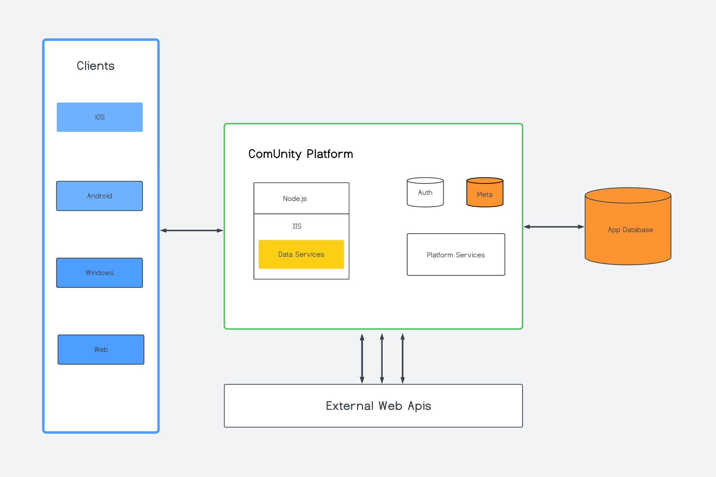


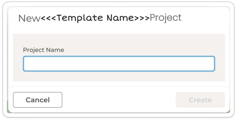
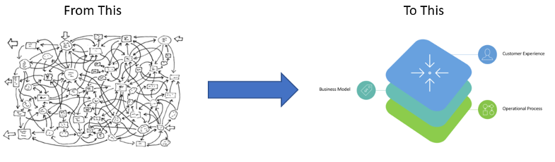
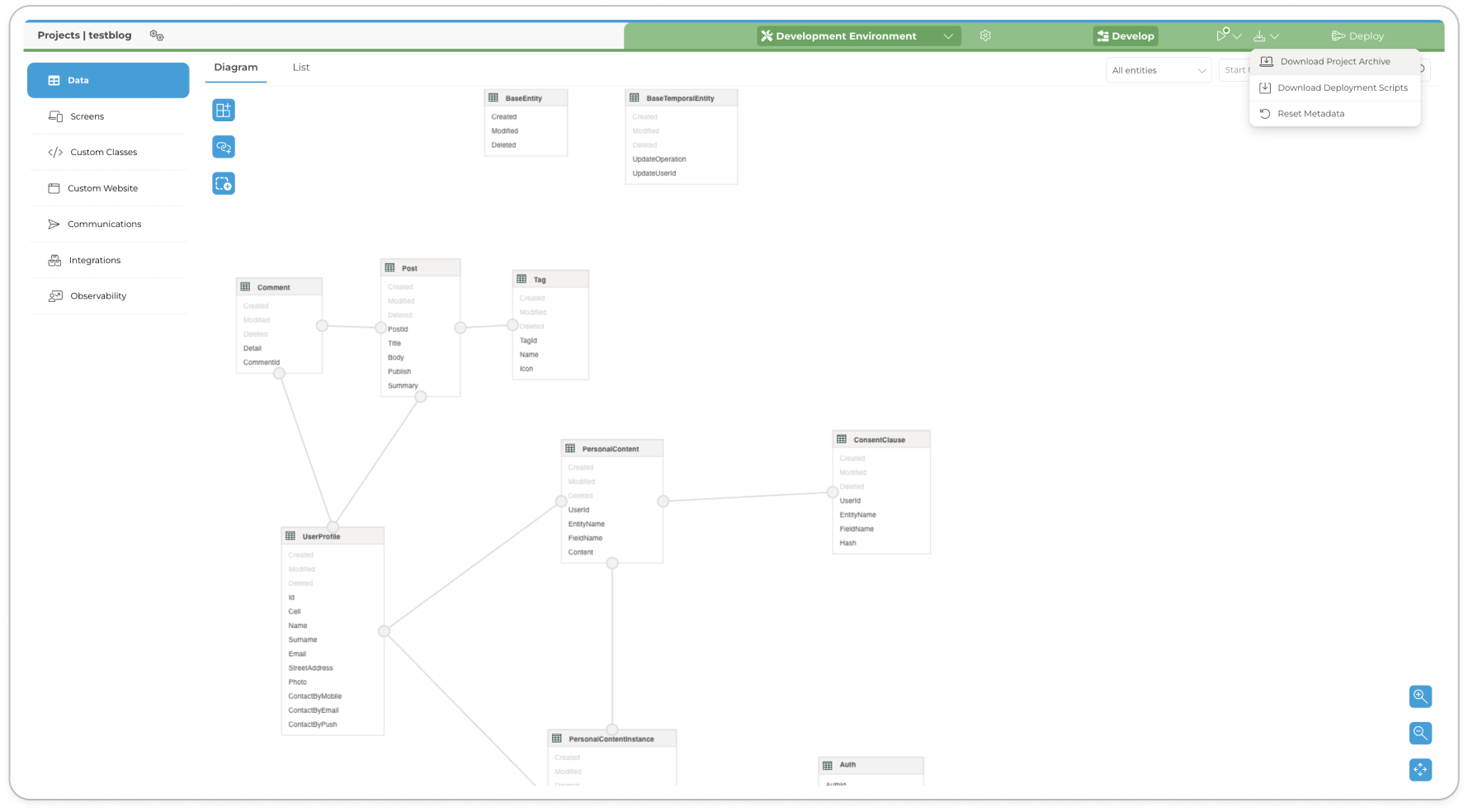
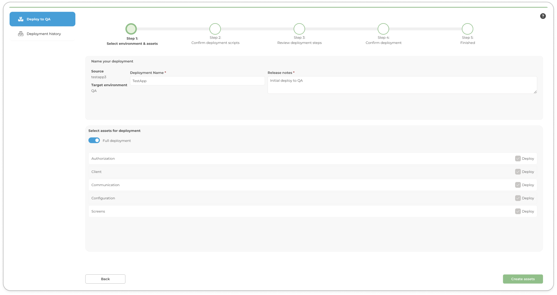
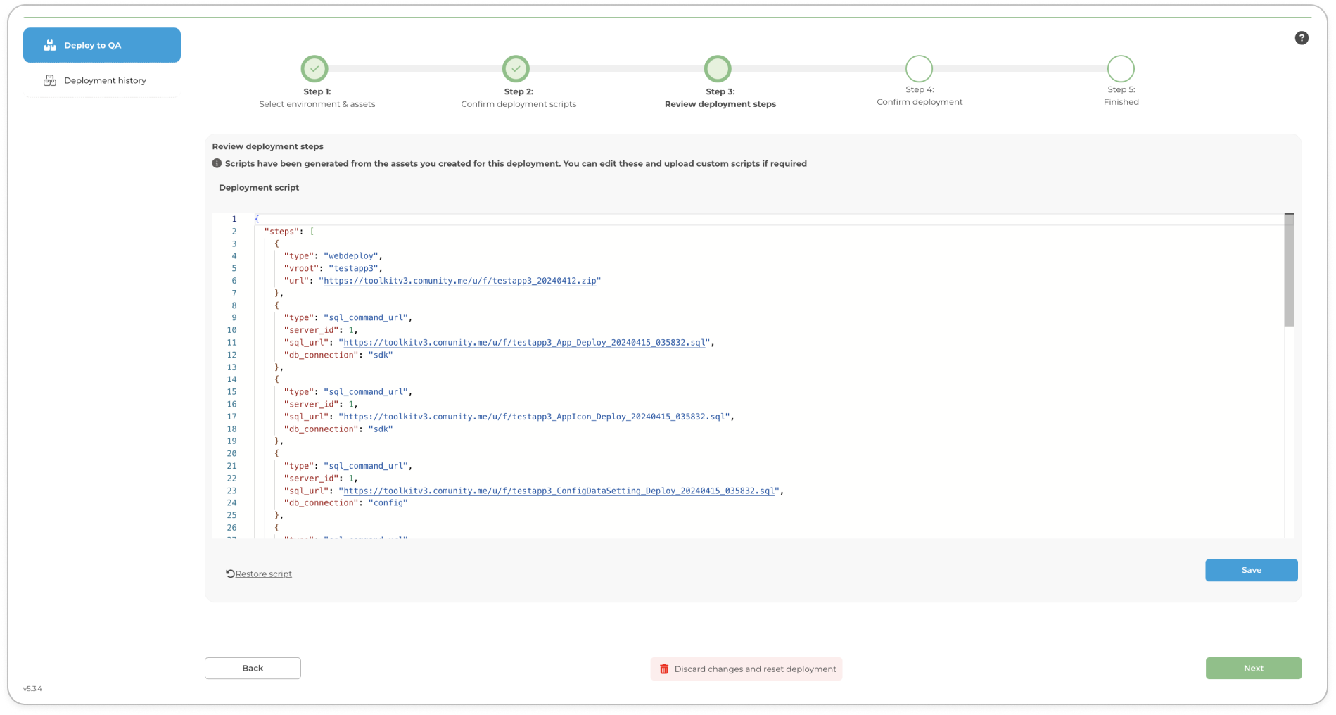
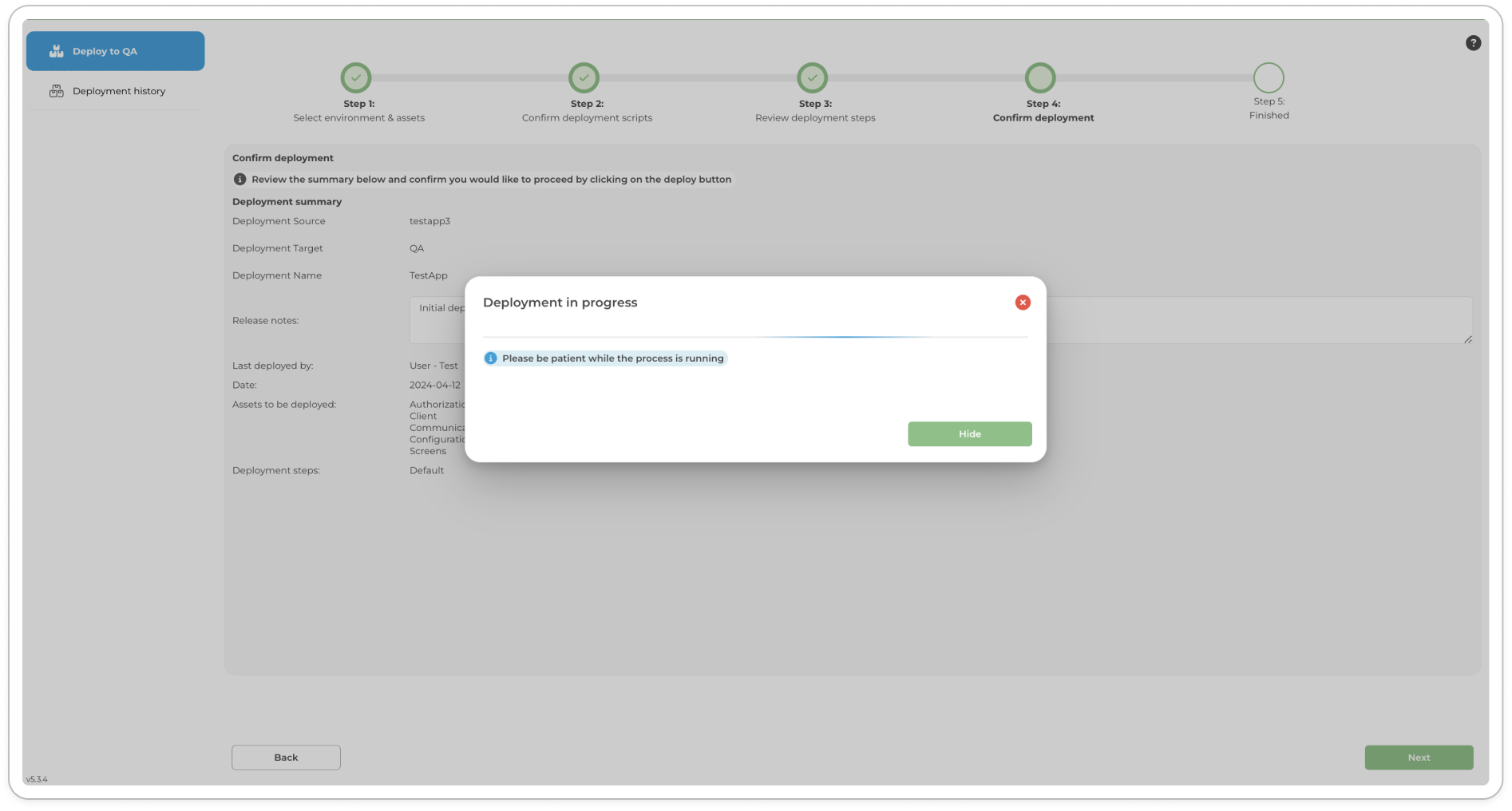
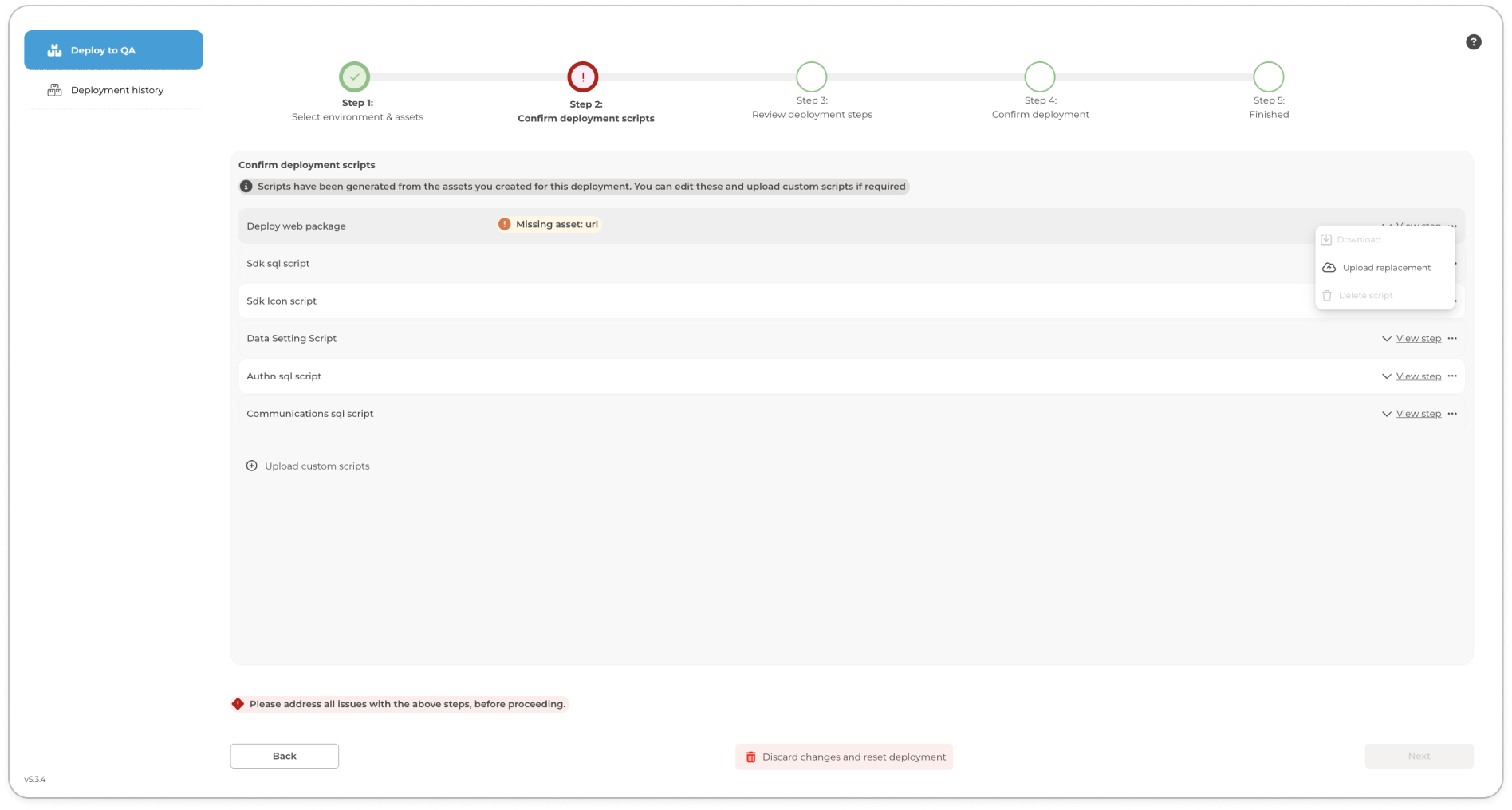


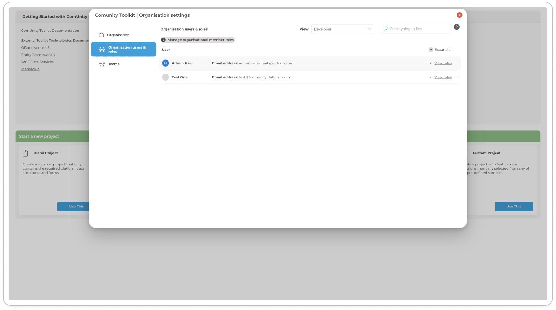
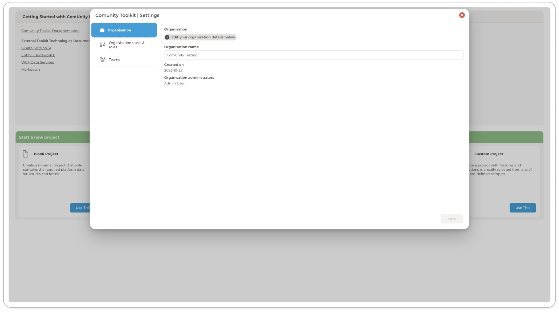
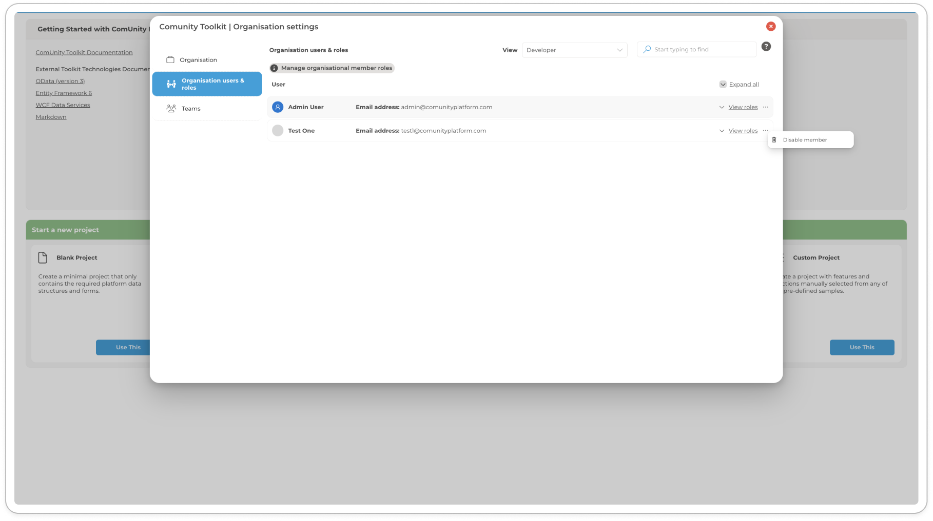
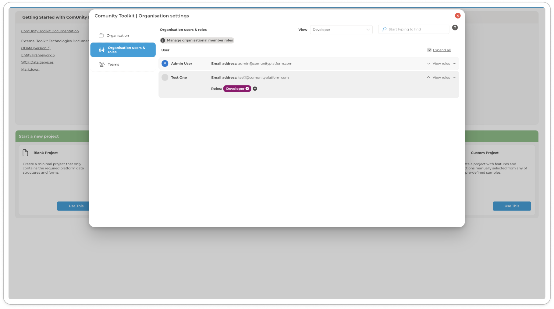
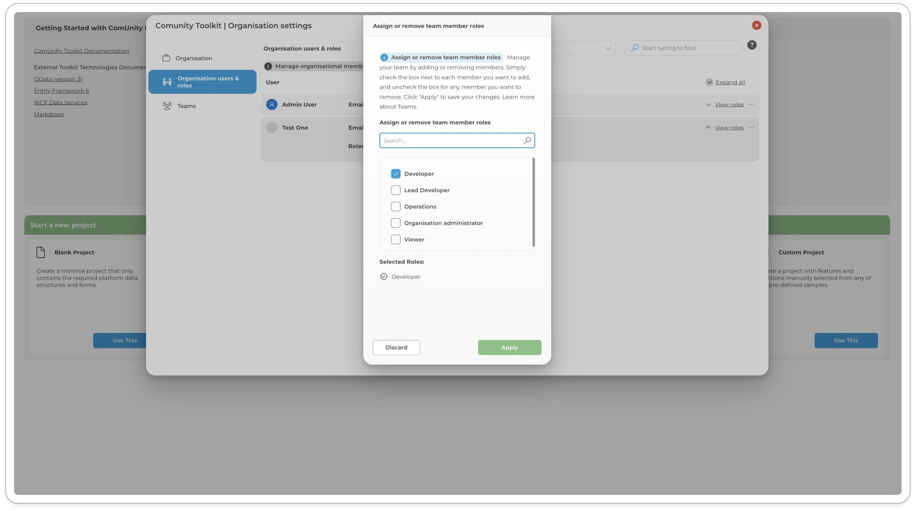


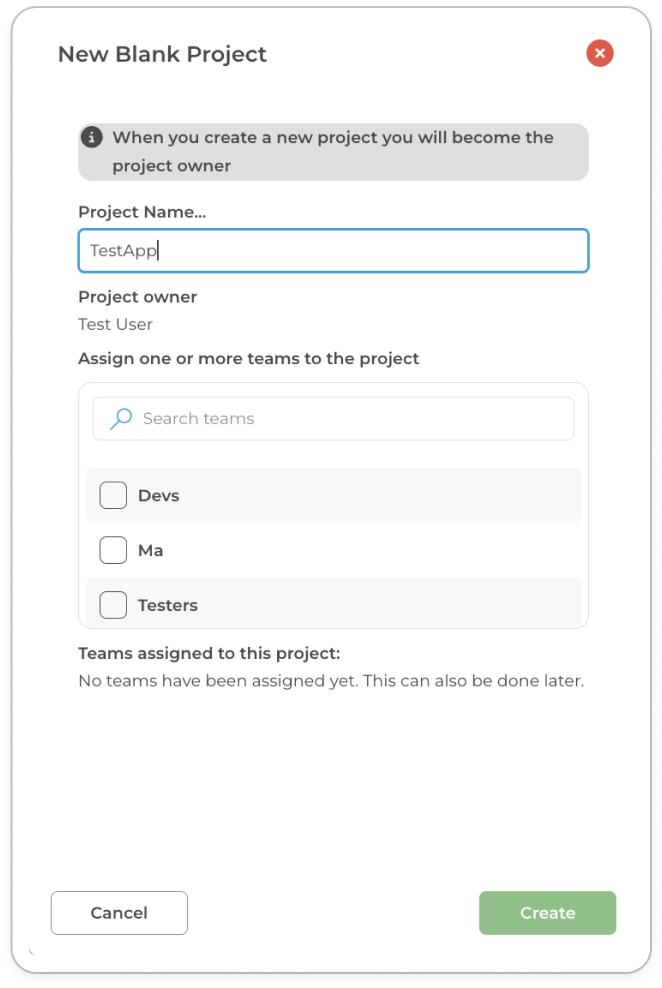
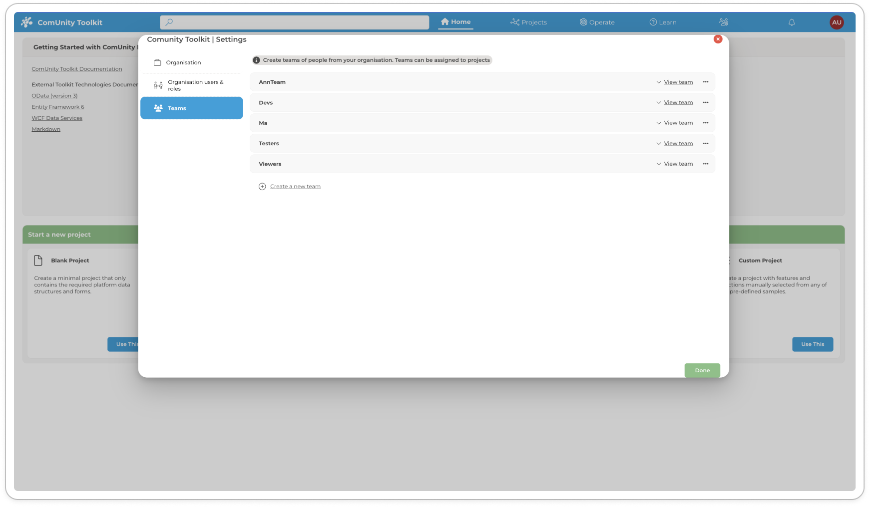


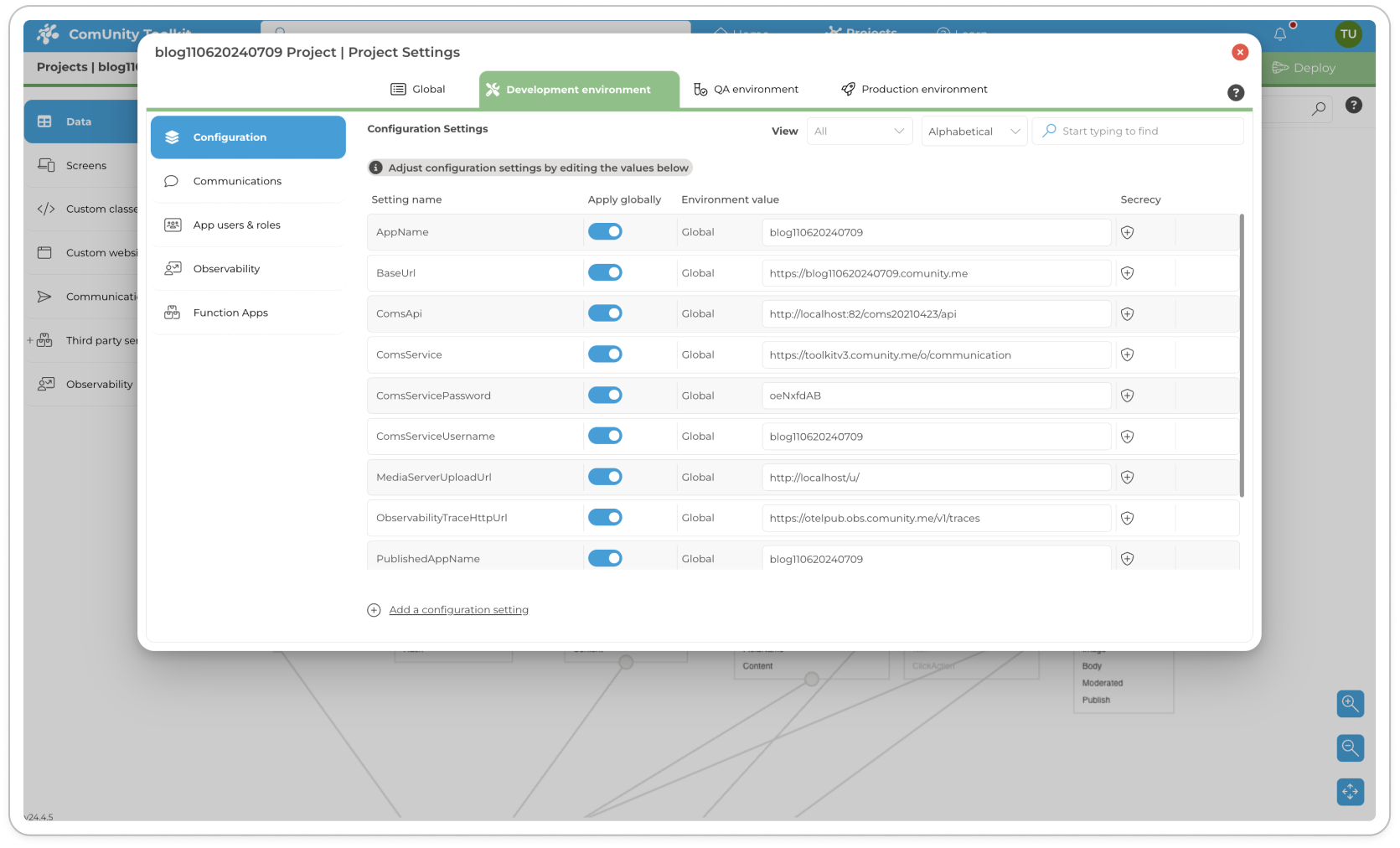
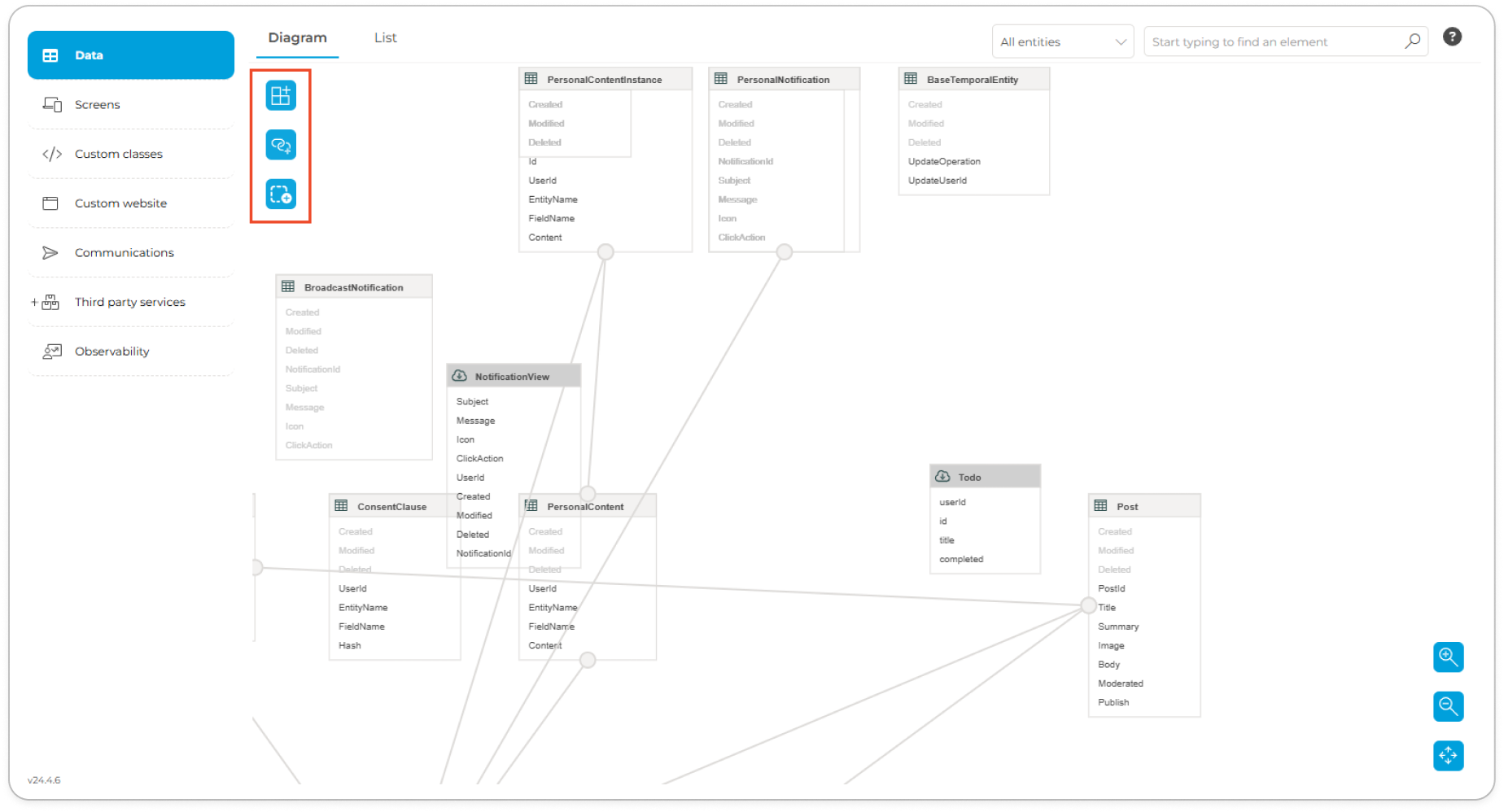


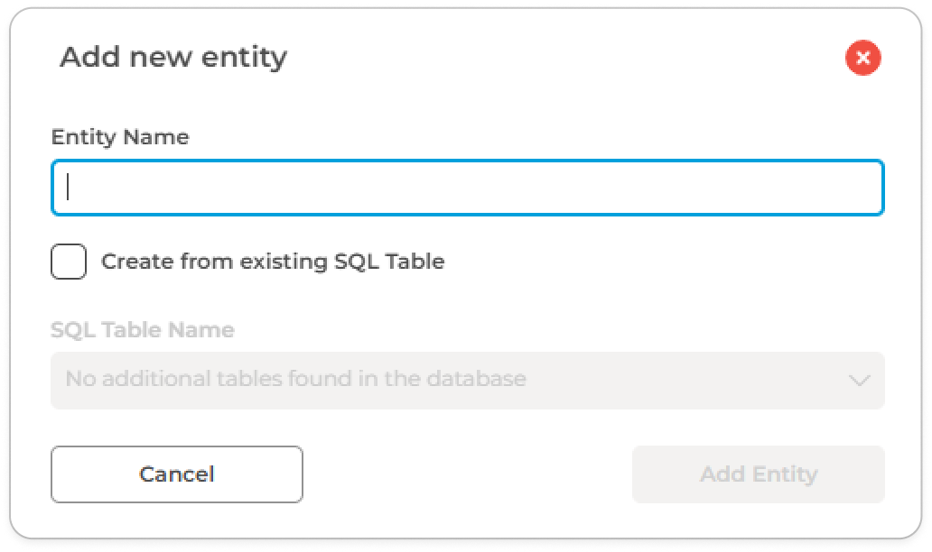


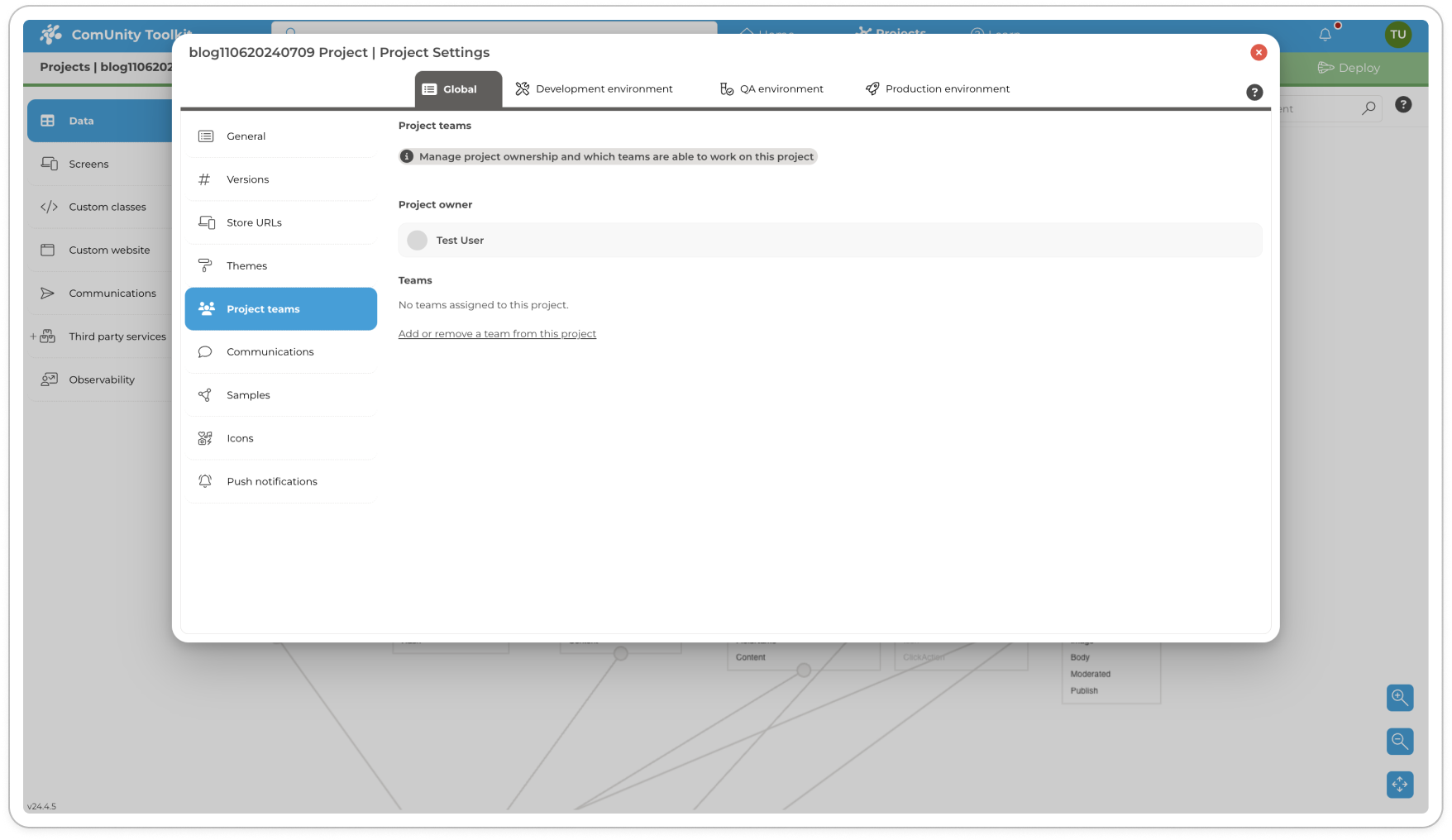


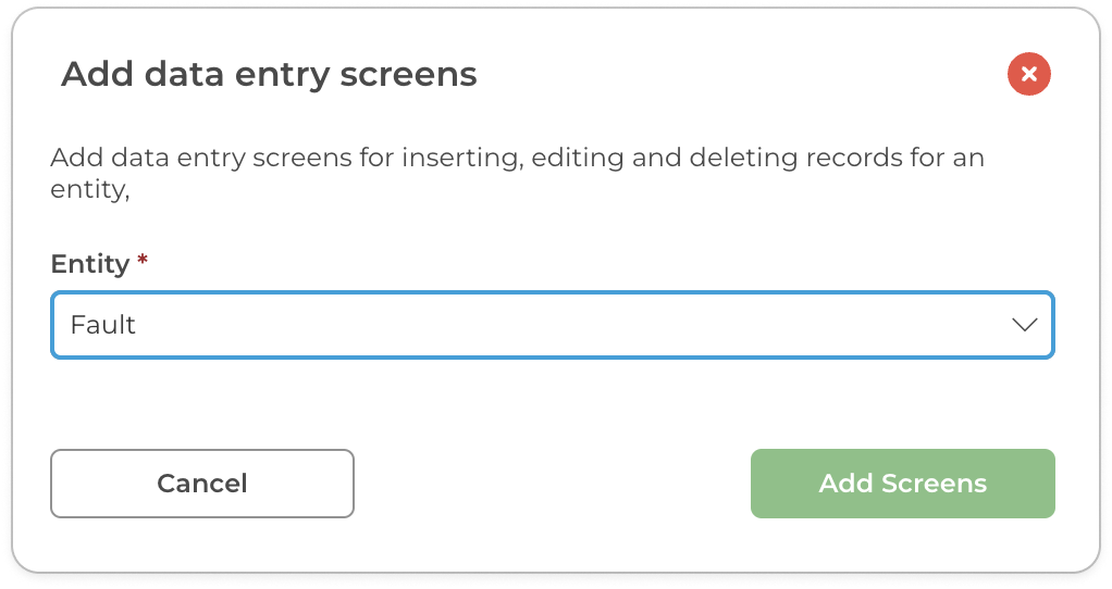


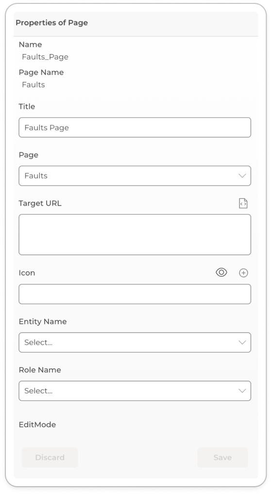


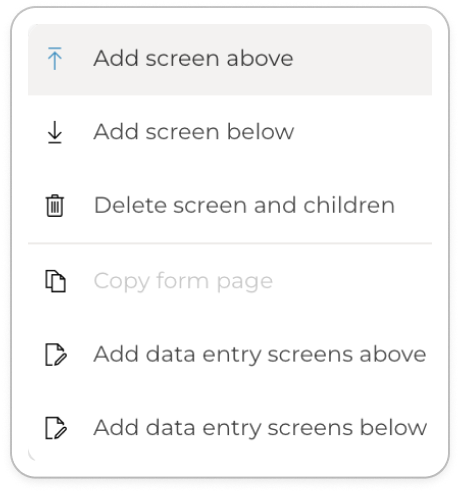


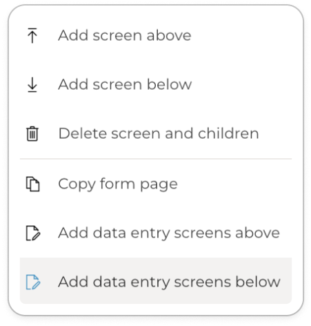
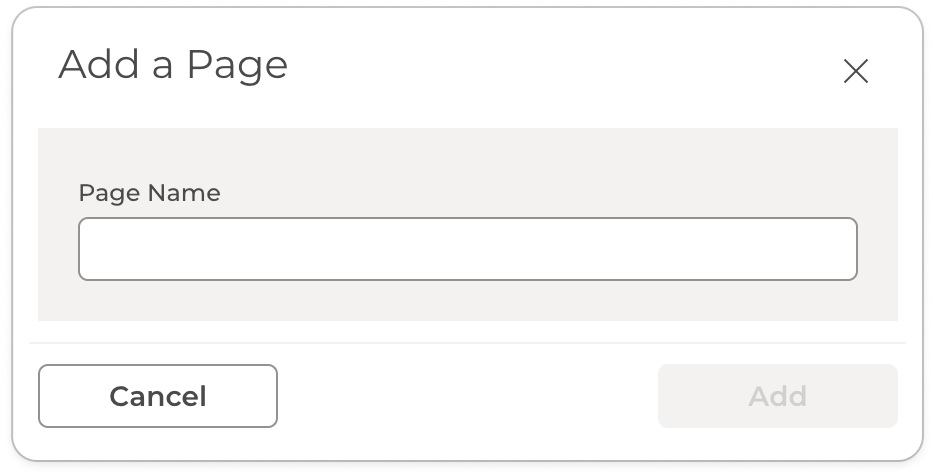


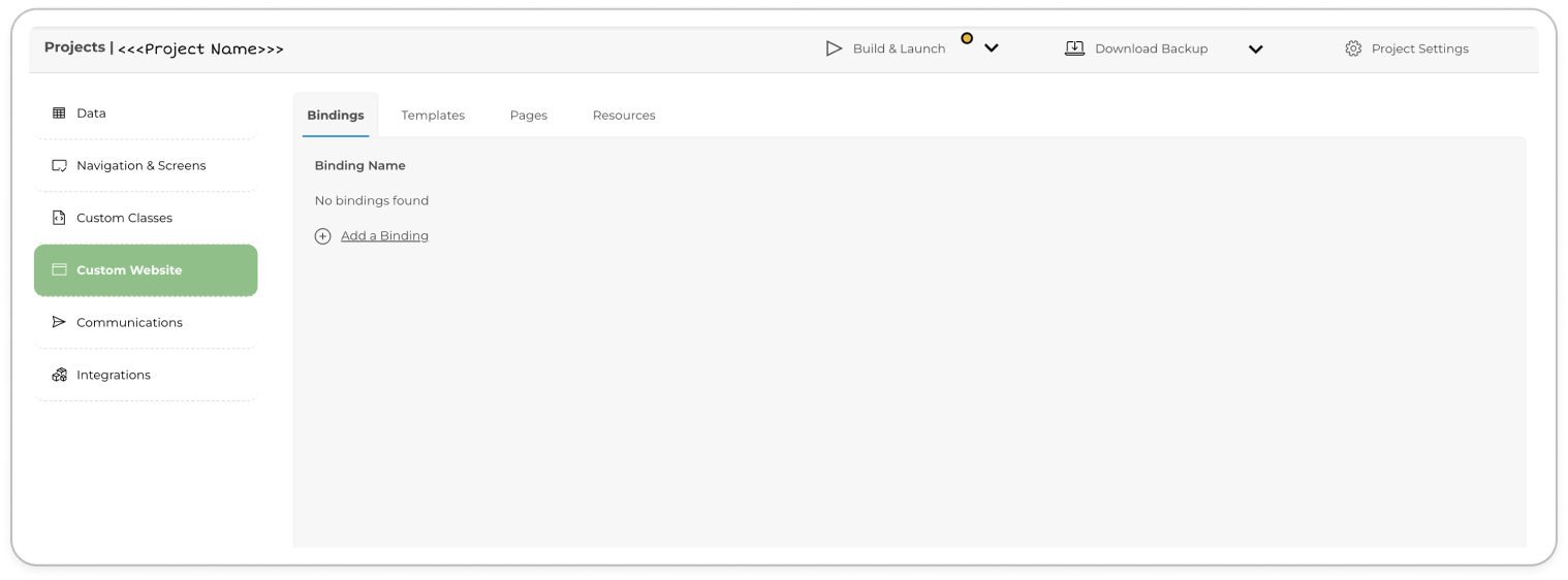


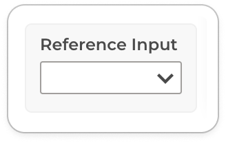
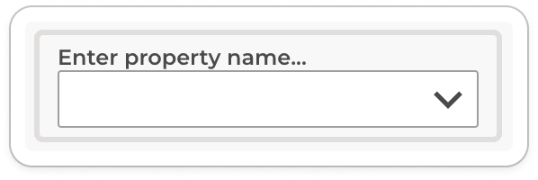

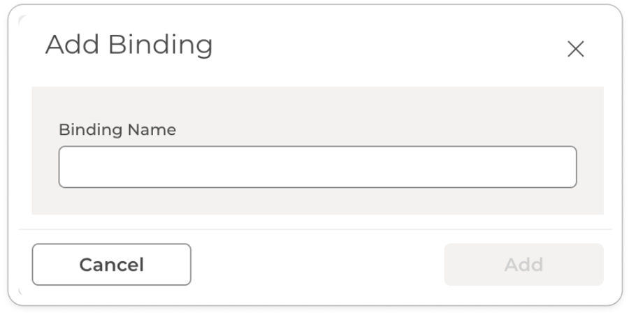


